Trending
Opinion: How will Project 2025 impact game developers?
The Heritage Foundation's manifesto for the possible next administration could do great harm to many, including large portions of the game development community.

Featured Blog | This community-written post highlights the best of what the game industry has to offer. Read more like it on the Game Developer Blogs or learn how to Submit Your Own Blog Post
This is a reprint of my recent Llamasoft blog entry about upcoming PS Vita game TxK. Even if you aren't interested in TxK I hope you might enjoy some of the historical stuff.

TxK for PS Vita. Out Feb 2014.
There's a particular style of arcade shooter that's pretty well established by now - let's call it the neo-retro arcade shooter. It's characterised by oldschool arcade-style shooting gameplay, typically uses a stylised glowing vector graphic style along with high-energy techno music and of course particles. Lots of particles. These games aim to deliver something of the purity of the oldschool arcade experience whilst also exploiting the modern aspects of the hardware they are implemented on to deliver beautiful abstract graphical displays well beyond the capability of the old arcade games that inspired them.
We can trace the evolution of this style back to its genesis in Llamasoft's own "Tempest 2000", created for the Atari Jaguar system in 1994. We were tasked with creating an update to ancient, excellent coin-op arcade game Tempest. Tempest was perhaps the pinnacle of the old style of arcade games based on "vector graphics", a kind of display hardware that has long since fallen into disuse. Rather than drawing graphics as a matrix of dots on a screen - "pixels" - vector graphics displays drew pure, straight lines directly onto the phosphor of the CRT. In some ways this method of producing graphics was rather limited - one couldn't create extremely detailed backgrounds, or large areas of filled colour, for example; but in others it was uniquely beautiful.
Displays of the time were typically pretty low in resolution, and objects made of pixels inevitably had a chunky, blocky aspect to them. Vector graphics displays effectively had no pixels, so game objects on a vector graphics display had a particularly pure, clean look that was visually striking.
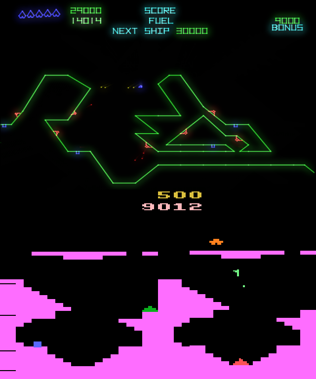 Arcade game "Gravitar" - top image is the game as rendered on a vector graphics display; bottom image is the game as rendered on a pixel-based home game console of the time.
Initially vector graphics displays were monochrome, but eventually colour vector displays appeared. Tempest was perhaps the most beautiful of such games, and although the gameplay itself was extremely simple - effectively it was a simplified kind of Space Invaders game at its very core - the beautiful glowing neon playing surfaces and quick, challenging gameplay drew in and entranced many a player in the dim early 80s arcade rooms.
Although there had been various conversions of vector graphics games onto 8 - and 16-bit hardware platforms previously none of them looked particularly pleasing, because translating vector graphics to pixel-based displays tended to look disappointing. With the unique purity of the vector display taken away, such conversions tended to just look a bit thin, weedy and blocky on pixel-based displays.
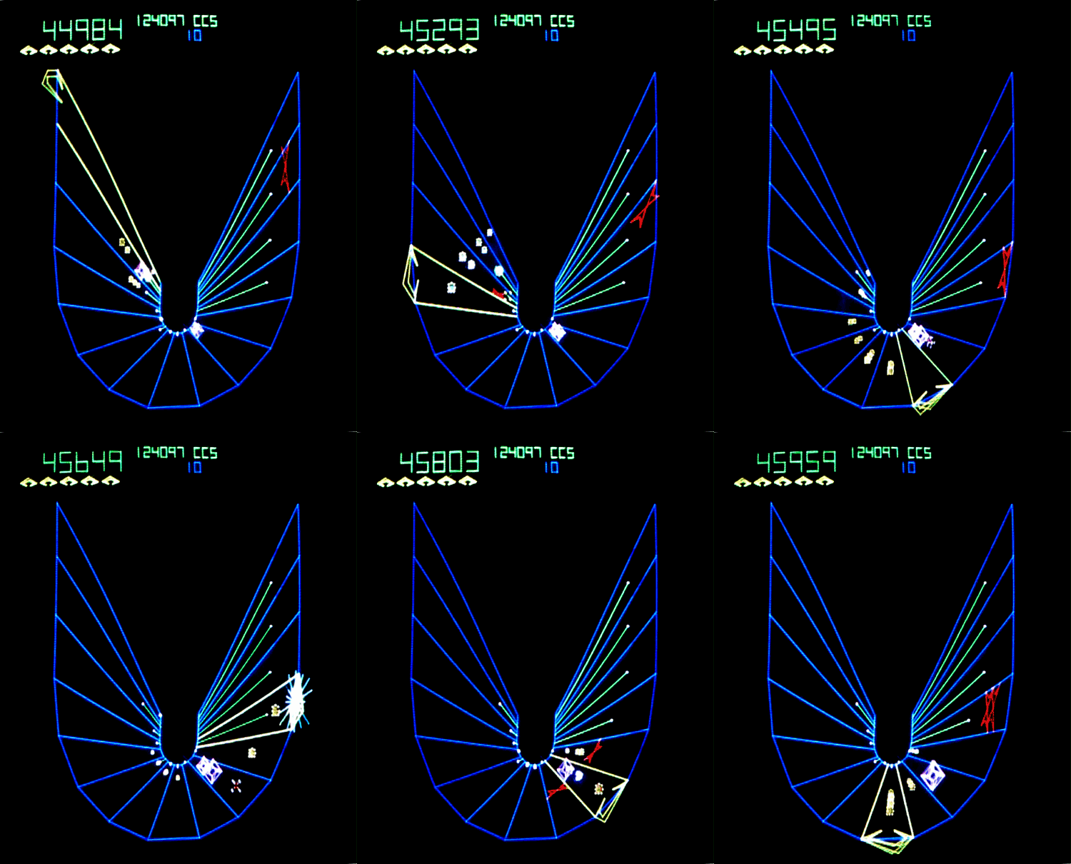
"Tempest" as seen in the arcade.
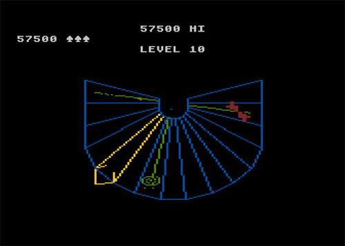
"Tempest" on an 8-bit Atari system. It's a good effort but it's lost some of its charm.
One approach to solving that problem was to keep the essence of the gameplay intact but to redesign the graphics in terms of "sprites" - the objects made of hand-drawn pixel art which comprised game elements back in those times. An example of this approach can be seen in Atari's "Blasteroids", which is a sprite-art-based reworking of the original vector graphics coin-op "Asteroids".
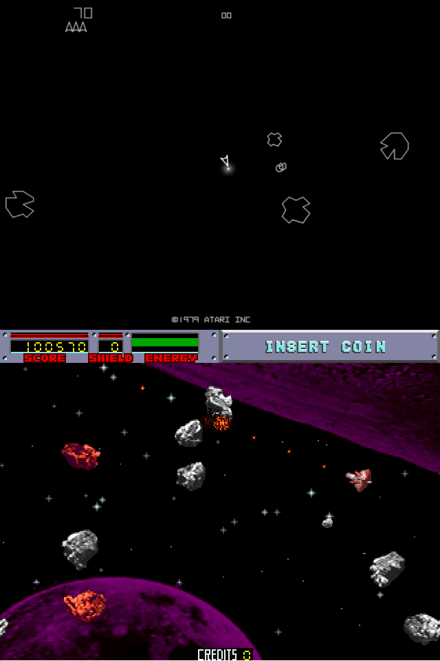
Top image is "Asteroids" similar to how it would have looked on a vector display (although only an approximation). Bottom image is the sprite graphics remake "Blasteroids".
I didn't want to take that approach when it came to T2K though. One of the things I particularly liked about vector graphics displays was that the display limitations enforced a kind of deeply abstract aesthetic onto games made that way. The glowing, geometric, jewel-like objects and the abstract mathematically pure worlds that they occupied looked to me like visions of life in other dimensions. Traditional graphics strove to become more and more lifelike with each passing hardware generation, more and more like the real world - but I didn't want my game to look like the real world at all. I wanted to take players into that lovely abstract dimension.
It didn't take too long to get a basic framework for T2K's gameplay up and running, but at first it suffered just as the other, earlier vector-to-pixel translations had - thin lines made of pixels against a dark background just looked too insubstantial and weedy and had none of the glowing purity of their vector ancestry.
Fortunately at that time a major evolution in the power of graphics hardware was beginning. For many years simply moving sprites around and scrolling background imagery had been as much as one could do on consumer-level hardware. Even something as objectively simple as drawing lines between arbitrary points was tricky on such hardware.
Inside the Jaguar, however, there was new stuff that let us move a bit beyond simply shovelling sprites and tiles around on the screen. For one thing there was hardware which made drawing those lines much simpler and faster than had been possible before. This meant that instead of drawing the game surface in Tempest at the start of a level and only redrawing the actual enemies on it every game frame (as had been done in prior conversions of the game) I was able to entirely redraw the surface and the enemies every frame. This enabled me to unlock the game from the entirely static viewpoint which even the old coin-op had stuck to, and have a dynamic viewpoint, as if from a "camera" floating somewhere behind the player character. As you moved around the surface your perspective changed in realtime, making it feel like the game was taking place on a surface that was somehow floating in space.
There was also hardware that could quickly fill a horizontal line with pixels, and even do so with "interpolation" - basically, you could specify what colour you wanted at each end of a horizontal line, and the hardware would fill in all the pixels between the two ends, smoothly shading between the two colours as it went. This allowed you to make objects that were filled in smoothly with colour rather than just being made of thin lines.
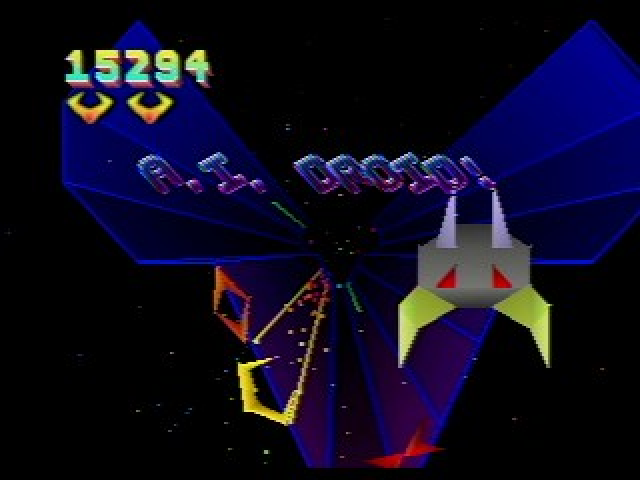 In "Tempest 2000" game objects and play surfaces could be filled with smoothly graduated colours.
(This may all seem rather tame in these days where you just point your GPU at a vertex list and miracles happen through your shaders, but back then it was amazing and new for us!)
I really liked the look this gave to the game. Objects and surfaces were still pleasingly abstract and mathematical-looking, and although I could never have the absolute purity of the vector displays I could now have things solidly filled with smoothly varying colours, which seemed to me to be an acceptable tradeoff.
The Jaguar had another couple of lovely gifts to give though. One of them was particles - ahh, delicious particles. Back on the 8-bit machines simply drawing individual dots in an arbitrary position on the screen was in fact a bit of a palaver, involving a surprising amount of fiddling about to do, having to tit around with bitplanes and masking and bitwise shifting and ungainly indexing and other such CPU-consuming trumpery, so even basic particle stuff was pretty expensive.
On the Jag though you could blat out individual pixels like there was no tomorrow, and still have plenty of time left over to run your game and draw your polys too. I wanted to build on the feeling I had of the game being on a platform floating in some kind of virtual, abstract space. I was under no obligation to make anything look even remotely "realistic", so I just made up a kind of tunnel effect made out of loads of particles and floated the playing surface inside that. Changing the parameters for the particle tunnel every level meant that it could have a different look for each level (it was based on an algorithm inspired by John Whitney's experimentations with differential motion particle plots that he'd done - rendering each frame onto film! - back in the 70s). I could speed it up to emphasize the transition between levels, too.
(This is John Whitney's "Arabesque" animation from 1975 in which he explores differential motion and the idea of "visual harmonics")
Another distinctive particle effect came to me thanks to the Jaguar hardware and a love of Eugene Jarvis' iconic Williams coin-op arcade games Defender and Robotron. In those games the enemies were made of sprites, but upon shooting them they would fly apart into their component pixels in a most satisfying way. There was a part of the Jaguar hardware that was intended for drawing scaled and rotated bitmaps, allowing you to step over a texture in non-contiguous steps picking up pixels and assembling them into a contiguous destination bitmap. I kind of used that backwards, reading from a contiguous bitmap and writing out dispersed pixels instead. This let me smash up entire sprites of any size into tiny bits for nearly free, which pleased me greatly. We even came up with a name for the technique, calling it "pixel shatter". You can see it used a lot in the bonus points annunciators in T2K.
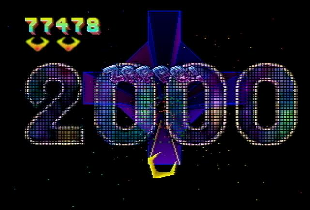 By "running the blitter backwards" you could smash up large bitmaps into little pieces.
Perhaps the most amazing thing that we got out of the Jag hardware was something that I confess absolutely stunned me when I first discovered it. The Jag had hardware that could move pretty big chunks of graphics around, allowing for ginormous sprites that you could also scale and rotate and change the intensity of. That in itself was pretty liberating, and although my game was to be primarily polygon based the ability to manipulate such sprites was certainly a handy thing. You could even have sprites as big as the screen if you wanted to, something I was thinking about one morning, and I suddenly wondered what would happen if you drew a sprite that actually WAS the screen (or at least the previous frame). So I coded up a giant sprite that had as its source texture the previous output frame, and the universe exploded.
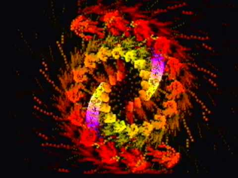
SWIRLY THING ALERT
Or that's how it seemed to me :D. I'd stumbled onto the digital version of video feedback, and was doing with my sprite routine what people used to do by pointing old analogue video cameras at TV screens that were displaying the output of that same camera.
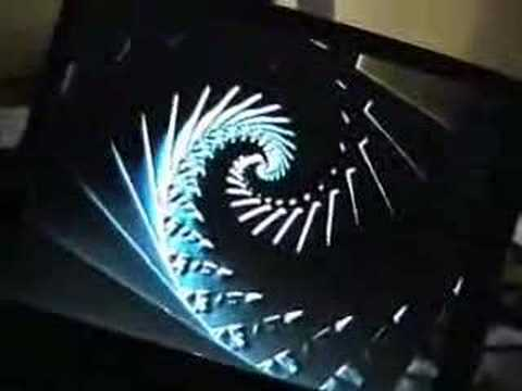
Same trick done by hand with a webcam. Real analogue cameras made feedback that was even more organic and blobby (to use the technical term).
I hooked up the parameters of the sprite routine to a Jaguar controller, allowing me to fiddle with the angle, scale and intensity in real time, and lost a good few hours just making swirly fractal vortices. It was great fun, and whereas it was a bit too overwhelming for use in the main part of the game (and robbed the frame rate a bit) it ended up being used for some of the bonus rounds, and for the distinctive title and Game Over effects in the game. It also proved to be extremely useful as the core effect of the Jaguar CD-ROM Virtual Light Machine visualiser that I made after I'd finished T2K.
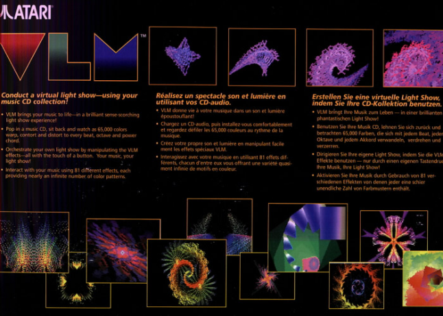 VLM, Atari's second music visualiser. I only found out there had been a FIRST one (the extremely rare Atari Video Music from the late 70s) after I made VLM!
All these techniques and effects were starting to come together to impart to T2K a unique style and feeling. It didn't matter any more that we couldn't reproduce the apparent perfection of the arcade's vector graphics displays - T2K was playing to its own strengths, and its graphics were the distinctive signature of newer, more modern hardware being used purely as "effects synthesisers" rather than striving for any kind of realism. I felt that this was entirely in keeping with the abstract nature of the game, and kept that "other-dimensionality" that I'd always loved about vector coin-ops despite the transition to newer, different graphics hardware and techniques.
With T2K very much finding its style and becoming its own entity the gameplay needed transforming too - a bit more was needed at core than just simplified Space Invaders. So I added a ton of enemy types, powerups, the ability to jump up off the playing surface, bonuses, and lots more levels. I made it so that good play in the main game would yield access to special "bonus rounds" where the player could leave behind for a few minutes the frantic shooting action of the main game and drift gently through peculiar spaces accruing bonus points or even the ability to skip forward a few levels in the main game. Once again with no obligation to be realistic these bonus rounds were entirely abstract - one of them had you flying through rings floating over and under what looked for all the world like a giant strip of bacon (but was in fact a rippled and distorted image of the surface of Jupiter). Another transformed you into a disembodied sparkle flying down a green path in a tunnel made entirely of particles (because I'd wondered what it'd be like to try and make a game level entirely out of particles, given that I could now have a smegload of them).
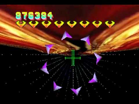
"Flying the Bacon" bonus round from T2K.
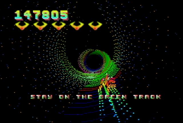
Following the green path in a bonus round in T2K.
an audio driver for the game, and they'd asked me what style of music I wanted in game. I remember I made a video tape of me playing the game along with some of the kind of music that I enjoyed listening to while playing (a lot of house, techno and industrial type stuff as I recall) and sent it off to them, and some weeks later i received a cassette tape through the post with examples of the tunes they'd made for the game. The tunes blew me away, they were excellent, so excellent in fact that I could scarcely believe they'd sound that good in-game. I actually phoned them up to ask if those were in fact exactly as they would be in-game and they assured me that they were. In a couple of weeks the driver and music data arrived and I plugged them into the game and they worked flawlessly and sounded absolutely amazing.
(Atari released a soundtrack CD of the T2K music. Here is a sample, played through the VLM! Enjoy!)
With that final piece in place we finished off the game and in due course it came out on the Jaguar. It became one of the most popular games on that system and also became the archetype for the entire neo-retro shooter style that was to develop in years to come.
I revisited T2K a few years later when I was working on the Nuon DVD/game system at VM Labs, where I made "T3K", which was basically a remake of T2K with some particular design goals in mind. The Nuon chip was a very interesting beast from the point of view of an assembly language programmer in that it encompassed both coarse- and fine-grained parallelism in the CPU. You actually had an array of 4 VLIW "processing elements" that ran in parallel. VLIW means "very long instruction word", which is jargon for saying that instead of just launching one operation per instruction as was usual for many CPUs at the time, you could build up longer instructions that allowed you to start operations on several different parts of the CPU at once, hopefully maximally occupying all of its function units.
Suffice to say it was considerably gnarly to code on (but nerdy heaven for an inveterate assembly language coder like I was at that time) but you could get an awful lot of bang for your buck in terms of computation per tick. So much so, in fact, that despite the CPU only being clocked at 54MHz you could actually do a significant amount of processing per pixel over the entire display and still keep a reasonable frame rate. In effect we were starting to use what would eventually be called "pixel shaders" before such things actually existed. It was interesting and fun but ultimately too gnarly for many people to get the hang of and not many games were written for the Nuon, and of the ones that were not many got the most out of the system.
One thing I was aiming for in T3K was "no visible pixels". I still couldn't come close to replicating the purity of an actual vector display, since we were still working at a fairly low spatial resolution. But I could do some pretty good blending and shading using the per-pixel calculation capability we had.
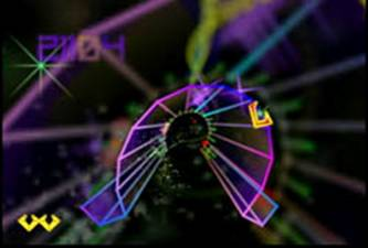
In T3K the guiding aesthetic was "no visible pixels" and it's amazing how close we got to that given the low spatial rez it ran in.
In the end I don't think the game ended up being as nice as T2K, since as the platform got finalised around me while I was making the game I ended up having to give back some of the processor elements to the OS for other functions and the game ended up running at a lower frame rate and resolution than I would have liked. If it'd been twice the rez and frame rate it'd've been a much better game I think!
But even as it is it's not too shabby when you consider that it's all done in software on half a 54MHz CPU.
In subsequent years I've not been alone in exploring the delights of the abstract neo-retro shooter. Great classics have emerged from the genre, such as the all time great "Rez", which takes the gameplay of Panzer Dragoon on the Saturn and launches it into a Tron-esque universe to the excellent accompaniment of some killer techno tracks...
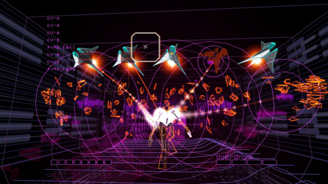
Rez. Pack-in for the hi-def release version of Occy Rift please.
and of course Geometry Wars, which re-imagined the twin stick arena shooter as a vector coin-op that never was, and then brought it to life with lashings of lovely particles as one of the definitive launch titles on Xbox Live Arcade for the Xbox 360.
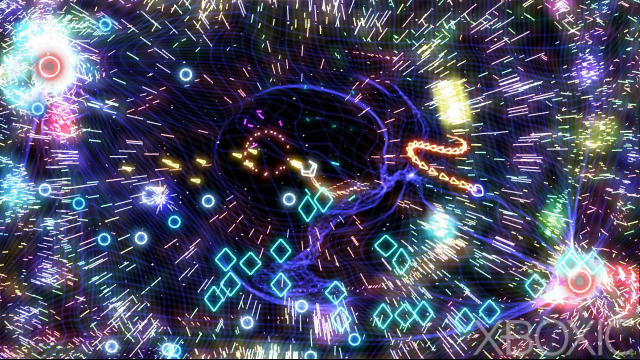
I think the entire top of my head just came off.
I've been there a couple of times since myself too, most ambitiously with "Space Giraffe", a deeply abstract tube shooter that we made for the Xbox 360 back in 2007. This game brought together the two major strands of my work throughout the years - video games and interactive music visualisation tools - into one entity. On the surface it was a straightforward tunnel shooter in a similar vein to T2K and T3K, but the deeper you got into it the more unusual it became. It was based on the Neon modular graphics synthesiser I'd developed as a basis for the Xbox 360's music visualiser. Gameplay effectively took place inside an ongoing music visualisation, and game difficulty was determined not only by the behaviour of enemies but also by the degree of abstraction imposed upon the scene by the visualisation. All the visual and auditory cues necessary to play the levels were there, but part of the skill of playing was in learning how to interpret what you were seeing and hearing into a coherent whole.
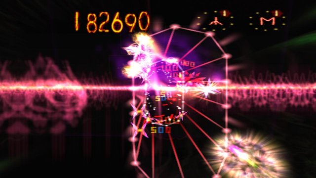
Some people wanted to shove me into a coherent hole when Space Giraffe came out.
Space Giraffe was easily the most divisive game I've ever made, eliciting a massive swath of opinions ranging from a couple of reviews which rated the game and its creator somewhat below pond scum, to others which reckoned it one of the best games ever made (Jonathon Blow, creator of "Braid", recently mentioned that he thought SG was one of the best games to be released on the Xbox 360 throughout its entire life, for example).
I think part of the reason for that is that for one thing, the game presented itself as looking like a pretty straightforward tunnel shooter, but it was in fact quite a bit different and more complicated than that. The way to score highly, for example, was to deliberately accumulate enemies at the rim of the playing surface and then push them all off at once, a technique not only impossible in a classic tunnel shooter, but also one which if attempted would be suicide for the player (keeping things away from the rim is central to surviving in the classic game).
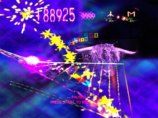
"Bulling" was the technique of collecting up enemies on the edge of the surface and then shoving them all off at once.
Some people simply could not handle the sensory overload that built up on the higher levels. Some people didn't like it, some people seemed to actually be angry that I'd even try to modify game difficulty using such a technique. But to those who ended up loving the game it is the very thing that they like about it the most - how you had to open up your senses as wide as possible, take everything in, both visually and sonically, and process it into something you can see clearly. It's hard to describe but it feels almost transcendental when you can do it.
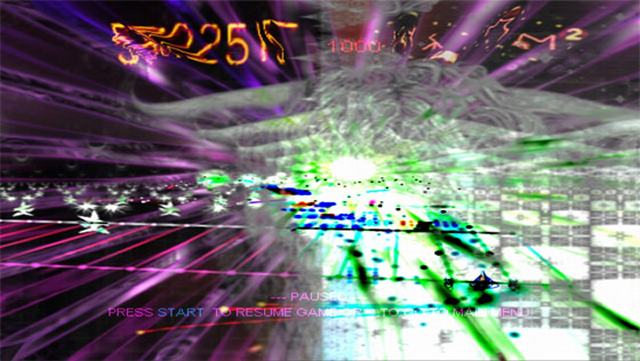 Transcendental or Radio Rental? You decide :)
It wasn't for everybody, that much is true, but SG remains one of the designs of which I am most proud. By and large those people whom it angered have long since forgotten about it, but those who understood and enjoyed it still remember it well, and play it to this day, and for that I am happy. SG attempted to push out a little beyond the boundaries of what had been before. It's a direction I'd love to push in again one day if I can ever afford to do so. Who knows what it'd be like with new heights of available processing power and the advent of decent VR equipment. I'd certainly like to try to find out!
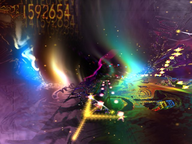 To boldly go where no giraffe has gone before.
Following Space Giraffe I did another neo-retro styled shooter, on the PC this time, once again using the Neon graphics synthesiser engine but just for enemy shape generation and background effects creation rather than for sensory overload purposes.
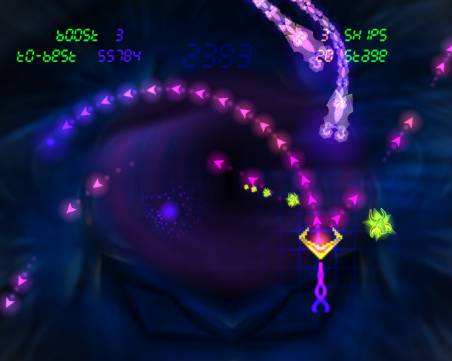 Gridrunner Revolution in one of its quieter, more contemplative moods.
After the frantic overload of SG Gridrunner Revolution was a much more chilled-out and contemplative affair.
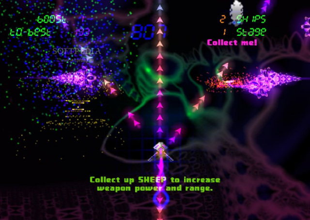 There were even sheep to collect. Can't get more restful and chilled out than sheep.
Since Gridrunner Revolution I've pretty much stayed away from the neo-retro style stuff, partly because I was working on shortish projects on iOS which lent themselves much more to the traditional sprite-and-tile style, and partly because if anything some of the neo-retro tropes were becoming a little bit overused and simply throwing up some bloomy vectors, cranking up the feedback and chucking a million particles around seemed to be getting commonplace. "Looks like Geometry Wars" started to become more of a curse than a blessing, great though GW originally was.
However it's been ten games and quite a few years since my last foray into neo-retro territory, and when the opportunity arose to do a project on the PS Vita I thought it'd be particularly nice to do something in that style, as the Vita has such a fantastic screen that is ideally suited for such things, with chthonically deep blacks and intensely vibrant colours. And so I postulated a project with the following characteristics:
- Tube shooter, more traditional than overload-y like SG was, more accessible to all and straightforward.
- Cognisant of its heritage from T2K and T3K, but extrapolating forward from both and fixing the most egregious flaws from both.
- Neo-retro but not cheesily so. Classy and sharp rather than just vomiting a load of particles out and cranking the feedback up to 11.
The result of all this is our new Vita game: TxK.
Hooray!
We've tried our best to create something that will feel familiar to anyone who has played any of our earlier tunnel shooters, but which will have enough fun, beauty and challenge in it that you won't feel like you're just running over the same old ground.
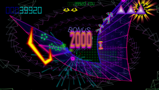 there's lovely!
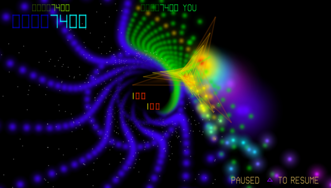
We've come up with a game that won't overwhelm you with too many effects and particles thrown in your face at once - it's certainly pretty but not obnoxiously overloaded. For the first time we're able to create vectors that actually look "vectory" - not overbloomed exaggerations. The high pixel density of the Vita screen and the incredible clarity and contrast of the display yields vectors that really do look almost as nice as those of the old vector display coin-ops.
We believe that whether or not you get a high score, the actual process of playing should be enjoyable enough that you will always enjoy the ride. Play should look so good, feel so good and sound so good that playing is its own reward, win or lose. After all, shouldn't playing be fun?
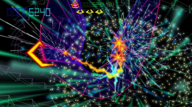 TxK is FUN on a BUN!
For me, part of the pleasure of playing this kind of game comes from the continuous flow of the gameplay. Even if you lose a life, there shouldn't be a huge jarring discontinuity in the flow of the game to take you out of "the Zone". As such it is axiomatic in my game designs that progress is never taken away. You are never sent back to the start of a level. You may lose some lives getting through a level, but progress made is always progress kept.
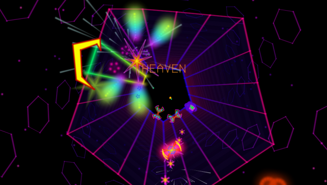 HEAVEN is where your BRAIN will be when you play TxK!
Likewise I'm not a huge believer in boss fights in games - certainly some classic boss fights can be entertaining, but for every one great boss there are ten others that are just roadblocky annoyances that stand in the way of the smooth progress of the gameplay. So TxK is bossless.
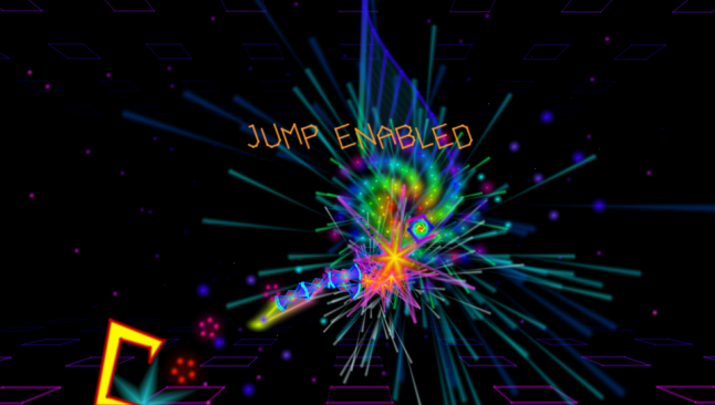 TxK may be bossless but the gameplay is BOSS-ASS!! You'll be trancing your way to the top of the leaderboards like a BOSS!!
That's not to say that the game doesn't have its difficulty spikes - an interestingly shaped difficulty curve, with some spikes to challenge you, and some valleys to let you regroup and recover is essential to fun gameplay I believe. But rather than arrange the difficulty into boss-shaped clumps we'd rather express it in terms of the behaviour of enemies across an entire level. You might lose 5 lives on a hard level the first time you reach it. Later on as you improve you might only lose one. But in neither case will you actually lose any progress you've made.
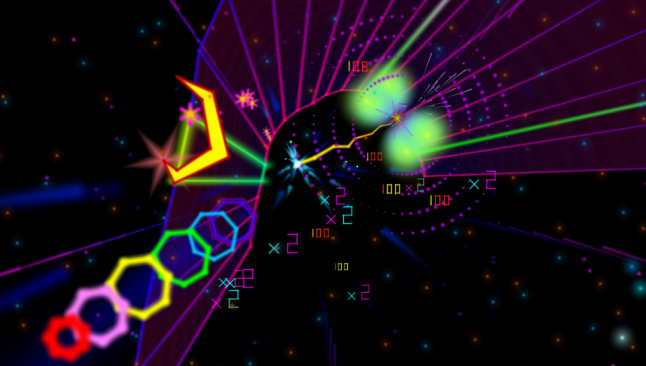 Look I don't really have to make up any more stupid marketing captions. Just look at it. It's beautiful. It's even more beautiful in motion, on a Vita screen.
TxK is perfectly suited to its home on the PS Vita. Not only do the graphics positively pop on the delicious Vita screen - we've also taken care to cater to your gameplay needs whatever they may be. Fancy a long session? Begin at level 0 and go as far as you can for a Pure Mode score. Want to push your best hiscore up a little higher? Start at your highest Restart Best point and see if you can press through to the next level. Just have 5 minutes to dip in to the game? Choose any level and try to improve your Restart Best for that level.
Restart Best is something that we've been building into all our games for the last few years, and players really seem to like it. How it works is like this: at the start of every level your lives and score are checked. If you have more lives than you ever had before at that stage in the game, OR if you have the same number of lives but a better score than you ever had before at that stage, then your lives and score are noted and upon starting subsequent games you can choose to begin at that level with the number of lives that were noted. Upon completion of the level you will be awarded the score that was noted as a Start Bonus. Scores made with Restart Best go to the Classic Mode hiscore table.
Over time you can gradually improve your Restart Best profile across all the levels, and so you're never far away from being able to push for a new Classic Mode hiscore without having to play all the way through from the beginning.
If you fancy a stiff challenge, switch to Survival Mode where you'll start from level 0 with three lives - but no extra lives may be earned along the way, and no Bonus Rounds are available. A challenging mode for the shmup purist!
Oh, did I mention Bonus Rounds? Yes, as one of the things I most enjoyed about T2K back in the day was the way it switched back and forth between the fire and fury of the main levels and the floating chillout of the Bonus Rounds, and so I've brought them back in TxK. You'll waft gently over fields of fluff or surf down the Green Path collecting up the bonus points - if you are diligent in collecting your Powerups in the main game.
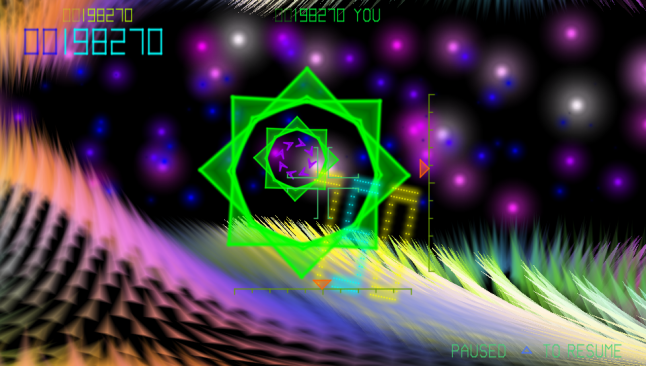 Fly through fields of fluffy fur in this TxK Bonus Round.
 Follow the green path to fame, fortune and glory (or at least some nice Bonus Points).
And once again, the icing on the TxK cake is the incredible soundtrack. You'll be wanting to plug your headphones into your Vita and we guarantee your head will be nodding in no time as you blast your way into "the Zone". A whole herd of talented musicians have all conspired to bring you one of the best game soundtracks I have ever heard. Each and every track is just superb. Given the game's ancestor's sonic reputation I couldn't have hoped for a better and more appropriate musical accompaniment - if anything the soundtrack of TxK actually manages to eclipse that of its illustrious forebear.
Oh yeah :)
That's fine for hearing a sample of TxK's music but Youtube rather compresses the hell out of the graphics, so I'll drop a few links here where you can download much less compressed videos. I really do recommend you do that in order to see just how lovely TxK looks in motion. And bear in mind it looks even *better* on the Vita screen :).
"Noise Pulse" video, uncompressed version of what's in that Youtube clip above.
"TxK 30 seconds", shorter clip for the sparse of bandwidth.
"TxK 60 seconds", longer clip with moar stuff in.
Right I am going to shut up now as I hate feeling like I am blowing my own trumpet, it's not something I enjoy doing very much. But I hope that you've at least found some of the notes I've written here about the ancestry of TxK and neo-retro to be interesting and worth a read. And if I've been gushing about TxK (and I've tried hard to gush with tongue firmly in cheek, if such a thing is possible) then it's only because it's something I'm really happy with. I truly think we've done a good job with TxK and that if you enjoy those neo-retro-style shooters, and want to play something that is a lot of fun and really does look beautiful on your Vita and which sounds absolutely awesome, then you'll really enjoy TxK.
I hope to see you on the TxK high score tables come February then!
Read more about:
Featured BlogsYou May Also Like