Trending
Opinion: How will Project 2025 impact game developers?
The Heritage Foundation's manifesto for the possible next administration could do great harm to many, including large portions of the game development community.
For the past year, I've been responsible for the UI and UX for Arboreal. It falls into multiple genre boxes, including "adventure", "open world", "zelda-like", "farming", and more. How do you make UI for such a game? I explain my iteration process.


Mirrored from my blog: https://auroriax.com/the-ui-and-ux-of-arboreal/
The game I've been working on as part as an university project was announced recently, and I've been responsible for the UI and UX for it. It falls into multiple genre boxes, including "adventure", "open world", "zelda-like", "farming", and more. From the get-go, it was clear this project needed a lot of UI, and user friendly one as well. That's where I come in, and use this post to explain what that process was.
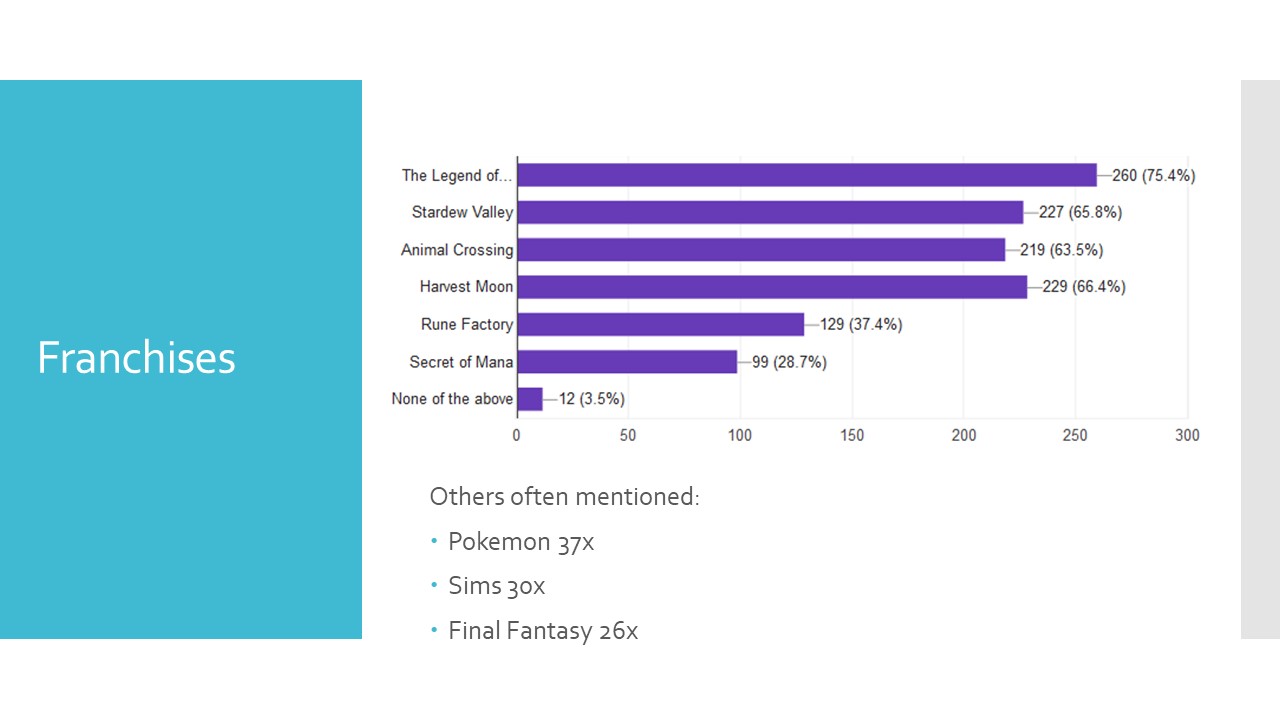
We started researching our target audience, to help the team determine the game design's core pillars. That included competitive analyses and digging through SteamSpy, but the most valuable source was a survey, posted on subreddits of the games on our reference list. This netted us 345 responses that we could use to identify our target audience with.

From our target audience research, we started building from the assumption that the game needed to support players liked micro management, as well as more casual players, who just want to relax without thinking about things too much. We adopted a keyboard and mouse control scheme, where players had five hotbars that had spaces for two items each. With the left mouse button, you'd use the item in the left slot, and the right press for the right item. And scrolling the mouse wheel would swap between the slots.
This approach didn't seem right once it was in game. Micro managing players found it too much work to set up initially, while casual players did not get it at all. It resulted in a lot of nasty edge cases, for example for inventory management and interacting with items inside of the world. I do think this was a good inventory system, but it was not suitable for this type of game.
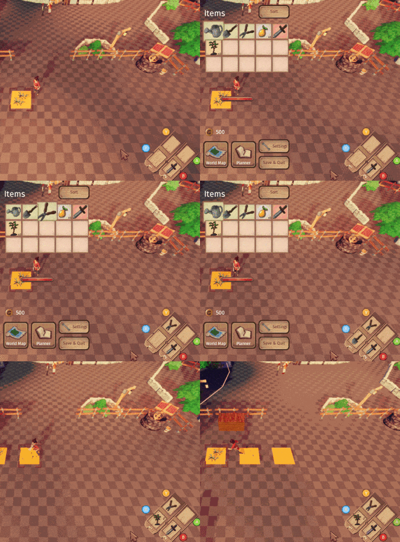
It was clear that both micro managing players and casual players did not wanted to spend a lot of time inside of boring menus. I had over-engineered. My new plan was to make sure items could be swapped in and out as quickly as possible, and I started prototyping to find out what would work best in our game. We also switched from keyboard & mouse controls to controllers, to simplify the controls.

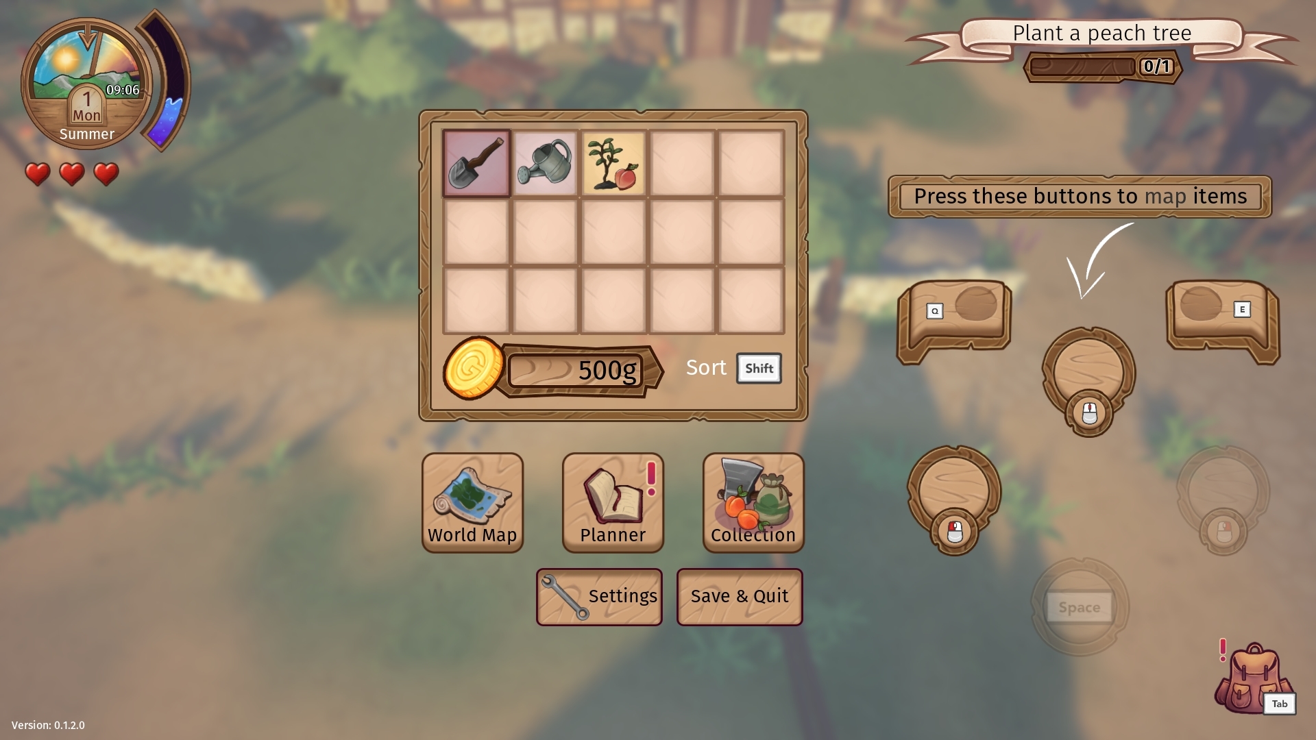
Ultimately, we decided to allow players to map items to three of the face buttons, by pressing that button inside of the inventory. The fourth button would be reserved for context sensitive actions, like talking to NPC's. This design was received better, and while it still suffered from a large amount of edge cases, we had a better base to work from.
We decided to permanently assign the sword to one of the face buttons, and adding mapping for shoulder buttons, bringing the mappable buttons up from three, to four plus the sword. Rolling was brought from a separate button to the interact button when no context sensitive actions are available. Other screens were also finalized during this stage in development, and keyboard support was added again.

When we started putting out a form for alpha testers, I included the same questions as back in the target audience research. This really allowed us to learn how well we connected with our intended target audience, and with 650 alpha submissions, has gifted us yet another pile of data to dig through, showing us that we were actually reaching our intended audience.
Some of the more important lessons I learned from working a year long on the UI and UX of this project:
The team didn't really care about UX in the beginning, much less knew what an UX Designer even was... Most members of the team had been developing in their own bubble at that point (including me), and needed to realize that this game would actually need to be released and connect to an audience at the end of production. Presenting research in the first week was a great wake-up call, and allowed the team to take statistics into account when making designs.
A good rule for UI design is "Keep it simple, stupid". Don't over-engineer, keep everything clear. Usually the 'cheap' solution works best for UI design, like making UI based on another game's interface, or recycling similar screens and elements between screens for consistency. The less buttons people need to use, the more accessible the game is.
Reduce friction and streamline the UI as much as you can, allowing player to translate intention into action as quickly as possible. Keep in mind that players want to spend more time playing the game, and less time in boring menus, and you should use that as a metric for effectiveness of UI. Also see "Who is typography for?" from the Practical Typography, just replace all instances of 'reader' with 'player'.
Beyond that, if the UI echoes the personality of the game in visual style, it can be a great way to make UI easier to use by using metaphors, the same visual style, and making UI feel more connected to game by placing it inside the world or in another smart way, makes it less painful to use.
UI connects to pretty much every other system in the game, so you'll need to know all systems in the game, and communicate with everyone to get to know their UI demands. It can be hard to keep track of, and sometimes requests may be conflicting. An issue with the UI can very quickly become a problem with the entire game, and vice versa. Problem solving skills are an absolute must for UI/UX people. You can clearly see the correlation between which games were easy to learn and play, and which teams had an UI designer.
Thanks for my team for developing the game and helping me make the UI! If you liked this breakdown, I'm planning to analyze interfaces from other games in the future! You can follow me on Twitter, or sign up below to know when I've made a new game.
Read more about:
BlogsYou May Also Like