Trending
Opinion: How will Project 2025 impact game developers?
The Heritage Foundation's manifesto for the possible next administration could do great harm to many, including large portions of the game development community.
Happy 25th birthday B. J. Blazkowicz! iD co-founder Tom Hall, who directed Wolfenstein 3D, shares 5 crucial lessons of game design he learned from making that game that he still uses to this day.

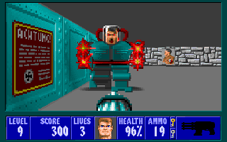
Wolfenstein 3D came out exactly 25 years ago, on May 5th, 1992. Nothing was the same after that day. “We knew it was new and special, but we were pretty blown away by the reception,” says Tom Hall, the director and co-designer of the game.
He and the co-founders at iD Software quickly realized that they had a hit on their hands. What they couldn’t have known then was how much B. J. Blazkowicz and his subjective POV would revolutionize video games.
It wasn't the first game to use a first-person perspective. In 1991, Softdisk released what has been called the original first-person shooter, a wizards-and-warlocks dungeon crawler called Catacombs 3-D. But the game didn't click with the public.
So the main people behind that game, and dozens of other Softdisk releases--John Carmack, John Romero, and Tom Hall-- reworked the formula. Instead of dark fantasy and spells, Wolfenstein 3D cast players as a beefy action hero racing through corridors with a deadly projectile weapon in hand, giving the Nazi's what-for.
A quarter-century later, the FPS is a cornerstone of the games industry. The genre is a foundation upon which developers create massive sales juggernauts like the Battlefield and Call of Duty and Overwatch franchises, horror games like FEAR, immersive experiences like the System Shock and Bioshock series, survival games like Metro 2033, and even quirky personal expressions like Andy Sum’s GAME OF THE YEAR 420BLAZEIT.
“Since we made games out of passion and were so geeky-early, that gave us a leg up, a rare opportunity to make a new genre come to life," says Hall. "That doesn't happen very often, and I'm honored to have come up with the fundamentals of what an FPS is with the team.”
Hall went on to co-found ION Storm and Monkeystone, and designed titles like DOOM, Rise of the Triad, Anachronox, and PlayFirst's DASH games. We asked him to tell us about some design lessons he learned while working on Wolfenstein 3D that he still uses today. He began his list, not surprisingly, with guns.
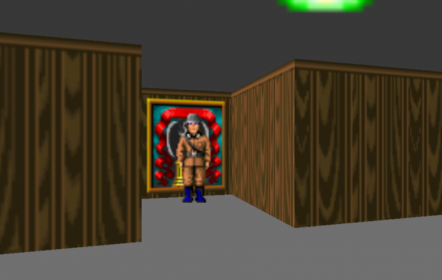
This seemingly simple shooter was full of hidden secrets.
“Design-wise, if something is critical, stick to your guns. I fought for pushwalls,” Hall says, referring to the secret parts of the corridors in the game that appear to be solid wall but can be opened, leading to new areas.
"Adding pushwalls made Carmack's engine slightly less elegant, but it made the game way more fun."
“In a game, you don't want activity fatigue, where you get bored doing the same thing all the time,” Hall says. He describes the main gameplay loop of Wolfenstein 3D as “shoot guards, loot, get key, open door, shoot guards, loot, get key, open door…” He says that programmer John Carmack questioned the need for fake doors, but he argued for it, and the end result made for a more surprising, compelling game.
The pushwalls added secrets to the environment, and added a twist to the propulsive combat. ”There needed to be that ‘10% thing’ that you can do for a variety of experience,” he adds. He describes the professions in World of Warcraft or cooking in Breath of the Wild as examples of side activities that help break up the sameyness of the main gameplay.
“Adding pushwalls was a classic way to hide secrets, using the exact same controls as doors, so it made sense,” he says. “It gave you that rush of discovery that Bartle's Explorers crave. It made Carmack's engine slightly less elegant, but it made the game way more fun.”
"Carmack shines at optimizing and making things fast, and figuring out tricks to do more and do it faster than would be straightforwardly possible," explains Hall. "He had crafted an elegant and efficient renderer. This would make it less elegant, plopping what was essentially a special case kludge in the middle of all that nice, clean code. But it was super-necessary for fun."
Wolfenstein 3D was a paradise of creative visual freedom compared to the old games, but it had its limitations. Things on the ceiling were just hanging from a flat colored surface, same for the floor. But it was okay. But since everything was on one level, it was rather difficult to surprise the player, so the design had to be tricksy. Alcoves with walk-throughable or shoot-throughable objects, so enemies could surprise you, and from then on, make you paranoid, even if they weren't there!
[FASCINATING SIDE NOTE FROM HALL: "Off-topic, one sad story was this -- Wolfenstein actually had animating wall textures. From early on. The scene is this: we were making a cool FPS in a crazy short time. We had an outside artist helping on art, and the art wasn't turning out very good. A flickering torch wasn't well done. We parted ways. And then, WE FORGOT TO USE ANIMATING WALLS. At all. They could have really added to the atmosphere and been used for interesting things.... but, well, we had so much to do and simply forgot."]
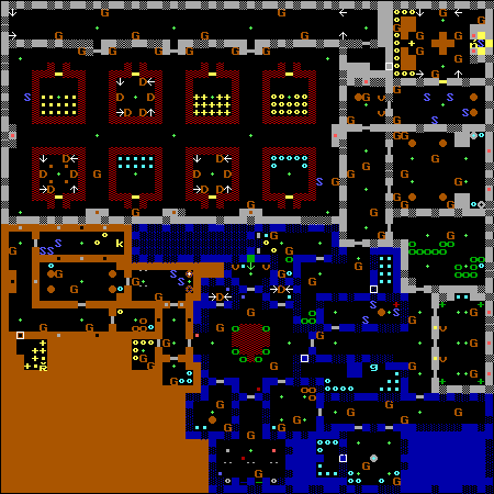
Map of Episode 1 Floor 5 of Wolfenstein 3D
Carmack, Hall, and John Romero would go on to build off of Wolfenstein 3D’s success with the spiritual successor DOOM. Though the fast action, over-the-top violence and pithy humor remained, advancing technology allowed for more open, flexible environments. With Wolf 3D, Hall had to focus on making simple locations feel more alive.
"What little you could achieve had to be effective in saying a lot."
“Before DOOM, these 3D spaces were more primitive, as they were limited to a tile grid: a bunch of square walls or not-walls. So your creativity is trying to work within those constraints,” he says. Today a designer can effectively create an environment as abstract or realistic as they want; the choice is one of intent. But in 1992, you could only do so much. So what little you could achieve had to be effective in saying a lot.
“In Hovertank One [their predecessor to Catacomb 3D], there were no textures, just solid-colored walls. So I placed a green one and thought, ‘Well, in this level, that's a tree,'" he says. "Working with constraints is amazing! But it can also get silly...”
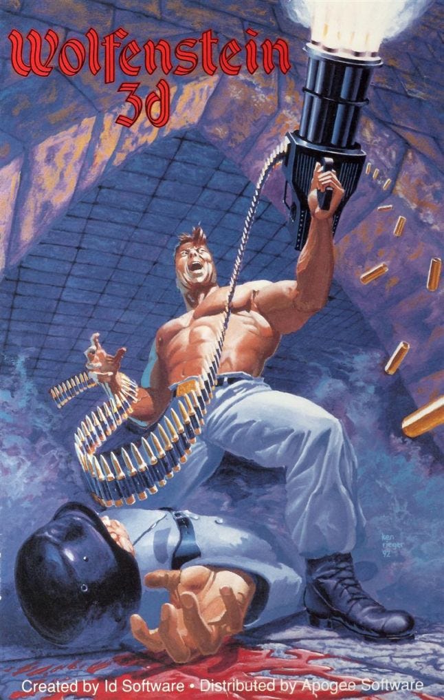
The advent of first-person games shifted not only the player’s perspective, but that of the creators as well.
“Our 3D shooters, starting with Hovertank, were the first I imagined as real three-dimensional active spaces, so a lot of things would come to me sort of cinematically," says Hall. "It was a new, different way of thinking about what you were making.”
"How does this feel different than other levels? What is this space like, how can I convey its uniqueness? How does it begin, how does it flow and progress, how does it come to a close?"
“Before the games got textured 3D, you would make a clever maze, or do a layout similar to a familiar architecture shape," he adds. "But now that it was textured, and you could have detailed sprites to make rooms feel different. It became more of a true first-person experience, a visual and sonic experience that as both a designer and a player, you were the authoring protagonist of.”
The first-person games we play in 2017 have accumulated two decades worth of tropes and assumptions of what best practices are. But back in 1992, there were no rules. There were no obvious answers.
“So you start asking questions,” Hall says. “How does this feel different than other levels? What is this space like, how can I convey its uniqueness? How does it open (like the start of a movie), how does it flow and progress, how does it come to a close? What new way can I sneakily hide stuff in unexpected areas? You could begin to be less abstract and really create a sense of place, of progression. A unique experience in every level. It was the tiniest start of what you expect today.”
The technology built and the design authored during Wolfenstein 3D’s development, Hall says, “challenged you with these amazing, if primitive, new toys to play with.”
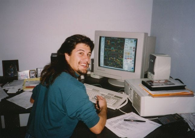
John Romero made a labor-saving level design tool for iD
“Nowadays, you can learn any language and any platform by checking out the hundreds of available tutorial videos, articles, and books,” Hall says, “or the dozens of available classes. But tools and resources were much more primitive back in the early 1990s. Back then, you had to Assembly-code the stuff you wanted to blaze. And often, you'd roll your own tools.”
Decades before Unity or Unreal, Hall had his famous iD co-founders, John Romero and John Carmack to craft tools. “Romero did make a pretty amazing one, TED 5, the tile editor. [We] used that for like thirty-seven games," he says. Wolfenstein 3D was one of them.
The benefit of rolling your own tools is that you become intimately familiar with what your game can and can’t do. But it took time. And energy. And money. Today’s shortcuts have allowed many more into the garden of game creation. Current developers have a head start in some ways. But with that added opportunity comes a price.
"Games are easier to make now, but it's harder to get your stuff noticed."
“Now it is much easier to make your game,” Hall says. “Compilers optimize code fairly well now. But the downside is that there is a tsunami of games. They are easier to make, but it's harder to get your stuff noticed. Conversely, if you have the particular sickness that compels you to make games, there are a lot more game jobs now.”
Hall has been a proponent of helping teach young coders his craft, going so far as to Kickstart game-creation software named Worlds of Wander. (It didn’t succeed.) But he sees its stamp on other similar projects.
“Super Mario Maker is like a simpler Worlds of Wander, applied to Nintendo's IP,” Hall says. “It's an amazing game and tool. And pretty much precisely what I wanted to do, even down to the concept of auto-theming to a new graphics set. Even the way it changes [themes] -- with a wave across the tiles!”
But the passion, the geekiness, the long hours, and the attempt to push the edge in various ways always has to be there. Though Hall says “it would have been great to have informative books and amazing tools back then,” you wonder if today’s pre-built engines and asset libraries hamper the ability to revolutionize the way Wolfenstein 3D did.
Twenty-five years on, Hall looks back fondly on the madness that birthed a classic and, indeed, an entire genre. But with age comes a change in perspective.
"I still have that love of making games, but I also have a life."
“Our time management making Wolfenstein was ‘Work on the game for 14-18 hours, seven days a week,’” Hall says. “I like the balance I have now better.”
Hall is now senior creative designer at PlayFirst Studio. His latest projects, among them the latest iterations of the venerable Diner Dash series, may seem a far cry from the gory frantic envelope pushing action of iD Software’s heyday. But the same passion that helped introduce B.J. Blazkowicz to millions of players persists. It just gets funneled into other pursuits beyond his dayjob.
“Those were amazing times to be young and making games for the love of it,” Hall says. “I still have that love. But I also have a life.”
You May Also Like