Trending
Opinion: How will Project 2025 impact game developers?
The Heritage Foundation's manifesto for the possible next administration could do great harm to many, including large portions of the game development community.

Featured Blog | This community-written post highlights the best of what the game industry has to offer. Read more like it on the Game Developer Blogs or learn how to Submit Your Own Blog Post
A detailed look at the design of each enemy in Tomb of the Mask. A Pac-Man collect the dots in a maze style game for iOS and Android. The ghosts ain't got nothing on these bats, snakes, and flying monkeys.

This article was originally posted to the Lit A.F. Game Design blog.
Tomb of the mask has been at the top of the app store for a while. It's a game published by Playgendary, who have several chart topping apps.
The development team seems to be a single developer by the name of Shelzy, who worked with a small team of artists known as Happy Magenta. I like seeing developer-artist collaborations like this since it's the same team makeup as my own.
It's also encouraging to see a game made by a small team achieve success. Yes, they 'sold out' to a big publisher, but let's face it, that's required in today's mobile gaming market.
And it's well worth the attention because the game is fun, polished, and unique. It reminds me of pac-man as the player must collect dots and avoid enemies in maze like levels.
Of course the game is not limited to just one enemy type like pac-man and has many different powerups and levels layouts.
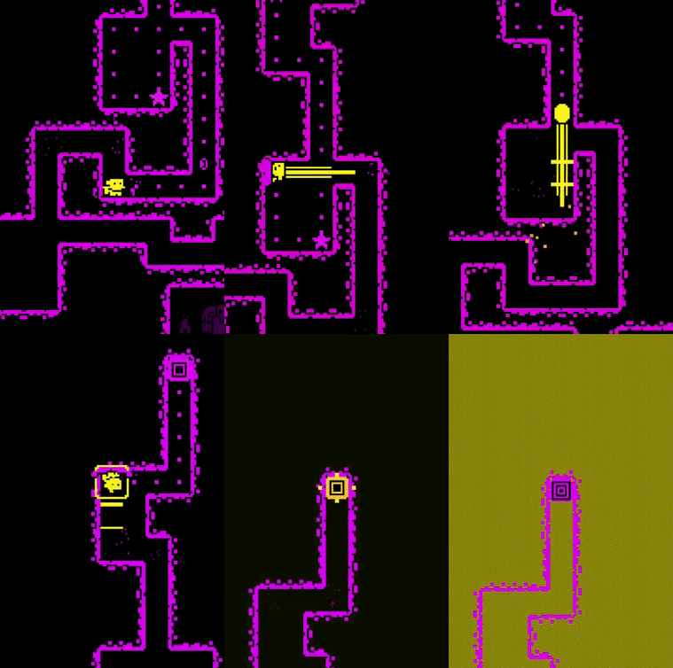
The controls are extremely well done and feel very native to mobile. No on-screen joystick or arrows. You swipe in the direction that you want to go. I am a fan of good native controls and this game nails that.
My only complaint about the controls is that sometimes my swipe is not registered which leads to death. Most of the time, I blame myself for trying to go too fast.
If you're anything like me and play a variety of mobile games, then you are certainly aware of features that are consistent across the medium.
Usually a game implements a few of these, but this game seems to have every…single...one.
Level based gameplay AND infinite mode
Three star system for each level
Lives system to prevent binge gaming
Watch an ad to revive
3 Missions rewarding certain behavior
Player level system
Spin the wheel luck mini-game
Watch an ad to double your reward
Video reward ads for in game currency and power-ups
Skins with stats
Constantly asking you to subscribe, rate, and pay to remove ads
Changing colors of the environment every few levels to mix things up
I'm actually surprised and almost disappointed there isn't a daily reward.
I'm not going to go into each of those systems in detail as that would be way too much to take on. If you have played mobile games then you know the basics of how they work.
And I'm also not saying that it's good or bad that all of these are in the game. Plenty of people will be upset about some these mechanics while I could argue in favor of some of them.
But that's besides the point. In this article I want to talk about a couple aspects that I really enjoy.
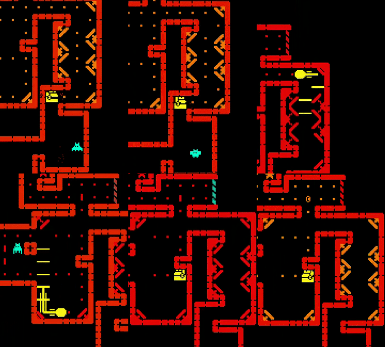
The piece of design I do want to deconstruct is the obstacles/enemies. Again, you swipe to move through this maze-like-tomb and collect dots. There are obstacles like spikes, bats, and flying arrows that kill you if you touch them.
Each mechanic is introduced to the player slowly over the course of different stages. The first stage in which the player encounters an obstacle will be fairly simple as the game teaches the player how to handle the danger. Then the game will mix that obstacle with the existing ones to make things more difficult and interesting.
Each obstacle is also unique in how it functions within the game. If the enemies are different, then so should their behavior. For example, there are bats and snakes in the game but both are dangerous in different ways.
This table shows the obstacle distribution of the first 50 levels.
[Insert table on obstacles and levels]
LevelObstacles.png
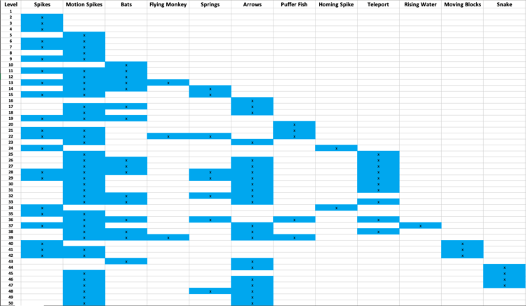
You will notice that the spikes triggered by motion detection are the most common obstacle. This is most likely due to their versatility and ease of implementation. They replace any wall and can easily kill the player if they are not paying attention.
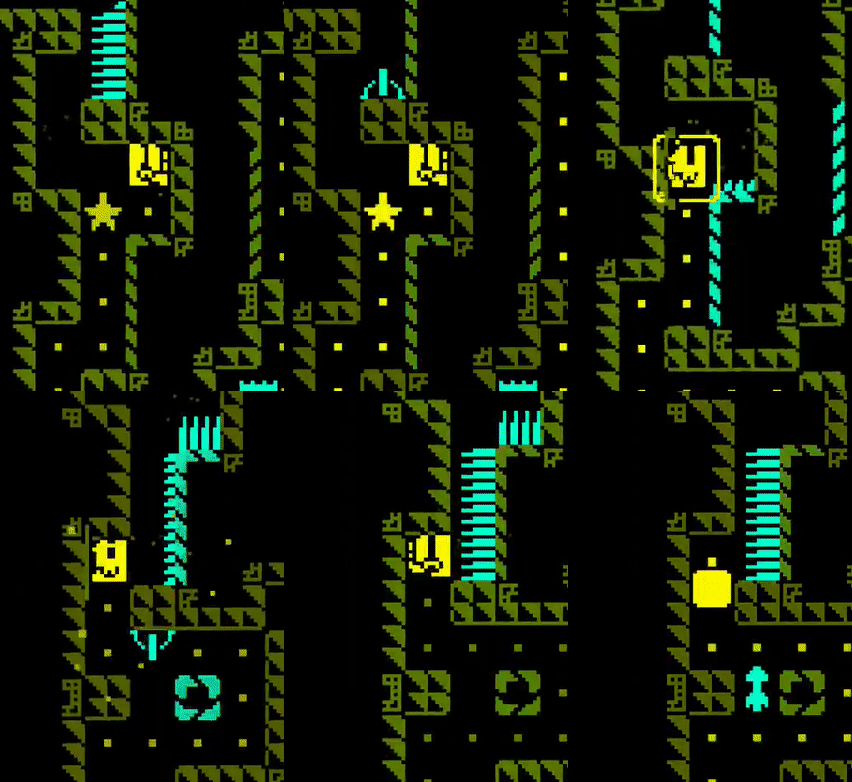
I was actually surprised the regular spikes show up less often. The problem with regular spikes is that the player can never go on them. So they limit the movement of the player. They are used more as an occasional trap if you are trying to maneuver through the level a certain way.
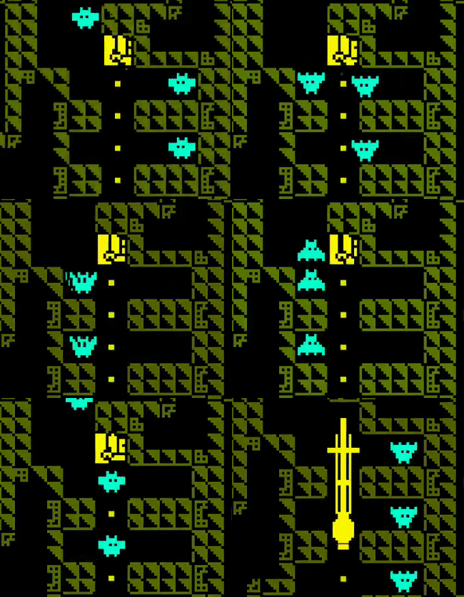
The next most common is the flying arrow trap, followed closely by the bats. These represent the basic mid air obstacles and can be used in plenty of applications. It's important to note the distinction between the two. The bats are always there and move back and forth while the arrows move in one direction with a brief moment of non-existence. This non-existence enables them to be used in tunnels where a bat would be impassable.
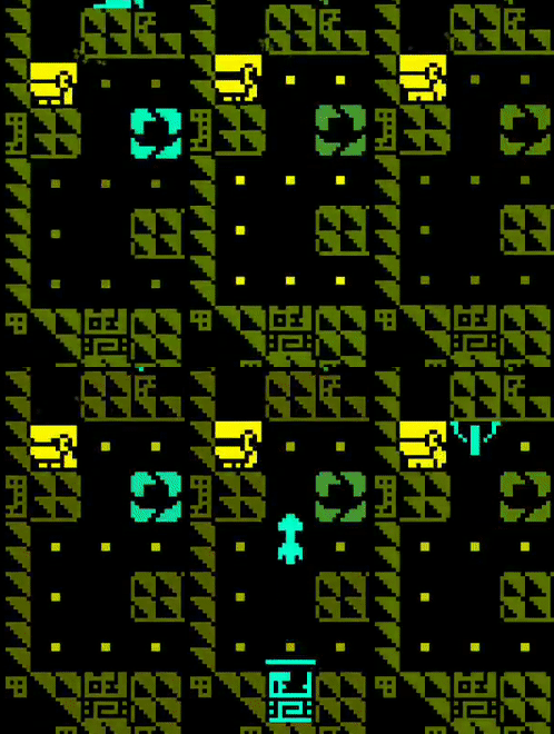
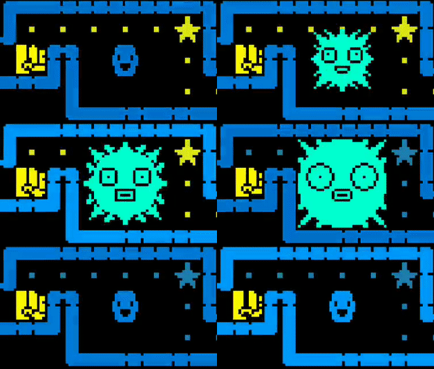
There are some less common obstacles such as the puffer fish. I thought the puffer fish would be used a lot more once it was introduced. I can only guess that there is some aspect that makes these enemies less level design friendly, the designer just doesn't personally prefer to use them, or simply that they will be used more in later levels.
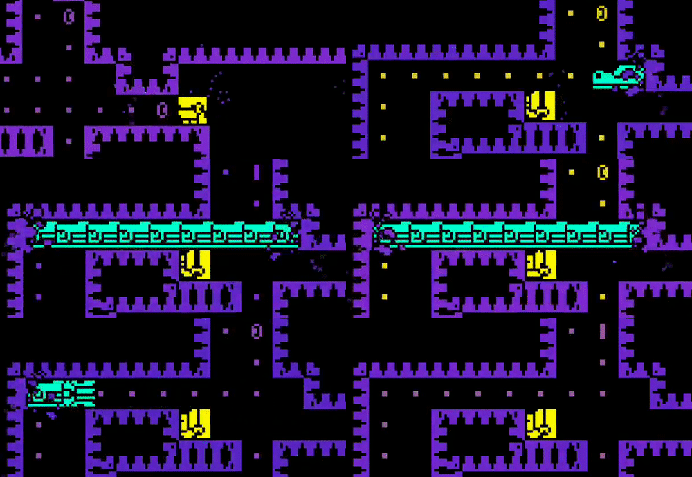
One of the coolest (yes, I did just use the word 'coolest') enemies is the snake. It does not have a predictable pattern (unless you repeat the level) and can appear anywhere in the level. A wall will flash momentarily before the snake comes busting out of the wall and goes straight through any other obstacles until it disappears. The rest of the level is tense as the snake could return at any moment.
The snake really feels like a boss type enemy. It's pattern is unpredictable and it is much larger than any of the other enemies.
For the rest of the enemies, I am going to give a more lightning round style explanation.
Flying monkeys that drop…coconuts? Like the snake, also unpredictable. Causes a sense of panic until you realize to just chill in a safe spot until they pass.
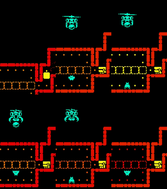
Homing spike thingys that, well, follow the player and kill them. Move quickly! I didn't make a gif of this one so boo to you.
Springs and teleporters that exist to alter movement. The teleporters enable crazy level layouts.
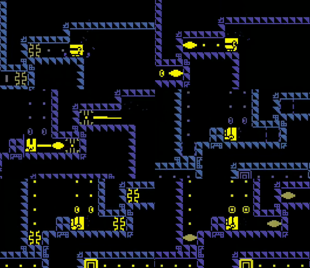
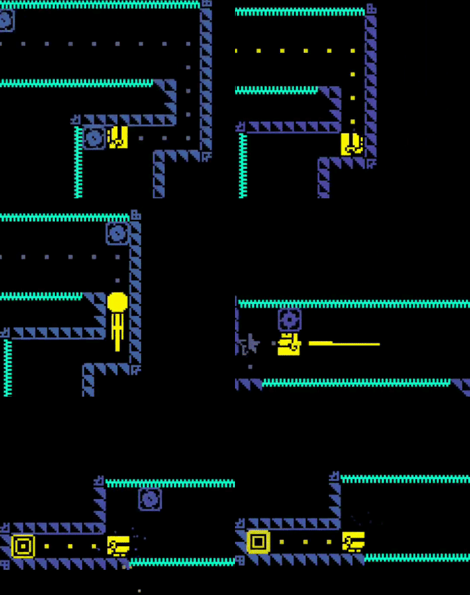
Moving blocks are likely paired with spikes. Slows the player down and forces them to make some timely jumps.
The last topic I'd like to cover is the difference between the 2 game modes: Stage Based Mode and Arcade (infinite) mode.
The key difference in these modes is that in infinite mode the player is pushed forward by way of a rising pool of water. If the player touches the water, they die.
This changes the design of these levels. In infinite mode, the end goal is always to go up. There is not much side winding around. The player will also not be able to get all the dots or coins. They can merely get as many as they can and then continue up.
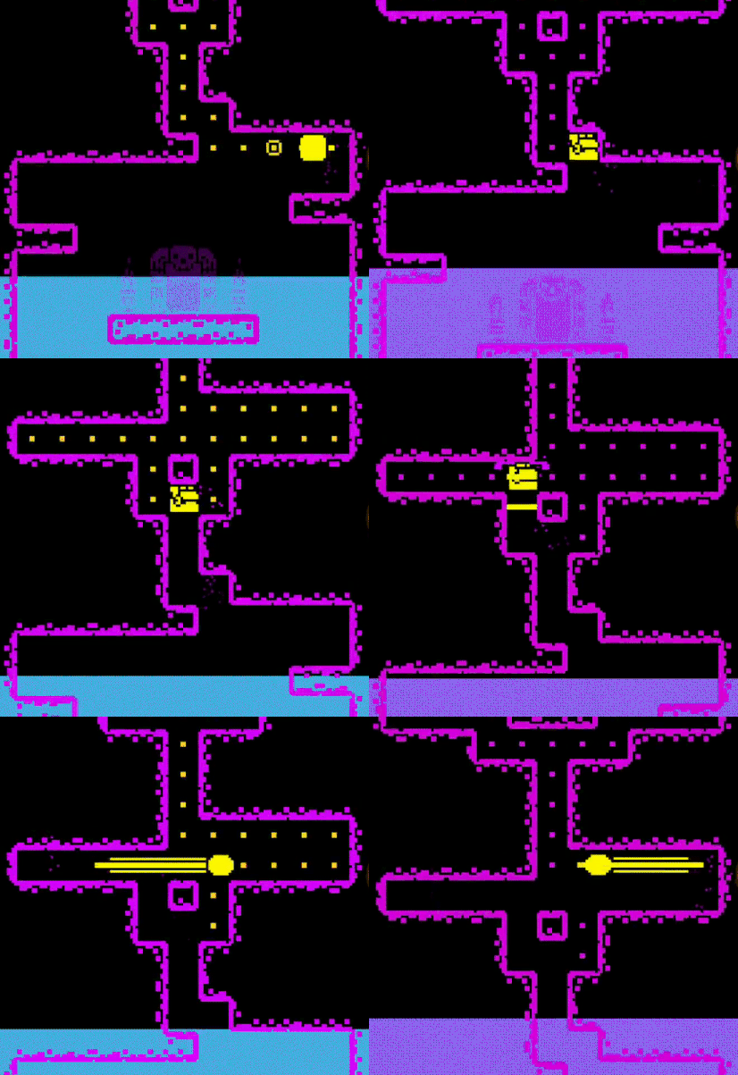
In contrast, the stage based mode (while there are some levels with the rising water) has drastically differently designed levels. You can start in the bottom right of the level and wind your way around until you end in the middle. Sometimes the exit is right next to the entrance but you just can't reach it until you go through the whole level.
This sort of design is much more puzzle based. The player has time to think about each move they make, and so making the levels catered in this way makes sense. I spend time trying to figure out how to get each dot, not simply survive and escape the water.
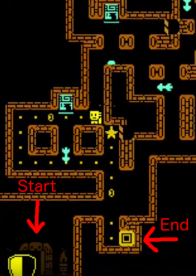
Infinite mode favors fast reflexes while stage based mode favors logical thinking.
Infinite mode dots are points while stage based mode dots are currency for level bonuses.
I want to point out that I'm not saying one is better than the other. It's just that this one mechanic changes the design of the game. The player must change their play style depending on the mode even though the underlying mechanics are the exact same.
The well thought out introduction to obstacles is something to really take note of here. Every good game that has a multitude of mechanics will introduce them one at a time to the player.
I also love how the different modes create drastically different styles of gameplay. The development team has really taken a core set of mechanics and stretched them out to get as much playability out of them as possible.
I will say that one thing that got out of hand in this game is ads and pop ups for their subscription. I have no idea if this is what it was like when it first launched or if this was insisted on by the publisher, but it's pretty annoying.
Every time you open the app they ask if you want to subscribe for $8 per week for some in game bonuses. This really is only targeting the whales while just annoys the general player base. There's also a video ad between every level that you can't skip until about 10 seconds in. Which makes dying that much worse.
My theory is that once a game reaches a certain level of popularity, they can up the monetization efforts with less of a negative effect.
Ok that's enough complaining about the monetization. Taking that aside, I really do enjoy this game!
Read more about:
Featured BlogsYou May Also Like