Trending
Opinion: How will Project 2025 impact game developers?
The Heritage Foundation's manifesto for the possible next administration could do great harm to many, including large portions of the game development community.

In Alan Wake II, the latest reality-warping entry in the expanding Remedy Connected Universe, mind truly is matter.
Saga Anderson, one of the title's two protagonists, is an FBI agent with an uncanny ability to profile suspects and untangle the most convoluted cases. That knack is rooted in her ability to retreat into the Mind Place, a metaphysical construct within her subconscious that doubles as an interactive, narrative-driven character sheet.
Players can visit the Mind Place at the touch of a button and once there can flick between case files, analyze clues, and connect narrative dots by placing evidence on a case board to piece together a spate of homicides that have enveloped the sleepy town of Bright Falls and realms beyond.
It's also possible to profile suspects to unlock new conversation options that will have ramifications in the real world, peruse the local topography by poring over maps, follow a paper trail left by a certain writer, and upgrade weapons to increase your chances of surviving the nightmare unfurling before you.
The mechanic realizes the real-world notion of the Mind Palace, a modern interpretation of the 'method of loci' technique which posits it's easier to recall information that has been mentally associated with a physical location. In-game that means replacing quest logs, upgrade trees, and more with a setting that can be explored like any other.
To learn how developer Remedy conceptualized and iterated on the mechanic, we entered the studio's very own Mind Place to chat with lead narrative designer Simon Wasselin, senior gameplay programmer Alexander Balakshin, and lead UI/UX designer Riho Kroll.
The decision to create a fully realized Mind Palace for Saga was both functional and stylistic. Wasselin explains the studio started exploring the idea out of a desire to include a profiling mechanic and detective board in some form, but realized that implementing both would require some spatial tinkering. The team was also encouraged to double down on the concept after being presented with a "striking image" of Saga facing the corpse of a victim and interrogating them.
"If both elements (the board and profiling) were to be used heavily in Saga's gameplay loop, it was necessary to reduce the time to travel to these places otherwise the pacing would have been horrendous," says Wasselin. "Putting them 'in her mind' made a lot of sense."
One of the first iterations of the Mind Place was set in a hotel room that was designed to provide a cozy reprieve from the brutal world and tense gameplay of Alan Wake II. When concept artist Juhani Jokinen began working on the Mind Place, however, the setting shifted to a larger motel conference room that could more comfortably accommodate the various "modules" (case boards, maps, upgrade benches) that Remedy wanted to include.
"His initial layout is very close to the end result," explains Wasselin. "The mood inside evolves a bit as the game progresses to better fit the story we wanted to tell." He notes it was important to lose some of that coziness further down the line to avoid diffusing too much tension and suggests that finding the aesthetic balance between "dreamy" and "grounded" required multiple attempts.
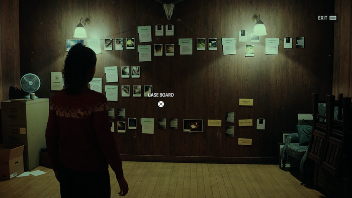
The Mind Place as it appeared during development // Image via Remedy
For Wasselin, it was important that players didn't feel they had been yanked magically to some other location while ensuring they understood the Mind Place wasn't necessarily of this world. As for the modules themselves, each was designed to strike a balance between usability and presentation.
"Getting it right took some time," he continues. "The last design update we did on the Mind Place and its content was around the end of 2022, but we continued to work heavily on the presentation, the mood, technical issues, and a myriad of more minor details until the very end. One interesting element in particular was that going into the Mind Place doesn't pause the game, but the world continues to live."
Wasselins explains how this particular design choice bleeds into the wider experience, helping Remedy build tension by ensuring players can never retreat to the Mind Place in search of refuge. It brought challenges, too. Because accessing the Mind Place doesn't pause the game, Remedy had to consider everything that could be occurring in the 'real world,' irrespective of what players might be doing in the Mind Place. "Everything needed to be interruptible without problem," he says.
On a nuts and bolts level, Remedy's aspirations for Alan Wake II required the studio to move its in-house Northlight engine from a classic object-oriented framework (OOP) to a new Entity-Component-System (ECS) model—which in turn resulted in many systems either being migrated or re-implemented from scratch.
"The ECS approach turned out to be effective from the performance point of view (cache-friendly, easy to parallelize) and very convenient to use from the gameplay programmer's perspective. However, it took some time to change my mindset from 'working with objects' (classical OOP) to 'working with data' (an ECS way)," explains senior gameplay programmer Alexander Balakshin.
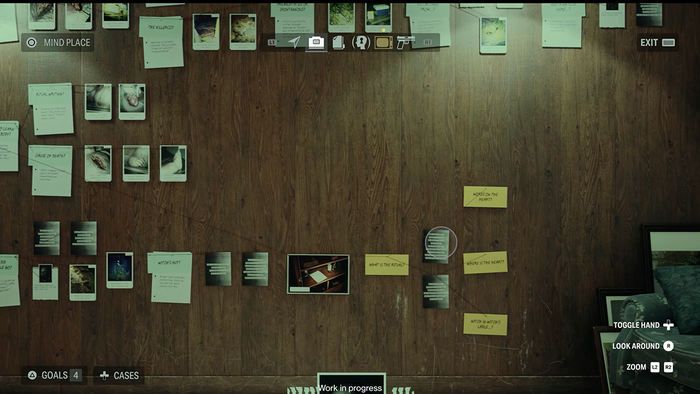
Evidence and clues placed on the Case Board // Image via Remedy
With regards to the Mind Place, specifically, Remedy had to implement shared systems such as a game cursor that would work correctly with both mouse-keyboard and gamepad inputs, letting players collect clues, navigate maps, and select elements on a case board. Camera panning volumes were also required to control a camera in both the map module and case boards. Spring Motion was another essential piece of the puzzle when it came to animating case board items and other elements.
"All these systems have a convenient Lua API to allow our designers to script necessary logic. Another exciting aspect was localization," continues Balakshin. "Initially, we tried to make the Mind Place's module interface as diegetic as possible. And while closer to the release, we went with the more traditional approach to some elements (radio, TV, manuscript). Other ones, such as the map, case board, plot board, and profiling, still belonged to the 'real world.'"
"They all had a lot of vital text information that should be localized for a selected language. We are using 'Coherent Gameface' as a UI middleware; this framework allows us to make UI layout as an HTML page. It also has the functionality of rendering a UI element to a texture, eventually allowing us to localize all titles and labels on maps, case board items, and profiling cards. But all these textures require memory, and we had to ensure that we fit all of this into our budgets. To achieve this, we unload all textures of non-active cases on the board and store lower-resolution map textures for ones that are not selected right now."
That case board is perhaps the linchpin of the Mind Place. It's where players (this one included) spend most of their time, digging through files and scrutinizing evidence. Visually, the mechanic was inspired by the chaotic evidence board pieced together by Rustin Cohle in the first (and standout) season of HBO series True Detective, but although Remedy had a clear idea of what it wanted the board to look like, finessing the mechanics behind it required the combined effort of 10 people.
"Earlier versions emphasized the player's agency, finding your own answers, and solving more significant questions in a sandbox way–but it was too complicated and confusing. Playtesters had trouble getting through it and questioned the meaning of the whole thing. We were trying to cram a full detective game inside a survival horror game, and it didn’t work," says Wasselin.
"We returned to the drawing board, and Riho Kroll (lead UX) came up with a more precise, more chronological design with more minor questions that reward players more often. We took a long time to iterate on this formula on the visual side and the design side to balance ease of use, information flow and the necessary puzzles from Mission Design."
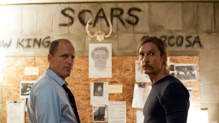
The leads of True Detective (Season One) // Image via The Daily Beast
Notably, Kroll explains that the iterative process was long and winding and saw the team take inspiration from some unlikely sources. "The initial designs I started working on were somewhat inspired by Hearthstone. The idea of having a 'hand' of clues that you then place on the board was a way to solve a problem where people were missing new clues and losing track of what they needed to put where," says Kroll.
"The original prototypes had the clues just appear on the board in certain places, but people were missing new items being added, so this is where the idea of having this 'hand' came from. This way new clues are always front and center for the player. We did call it the 'hand' for the longest time, even on the player-facing side, but we decided to call it “clues” to make things more straightforward."
Before Remedy had a case board prototype working in-game, Kroll actually built a web-based prototype (pictured below) to test some of the mechanic's core functionalities. He describes it as a "text-based adventure game-style pop-up" and says it enabled the team to conduct vital user research before eventually evolving into what players see in the final build.
"The case board at that point was almost a self-contained game," he says. "That prototype eventually evolved into the tool we used to create the content for the case board. It became clear very early on that to make this type of content, a very specialized tool is needed, and the tool is primarily based on that initial prototype."
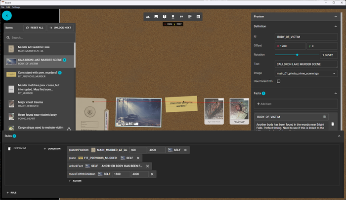
A prototype case board that was used for testing // Image via Remedy
Kroll notes the team also worked hard to refine the complex rule system that governs the case board. For instance, placing an item on the board will trigger an 'OnPlaced' event that can kickstart a myriad of actions ranging from another piece of evidence being unlocked (so it can be placed) or an item being moved to another position. In-game it's a seamless process, but there's a lot happening behind the scenes.
"These rules can also have conditions, like checking if another item has been placed on the board or if the player has unlocked it," says Kroll. "This system allows us to create a more organic experience for the player, where you can place a specific clue in multiple places or open things in a specific order based on what the player did, rather than forcing players always to follow a single path."
From a programming perspective, evidence placement posed a significant challenge. Balakshin says it was initially possible to move items on the board freely, letting them stack and overlap. "Their position would have been clamped to the board's limits if we moved the items to the very edge," he adds, noting this is where Remedy's Entity-Component-System helped organize the flow of logic.
"The whole positioning mechanic is split into multiple systems, executed one after another. First, we updated the item's XY position and boundaries regarding current offset values and the board’s boundaries. Then, we check overlaps by making AABB tests for items and find which items lay under another. After that, we sort them by depth, and finally, we set an item's final position and rotation," he explains. "Also, I need to mention that while some systems (such as depth sorting) require access to all items and can run in a single thread, other ones (overlap tests) can be easily parallelized and run for each item entity separately."
As mentioned earlier, it took some time for the programming team to make item selection feel convenient and natural for both gamepad and mouse users, and there were also refinements required in order to separate placeable items from non-placeable ones. For Balakshin, however, the trickiest aspect of programming the case board's Hearthstone-inspired 'hand' was ensuring it cooperated with the camera without causing lag or jittering.
"To be in sync with animations our camera runs in a fixed update, and the camera mixer logic is a complex thing itself," he continues. "Thankfully, with our ECS framework, we can add dependencies between different systems and control the execution order. So, ensuring the case board hand system runs after the camera system was quite an easy change (one line of code when we register a system).
"What was not easy was that all hand animations—such as opening the hand, selecting an item and previewing placeable item—should also be in sync with the camera. It required modifying our motion system to just calculate the entity’s position, store the calculated transform in a component, and then use the result in the hand system."
"Hard work and iteration," says Wasselin, hammering home how everybody involved with the project worked tirelessly to deliver what we see in-game. For instance, he explains how principle narrative designer Molly Maloney was "fundamental" to designing the investigations themselves and had a huge impact on how the background cases—which summarize a lot of information about the world, its characters, and more supernatural qualities—convey information in a "playful" way.
Outlining why it was important to consider how information is relayed, he suggests it was imperative that Saga be capable of making "educated guesses" about some of the case's more far-fetched clues without giving away all the answers. Her natural intuition and status as a new character—someone unfamiliar with the happenings and history of Bright Falls—meant that, by locking players into her perspective within the Mind Place, Remedy was able to breadcrumb information and dictate pacing in a way that felt organic.
Remedy, however, had to keep tabs on all of that information from the outset, and that required the use of the virtual board tool Miro, which Wasselin says helped "tremendously," and regular conversations with creative director Sam Lake. In addition to Miro, the Finnish studio also developed an internal tool to edit the data (image texts, logical links, etc) behind each case. "We couldn’t have designed them without this WYSIWYG tool that mimics almost one-to-one what we have in the game," he adds.
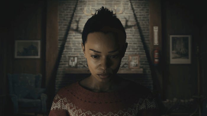
Saga Anderson contemplates in the Mind Place // Image via Remedy
After spending years finessing and tweaking how the Mind Place works—building tools, implementing rules, and finessing workflows that shepherd players through the psyche of Saga Anderson—Remedy marked the occasion by doing what it does best. It leveraged those intricately engineered frameworks to maximum effect by smashing them to pieces.
"Without spoiling too much, there is a sequence in the Mind Place that I’m quite proud. We used all the rules that we established along the game and try to shift them around and play on expectations," says Wasselin.
"This sequence was relatively vague on paper so we had space to be creative and make a memorable moment for the player. The interface, design, story and visual all came together in that moment making the Mind Place more than just a walkable menu and a true pivotal element of Saga’s journey."
For more on that particular anecdote, you'll have to venture to Bright Falls yourself.
Read more about:
Horror GamesYou May Also Like