Trending
Opinion: How will Project 2025 impact game developers?
The Heritage Foundation's manifesto for the possible next administration could do great harm to many, including large portions of the game development community.

Featured Blog | This community-written post highlights the best of what the game industry has to offer. Read more like it on the Game Developer Blogs or learn how to Submit Your Own Blog Post
An in depth look at what makes the character controller tick in HAL Laboratory's BOXBOY! This was done by "Covering" the game - a terrific game development exercise for finding hidden design, honing you craft, and expanding your toolset.

The video essay version of this blog post.
To properly celebrate the release of Boxboy + Boxgirl! for the Nintendo Switch this week, I wanted to go over my in depth investigation of Boxboy's character controller. It also doubles as an opportunity to spread the word on one of my favorite, most valuable techniques for honing game craft.
This technique is an exercise called "Covers". The idea is to take an existing game mechanic, break it down into extreme detail, and then re-implement the design on your own. The process of close analysis taps into the game's underlying design DNA and reveals that even the smallest of details reinforce higher level design pillars.
The exercise comes from other apprentice based professions. Artists typically don't start by painting a masterpiece right off the bat - instead the imitate the masters. They learn to paint like Monet. Carefully replicating the work illuminates the intention and approach of the original artist. Seemingly random brushstrokes begin to coalesce and inform the larger vision. And along the way you get to practice new techniques, add new tools to your toolbox, and gain practical experience.
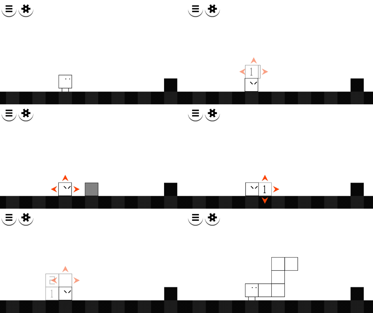
Which brings us to the Cover at hand - HAL Laboratory's BOXBOY! for the Nintendo 3DS. Boxboy (and its many sequels) are endlessly clever puzzle platformers. Don't let it's cute exterior fool you! These games are some of the best puzzle games this side of Portal. Players control Qbby the cube, who has the power to create blocks at will. With these blocks he can makeshift platforms, build bridges, and solve puzzles. HAL pairs this ability with an amazing array of puzzle mechanics and best-in-class level ramping that elevates the game to truly sublime.
The specific scope of my Boxboy Cover is Qbby's character controller. In other words, the way he moves, jumps, ducks, reacts, and handles - the real bread and butter of game feel. Boxboy is a particularly good entry point for platformers. First, HAL has been making platformers for almost four decades at this point, so they're quite good at it! Second, the game's slower pace and digital controls make breaking down the action frame by frame easier to manage. The simplicity is augmented by the complexity of the copy mechanics, which allows players to change their collision shape at will. In short, Boxboy is simple without being too simple.
In Covering Qbby's character controller, there are three main lessons: the specificity of Qbby's character design, the underlying grid system, and the game's lazy camera.
Let's start with his character design. Qbby's legs elevate his core collision shape to give players more buffer room when platforming. So if they hit a block at his legs, the collision will resolve this as a successful jump and place Qbby on top of the block. This is especially important since Qbby's jump is only a single block tall. Without his legs, players suddenly need superhuman timing to get on top of anything.
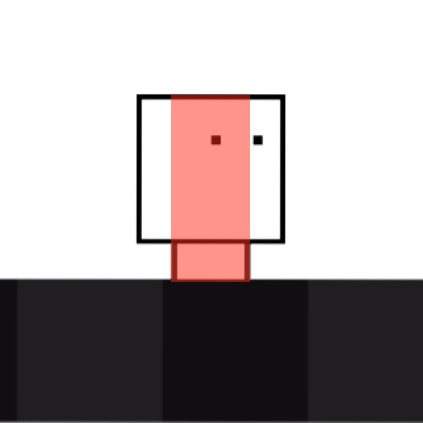
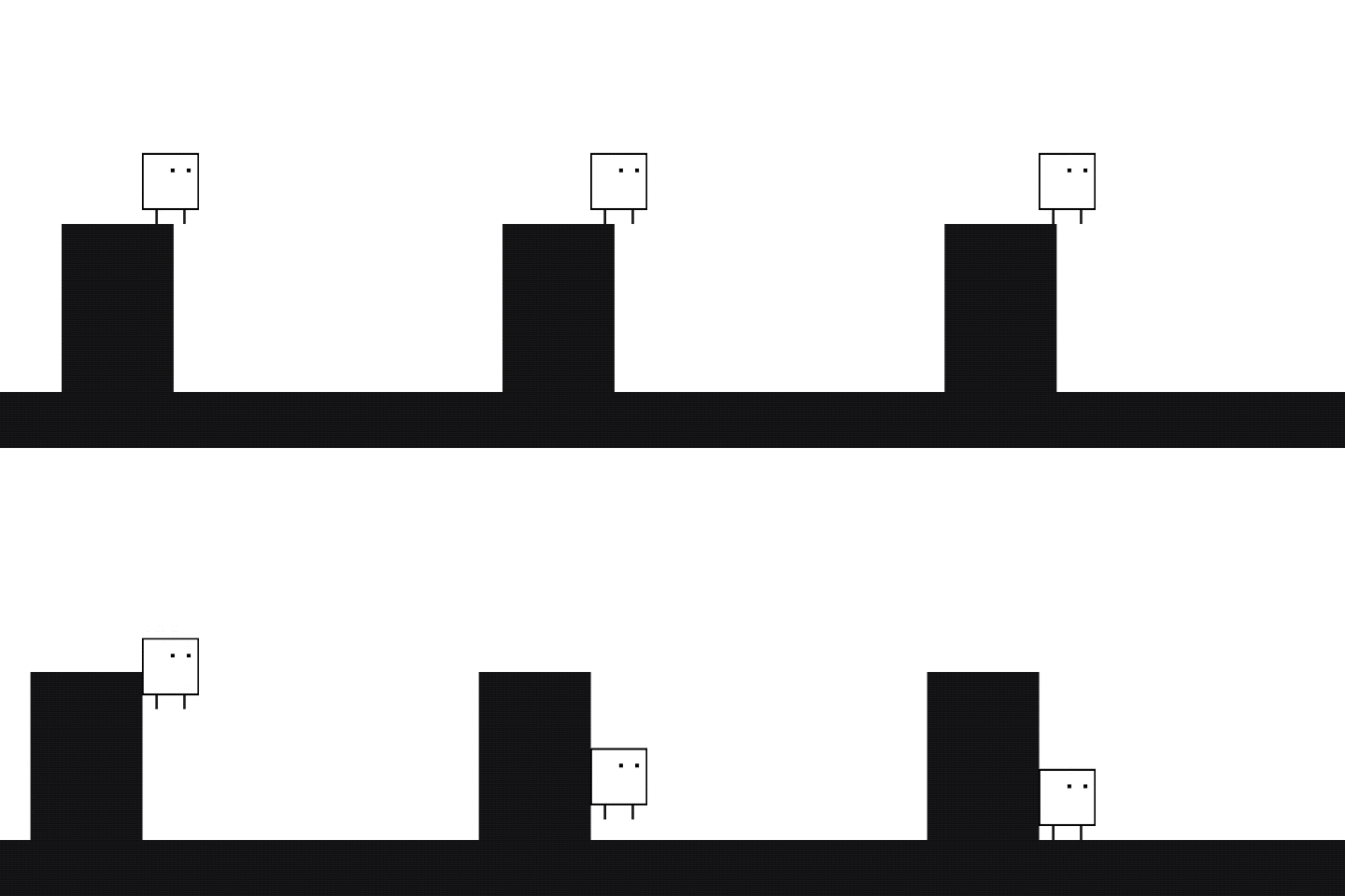
Even the horizontal spacing of his legs comes into play, as this distance defines his horizontal collision size. If both legs go off a ledge, Qbby falls off - which makes visual sense. This lets Qbby easily squeeze into single cell gaps, a required skill for solving puzzles. In other platformers, like Mario, the character's feet are placed at the edges of his shape to make him a rectangle best suited for big bounding movement. Boxboy's gameplay requires a more precise shape.
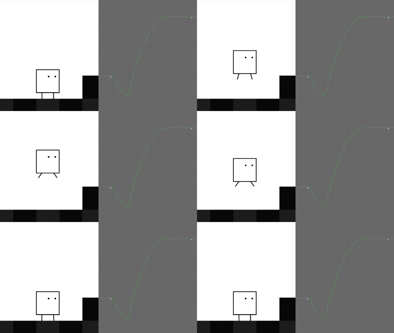
HAL was clearly trying to make an accessible, frustration free platformer. This is further evidenced by the jumping mechanics. Jumps are digital, which prioritize high level decision making over minute movement. Jumps also spend almost half their time at the apex, resulting in a shockingly floaty action. The combination of collision shapes and jumping de-emphasizes mastery of movement.
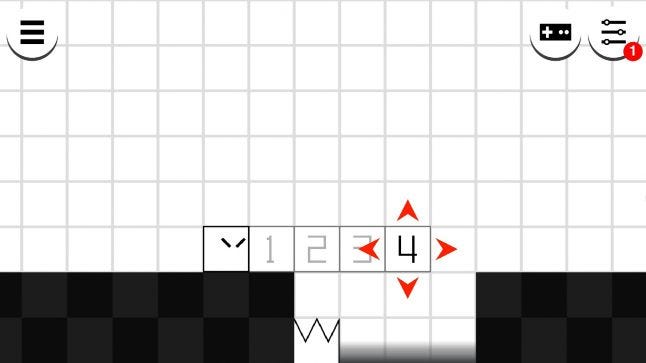
One of the most surprising findings in Boxboy is its insistence on an underlying grid structure. HAL is working overtime to realign Qbby to said grid. Though the team could have made the game strictly grid based, players would have lost out on all the feel of a fluid platforming game. Their solution is a happy medium.
When pressing the copy button, Qbby slides over to the nearest grid cell. While overly straightforward, the realignment sincerely puts players in the ideal position for solving puzzles. The implementation is made less obvious as it only triggers if both of Qbby's legs are in the same grid cell - once again reaffirming the importance of his character design.
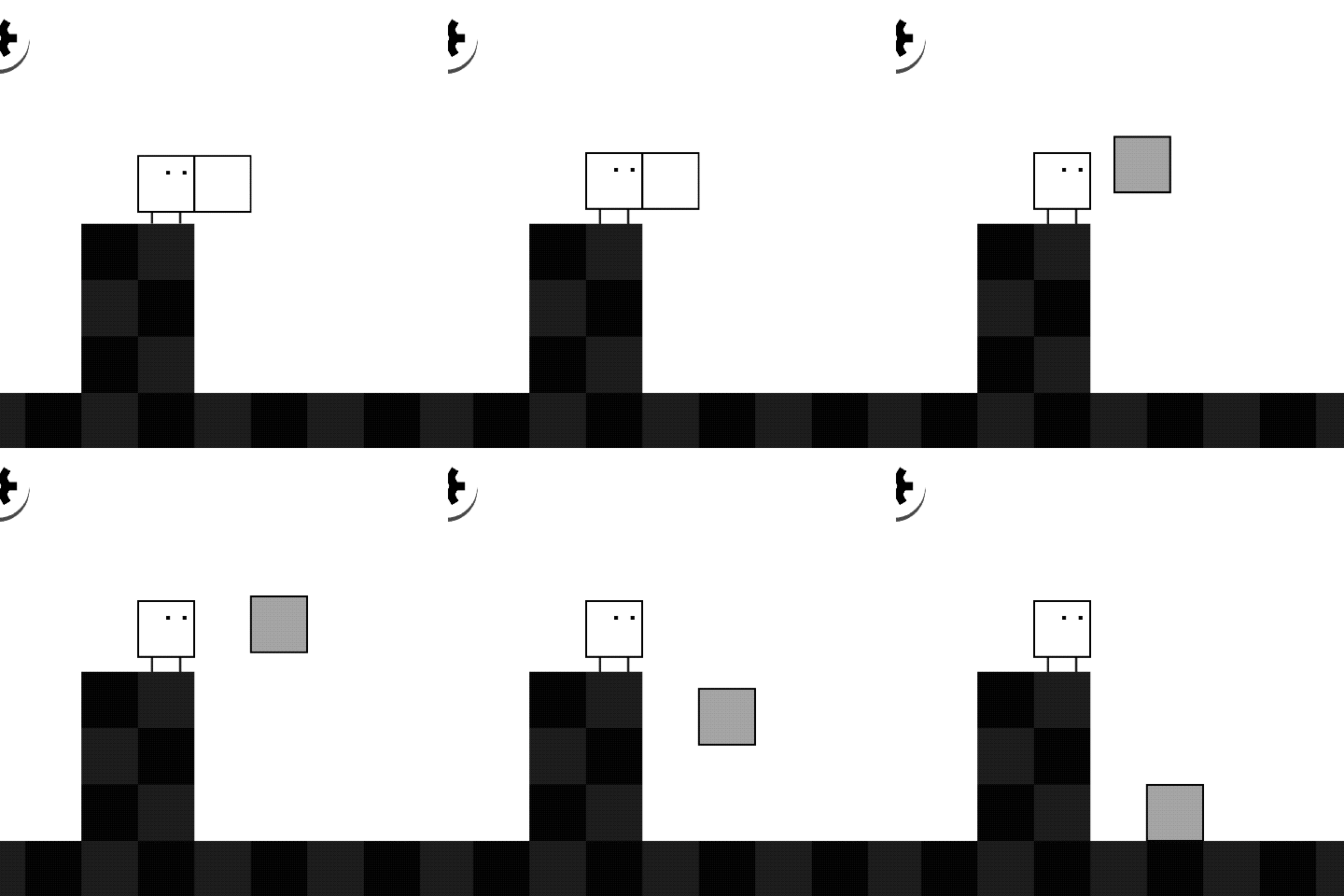
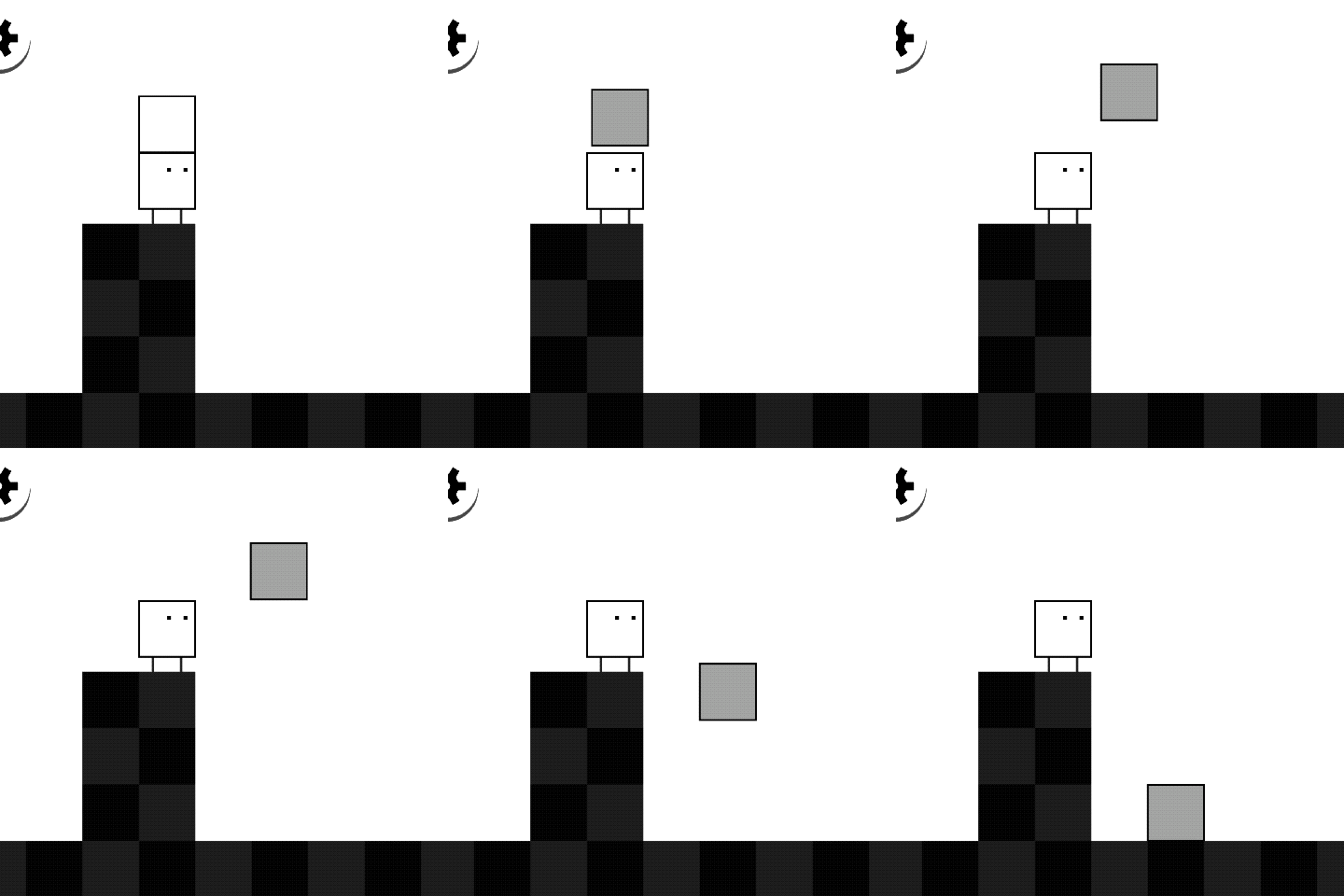
Even throwing blocks is informed by the grid. I expected thrown blocks would travel a set distance. Instead blocks travel based on which side of Qbby they're thrown from. Blocks from his side move one cell, and blocks on top of him move two cells (i.e. Blocks want to keep a single cell between themselves and Qbby). This lets players throw with reckless abandon, since they never have to worry whether a tossed block will make it over a single cell gap.
Without the grid manipulation and Boxboy starts to feel noticeably less magical. Blocks no longer happen to be in just the right place and need constant fiddling. Nudging blocks a pixel or two isn't the end of the world...but this interaction quickly snowballs when throwing hundreds of blocks over hundreds of levels. The grid makes this issue moot!
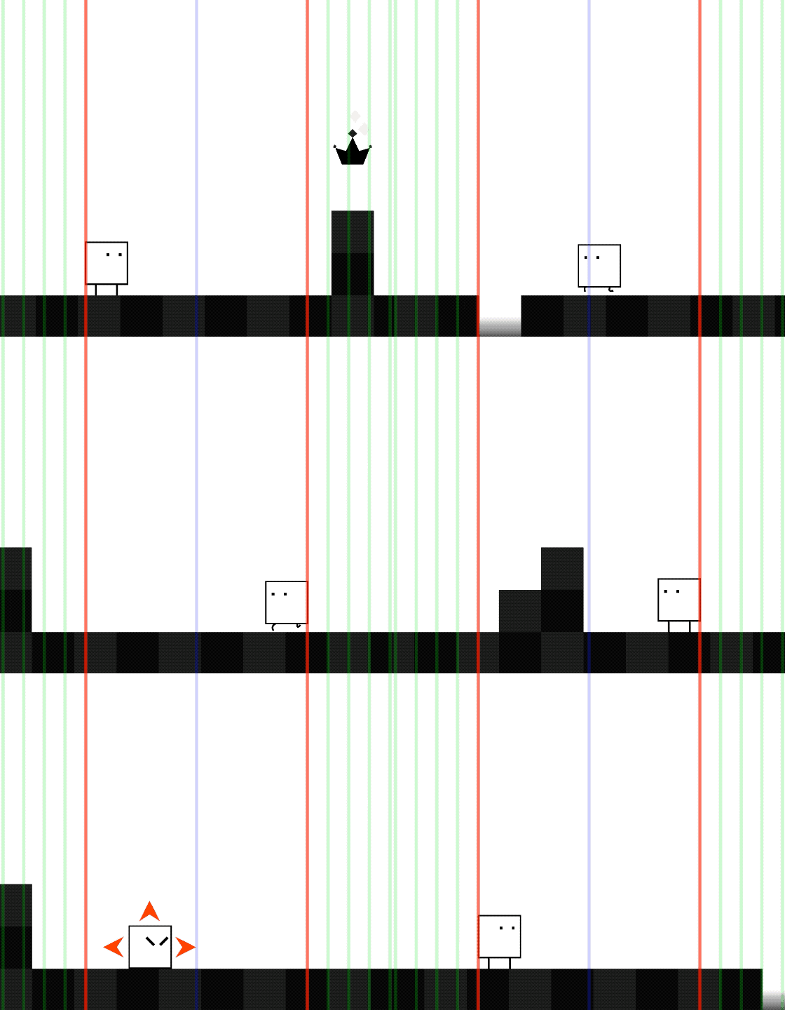
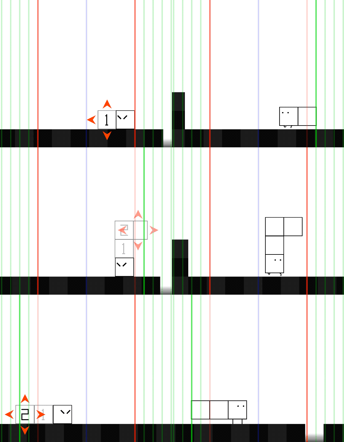
The last mechanic to re-implement is the camera. Boxboy's camera frames the action based on Qbby's current direction. As Qbby runs left or right, the camera slowly moves into place until Qbby hits the edge of the frame (Shown above as the red lines). When copying, the camera uses the same framing rules, just moves more quickly. If players copy blocks in the opposite direction, the camera refocuses in half grid cell increments (Shown above as the green lines). The only other special case is at the level extremes, where Qbby must pass the center of the frame before the camera system kicks in (Shown above as the blue line).
All of this is well thought out: basically keep the action on screen. The twist comes from the camera's refusal to move, lending it a distinctly pensive behavior. If players stop moving at any point, so does the camera. If players release the copy button at any point, the camera stops on a dime.
The camera is trying to match the player's state of mind. More often than not discovering a puzzle's solution involves standing still, as players solve it in their head. HAL wants to encourage players to stop and assess the situation. They don't want to distract the player with extraneous information…an obvious mindset considering they made the game black and white to do just that!
When viewing all of these details together, they point to Boxboy's core design philosophy: it's a puzzle game, not a platformer. The platforming mechanics provide lots of enjoyable tactile feel. But the heart of the game is in solving puzzles. His collision shape makes platforming easier to perform and more forgiving of mistakes. The grid system constantly fudges the numbers to benefit players. And the camera refuses to move without the player's consent as not not distract their train of thought.
None of this knowledge is necessary for enjoying Boxboy. Instead it helps explain why the game is so effortlessly engaging. It's easy to forget that games are made by people, who make thousands of tiny decisions each and every day. Great games take advantage of these small decisions to ensure they reinforce the game's core design. It's difficult work, but absolutely worthwhile!
If you're interested in playing this Cover, it's playable in browser over at my website. If you're looking for more of the nitty gritty details (like how many times I rewrote the collision, or how I implemented levels using PNGs) I kept a dev blog throughout the cover here.
Read more about:
Featured BlogsYou May Also Like