Trending
Opinion: How will Project 2025 impact game developers?
The Heritage Foundation's manifesto for the possible next administration could do great harm to many, including large portions of the game development community.
Nick Adams, design manager on Blitz Games Studios' Puss in Boots explains how the game's sword fighting mechanics were made to work for a wide audience, and how conventional controller-style game design rules just don't apply when working for with motion controls.
March 1, 2012

Author: by Nick Adams
[Nick Adams, design manager on Blitz Games Studios' Puss in Boots explains how the game's sword fighting mechanics were made to work for a wide audience, and how conventional controller-style game design rules just don't apply when working for with motion controls.]
On paper, at least, Puss In Boots was not that dissimilar to many of the games the studio had done before: a traditional, family-friendly, single-player action adventure based on a well-known IP. There would be the usual production challenges developing a game alongside a movie, but this was nothing we hadn't done before. Our main focus was to create an enjoyable, polished game that would deliver the movie experience to the player.
Ironically, it was the requirement to make the lead platform Kinect that ultimately allowed us to achieve this -- but trying to adapt this type of game to Kinect (the first of its type) felt like an almost impossible challenge when we first started work on the design.
How do we get the player to do even basic tasks like move or look? How do we allow the player to target different enemies in combat? Will any of the expected game mechanics even work?
The answers were found in a fundamental rethink of how we approached the design. The fact that we were even asking these questions highlighted an initial shortcoming in our approach. The real questions we needed to ask were "What can we do with this technology, and what should we do?"
The main goal when designing a controller layout is to create a good player experience. A good layout obviously needs to be ergonomic, intuitive, and, where appropriate, should meet player expectations. Less attention is paid to the experience of actually pressing the buttons, because button-pressing is not inherently fun. It is in the on-screen response where the fun lies; the act of pressing a button is largely a means to an end.
When designing for Kinect, it's very different. Input gestures are not just a way to control something on-screen; they are an integral part of the experience. The player has to physically perform, and so to maximize the experience that performance has to be engaging, fun and un-embarrassingly intuitive.

Focusing on player performance is key to creating an engaging Kinect experience.
When we brainstormed ideas for mechanics, rather than focusing on what the on-screen character should do, we began by looking at what would be fun for the player to perform. We placed particular emphasis on actions that the player would already know (such as air guitar) and built on these, rather than devising new actions that would have to be taught from scratch. This worked very well and gave us a great starting point for our mechanics.
What we learned: Don't just think about what the character does. Think about what the player does and use that to build a strong player-character bond.
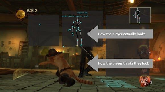
Having focused on what would be fun to perform; our next job was to make the player feel connected to their on-screen counterpart. We wanted the player to feel heroic, and this raised the next problem. Puss always looks great because he is posed by some of the world's best animators. Most players, on the other, hand do not exhibit the same flair. This is further compounded by the player's egocentric bias -- the perception that they look considerably cooler than they actually do.
We quickly discovered this when we first hooked up the sword fighting. We initially used avateering -- the process of mapping a player's exact skeletal movements on to the on-screen character model. Puss would do exactly what the player did, but this simply highlighted the gulf between the two. It felt underwhelming rather than heroic (not to mention the fact that the on-screen character ceased to look and behave like Puss at all). We needed a Plan B.

Exaggerating the player's input can be used to create a more heroic experience.
It was the animators on the team who drove the idea to use gesture-triggered animations. Rather than map the skeletal movements directly, we created a library of pre-animated moves and triggered the ones that most closely matched the player's input. There were concerns among the design team that this would break the crucial one-to-one bond between player and character. We were also concerned that the idea was too complex and would simply not work. A "fail fast" process of quick prototypes and rapid iteration (critical to the development of motion controlled games) allowed us to prove this out quickly, and the end result was a huge success.
We found that players didn't have a problem with the lack of exact correlation, as long as they felt like they were driving the on-screen action. In addition, we were making players look better than they were, which made them far more willing to buy into the illusion.
What we learned: Exaggerate the player's performance to make them feel heroic. Use the player's input to drive the action rather than directly reflect it.
At this point we were focusing on player performance and using gesture triggered animations to deliver a more heroic experience to the player. The next step was to get this working properly on the hardware. This is where our next problem came to light.
Our initial approach was to detect completed gestures and then trigger the appropriate responses. This works perfectly well on a controller, because a button press is instantaneous and the player does not expect anything to happen until after the button has been pressed. On Kinect, however, the expectation is for the gesture and response to occur simultaneously.
We had a situation where the response did not happen until after the gesture had finished. This resulted in latency, an uncanny valley of motion control that completely broke the bond between the player and Puss.
This was even more apparent with sword fighting because it was so quick, and any dissonance quickly became very apparent. The game simply couldn't keep up with player.
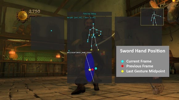
Our solution again was to take a different approach. We developed a system of pre-emptive detection. Instead of waiting for each gesture to finish, we would trigger the animation at the midpoint of the gesture and assume that the player would follow through.
The animation (which was half the duration of the gesture) would then catch up with the gesture, creating the illusion of one-to-one sword fighting. We then layered on secondary motion, sword trails, and audio to add more weight to the feedback, and extend it beyond the end of the gesture.

Only the first half of a sword strike gesture is used to trigger a response.
Of course, a system like this does allow for false positives (outcomes that the player did not intend) and whilst it was a design risk, it never became an issue because those false positives required deliberate, unnatural behavior that went against how players wanted to play.
What we learned: To create the feeling of one-to-one feedback, look for the earliest opportunity in your gesture detection to trigger the appropriate on-screen response.
At this point in development, we were feeling quite happy with our achievements. Everyone on the team knew how to play the game, and everyone was comfortable with how it worked. The next step was to test on real people. This turned out to be our most valuable lesson.
Our goal was to create an intuitive experience that "just worked". We wanted to avoid having to tutor the player on how we wanted them to play. We wanted players to follow their instincts and have the game respond. Player confidence is a big part of the Kinect experience, and if you betray that confidence, players start to lose faith in your game. User testing soon revealed that not all of our players had the same instincts.
Our first discovery taught us that it's perfectly alright to have more than one gesture for the same move. Our natural instinct, based on years of designing for controllers, was to limit this to one gesture -- but if not all players get that gesture then you have a problem.
This was most apparent with our "ledge shimmy" move. Our intention was to have the player use their hands to scrabble along a ledge, and this would move them across. What we observed was a range of different inputs, but all with a common theme -- players were moving their hands laterally in front of them, but in a wide variety of different ways. The solution was simple -- detect for the two wrist nodes moving in any direction along a horizontal plane in front of the player. When we re-tested, everyone was able to perform the move. It didn't matter that everyone was doing it differently.

Multiple gesture inputs were used to trigger the shimmy move.
Another recurring theme was the accuracy of our gesture detections. Our natural approach was to test for very specific gestures, as this seemed like the obvious thing to do. What we learned was that if you make your gestures too specific, not everyone will be able to perform them.
People come in all shapes and sizes, and have varying levels of coordination and mobility. Penalizing people for not being able to get it absolutely correct served only to destroy our players' confidence and enjoyment of the game. It added nothing to the experience and broke the illusion. The solution, again, was simple: lower the accuracy threshold by being less specific with the requirements.
Gesture conflicts were another real problem during development, despite the fact that we were already well aware of the potential issue. We had deliberately designed our gestures to be distinct from one another, but once we started user testing, we discovered that players were still unintentionally triggering certain moves. We had assumed that players would always perform the same moves in the same ways, but this did not always turn out to be the case.
The best example of this relates to the "claw frenzy" attack -- a special attack move that requires the player to scratch wildly at their opponent. The move is triggered by holding both hands out in front of the body as if ready to pounce. During sword fighting, some players were triggering the move without knowing why.
We had assumed that all players would fence with their non-sword arm down by their waist, but after studying more user tests, we discovered that this wasn't the case. Many players were actually holding both arms up in the air, which inadvertently lead to the gesture conflict. Without user testing we wouldn't have discovered this. Whilst we didn't intend for the game to be played this way, we still had to make sure that more unusual inputs were catered for.
What we learned: Test as early and as often as you can. Adapt the design for the player, not the other way round.
Our final lesson related to the complexity of the mechanics we were designing and, specifically, what sort of gameplay works best for Kinect. We learned that above all else, Kinect is all about performing an action and getting a response. That's the real magic and that's where most of the enjoyment was occurring.
We discovered that mechanics that looked too simple on paper actually worked extremely well and, conversely, more complex mechanics (that would almost certainly work for controller-based games) did not.
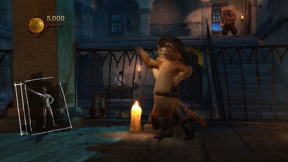
Our shape-matching game was a great example of the former: Puss would appear in front of a series of objects that had very distinct silhouettes and the player had to match the pose within a short time window.
If the pose was close enough, Puss would hide behind the object and avoid detection by enemy guards. As an idea, this appeared overly simple -- with seemingly no real skill or challenge -- but it turned out to be one of the most popular mechanics during user tests.
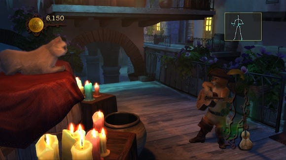
Conversely, our designs for the guitar playing mechanic were a good example of the latter. A special power-up allowed Puss to play a tune on his guitar midway through combat. This would subdue enemies until such point where Puss could swing his guitar and knock them out. The player could strum or change chord by sliding their hand up and down an imaginary fretboard.

Simple, responsive gameplay generally tested better with our target audience.
Our initial proposal tracked a number of metrics: was the player strumming at a consistent tempo, did the player change chords after each bar, and how frequently did they change tune? All of these factors would affect how quickly a power bar filled that would enable the guitar attack. We soon discovered that players had no concept of how this worked. This gave us two options: add complex tutorials and HUD, or simplify the mechanic. We chose the latter -- strum the guitar to fill the meter -- and it worked perfectly. Everyone understood and everyone loved the mechanic.
What we learned: What works for the controller doesn't always work for Kinect, and what shouldn't sometimes does.
Creating Puss In Boots was fun, challenging and ultimately very gratifying. It was also a real learning experience which taught us some very important design lessons:
Focus on creating a strong player-character bond
Find ways to make the player feel heroic when they perform
Look for early opportunities to trigger your gesture responses
Test your game regularly and adapt your design for your players
Tailor your gameplay to what Kinect does best
It's unlikely that many people will go on to do cat-based sword fighting games on Kinect, but the fact remains that motion control is not going away, and as time goes on user interfaces will continue to evolve in new and exciting ways. More than anything else, our experience on Puss In Boots really taught us how to adapt our thinking when dealing with new technology and highlighted the critical importance of usability testing on our target audience.
Read more about:
FeaturesYou May Also Like