Trending
Opinion: How will Project 2025 impact game developers?
The Heritage Foundation's manifesto for the possible next administration could do great harm to many, including large portions of the game development community.
"I think there’s something very valuable in just shaking up the process to the point where you can’t be concerned about individual vertices or edges, but rather form and shape."

Sunlight is precisely what the world needs right now. Krillbite Studio's latest is a meditative tonic that offers a brief reprieve from our relentless reality where doom-scrolling is second nature, pandemic anxiety is through the roof, and lockdowns have turned our concept of normality on its head.
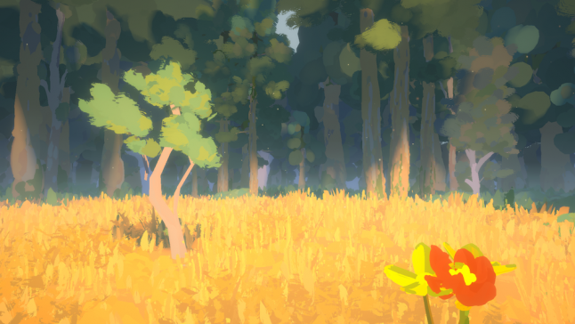
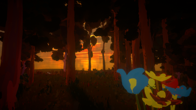
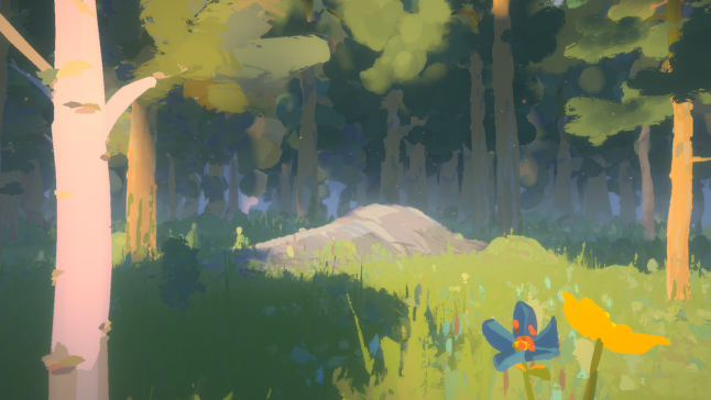
The lucid exploration game stretches out a hand and invites players to leave all of that behind for a wander, imploring them to embark upon a philosophical journey into a hand-painted world where trees can whisper and everything is connected.
It makes for a fleeting but intensely evocative adventure, and that's in no small part down to the impressionist visuals that give each minute detail -- from rocks and trees to individual blades of grass -- a feeling of deliberate purpose. Bolstering that sense of escapism is the fact that each brushstroke that comprises Sunlight's idyllic landscape was conceived in another reality: a VR canvas that's as separate from our world as the game itself.
Why, though, did Krillbite turn to VR to create their own abstract reality? To find out, we caught up with Sunlight art director Simon Nyhus and designer Adrian Tingstad Husby.
Gamasutra: You said Sunlight's visuals are inspired by Norwegian artist Edvard Munch, whose most famous work is The Scream. What was it about their paintings that captivated you, and did you look anywhere else for inspiration?
Simon Nyhus: What initially sparked the inspiration for us from Munch was his impressionist work. From the beginning our goal was to create an art style that looked unique, inspired by painted artworks. There are certainly a number of ways to approach this in a fully 3D environment, but we wanted to take a step back and re-examine the task at hand. What we found was that rather than focusing on just emulating brushstrokes in textures applied, we tried to go deeper and emulate the guiding principles of art. The grouping of shapes and colors, and managing the level of detail in a more deliberate way. The results and the art style evolved several times along the way, but I feel like that guiding principle we set out to achieve has been visible throughout.
As for other inspirations we looked to a lot of different artists, old and modern, which helped guide us in our decision making when figuring out what elements to emulate in order to make an art style look like a painting. A lot of different games achieve the painted/drawn look by, for instance, by applying hand-painted textures or outline and cell shaders to objects. We tried to go in a different direction by, among other techniques, mimicking how paintings can have a more decisive area of focus with less detail the further away you get, as well as going a step further with painted textures and having the forms themselves be "painted" in the VR application Quill. Ultimately, we tried to match the underlying principles of painting as much as the final look of it.

Gamasutra: Going right back to the start, why did you choose to hand-paint Sunlight's visuals in VR? What was the thinking behind that decision?
Adrian Tingstad Husby: One of our goals, tied to the themes the game explores, was to make the game intimate and human-made. With game productions usually involving lots of people and spanning a long time this can be a challenge. Our small team and game size helped a lot, but in addition we felt that actually building the assets with our hands would really emphasize that notion, since everything you see has been touched or 'painted' by a human hand.
Gamasutra: I've seen the clip you uploaded (embedded above) of Simon working his VR magic in Quill, and I'll be honest, the entire process looks pretty disorienting. Was it difficult to adapt to the 3D virtual reality space as an artist?
Simon Nyhus: It's a very new and different interface that took some time getting used to at first. Especially from the outside, or through screen recordings, it looks incredibly chaotic. That being said, as you put the headset on and have your head and hand movement replicated 1:1 in the digital space it really feels like stepping into another reality. It takes a lot of practice at first, but as with all art and visual media, the underlying theories and principles still ring true.
I think the most difficult aspect, as opposed to working on a digital art tablet or canvas in real life, is that you have full control over the depth in which you're placing strokes at all times. It’s definitely something to get used to, but I also think that’s the key that makes the look so different and unique. In a way it doesn’t feel quite like painting, 3D, nor sculpting, but rather a mix of the three and, in my opinion, it's more than the sum of its parts.
Gamasutra: How intuitive are the Oculus Touch controllers in that space, and how do they compare to more conventional tools?
Simon Nyhus: They’re very intuitive. It feels just as if you’re there, drawing with your hands in space. There are a lot of applications for VR painting that are quite simple in terms of functionality. Not offering the complexity of, say, Photoshop or Maya or ZBrush. However, because it’s so intuitive it more than makes up for that in other ways. While there certainly are tools for precision within VR, I think that is the place where traditional techniques are far superior.
Gamasutra: Following up on that, what were the most notable pros and cons of hand-painting your assets in virtual reality? Did you encounter any unforeseen hurdles or surprising benefits?
Simon Nyhus: From an artistic point of view I think there’s something very valuable in just shaking up the process to the point where you can’t be concerned about individual vertices or edges, but rather form and shape. Optimizing and getting that same look and feel from the unlit space of Quill to the fully shaded Unity environment took a lot of effort. One of the greatest benefits was how much extra information we got to pass through in this process.
It turns out there are quite a few hidden attributes you can take advantage of when exporting alembics from Quill. The direction in which the strokes were initially painted could be used to guide normals, and random values per stroke could be used to wrap textures around in unique ways on a shader level. Not to mention that the seamless morphing into further LODs was a result that could’ve only been achieved by having the asset consist of many different "brushstrokes" meshes. Of course, vertex colors were passed along and used for all textures in the game up until we implemented a palette system in the processing stage.
The biggest con of the technique is that it's very alien and breaks a lot of traditional tools. Adjusting assets is more time consuming as well because it requires you to go back into Quill to push the strokes around before reexporting and reprocessing, whereas with traditional techniques small changes like these could be made on the fly.

Gamasutra: Do you have any tips for other developers who might see Sunlight and want to try their hand at made-in-VR visuals?
Simon Nyhus: Yes! I would very much encourage other developers to play around with it and see how it feels. It is a very fast process to try out in the painting stage, even for non-artists. While Sunlight is the first game where we created final in-game assets exclusively in Quill, I’ve been using it for concept art and other facets of production before. Ultimately, this turned out to be the perfect tool for the job to achieve the aesthetic for Sunlight, but we kept our options open while experimenting with the art style until we reached that point.
I strongly believe that it’s a great tool, but that it isn’t here to replace traditional techniques. While it is a very appealing choice to make, it is also a big commitment to rely on it in production as much as we did. The framework and tech we built around the art pipeline for Sunlight is what made it work. Without our brilliant tech lead, Bjornar Froyse, we would’ve never been able to rely on this to the degree that we did. That being said I am very excited about what we learned throughout Sunlight. There are a lot of new and different ways of applying this technique, and I can’t wait to experiment with going forward.
Gamasutra: I'm also curious to know more about the technology you used. What hardware and software did you integrate into your art pipeline, and how cost/time effective did that setup prove in the long run?
Simon Nyhus: The secret ingredient to make this all work is Houdini, where we built a very robust automated processing step to take the raw VR-painted assets from Quill, extracting and adjusting the attributes to make it work within our environment in Unity. VR Painting in Quill (and a lot of other applications like it) is fun in the sense that you’re basically painting ribbons or tubes of geometry in the first place. To simply send that into Houdini let us manipulate the geometry in a lot of different, interesting ways. The process started with re-meshing the brushstrokes using a few different techniques depending on the form of each asset before calculating animation multiplier values (depending on how far from trunks/static objects any given brushstroke is).
After that, the vertex colors are used to snap UV’s onto a predefined bitmap palette for us to easier tweak the colors of the forest as a whole. The final steps are calculating the LOD morphing, done through reducing the density and fidelity of details by shrinking away a set number of brushstrokes while expanding others. Making the objects consist of fewer brushstrokes the further back it recedes. In the end, we passed along seven extra sets of UV channels to Unity for a lot of control on the shader level. We find it important to do things right on the technical level, but also to ultimately not lose that final artistic control we went so far to preserve in the first place.
As far as efficiency goes it was vital to this workflow. In the end we had a neat little snippet of python that re-exported the art for the entire game through Houdini in 15 minutes as well as direct control to re-export any single asset. This really helped make big, sweeping adjustments very fast and flexible. Even though the visual side of Sunlight was put together over only a few months, we really felt the benefits of spending the time to do this efficiently, and it’s something I am very keen on devoting more resources to going forward, also in a pipeline of traditionally made assets.

Gamasutra: Looking back, is there anything you'd change about the process -- and is it something you'd recommend to other devs now you've crossed the finish line?
Simon Nyhus: I'm very excited about the result and that other people are finding this whole process interesting. On a personal level I’ve always been excited to experiment with new workflows and to question old ones. If I were to do it all over again now, I think I'd make sure that the whole team is much more on board about what this workflow means. We’re not relying on advanced post processing or shader effects, but the trade-off is a very alien asset workflow that kind of requires an even mix of artistry, tech and general experience to make sense of.
Being able to take the very artistic expression and turn it into something viable for a real time game environment took a lot of very smart decisions and the pipeline itself was being worked on in parallel with the production as we went along. As always, more time dedicated to pre-production and figuring out the pipeline first would’ve been nice, but I don’t think we could’ve put it together the way we did without stress-testing the workflow as hard as we did.
If others are interested in experimenting with introducing VR in asset production I would recommend also looking at applications like Medium or Gravity Sketch which might be better suited as it sits a bit closer to the traditional workflow in the sense that you’re working with geometry that’s usually intended to be shaded in an ordinary way.
You May Also Like