Trending
Opinion: How will Project 2025 impact game developers?
The Heritage Foundation's manifesto for the possible next administration could do great harm to many, including large portions of the game development community.

Featured Blog | This community-written post highlights the best of what the game industry has to offer. Read more like it on the Game Developer Blogs or learn how to Submit Your Own Blog Post
In this post we discuss two themes: how to facilitate writing for games and how to design a dialogue user interface for games. We present examples from outside and inside videogames and some experiments we've curated.

This post is co-authored by Pietro Polsinelli and Daniele Giardini.
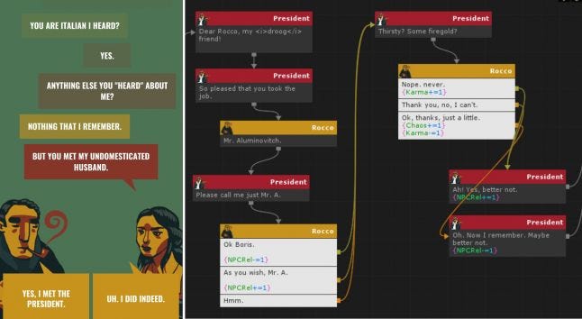
In this post we discuss two themes:
How to facilitate writing for games?
Given that writing say partially generative in-game dialogue is a specific process, how can one minimize the impact on writing of values from state and output variations technicalities?
and
How to design an in-game dialogue user interface?
Designing in-game dialogues doesn’t seem to generally get much attention with respect to other kinds of game assets. We look at existing usages and we point out features to be considered when designing dialogues’ user interface.
A note on the use of the author’s point-of-view. We sometime write as “we”, in the outlining sections, and sometime use “I” as a part may be one of the authors writing his direct experience, be it Daniele or Pietro. Bare with us - him - me :-)
Stories are remarkably useful tools for creating good games, Bogost aside. But writing for games is hard for several different reasons.
In The future of dialogue in games Adam Hines is quoted:
Writing for games and writing for anything else is a totally different job. It’s more like trying to solve a very complex mathematical problem than it is a pure writing exercise.
Most media have a predetermined, linear, progress. Even when the writer tries to hide this under a complex narrative, there's only one way to go from beginning to end. Under this aspect, games are a completely different medium: writing a game means dealing with mutations, branching narratives, and is a sort of chaos theory applied to storytelling.
Hence the writing style for games needs to be quite specific - this is from Writing for Animation, Comics, and Games:
Animation, comics, and games fall into the category I think of as “shorthand” writing. This is in contrast to prose writing, where a writer can write plot, description, and dialogue to any length, and can cover all of the senses—sight, sound, touch, taste, smell—using both external storytelling (description, dialogue) and internal storytelling (thought processes, emotional description).
This specialized form of “shorthand” writing requires the discipline to write within a structured format; to pare description down to an absolute minimum; to boil dialogue down to a pithy essence; and to tell concise, tightly plotted stories.
In the following we consider how shorthand writing merged with state and variations handling can be smoothened for writers using specific tools. Methodological advances in how writing can be prototyped and tested can make a crucial difference in the quality of results (see How We Design Games Now and Why for an historical perspective) and so adding practical writing applications to your toolset can be useful.
Another feature of writing for games is that it has specific properties in the testing process: when you write say a short novel, you can do testing by printing drafts on paper, or reading it out loud, but in all cases you are working on a unique draft. In the case of in game state you need a way to do quick testing and changes while testing multiple possible results.
For example this allows testing of the logic of what your characters end up saying in different situations.
Narrative in games can solve problems - but it must be capable to relate and change in connection with dynamic state.
Here is a problem described by Daniele that having a dynamic flow tool that supports interactive writing and testing can probably help to solve:
As a short out-of-theme anecdote, Pietro wanted me to write about one thing I mentioned in our talks, a thing that always kinda annoys me, and which represents a good example of bad flow. It's what I call the "wall of NPCs" effect, which is typical of RPGs but also of some adventure games.
It's when, for a few hours, you went around exploring and met no more than a couple people to talk to, then suddenly you reach a city. And kaboom, tons of people appear and, if you're a completionist / narrative - explorer like me, you HAVE to talk to each and every one of them. If the group of people was small, let's say four people, it would be a welcome change in pace. When the group is city-sized though, the flow completely breaks and you simply enter the "wall of NPCs" section of the game, which I find to be both interesting and stressful, mostly because all these people are not introduced gradually, but as a sudden presence, a feat, you have to overcome.
One solution to this problem is already used by less dialogue-centric games, where most NPCs are idiots with nothing to say. This removes depth from the characters, but keeps the flow, uh, flowing, since the player doesn't see them as a weight anymore. Still, I'm sure there's better solutions for more dialogue-centric games. Just something to ponder about.
So let’s have a look at the existing writing tools for games.
A remarkable tool that allows all above is Inkle’s Ink, presented generally by Jon Ingold here and in more technical detail in this GDC’s talk by Joseph Humfrey.
Ink is free and open source, just download it, install and there you go. Writing is linear (top down), the syntax is a markup language of sorts, and you control everything directly from text.
This is how Ink’s author sums it up:
Possible problems with this (wonderful) tool is that it seems really hard for anyone to get what is happening in anybody else’ writing, and possibly the writer herself could get lost when the text gets longer.
A different approach is to write by creating nodes of a connected graph on a plane, as in the pictures below.
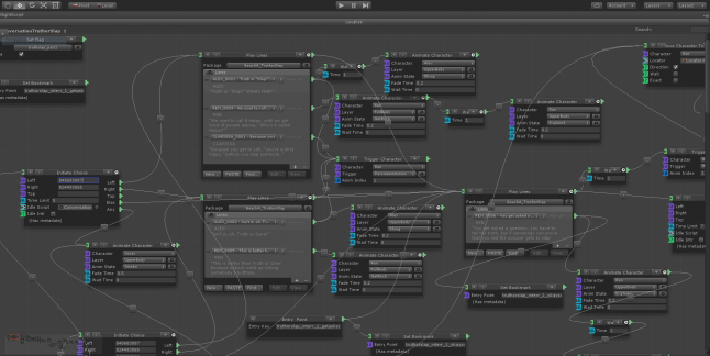
Night School Studio’s Oxenfree dialogue editor - image from The future of dialogue in games.
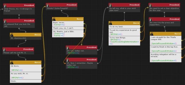
Daniele’s Outspoken (see below).
In a recent podcast by Keith Burgun interviewing Raph Koster, the latter made a wonderful casual observation about IDEs (Interactive Development Environment, Unity's in particular) embodying in their evolution some principles of game design. In the case of Unity, some of this learning by the IDE structure is built-in, and sometimes it is provided by third-party extensions. For the case of writing tools for games, let’s see an example from one of the author’s: Daniele Unity’s plugin Outspoken.
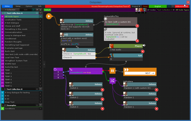
A while ago I (Daniele) found myself in need of a dialogue editor to use in Unity. I'm sure there's some marvellous in-house editors out there, but for what concerns publicly available stuff, I couldn't find anything that suited my tastes, most of all because all editors were pretty writer-unfriendly (except Ink, which is great but is missing a quick visual/organizational side which for me is—totally subjectively—fundamental). So I started the taxing feat of making my own internal dialogue editor, Outspoken. Please note that this is not advertising for Outspoken, especially because it is internal/for-friends-only. It's just a good example of the philosophy behind an in-house dialogue editor which I obviously know extremely well.
So. The philosophy I decided to follow for the editor:
1. It must be, first and foremost, writer-centric.
As a writer, I will write directly inside it, so I want its flow to be fast, easy to read/use, and pleasant. If my focus is lost and I'm distracted by the usage/complexity of the editor, the coherence and verve of my writing will resent it.
2. It must be fun to use, almost giving the writer the feeling of a comic.
Because this editor is very personal to me and I'm a comic writer too, so that mindset works perfectly for me.
3. Nice to the eye, no cluttering UI.
A dialogue node shouldn't be cluttered with encumbering UI, and should be as small as possible. In the end, I decided to hide all UI that is not always necessary (which means a lot of it) unless ALT is pressed.
4. Keyboard shortcuts for the win.
They allow to write without moving your hands back and forth between mouse and keyboard, which is a focus-breaker.
5. It must obviously have all necessary features, and be expandable.
"Necessary" as in "what I personally deem necessary" :P Which means actors, audio clip references, a custom in-dialogue scripting language, in-dialogue text blocks either randomized or chosen from variables/gender/etc, localization, global and local variables, etc.
It was a lot of work, but I used it for a few games and I can say I'm pretty happy with it (and the few friends that used it, Pietro first among them, seem happy too). Clearly, I'm also constantly evolving it.
How to design beautiful dialogues in games? Here we begin by presenting some example of existing in-game dialogues and then describing what we learned from developing several projects with such dialogues.
I (Daniele) come from a strong comic culture. I loved, studied, cherished, all forms of comics — and also made tons of them. Thus when I made my first mini-adventure, Faith No More, it felt natural to me to look in that direction and start experimenting.
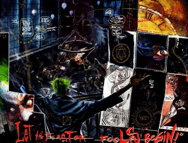
There's one thing comics understand very well, out of necessity. Lettering/written-dialogues are, or should be, an art. They can be used to convey emotions, mystery, fascination, as much — sometimes even more — as the text they display. Videogames instead, either consider text as mere subtitles, even when there's no audio, or as a beautifully printed paragraph from a book, sometimes surrounded by a multitude of decorations (there's just few recent exceptions I can think of, like Night in the Woods and Oxenfree, both inspired from comics). In short, every dialogue is, if not a wall, a brick of text. And that's bad: lettering can be so infinitely better. Both in how it displays text and in how it composes its elements, pulling them apart, shrinking and distorting them, giving a director's touch to their flow. Just look at these wonderful works — please enlarge those images to watch them in full glory.
Cerebus: Dave Sim and Gerhard
Snapchat: Chris Ware
Arkham Asylum: Grant Morrison, Dave McKean, lettering by Gaspar Saladino
Giallo Scolastico: Andrea Pazienza
Elektra Assassin: Frank Miller, Bill Sienkiewicz, lettering by Jim Novak
Obviously, comics have it easy. Everything is—kind of—created altogether in there, with perfect knowledge of each, utterly static, element. Videogames instead live in a dynamic state, with lots of variables messing things up. They're much more complicated. So I'm not saying, "Look at them comics! Let's just make dialogues like they do!" I'm just saying it's a pretty cool visual culture to start from, in order to find one's own way.
Let’s start with a negative example, or “how not to do it” / the standard way / the obvious way: I (Pietro) chose The Banner Saga, because it’s a wonderful game and also its narrative flow is a marvel but its dialogue user interface may be its less curated feature, as you can see from the screenshots:
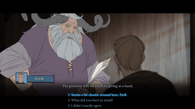
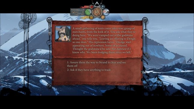
The great quality of the graphic design of the game is a bit in contrast with the dialogue and ensuing choices UI. It looks like the designers have a cinematographic sensitivity, that does not consider “user interface” as deserving design attention beyond the basics.
A (very) positive example of user interface for in game dialogue is Night In The Woods (best comic-based example in our opinion - it's just beautiful):
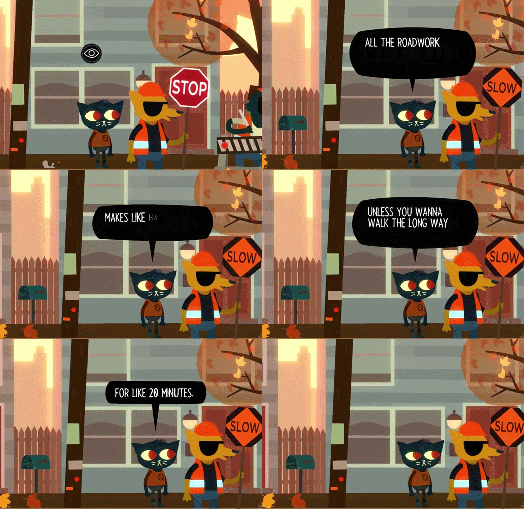
As Night in the Woods dialogues are explored best when seen in animation (and that already tells something), check out this: 24 Minutes of Gorgeous Night in the Woods Gameplay.
For each of the examples we’ll list a recap of the design choices is expresses.
Choices for the user interface: text all caps, fixed font size, animated background, left aligned.
In 80 Days, there are two kinds of dialogues. The most used is a flow of pure text in a graphic context:
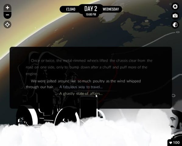
And a second less used style is with characters on the side:
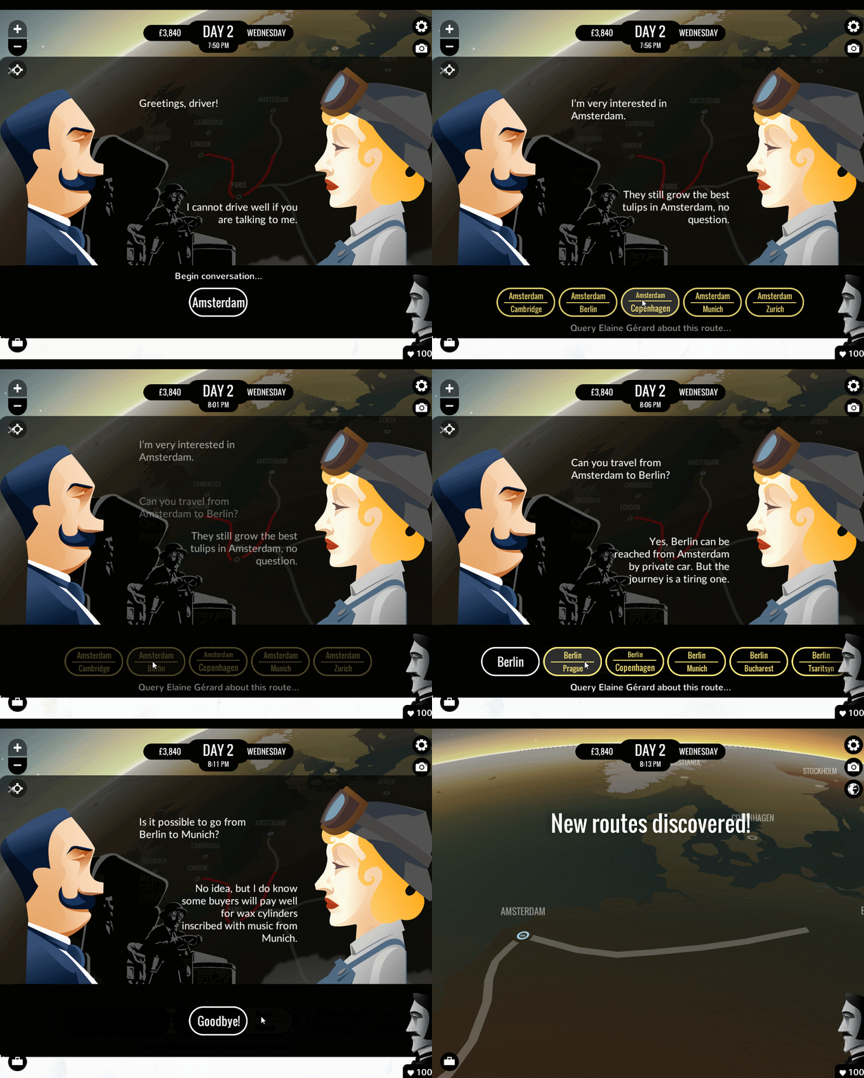
Choices for the user interface: sentence case, no balloon, left aligned on left and right aligned on right.
Now let’s see three examples of user interface for in game dialogue we (the authors) developed.
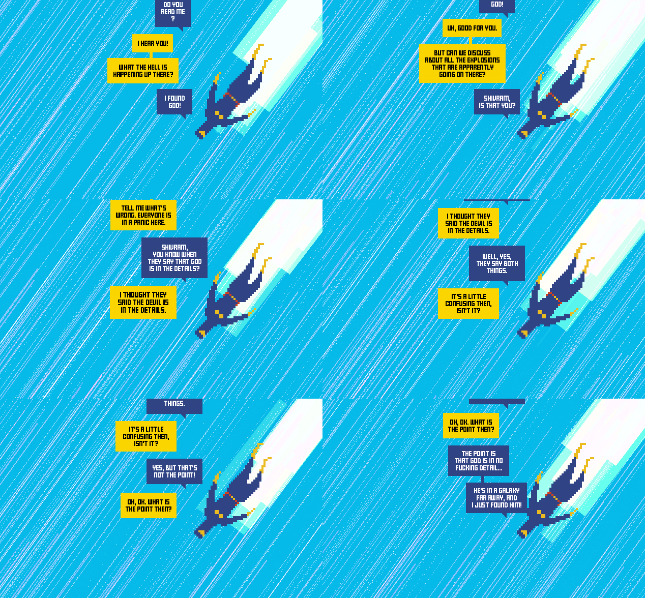

Notes on the user interface: (Daniele) apart from the comic-based approach, the interesting thing here is the choice of leaving previous balloons present in the background. In my opinion, this helps readability, since the player can see a partial history of the dialogue (still, in a new game I'm working on, I'm scrapping this "history" concept to have single animated balloons, so it all depends on the context—see work-in-progress example of a "thought balloon" below).
In hindsight, I have to say I find the dialogue user interface of the two pictures above as nothing more than interesting experiments, still lacking a lot of the depth and charm they should strive to achieve. The one on the bottom is already going in a better direction. Whew, did I write too much here? Pietro never scolds me and then this is what happens!
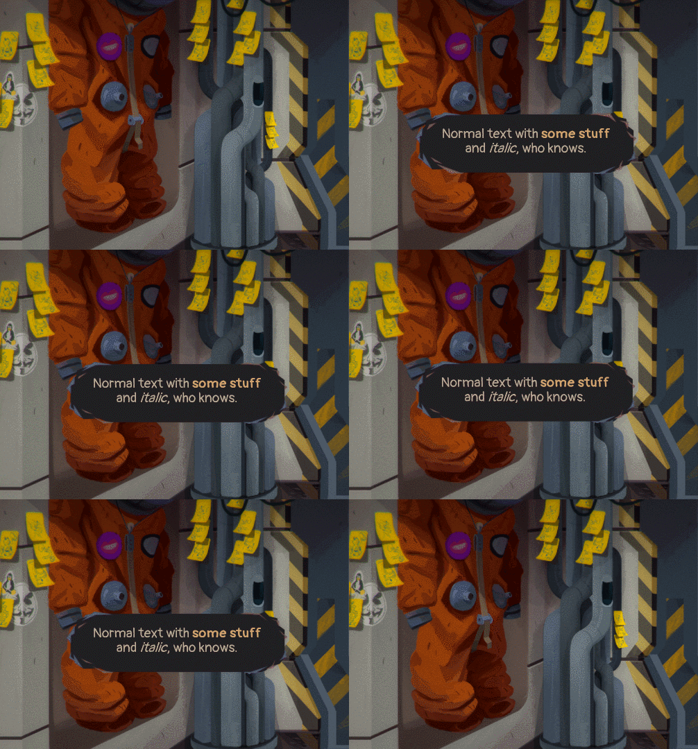
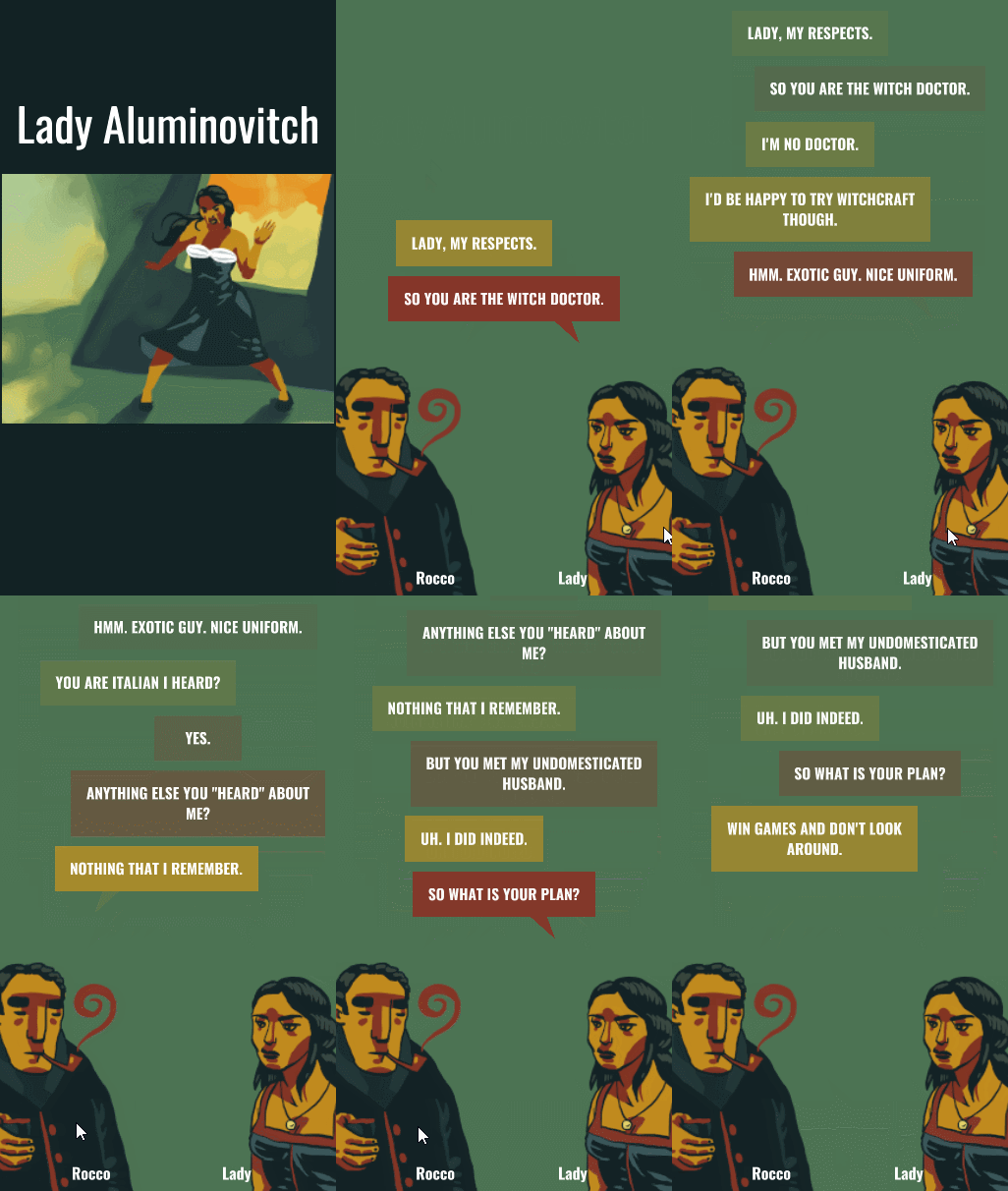
Choices: centered balloon text, fixed font size, standard “sharp” pointer, slight bounce of talking character.
The above dialogue design examples draw ideas and techniques from comics and game feel (see An Incomplete Game Feel Reader to learn about the latter). What is the conclusion?
The conclusion is that there is no conclusion. What are you, crazy, in thinking the creative work of crafting a dialogue user interface can be concluded anyhow? It's a constant never ending work in progress, and being inspired from comics is just a suggestion, mostly to point out a different creative direction than the "widely accepted and standardized" one :-) But games are games, not comics nor books nor movies, so it's an open ground for experimentation and for bringing your own personality in play. Cheers!
You can follow Daniele and Pietro on Twitter.
Read more about:
Featured BlogsYou May Also Like