Trending
Opinion: How will Project 2025 impact game developers?
The Heritage Foundation's manifesto for the possible next administration could do great harm to many, including large portions of the game development community.

Featured Blog | This community-written post highlights the best of what the game industry has to offer. Read more like it on the Game Developer Blogs or learn how to Submit Your Own Blog Post
A 4 year long experience of working in a completely new artistic medium. What is written will explain in detail the steps taken and learned in my career that brought me to my current artistic style using voxels.

Voxel art hasn't been around for too long in popular games media. It had an appearance long ago before polygons were the deciding factor for art/technical direction in games, but that's long forgotten. The reason, simply put, is hardware stress making it impossible for voxels to be a feasible rendering technique in games.
Greebles can be easily explained as "bumps". A Minecraft map, when viewed from afar, looks rather bumpy doesn't it? Well that bumpiness would be called "having a lot of greebles". I hope that helped to clarify the confusion.
When I first started making voxelart in the summer of 2013, it was pretty common to use the form to make "retro-3d-art" like 3D Dot Heroes. It was fun and considerably easy to get results fast so I would often make between 5 to 10 full models a night (5-6 hours). I didn't think much of the resulting poly count when making these models because everything I was producing would be exported and rendered in a Voxel Engine. Voxel engines were good at making you think "oh hey! this should totally be fine on computers to run, I wonder why more studios don't use voxels in games". Well, once I started actually contracting art out instead of modding, I quickly learned how intense voxels really are.
Late 2013 I started working on my first commercial game and, boy, did I learn a lot about Voxel engines. Everyone back then was either using an existing voxel engine or making their own (please don't do this if you're doing this today, for your own sanity) and I had to learn a lot about the inner workings of voxels. Once you start working in a voxel engine you start to observe how much voxels burn through your computer hardware. Various factors play into this stress but if you simply view the polycount, something as simple looking as Minecraft can be extremely memory consuming. Every single voxel will draw 12 polygons at a time, which is a lot for something as insignificant as a piece of dirt. On top of that, if you make a character which isn't a perfect cube, you sure as hell are going to break through 100 polygons for the 1 model, and fast.
Luckily, when working with any engine today, you can export voxel models as polygonal objects (because most, if not all, voxel editing tools will come with exporters for standard 3D formats). This will allow you to take something made up of hundreds of voxels exported with as little polygons as possible.
This is where the fun begins. When I started doing Voxel Art professionally I decided to spend most of my spare time figuring out new voxel art styles. These were all style which ignored the constraints of poly count, so I was still committing a terrible sin of killing my computer graphics card and CPU. When I started making mobile games I realized that this can't do; I needed to make an art style that could reduce the poly count as much as possible so you could still enjoy your games at 30FPS+. Soon enough I realized this became my style. Due to market demand of making voxel art for low spec hardware, I started developing a style which got further away from Pixel Art and Retro Art and got closer to forms like Low Poly Art.
***
Almost every game requires a character and it normally becomes the first thing you make. Voxel characters suck.....so much. You don't have the freedom of making something super rounded or shaped out otherwise your character becomes completely unreadable and technically demanding (high poly count)
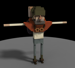
Ex: The character below looks to have a functional shape. you can see the defining factors; its limbs, its torso, and its head. "Not bad" you might think....but boy, add in some lighting and it'll become a mess of shadows.


This was one of my first experimentation's with freeform character design in voxels, ignoring the polycount or the squareness of voxels. The idea was to use the extreme and understand what are the pros and cons. The pros here is that you can very clearly define a shape and explain to a player that "X" is an ear. Admittedly, the above design isn't terrible, I'd even say it works, but the moment you add in new factors like animation you run into a massive technical wall. Skin rigging and even Rigid Body rigging become a painful job of making sure the mesh doesn't break itself. Aside from the T-pose model, unless this was animated frame per frame like a Pixel Art piece, it wouldn't come out in an ideal fashion.
When I came to this point in my designs I noticed I need to immediately find a way to reduce the poly count and make it look good. Simply put, I need to make flat design work somehow.

This was one of my first successful animations/rigs, made in a game jam years ago. This made me realize that I didn't need to make models with full arms and legs to be functional in expression. This was likely my first significant step in understanding the "Rayman" Aesthetic as the potential future of voxel character design. You can make hyper-expressive animations without the concern that your arm or leg will look all weird (because nothing is there) and you have less content to make in the long run, even if you make variants to limbs.
This step in my style was defined by my technical capabilities. I wasn't a great animator and I barely knew what I was doing at the time, so when I found something that worked, I stuck with it and refined it as much as possible. Today I've refined myself to the point of using arms and legs, while only using the Rayman aesthetic when the gameplay deems it necessary (ex: Spartan Fist).


These were both later attempts at Character designs. The first one above is from Critical Annihilation. I avoided the Rayman limbs since the game was lightly animated, but even then I felt the character was too stiff. I later made these set of dwarves for a client and I'll point out 2 mistakes I made:
I used noise....far too much. Something I no longer use. Noise will only cloud the design you intend to make. You have no direct control over the result when applying noise and so it no longer feels like something polished.
I used too much stepping to define a design. By this I mean that I made the beards have a 45 degree slant (little steps resulting in greebles).
Admittedly, you can see that I've already reduced the amount of stepping in my models from the first one I showed to now. This was me slowly realizing that I wasn't prioritizing shape/design clarity. When you apply shadows in-game, everything gets blurred out. Additionally i noticed that shadows would hide a lot of details I put into the color work. This lead me to reduce the amount of colors I had in my palettes and focus on the visible design.
***
We're in 2015, I've learnt how to animate a bit, I've started to understand limits of color use when applying lighting to models in-game....Let's throw all that out the window for something new!
For most of that year I worked on a game called Voxelnauts, which had a one of a kind aesthetic; Flat-shaded Voxel Art. The polar opposite of everything I had taught myself to date. Let's ignore the fact that shadows are a thing, and ignore the limits of voxel rendering (because it used a raytracing engine rather than a traditional mesh renderer).

(Voxelnauts, by Retro Ronin)
The character above was not made by me, though I did animate him (gif version can be found on my portfolio site). This model was made by the art director John Su. He taught me a lot:
You can apply shadows manually on objects by coloring the voxels. Imagine the light source and work accordingly. BUT!
Make sure your color gradient on shadows is obvious! Don't be shy, make it contrast both in hue and brightness (the beige skin vs the dark red/pink underarm)
Because it's flat shaded we can make limbs clip into one another and no one can tell!
And lastly, the way you sculpt a voxel model is VERY valuable. EVERY VOXEL COUNTS.
These are all the things I learned, either told by JS directly or things I've noticed as I was adopting the games style. I still take a lot of these points to heart, mainly the way I rig and animate models and the value of every voxel.
When I stopped working on this project I took everything I learned and starting finding designs in voxel art which can utilize an entire body design. I managed to go in a new direction and attempt a model with a full body.

This old man was designed with Luciana Nascimento. We worked together, using her concept art of this old man to make a design which would work in a single mesh. I was once again attempting to make voxels even more reduced in polycount though there were some struggles with this nonetheless.
I still hadn't accrued the skills to properly skin-rig, so making this old man work efficiently was a nightmare.
The coat has stepping, and while it didn't interfere with the model's visuals (it hid things as it should) it was, once again, a nightmare to skin rig.
However, I did gain some knowledge from this:
The head was connected to the body but splitting the head made animating a lot easier, and it had no obvious negative impacts to the look of the head animations (head rotation didn't clip into another mesh).
***
2016! New year, hopefully I get to learn and try a bunch more things. (I did)
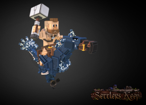
I had not used some techniques from the Flat-shaded experience since I thought it was reserved for that aesthetic....nope. I decided to take that knowledge and apply it to some high resolution voxel character. Splitting the meshes based on limbs, similar to the Rayman style, but this time I'll include joint limbs like arms and legs. Additionally, I'll take some knowledge from Flat Shading and model those limbs in a way which makes clipping less of a concern and more of an artistic rule.
Results:

(Settlers Keep, by Foxdawn)
This design took into account MANY things I learned to date and I bet you can see some of those things.
I used colors sparingly; 1 color as the base value for a property and a second color (normally lighter from the base) as the highlight which would contour the objects.
Limbs had variable sizes (voxel density is 1:1) so they would each go into one another. Using, say, a larger shoulder with a slimmer arm socketed inside made animating easier. No need to skin rig, I kept rigid body rigging and it gave the right amount of expression, as seen above.
I made most objects as flat as possible and utilized the rigging/animating process to dictate subtle details (like the feathers bending on the bird).
The above model is very high-res compared to everything I had made previously but it pushed my art forward with all the knowledge I had. When I moved onto another project you'll see that growth even further.


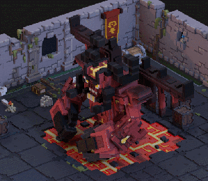
I took the large scale human model and condensed it further to make something a little less demanding yet would still follows the same animation process. This design became a lot clearer as something feasible when my animation and rigging skills got a lot better. Setting this up was simple in principle and the results were fantastic. However, this art direction is only feasible if:
The character design showed a level of importance based on sizes. eg: Character's head is predominantly larger than everything else.
I used the same philosophy as previous: limbs are variable sizes to hide any clipping/Z-fighting
Use contouring colors, except this time it's used to outline important segments instead of everything.
Any shading is done using contrasting colors instead of subtle gradients

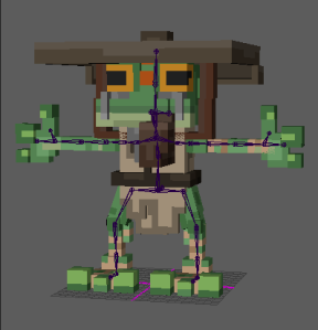
Here's another example of using the above rules, to give you a better idea when working with variable creatures and designs. The rules above can also help to make certain designs a lot easier to set up. By avoiding voxel stepping all together and preparing models in a T-pose for rigging, while keeping models as low poly as possible, you have more opportunities to create unique animations and poses, like below:

From Qubicle

To Maya

To Unity!
I became accustomed to a workflow which made my models feel entirely incomplete in the editor. A model was truly complete when it was running in-game. Building out the final design in my mind before doing the groundwork, and working backwards from there. This would be the process:
Keep the final design in mind
Deconstruct the model into limbs or parts which would require animating
Block out the limbs to get a sense of complexity and possibly reduce the complexity from there
Begin modeling
Simplify the design to utilize as few colors as possible but still do some shading on the model directly
Export to Maya
Rig and begin animating!
Seems quite straightforward, but once you get the hang of your tools, you get a better sense of how to make your art before actually making it.
Read more about:
Featured BlogsYou May Also Like