Trending
Opinion: How will Project 2025 impact game developers?
The Heritage Foundation's manifesto for the possible next administration could do great harm to many, including large portions of the game development community.

Featured Blog | This community-written post highlights the best of what the game industry has to offer. Read more like it on the Game Developer Blogs or learn how to Submit Your Own Blog Post
Games and game-making software are becoming smoother than ever. Maybe they need a little more grit.

Can you relate to this problem? I can't find anything to play on iOS right now. Now don't worry mobile developers—it's not you, it's me. I'm a picky customer on my phone. I don't go for puzzle games or narrative titles because I want something more mindless before I sleep, or while I'm on the bus. I'm usually looking for a picky balance of "low interaction" and "repeatable strategic depth
And for the devs making most "mindless" games—you're doing great too. I just have a different problem: I've played you already. Most of the live service games that attract my interest have UX patterns that are so similar. I feel like I'm just repeating an onboarding experience over and over again. It's this too-smooth journey through tutorial mechanics that leave RPGs and base-building games feeling like to-do lists more than power fantasies.
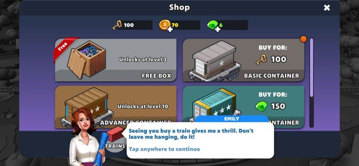
My heart broke in August when I tried to make the most of Train Station 2: Rail Tycoon. There wasn't anything wrong with Pixel Federation's free-to-play train simulator. And it wasn't even that it felt too easy—it was just too smooth.
I'll try to be specific. The first hour of Train Station 2 felt like a carbon copy of every other free-to-play idle game from the last half-decade. All tutorialization, introduction of the in-app currency, fingers showing you exactly where to tap, and wide-eyed characters cheering you on for completing the simplest tasks.
Once you get into the proper gameplay, there's a brief moment of finding some strategic balance in managing your trains, before things get too easy the instant you interact with the in-game spending. You get that tease of how easy all this grinding could be, and then are dumped back onto the treadmill as the difficulty curve catches up to you.
I'm well aware that especially in the world of mobile free-to-play titles, smoothness and slickness is life-or-death in building that reliable revenue stream. Anything that gets in the way of your player solving a goal makes them less likely to spend that valuable money (or brace themselves for an obnoxious in-game ad).
But the escalating arms race of retention-based game design might be hitting a peak. And it's even taking an impact on game development software as well. Let's discuss.
Earlier this summer Cantata creative director Kyle Kukshtel penned an incredible manifesto on the state of modern game design. Where I bounced off Train Station 2: Rail Tycoon, he bounced off of V Rising.
Kukshtel's core point is that the core mechanics of many video games are becoming calcified. Players are repeatedly tasked with grinding, looting, and crafting their way to victory with only mild variations on theme or end state to mix up the experience.
His economic argument points out that for many companies, chasing anything other than these retention-optimized mechanics is risky fiscal business. It's hard for many studios to imagine games that don't look like a mash-up of Minecraft and Diablo.
"It seems like our conception of a 'design future' of games has effectively stopped," Kukshtel wrote, referring to how many major games are crystalizing around overlapping sets of mechanics meant to maximize retention at all costs. "Our ability to think of games with systems and mechanics beyond what is already knowable seems like a lost cause."
I'm less cynical than Kukshtel, but not exactly out of alignment. Because there's been so much crystallization in systems design, it leaves openings for other experiences to come along and jolt audiences out of complacency. Today, Trombone Champ is a breath of fresh air. In the heyday of Guitar Hero and Rock Band? The concept was literally an Onion article.
There's still so much incentive to make rough systems feel smoother. But smooth and effortless doesn't automatically equal "pleasant," "fun," or "engaging." In Train Station 2, the smoothness of managing a bananapants train economy began to feel...well, wrong when I realized what my reward was. It wasn't the sensation of watching massive iron behemoths navigate the countryside. It was...whatever the heck is going on in these brief dialogue snippets.

This was not the most suggestive in-game dialogue I could dig up.
These uncanny moments felt like a trip down to Hollywood and Highland in Los Angeles. Gaudiness, spectacle, and a certain uncanny cheapness all mashed together. At first I kept playing because I wanted to see how ridiculous these narrative interludes could get.
Then I remembered the last idle game I played with a mechanic like this: Marvel's Avengers Academy. Narrative moments in those games didn't rely on virtual rubbernecking. TinyCo made a game that leaned on sincerity, earnestness, and a bit of exceptional self-awareness. That felt so much better than Train Station 2's narrative...uh, train wrecks.
A moment like that can make you believe in Kukshtel's cynicism. It also got me thinking about the tools that brought Train Station 2 to life.
Every now and then when you're out at GDC or lurking in some long-forgotten programming forum, you'll find the bad-faith arguments about how game-making is "too easy" nowadays.
Those arguments often come from developers who complain about efforts to improve work-life balance at game studios. It's a certain "I suffered, so you should suffer too" mentality that might never go away.
But it is true that the people making game-making tools (proprietary and commercial alike) have put in an admiral effort to make game development more accessible to the average person. Gone are the days of hard-coding your scripting in Assembly, now new generations of developers can build great experiences using visual flowcharts and other, less grinding tools.
Improvements to game-making software have also given birth to the modern user-generated content platform. Core, Roblox, and now Minecraft are all creeping on us as platforms within platforms, where developers are plugging away at making games for players who never leave these colorful playgrounds.
The business case for such platforms is almost kind of a digital landlordism. If you own the land people are making games on, you can take a cut of the sales people make in your space. And if you give more people tools to make interesting games, an everyday person might spend their free time noodling on interesting creations that can make your digital "land" feel special.
(Around here is where the pay-to-earn, blockchain metaverse types want to creep in and have people rent artificially scarce land. Get out with ye foul creatures, I pay too much in rent in the real world to ever pay it in-game).
That business case for getting as many creators as possible on different platforms incentivizes a certain approach to tool design. Most importantly, it can make tool design smooth, just like how several game mechanics have grown smooth. The creators of Roblox, Core, etc. aren't just making decisions about creativity, they're trying to boost retention on their platforms, so creators will keep creating, and creating, and creating, and creating and hey is anyone else getting weirded out by the word "creator" by this point?
"But Bryant, what's wrong with smooth tooling?" you might fairly ask. "We're talking business here, if we can't produce content at X pace, we can't pay people and keep the lights on."
A fair point! And I can't stress enough, game developers deserve the best tools possible. I was blown away by Eidos Montreal's writing tools shown off at GDC for creating Marvel's Guardians of the Galaxy.
But hear me out: what if smoothness in software design has diminishing returns?
The blog you are reading only exists by a newsletter from The Atlantic's Charlie Warzel, who took a look back at Matthew B. Crawford's 2009 book Shop Class as Soulcraft in a meditation on the value of friction-filled technology.
You can't escape "friction" when using tools or creating art in physical mediums. I just spent a weekend building furniture, and learned all too well what challenges you can face building a dresser with a perfectly fine set of instructions.
I'm not going to call that experience pleasant, but I looked at it in a new light after reading Warzel's thoughts: building that furniture was made approachable not by a smooth user experience, but by my past experience with woodwork and assembly in high school theater and on film shoots early in my career.
It's one thing to interpret instructions, it's another to have a sense for the feel of wood and metal objects in your hands. You only gain that sense of navigating in 3D space with repeated experience. You understand how the hammer interacts with the nail, what it feels like when a screw has landed in the correct place. If something wasn't fitting properly, I only knew how to suss out my mistake thanks to having physically done it in years past.
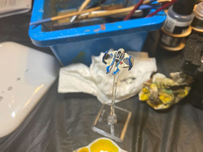
Let's get away from the chore of building furniture. In the COVID-19 pandemic, I took up miniature painting, something I never thought I'd be any good at owing to some shaky hands and poor experiences in elementary school art class.
To get even remotely comfortable with mini painting, I had to fuck up. A lot. I had to miss strokes, apply too much paint, remove the paint, google how to mask around the paint, fuck up the masking, realize I'd never get the masking right and try freehanding, etc. There were whole paint schemes that I thought I could never do, until I tried them, and realized that while I didn't do it "right," I certainly did it well enough.

I thought this model would be impossible to detail. It turned out to be one of the easiest.
Moments like these exist in the software we use to create in the digital world. Even my ability to write this blog comes after years of wrangling with the complex tooling of online management systems (the CMS we used when our name was Gamasutra? Pain. Unimaginable pain).
I'm not the only one who thinks such friction has its place in tool design. David Lightbown, user experience director at Ubisoft, agreed with me in a short e-mail exchange. I've been a fan of his GDC talks about tool design, and we've spoken in the past about how the tools we use shape the art we create.
He wrote me in agreement that friction can absolutely be "useful" in tool design. "A dialog box can be used to protect the user from accidentally accepting an irreversible destructive action, thereby losing their work and having to start over," he said as one example.
He added that toolmakers need an extra amount of awareness about how the user is interacting with their keyboard when such menus pop up—if a simple press of the "enter" key can close such a window, its purpose is moot, so said window needs to respond only to a very deliberate interaction.
Lightbown pointed out that there's debate about the notion reducing the number of clicks in software saves the user time. It's a "myth" in his words. "Adding clicks (for example, separating a complicated form into separate steps) can make the information easier for the user to understand, resulting in them completing the task more quickly with a better understanding of what they are doing," he said.
You'll find the most friction-filled interfaces in places like a plane cockpit, where Lightbown says the user needs immediate access to all controls in what might be a literal matter of life and death. Said complexity is counterbalanced by intense training and thorough documentation. Since literal lives aren't on the line (mostly) in the world of game development, we definitely don't need to swing all the way in that direction.
Remembering the value of friction can also help us recognize when "smoothness" isn't meant to help the user, but to extract profit. And that's where some nasty tools can rear their head.
My noodling over "smooth" tooling took new relevance in the last week as artificial intelligence-based tools began to publicly surface in the world of video games. Kotaku spotted a game on Steam that made use of AI-generated art. GLHF dug up an AI voiceover tool reportedly in use at Ninja Theory and Neon Giant.
I've also been fed a number of advertisements lately for AI-driven "content generators." They're pitched as timesavers—if you need a marketing blog for your product, just feed in a prompt and get some basic text out.
A good-faith use of all these types of tools is that you'd use them to get past the prototyping stage—that you'd act more like an editor than a writer, honing what you want out of algorithmic clay.
But let's be real. These tools make "good enough" content that can save money when you don't care about making a unique product. If you're running an SEO farm, why wouldn't you want AI-generated articles that you can feed in answers to the questions people are asking on Google? I've dug through an unusual number of "how do I do X" articles lately that I'm 90 percent sure were at least partly written by bots.
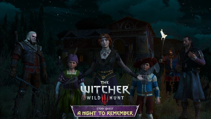
In 2021, modders used an AI tool called CyberVoice to create new voice lines for The Witcher 3: Wild Hunt hero Geralt of Rivia—without the input of actor Doug Cockle. The result was a performance that wasn't as good or equal to Cockle's, but it was definitely good enough.

The ethical and labor issues of such technology should be apparent on their face—if a major studio ever optimized this technology, they could restrict the budget on their vocal cast down to a few celebrity names who could help sell the game, and fill out NPC and enemy lines with performances generated from a script.
Kukshtel's warning about the state of game design becomes relevant here because once one studio figures out how to jump through the legal loopholes and execute this, others will too.
That day isn't far off. Disney is already archiving the voices of Mark Hamill and James Earl Jones for facsimile recreations of Luke Skywalker and Darth Vader—if it wants those characters to appear in a big blockbuster game, why wouldn't it go back to those files instead of casting someone like Matthew Mercer or Scott Lawrence?
When that moment comes, games will risk losing the spontaneity that can come with working through a performance in a V.O. booth. They'll lose that ingenious moment of "wait, if you edit those two performances, you'll get something better—" and things just spiral out from there.
Can a line like "I used to be an adventurer like you. Then I took an arrow in the knee" pop into existence if an AI generates 10,000 barks for an open-world game? Can a designer discover a bit of janky physics to make something like "rocket jumping" a core game mechanic? If a level designer doesn't need to slap together a series of hacks to emulate dancing physics, can something like the BioShock Bread Boy ever come to life?
These are shallow examples, and I know many everywhere would gladly trade away the creativity of old tech for something that makes their lives less painful.
But if tools become optimized to chase what the market wants, then games are going to get smoother and smoother. They'll be tuned to hit the most base psychological reactions in players to try and squeeze that next penny of in-game spending out of them, or trying to suck them in for hours of game time that justify a subscription service purchase.
At some point, those players may react like I did: closing the game store in exhaustion because everything is just the same, and I can get a cheaper high by scrolling through Reddit instead.
Read more about:
Featured BlogsYou May Also Like