Trending
Opinion: How will Project 2025 impact game developers?
The Heritage Foundation's manifesto for the possible next administration could do great harm to many, including large portions of the game development community.
Any QA testing team needs not only to take the front camera notch into consideration when testing, but it also needs a wide range of cell phone models because slight changes between them make a whole lot of difference for any, if not all, mobile games.

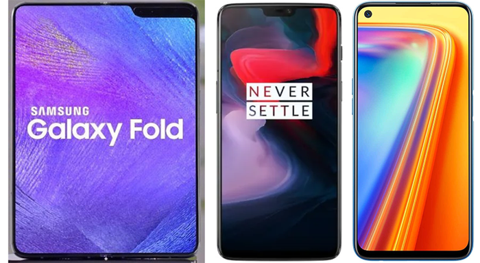
In modern cell phone design, front cameras are placed inside the display screen, almost always on its upper side. They’re nested in a rectangular area known as the Notch, and it slightly obstructs cell phone screens, in a subtle way that doesn’t interfere with the device’s normal usability, but that has a big impact on video game user interface (UI) and performance. Any QA testing team needs not only to take the front camera notch into consideration when testing, but it also needs a wide range of cell phone models because slight changes between them make a whole lot of difference for any, if not all, mobile games. Cell phones stem from one to two front cameras, from being placed right in the middle or aligned right or left, and the notch itself can vary in size.

Variety of Mobile Phones notches.
The main concern with this issue is that front camera notches block mobile video games’ heads-up display (HUD), and generate a myriad of problems as a consequence. The upper part of cell phones’ screens are usually used by video games to show relevant gameplay information, like resources, vitality, time, items, and so forth, all of which are important to achieve the game’s goals. In other cases, the upper part serves navigation purposes, so developers sometimes place buttons in this area to access menus and game settings. When the blockade caused by the front camera notch is not taken into account, important information and elements players should be able to see remain partially or totally hidden, hindering the game experience, or breaking the gameplay altogether.
Now, developers don’t usually program video games adding HUD exceptions for every cell phone model’s notch, because they don’t necessarily have all models available in the market when they program. They wait until the QA phase begins, when video games are tested in multiple, and as many as possible, cell phone models, to review the games’ resolution and visual performance, and how affected the video game is by the notch in every model. Only then, solutions that can match as many models as possible, are programmed in the video games. They usually have to tackle the two most important cell phone operating systems: Android and iOS.
Solutions for Android can be twofold: preemptive and corrective. All Android systems have the Developer Options setting that opens the Android Device Bridge, through which a developer can access and change the cell phone’s hidden settings, one of which is the Display Cut Out. Developers use this particular hidden setting to visualize a simulation of any device’s notch, and allows them to spot any potential overlap between the notch and the video game’s HUD for five different notch configurations: Default, Hide, Corner Cut Out, Double Cut Out and Total Cut Out. Then they can redesign the video game’s HUD to prevent any conflict between its UI and cell phones’ notches without the need of testing in every single cell phone model. This is what we call the preemptive solution, because it’s applied before QA tests. However, problems can still appear with certain models in the QA phase, when the video games are empirically tested in multiple devices. These require a corrective approach, where developers fix and redesign a video game’s UI so that it won’t conflict with specific Android cell phone models, which are reduced to two options offered by the Android system:
Render the app outside the safe area: a solution that moves gameplay elements from the space occupied by the notch to other locations on the display, with the video game still occupying the screen’s entirety. But this solution can cause other issues as well, because the UI can get overcrowded in a way not originally intended by the designers, and depreciate the game experience. This is the least practiced solution because it might imply readaptaing the game’s HUD to multiple cell phone models.
Render the app inside the safe area: a solution that delimits a horizontal area projected from the notch sideways, and set it as a video game’s margin. A black line will simply delimit the game’s HUD. Although it’s not necessarily the nicest solution (there’s some unused screen), it can be implemented in a way that applies to many cell phone models, it’s usually the most popular way to go.
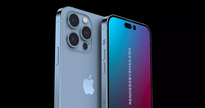
With iOS this issue is easier to tackle because of the limited and precise number of cell phone models, but solutions must match every iPhone model individually. The limited number of iPhone models allows developers to know beforehand the Aspect Ratio of all of them, and the space occupied by their respective notches. What developers do is design a video game’s UI so that it recognizes the seven Aspect Ratio configurations used in all iPhone models, and HUD are programmed to adjust to every screen, and all of its important elements are manually moved to screen areas in ways that no gameplay elements are blocked by the notch.

iOS and Android phone notches.
Because any of these solutions can have unintended UI changes, like a responsive design that can scramble all the elements when resolutions are changed, it’s crucial for any comprehensive QA team to test these solutions in as many cell phones as possible in order to spot contradictions that may come about with any model and correct it before launching.
This is a very common and recurrent issue in modern mobile video game development, since when the front camera notches were integrated in cell phone designs, which makes testing for this bug a crucial step in the QA phase.
This article was written with the help of TagWizz’s group of experts.
Read more about:
BlogsYou May Also Like