Trending
Opinion: How will Project 2025 impact game developers?
The Heritage Foundation's manifesto for the possible next administration could do great harm to many, including large portions of the game development community.

Featured Blog | This community-written post highlights the best of what the game industry has to offer. Read more like it on the Game Developer Blogs or learn how to Submit Your Own Blog Post
Two weeks after the release of Unexplored 2 we’ve redesigned the inventory system as players found it to be too restrictive and too diminishing of the fun of finding treasure during their adventures. In this post Joris Dormans looks back at this pivot.

Two weeks after the release of Unexplored 2: The Wayfarer’s Legacy we’ve made our first big redesign. Coming out of Early Access and into full release the increase in sheer number of players and the difference in expectations they had, made different types of problems with our game surface. In this case, players felt the inventory system to be too restrictive which diminished the fun of finding treasure during their adventures. A redesign was called for. In this post I look back at this pivot.
Unexplored 2 is a game about making choices. The inventory design reflects that. From the start of the design process we wanted to reduce the burden of inventory management, but also to have players think about what they should bring on a particular journey. We wanted to reward players who venture out well-equipped to deal with the hardships they encounter on their chosen paths.

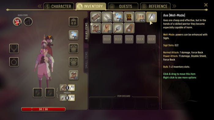
Image 1 - The old inventory system: 10 items collectively causing 5 bulk, leaving space for 3 more items.
When we released the game we were happy with the way we set up the system. Items fall into two categories: small and bulky. Small items you never need to worry about. You can bring as many as you like. Bulky items are more restricted, you have only 18 slots available, and many of them would take up multiple slots. These extra slots are represented as slots taken by ‘bulk’ in the inventory. As the inventory starts to fill up from the top-left, the bulk slots are taking away item slots from the bottom right (see figure 1).
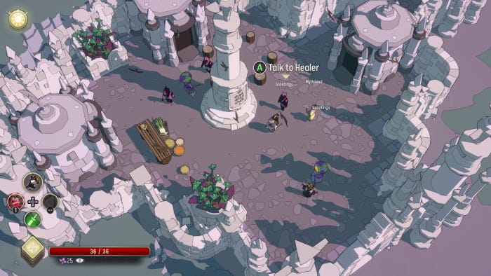
Towns function as hub locations in the game. People often spend considerable time in towns planning and preparing for their next journey. We imagined that choices about what to bring, and therefore most inventory management, were made at those times. During your journey the number of bulky items you can find are limited, there wouldn’t be much need for inventory management once you were having your adventure. Or at least, so we thought.

Image 2 - The town of Haven is the starting hub for the game, we expected players to do most inventory management here before they set out.
On a few fronts this system works well. People really had to think about what to bring. And survival gear such as tents, bedrolls, and sturdy boots are truly viable choices. You could bring a weapon or two, but a shield or armor significantly limits what else you could bring. We effectively got rid of the ridiculous amounts of loot that have become a staple of fantasy RPGs and it was nice to see players equipping themselves for survival for a change. Combined with the game’s barter system and the different qualities each piece of equipment can have, it can make items like threadbare, fur-lined boots a valuable find.
From a technical game design perspective there was one major challenge we never resolved. It was hard to make the number of available slots flexible. An intuitive item for this system would be a backpack that would add a number of slots so you can carry more. But that never became an item, as it is weird that the backpack would take a slot and then add some. What would happen if you have multiple backpacks? Or worse what would happen to your superfluous items if you drop or lose a backpack? To keep the design clean we decided that we best not have any items or skills that expand the number of inventory slots. This also made the UI design easier as we always knew how many slots would be available.
But from a player’s perspective a limit on what you carry is always going to feel restrictive. In the first two weeks after launch, but also during playtests before, it became clear that players didn’t always like it. Although many would accept and appreciate the choices you have to make, it would sting in particular when you would find something cool but could not take it, unless you are going to leave behind something else. It simply took away from the joy of what should have been a rewarding moment.

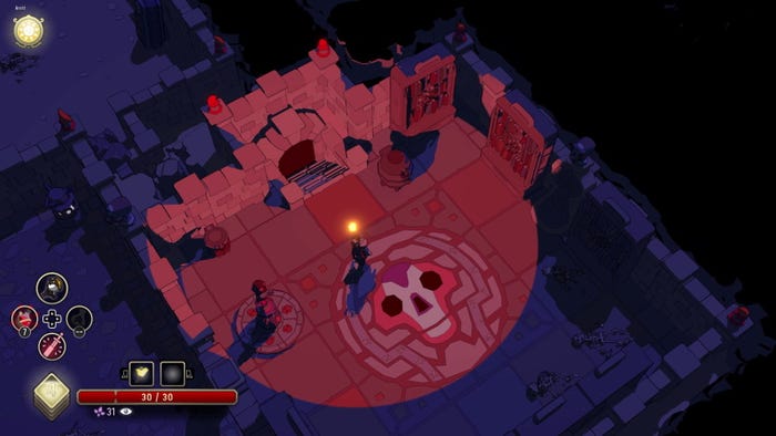
Figure 3 - Finding a treasure chest in a dungeon should have been a rewarding experience.
Unpacking the problem further, the unintentional effect was that, although limited in frequency, inventory management choices would actually pop-up while exploring a dungeon, and when they did they were particularly intrusive. We designed the game to do inventory management in hubs, but we didn’t effectively eradicate inventory management at other times, and that might have made it worse. Especially since the game put you on the spot for a big long-term decision when you were in the middle of exploration.
It wasn’t before long that players started asking for bigger backpacks.
So we sat down and discussed the options. Simply expanding the number of inventory slots to 21 or 24 didn’t seem like a good idea to us. First of all, we were afraid that it would also flush out everything we liked about the inventory system. Planning well for a journey becomes less rewarding when it is all too easy to pack for every eventuality. And second, in our experience players are going to fill up their inventory eventually no matter how much room you give them. And when they do, it does nothing to prevent that frustrating moment where you have to decide what to leave behind right now in order for you to pick up that cool item you just found.
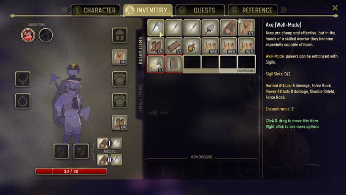
Instead, we decided on a different approach: we swapped out the concept of slots occupied by bulk for encumbrance. Like bulk, encumbrance is caused by extra bulky items and starts filling up the inventory slots from the bottom right. The difference, however, is that items can be placed on these slots. When that happens you simply get the encumbered status (see figure 4). This status has little immediate effect: it increases your weapon cooldowns a little and interferes with your ability to hide. Its effect on traveling is more severe: at the end of each journey you get the ‘Fatigued’ status. This makes traveling much slower and, well, more cumbersome because this means you probably need to rest more often.

Figure 4 - The inventory redesigned, 14 item collectively causing 6 encumbrance. The last two items are placed on encumbrance spots meaning the hero is now encumbered.
This design has three important effects. First, it added a choice for the player: you can take this item but you have to deal with the negative effects, but at least it is an option. Having an extra option is well in line with the rest of the game’s design philosophy. Second, the system is more flexible so it creates opportunities to have skills and equipment that affect the encumbrance of items: encumbrance can go up and down without the need of dropping items immediately. Third, and I think this is the most important reason, by making the immediate effects not too severe it moves the required inventory management to a moment when it is less disruptive and less stressful. Instead of having to decide what to keep immediately, you can grab the thing from the dungeon, and make all those decisions when you are ready to leave.
At the moment of writing we only have rolled out the change for a little over a week, but people seem to appreciate it. From our observations it seems to do what it should be doing. Players can bring more stuff if they really want, and while exploring a dungeon they can bring almost anything they find, at least initially. The skills give players a prospect to overcome the small inventory if they are willing to invest in it. Although some players are already suggesting more changes to the system so they can haul even more items on their adventures. For them there really never is enough space…
In hindsight we could have made these changes earlier. As stated above, prior to launch we had some indications that the inventory was too restrictive. Even though the early access players seemed to be much more willing to follow the design as it stood. In addition, as a designer I also feel that we simply sometimes need to stand by our design. For Unexplored 2, some sort of restriction and forcing the players to prepare and make choices is very important. If we simply had given the players what they had been asking for, the game would have changed quite drastically.
Ultimately, I think this whole redesign illustrates quite nicely the design philosophy I picked up when I was still studying to become an architect. There I learned that laymen suggestions or requirements for a design are almost always poorly phrased. Often there is a clear need behind what people are asking, but it is often hard for them to express that need. Game design, like architecture, is a professional discipline, it would be unrealistic to expect players to be able to articulate their problems directly or effectively. I have learned to be on the lookout for ‘the question behind the question’. The question that if answered, makes people say: “yes, this solves a problem I never truly realized I had”. In this case, it wasn’t until we realized that the size of the inventory wasn’t the real problem, but rather it was the lack of choices to deal with it combined with the awkward timing that forced these choices upon them, that we could really start to tackle the problem.
---
Unexplored 2: The Wayfarer’s Legacy is a challenging roguelite RPG, with a table-top 'feel', a node-based open world & a cool twist on permadeath. It is available on Steam, Epic, GOG, and XBox.
If you want to discuss its design in more detail please follow @PlayUnexplored, or @DormansJoris on Twitter and leave a comment there!
Read more about:
Featured BlogsYou May Also Like