Trending
Opinion: How will Project 2025 impact game developers?
The Heritage Foundation's manifesto for the possible next administration could do great harm to many, including large portions of the game development community.
Translating a game as complex as Divinity: Original Sin 2: Definitive Edition to iOS was no small task. Here's how Larian and Elverils pulled it off with flying colors.
September 1, 2021
Author: by Sam Faulkner, Ryan John, Platon Fomichev, and Nikita Shipovalov
Game: Divinity: Original Sin 2 (iOS)
Developer: Larian / Elverils
Publisher: Larian Studios
Release Date: 18 May 2021
Platforms: iPad
Number of Developers: 7
Length of Development: 1.5 years
Development Tools: XCode, Instruments, in-house developed
Translating a game as complex as Divinity: Original Sin 2: Definitive Edition to iOS was no small task. But thanks to Apple’s new batch of iPads, we at Larian and Elverils were able to work together to get the game running in its best possible form on the platform.
The game was initially ported to Mac back in 2019, and it took a couple of months to get the game from the idea to the first prototype, since macOS and iOS are quite close to each other in terms of porting. They both can use the same language and Metal GPU API. We hadn’t used any cross-compilers, API wrappers or anything like that on Mac and it paid off. So it went relatively well, but it was never going to be without its technical challenges.
When we had the first prototypes working, we didn’t realize how many challenges were ahead of our relatively small team – it took 11 months to adapt the UI, optimize rendering and many other things that you don’t think about when you start. Let’s go through some of the things that went right, and wrong, in the development of DOS2 for iOS.
What Went Right
UI iterations
In the early stages of development, if we wanted to update a window or a button – anything at all really – you needed to put the updated asset into the right place, or change a piece of code and restart the game. It was a time-consuming operation (restarting the game took at least several minutes) and obviously created a bottleneck. To get around this, we ended up with an additional feature to the existing tool which was working on PC or Mac. This could upload the change to iPad and update this specific part you’re working with on the fly, without restarting the game. This reduced the iteration time drastically and everyone was happy. Efficient tools are the backbone of any successful development project, and this was a prime example of a massive win being achieved. By cutting off this potential problem at the pass, we saved a lot of headaches further down the road.

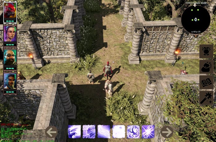
The very first adaptation of the main HUD to the touch interface.”

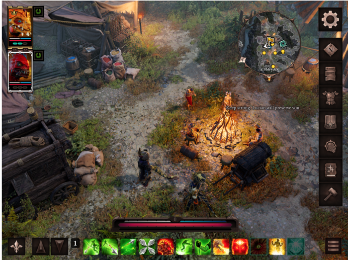
The second iteration looked better, and for some time we thought that this would be the final version.
Combat System Adaptations
Adapting the combat system to the iPad was a challenge for a couple of reasons. Firstly, because the game wasn’t previously ported to any touch device, no successful precedent had been set, meaning we had to start from square one on this. Secondly, there was practically no example on the App Store that we managed to find – and we really tried. We went through at least 10 games of different complexity purchased on our iPads, and none was close enough.
So in the end we started to make our own Super Combat System For Touch Screen. Of course, we failed to produce something perfect the first or the second time - there was always going to be at least one flaw.
Initially, you were able to cast spells by double tapping everywhere. We had been testing this system for a couple of months, and people had divided into groups – one group liked it and didn’t seem to have any problems with it, while we got complaints from the second group. There were misclicks, undesired behaviour, and it looked like you had to be an experienced touch interface ninja, which we don’t expect our potential players to be. The combat system had to be reliable enough. We broke up the problem into three parts, and every one had to be addressed:
а) Misclicks
b) Precision
c) Awareness
Whatever we tried to solve the misclick problem, nothing was ever quite able to crack it. For some spells that have a huge target area, double tapping worked quite well - however for pixel-precise spells, this was obviously not going to be the case. We wanted a player to feel involved in the game process as much as possible, and pushing a button doesn’t always give you that. But what if the button was a very special, beautiful one that you really, really want to push? Thus, we redesigned some UI elements to make this feel as intuitive as possible on the iPad.
The idea of solving the precision problem came to us when one of our team edited some text on the iPad, and there was a small magnifying glass icon that magnified the piece of text that you’re selecting. Prototyping something similar took a couple of days – this was a magnifying glass that appears only when you’re casting spells. The prototype didn’t change much until the game's release. Most players liked it so we decided to keep it, but we did make it optional, in case someone feels super confident about their touch-screen aiming superpowers.
The awareness problem became obvious when we realized that it doesn’t matter how cool your targeting system is, it has to be clear. It may seem obvious for developers or experienced iPad players, but when we gave it to the world – nobody seemed to understand what was going on. Fortunately, this was easily solved by adding hints to the main HUD. This was another thing that went right.
Quick UI prototypes
Early in the R&D pipeline, we used Axure RP to build high-fidelity prototypes that we could then play back on the iPad. This way we could experience different design concepts in situ and get a sense of how an interface feels for the end user before progressing it to development. This rapid prototyping quickly became a game changer.
Some of the prototypes were very rudimentary in detail - quickly made, and little more than interactive wireframes - but they answered important questions about layout design, and how we could take DOS:2 and fit it comfortably into tablet form. Other prototypes were a lot more detailed, trying to emulate the game and the player experience as closely as possible so we could make decisions accordingly. These might take a few days to build, often going through different iterations as we fine tuned the details, discovered new constraints and even advanced ideas beyond our initial concepts.
The final result of the prototypes is that we could create this proof-of-concept with user interaction and have it tried and tested during the design stage. This created a clear brief when it came to programming the interface, and apart from any technical restrictions it reduced the number of iterations and amendments in later stages of development.

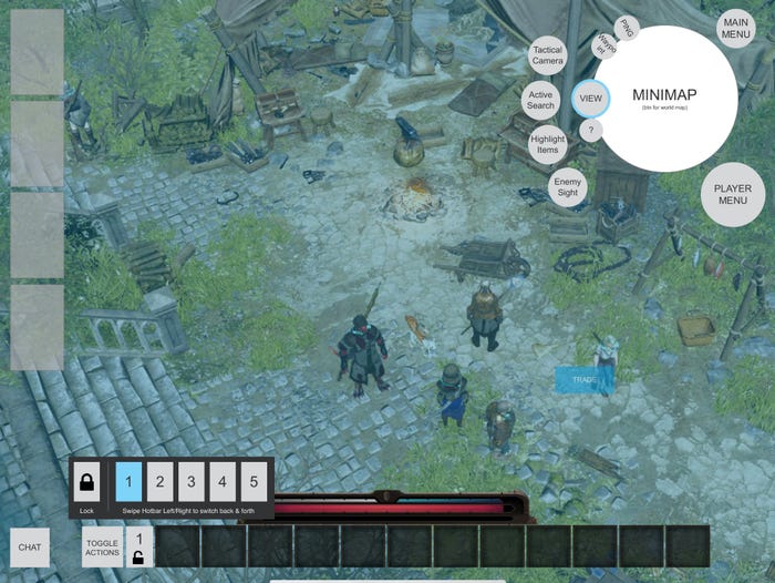
One of the prototypes we were satisfied with and put into action.

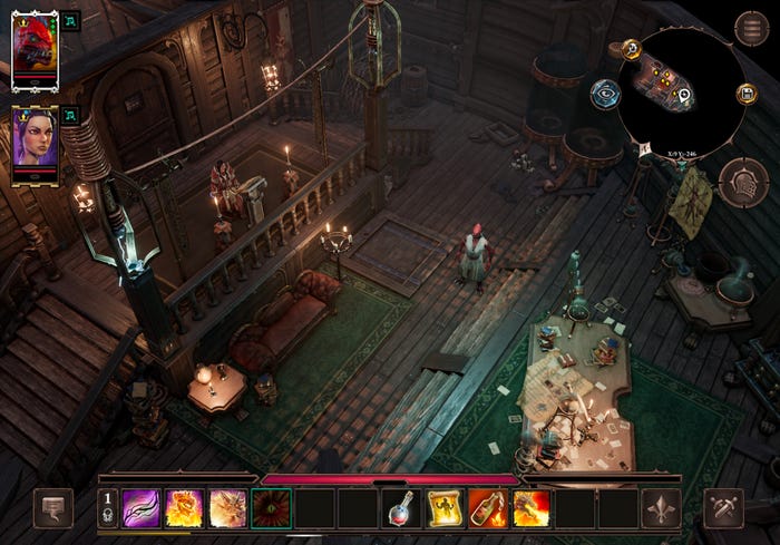
The Final version of the HUD
Delivering Fast Builds
Being spread across the globe, brings its own challenges, but thanks to our experience as a distributed team we were able to work on the game without missing a beat. We were working from different countries and timezones, so it was essential to get feedback as soon as possible. For this reason, we chose to use TestFlight. The ability for testers to provide screenshots, crashes and feedback was really invaluable. If we had to nitpick, we’d like the crash reporter to include a bit more information about the current game state when it crashes, but this was an essential, invaluable tool for us throughout the development of DOS2 on iOS.
Effective Optimization Decisions
Another huge win for us came from the usage of NEON acceleration and HALF types, both in shaders and in C++ code. HALF type is a wonderful thing on iOS devices, it essentially ‘halfs’ your memory requirements from typical float4 16 bytes to just 8. But this comes at a price, a complex mathematical price which developers should take care of. You need to understand the limitations of half type - it can ‘explode’ your code if it’s not done right. In GPU the usage of half is even better - it reduces the register pressure and allows fragment shaders to execute faster. Sometimes clever usage of HALF can increase the speed of the shader almost twice.
NEON acceleration was added for matrices and vectors, and this gave a solid boost, especially for Physics and Clothing. The original game used PhysX as physics engine and most of the accelerated mathematics was done using SSE2 or AVX. Of course we could just use reference ‘C’ code but we decided to port SSE2 routines to NEON - this was not very hard but allowed us to gain solid benefits when calculating clothes.
We also went far into optimizing the game using the compiler itself. The CPU performance was pretty good right from the start but we used almost all the arsenal of CLANG - fast-math, aggressive optimizations for some parts of the code (Flash internal interpreter f.ex), Link Time Optimizer. Even the executable size was optimized by hiding symbols and stripping all the unnecessary code.
What went wrong
Playtesting should have started earlier
In hindsight, we probably should have carried out playtests much earlier than we did. We found that experienced users, or indeed developers, could adapt easily to the systems and UI elements that we used. But as soon as playtesting began, we found that players who were not as familiar with the platform were consistently pointing out flaws in our combat interaction system which weren’t obvious for us. Getting the game in front of the intended audience in a quicker fashion would have allowed us to react faster to this feedback.
We didn’t have a total picture of all possible hardware combinations
Because the iOS ecosystem is closed, we had the impression that if we tested the game with a standard set of accessories like headphones or keyboards, we covered all our bases. This was wrong. When the game was released, we realized just how much of a misstep that was. For example, having a controller and bluetooth headphones connected at the same time caused the game to freeze completely, and you had to restart the game from scratch. This is something that you can easily miss even when you’re doing all kinds of checks, but thankfully we caught it post-launch.
It also quickly became clear that sometimes the game behaved differently depending on what mode you’re in – touch, keyboard or controller. For example, we found some font sizes were changed depending on which mode you were using. So while it was fine in touch, it’d be clipped in keyboard or controller mode. That’s not ideal, as we want the experience to be as consistent as possible across all the various permutations of hardware employed with iOS.
Version control
Looking back at the UI adaptation process, there is one message We’d give ourselves if we were able to travel back in time – please, please, use a version control system for the UI code. You see, for historical reasons, the UI script was embedded in .fla files, and when you change a substantial amount of code before trying it out on iPad it is natural to produce bugs that you’ll see when it’s too late. I can’t imagine how many hours we spent fixing these. Most of those bugs would’ve been found just by looking at the code differences using any CVS, so that’s a definite lesson we’ve learned there. A robust version control system saves a lot of wasted development time.
Not embracing touch controls soon enough.
Our initial assumption was that the touch interface would just be a way to telegraph a ‘hidden mouse’ into the game. We spent quite some time in the code imitating the mouse, and at the end we still do a lot of this, but after some time we really started to embrace touch in a more holistic way. Giving it a whole new level of support with fingers, gestures, etc made the game flow better and more intuitively for the player. We really should have done it right from the start, but thankfully it’s a lesson we learned in time to really give the touch screen interface the attention it deserved.
Defaulting to a blunt use of half types early on
The ‘blunt’ usage of ‘half’ type instead of float on the early prototyping stages of the game was not a good idea. This caused bugs that echoed back to the end of the game. In the end we wrote special wrappers just to catch precision caused issues. Remember we wrote about being careful with ‘half’ type - that’s exactly the truth - this type can fire back at you, if not done correctly.
Conclusion
With our small team working on the iOS version for nearly 2 years, there were a lot of technical hurdles to overcome when it came to getting DOS2 to run the way we wanted it to on iPad. the elements we discussed above hopefully give a good account of how we managed to overcome these.
There’s still work to be done, and we’re of course still looking to improve and optimise the game even further, but after the game came out to such a good reception, we’re very pleased with the results of this development.
Read more about:
game-developer-launchYou May Also Like