How Shedworks refined the art of Sable in pursuit of readabilityHow Shedworks refined the art of Sable in pursuit of readability
"Having light and shadows helps players figure out where they sit on a surface, and where other objects sit on the surface in relation to them."

You shouldn't judge a book by its cover, but it's difficult to do anything but when glancing at Sable.
Shedworks' open-world adventure immediately catches the eye thanks to an alluring low-poly 2D aesthetic that incorporates smatterings of French cartoonist Moebius, acclaimed Studio Ghibli movies, and architects like Carlo Scarpa.
As explained by Sable creative director Gregorios Kythreotis at GDC 2022, however, the game's unique style was as much a product of the team's limitations as their ambition.
For instance, Kythreotis explained how the game's now-iconic dune sea was largely born out of necessity. Shedworks was a small team, and they knew they had douse themselves with a healthy dose of realism to avoid scope creep.
"One of the key reasons the game is set in a desert is because we knew we couldn't make a really detailed open world at this scale," said Kythreotis. "The game is about 10km by 10km in size. The desert could have probably been something like an ocean, but anything more dense would have been challenging for us.
"We always thought of the dunes as a seascape and the locations that players would visit as islands of content. This really provided a focus for development because we could hone in on specific locations and allow the spaces in between to breathe a little bit. They also act as points of interest for the player in a world that could be really disorienting."
It's a fine line
Although the team's primary focus when it came to Sable's visuals was creating something they personally liked, they also knew they had to be able to effectively execute on that style.
Shedworks had to unearth a style that's quick to produce, quick to iterate on, and visually consistent -- while also standing out. After a bit of exploration, Kythreotis said the team realized they could leverage and push 2D visuals with a fair amount of success. Committing to that aesthetic, though, created new problems.
"One big issue with making a flat shaded world with characters and backgrounds is reading depth in 3D space," said Kythreotis. "It's already a really big issue to overcome in 3D games in general, because you're flattening a 3D environment into a 2D plane."
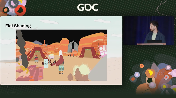
Shading and detail can help solve those issues, but because Sable utilizes flat shading the team already had less tools at their disposal. The solution, then, was to build scenes using a layered approach by adding lighting, fog, and lines.
"This is the initial flat shading without post processing (shown below). And the first thing we add is lighting. Lighting is really important to readability and depth," continues Kythreotis. "Having light and shadows helps players figure out where they sit on a surface, and where other objects sit on the surface in relation to them. Actually, that was the big motivation behind adding a shadow to the moonlight. We needed players to be casting shadows as often as possible to make sure they were readable on the surface."

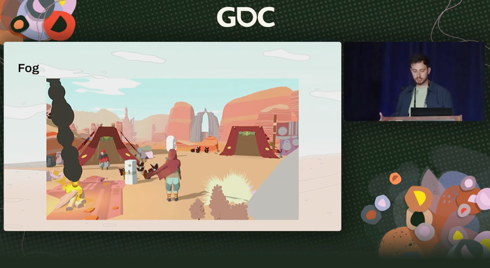
The team then added what Kythreotis describes as "distant fog." According to the creative director, that element was "really, really key" to improving the readability of mid-to-long distances.
"[Fog] was something we added fairly early on and it solved a bunch of problems for us. It definitely had the biggest impact overall. We were able to customise this per biome and environment to add variety and change tone, and it also provides the framework for our day-night cycle," he continued.

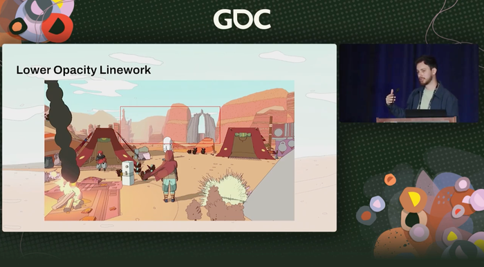
Outlines are another crucial part of Sable's art style, but according to Kythreotis they're also a "really useful tool" for adding depth to the world. He said they bring a sense of perspective and scale as vistas melt into the distance, and can also be used to add variety and texture to the digital space.
"Some environments might have these gridded lines that provide this perspectival focuses as well as overlapping and underlapping in nice ways," said Kythreotis "So we needed to have both texturing and object placement in the environment to support this, and again create a more readable 3D environment for players."
Those outlines were accentuated with the addition of "fading opacity," which essentially means they gradually fade out as they become more distant. Kythreotis explained it's a technique that serves multiple purposes: to emphasize the perspectival lines in-game and better disguise objects as they fade in.
"We have a game where we're rendering stuff quite far away and we need that to work. This helps us disguise objects as they fade in. At one point we didn't use this technique and objects would just pop in -- which was ugly and a real problem."
Ultimately, then, by embracing their limitations and striving to understand the scope of the project ahead of them, Shedworks succeeded in creating an aesthetic that worked for them on a technical level and also captured the hearts and minds of players.

Read more about:
FeaturesAbout the Author
You May Also Like

