Trending
Opinion: How will Project 2025 impact game developers?
The Heritage Foundation's manifesto for the possible next administration could do great harm to many, including large portions of the game development community.
While labor intensive, the process added a sense of dynamism to each scene by using techniques typically reserved for 3D.

Game Developer Deep Dives are an ongoing series with the goal of shedding light on specific design, art, or technical features within a video game in order to show how seemingly simple, fundamental design decisions aren’t really that simple at all.
Earlier installments cover topics such as the memory-altering mechanics of adventure game RE:CALL, the appeal of distorting the nostalgic and familiar for the sake of terrifying your audience with Choo Choo Charles developer Gavin Eisenbeisz, and teaching the player to find the beat through environmental cues in Melatonin.
In this edition, Danny Weinbaum of Eastshade Studios walks us through how the 2D art of Songs of Glimmerwick was informed by a 3D art pipeline and what that looked like in practice.
I’m Danny Weinbaum, founder of Eastshade Studios, and technical director (among other things) of Songs of Glimmerwick, a story-driven witch academy RPG where magic is cast through music.
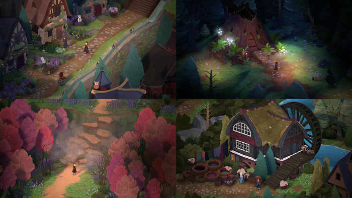
Songs of Glimmerwick is a huge visual departure from our previous title Eastshade, and kind of an oddball in its rendering style and art pipeline. The game looks like one massive illustration of creative director and lead artist Jaclyn Ciezadlo’s (at least that’s the goal!), but the world borrows a lot of methods from 3D art in how it’s constructed. It took over a year of trial and error before we came to this mix of workflows, but what we’ve settled on offers us a really nice mix of benefits from the 3D way of doing things, while maintaining the artisanal magic of Jaclyn’s illustrations. It also happens to yield a unique look and feel to the game.
Most "props" in the world are individual illustrations from Jaclyn (I suppose they could be called sprites), mapped onto planes or single "quads." Our camera looks down at 30 degrees. The planes are rotated 30 degrees back so they are perpendicular to the camera (in hindsight I wish I’d kept everything upright but simply scaled everything vertically to 1.43x so it looked correct from the camera). Each prop also has a plane beneath it floating above the ground, to act as a sort of soft contact shadow. The contact shadow really helps ground the props.
We then have a directional light sun, which casts fully real-time shadows. Because much of the world is planes, the sun has to be situated at a certain angle; casting side-long shadows will not work, as the planes have no thickness. The shaders have no directional shading at all, and only respond to the overall color and luminance of the light or a cast shadow.
Our workflow for props isn’t particularly unusual. It’s all fairly normal 2D-in-a-3D engine stuff, maybe with only the added 3D trick of real-time cast shadows.
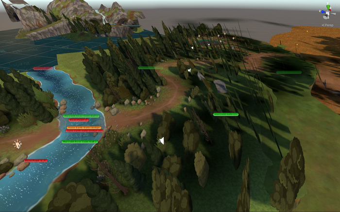
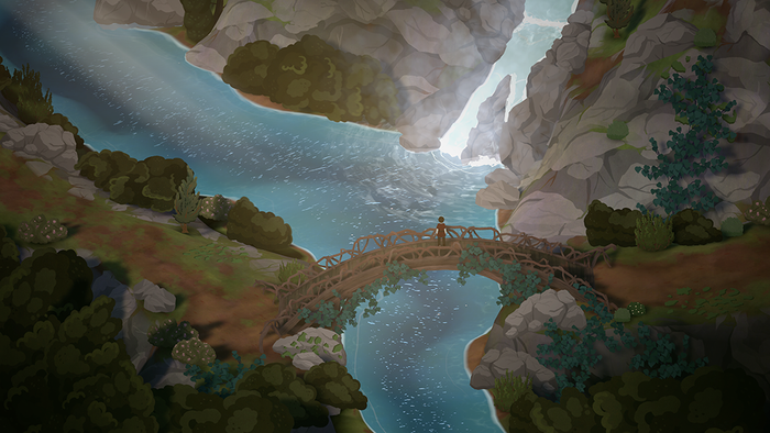
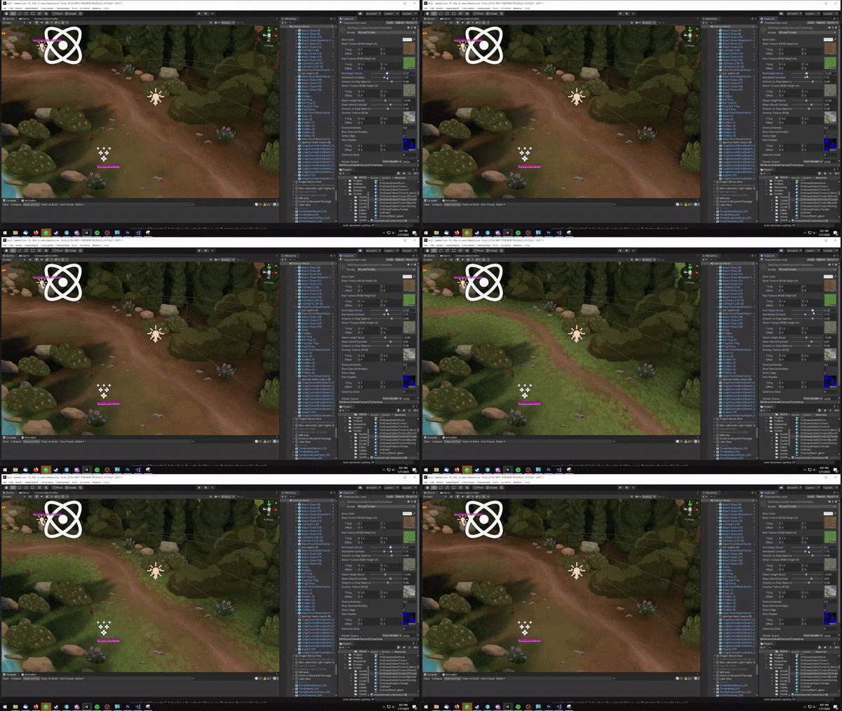
The terrain is where we really start to cross over into 3D workflows. Our terrain is a regular full 3D mesh with vertex splatting between textures. Doing this allows us to build a world with mountains, canyons, terraces, and elevation changes. It pushes the feeling of the spaces toward a more natural feeling, rather than the “gaminess” that can sometimes come with fully 2D worlds.
This is almost the exact approach we used on Eastshade, except with a simpler shader: with only diffuse and sans any directional shading. Even the shader program for importance/height mixing is the same, pulled directly from the terrain shader I wrote for Eastshade.
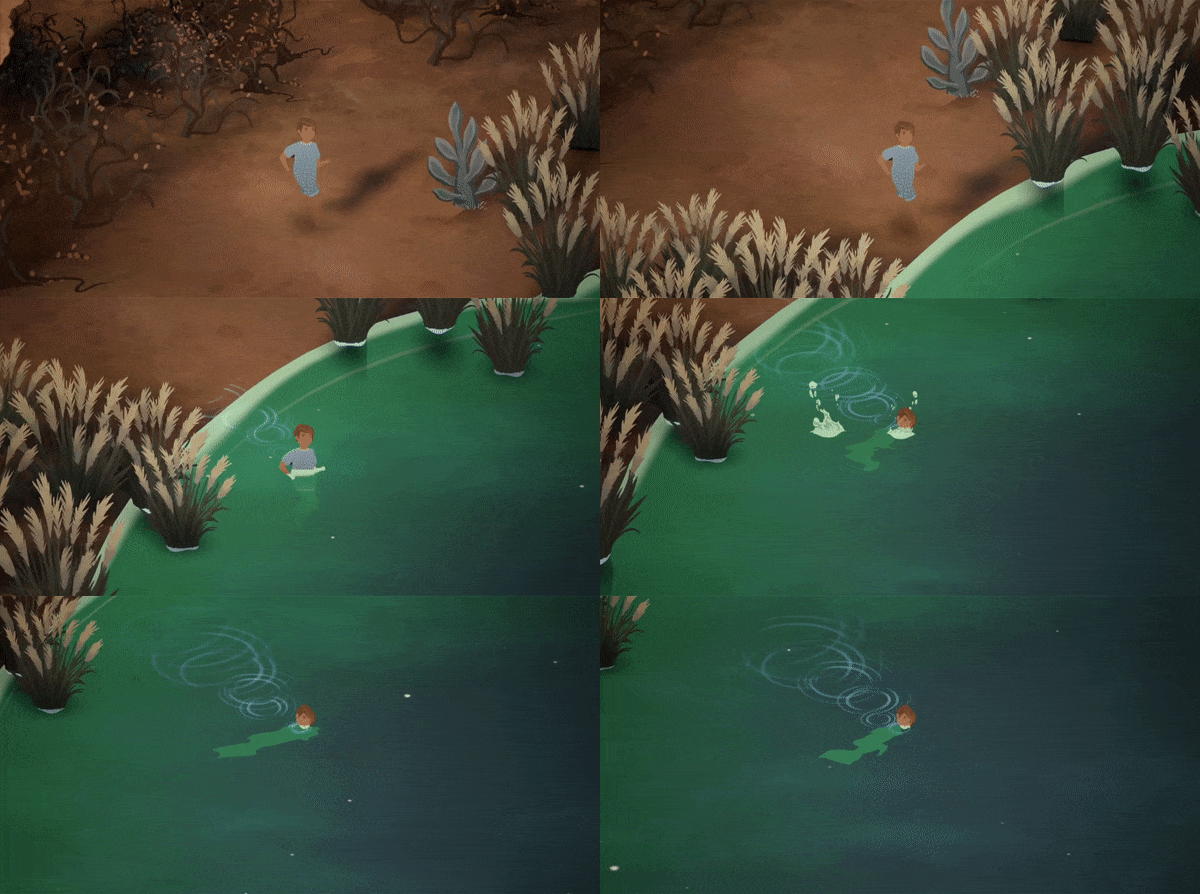
Another advantage to fully-3D meshes for terrain is that we can do things like the avatar running into the water:
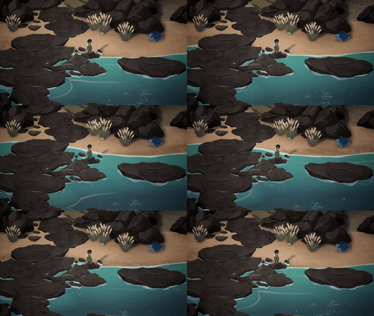
Or the shore waves rising and falling on the beach:
While the props and smaller objects are mostly sprites on planes, the larger objects use an approach I call “projection.” Jaclyn draws the entire building as one illustration, then I model a low poly mesh which is roughly the shape of the building. I then project the UVs from the exact angle of the player camera, so that Jaclyn’s illustration maps onto this low poly mesh as a texture.
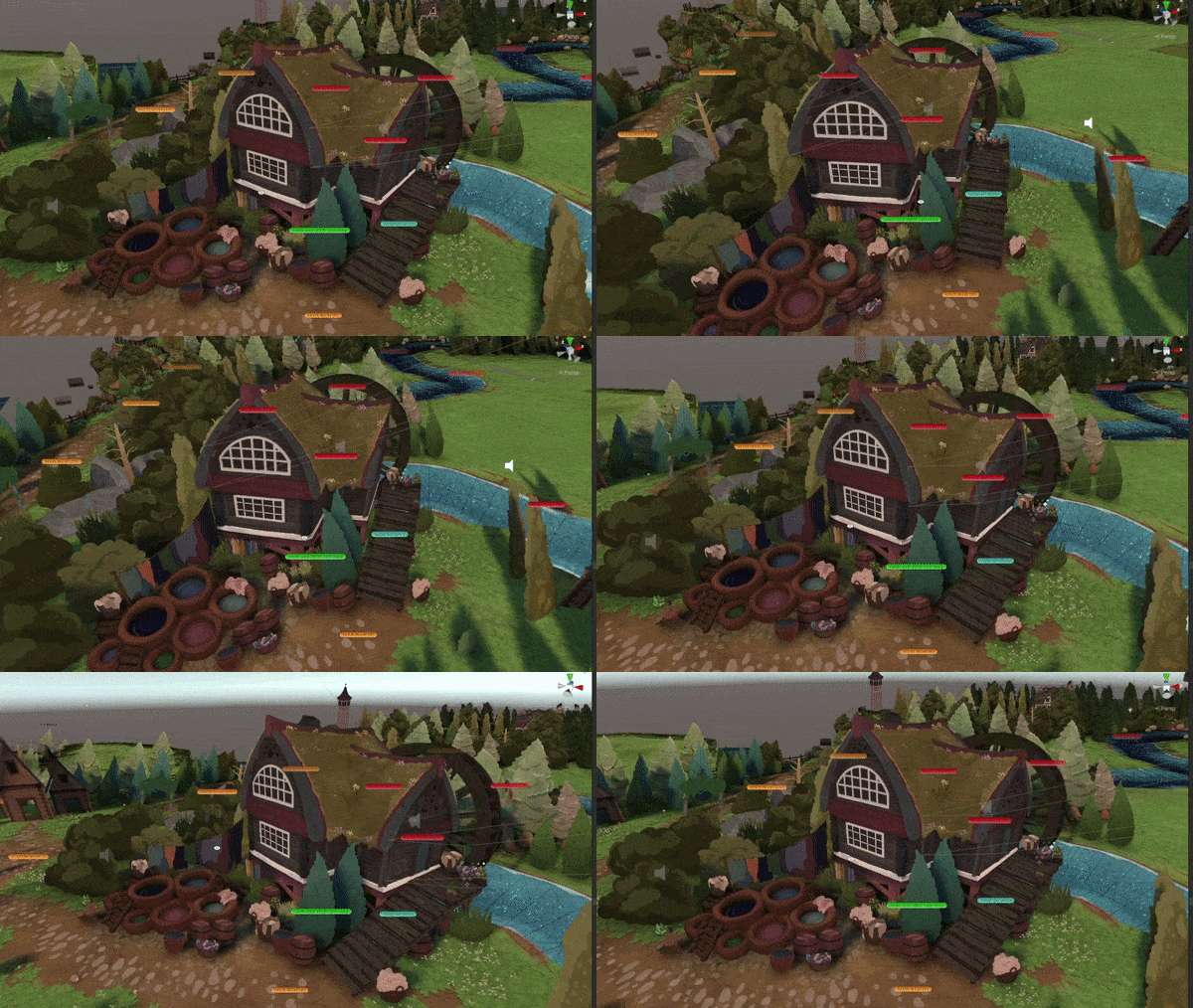
Jaclyn draws her buildings at arbitrary angles, with irregular shapes, and sometimes even with twisted perspectives (for example, shapes that are simply not possible in actual 3D space). I tend to just keep looking through the camera, modifying by small bits, and then reprojecting from the view every few seconds as I go. It took some time for me to learn which shapes are better left unrepresented in the mesh, and which parts of the building need to be separated onto a different island on the texture.
Because our game camera has such a tight field of view, and is so far away from the subjects, the effects of perspective are subtle, which makes the projection process extremely forgiving as far as how the texture maps to the mesh. The important part is that the projection meets the ground, otherwise the trick will give itself away when the player runs near the building (the bottom of the building will be floating higher than it should, and it will become apparent when the player stands next to it).
The advantages of having the buildings projected:
Players and NPCs can move around the buildings, and all the depth and collision will be correct.
There are never any corners that appear to be “floating” off the ground when the player gets near them.
The real-time cast shadows are more accurate, with the base of the shadow meeting the base of the building.
There is subtle parallax that adds depth, especially around the rooftops which tend to reach into the foreground.
Managing depth becomes much more straightforward (it can get hairy in true 2D isometric, especially when buildings are large and irregular).
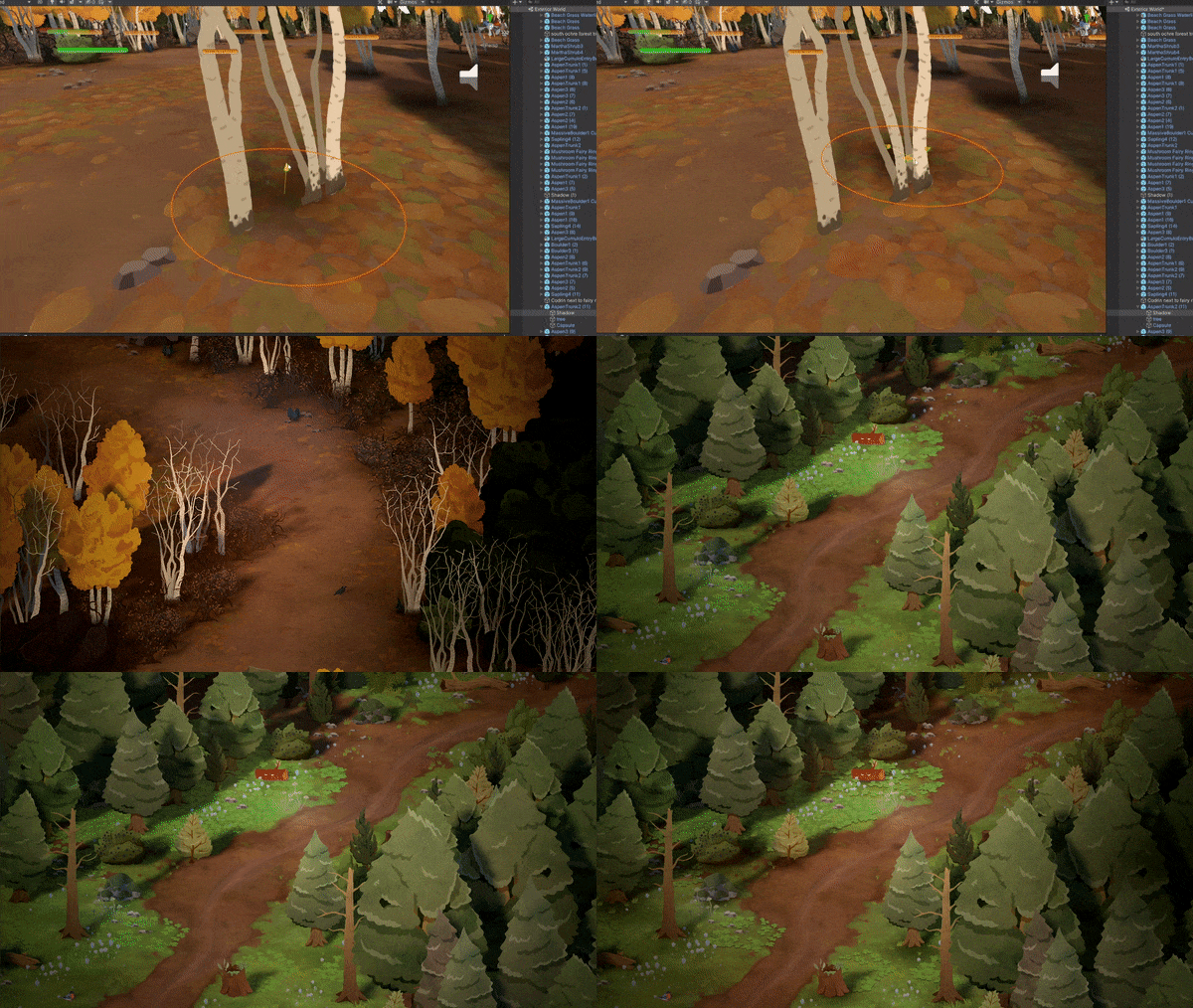
Sometimes we need objects to be fully modeled as 3D meshes. The following animations would be nearly impossible to pull off in a strictly 2D world. See if you can spot which thing in the .GIFs below had to be fully 3D modeled:
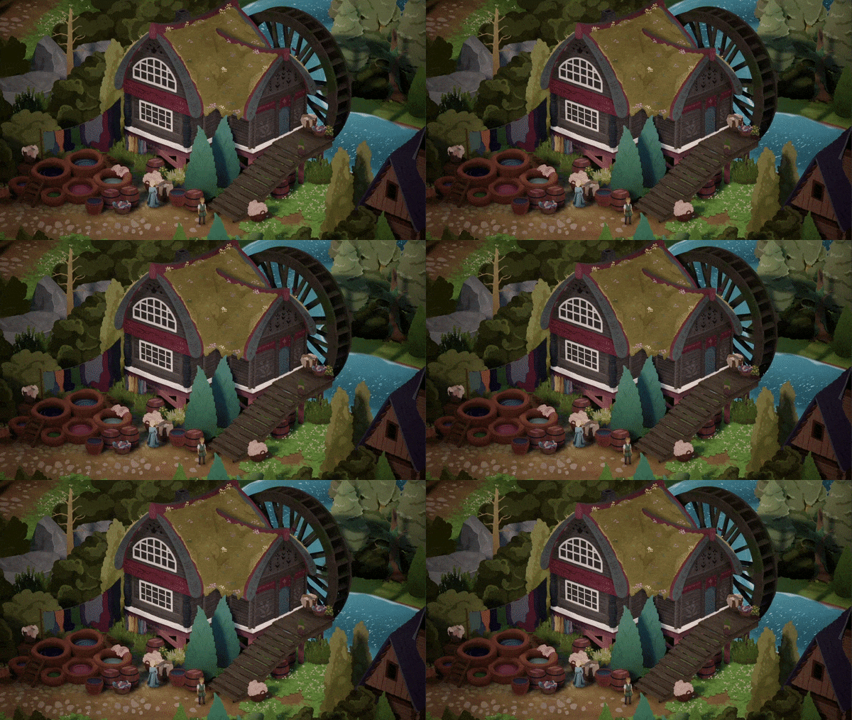
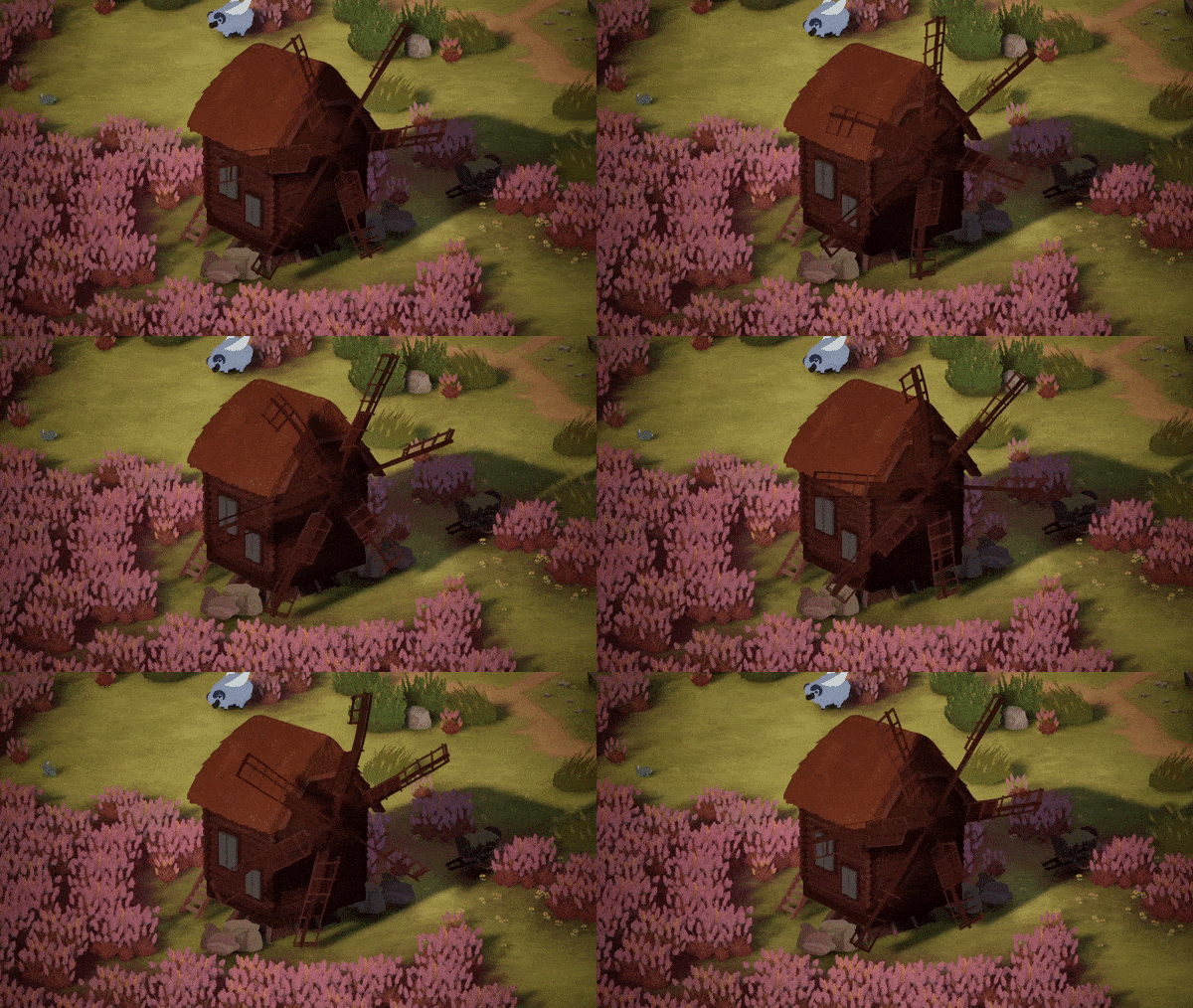
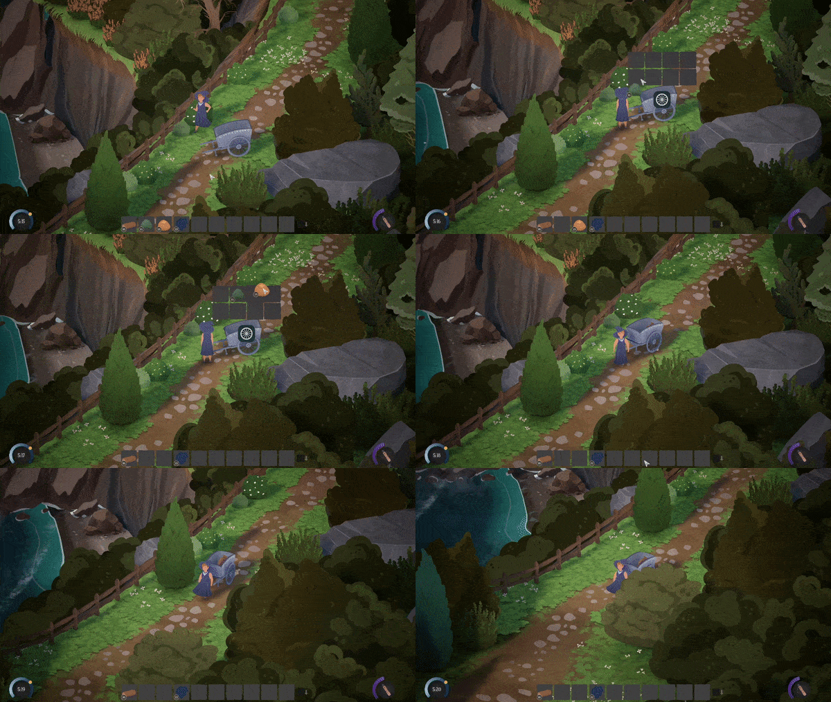
Another weird one is birds. We have two kinds of birds: fully 2D ones that are animated with skeletal animation like our other critters, but also fully 3D birds which are basically used as silhouettes in the sky. It would be really hard to pull off the arbitrary directions of a flock of birds without 3D birds, and I found they mixed with the backgrounds beautifully, once I simplified their texture and mesh enough.
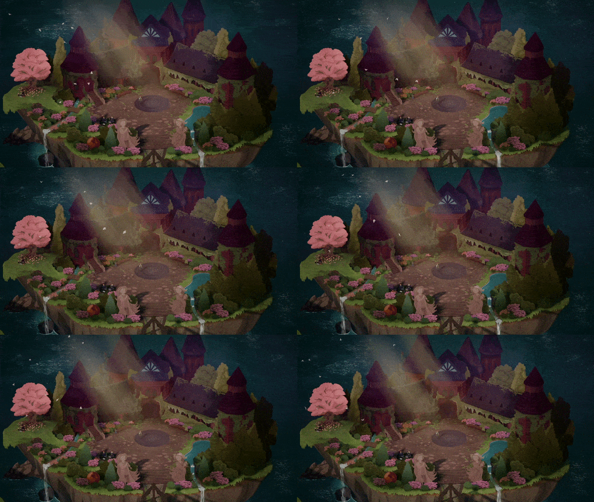
Of all the mixed workflows we use, our interiors might be the most mixed. For small interiors, our projection process is straightforward. Jaclyn draws the room, then I project onto a low poly 3D mesh just like our building exteriors.
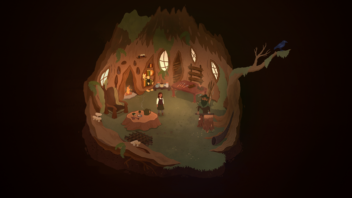
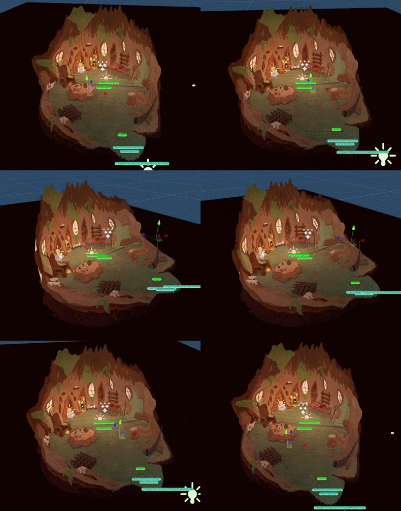
For larger interiors, however, like the library below, given that the player can zoom in whenever they wish, the texture resolution required would just be too huge to hold up. We could do a massive single texture, but then it would be a memory burden, or a loading/unloading burden, or an install size burden, or even a repository burden during development. It would also be a burden for Jaclyn to detail such a large image by hand. This is where tiling textures come in. Some parts of the interior are illustrations, and some parts are modeled and textured in 3D.
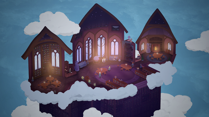
Typically, Jaclyn will concept the entire room as one image, then I will go in and model the parts required with mesh, using her concept as a reference. This is typically the floors and large walls. During this process, I break apart her illustration onto a texture atlas, which I then use to project all the different parts of the interior. Once I’m done, Jaclyn goes into the texture atlas and does a final pass on detailing all the different parts of her original concept I pulled.
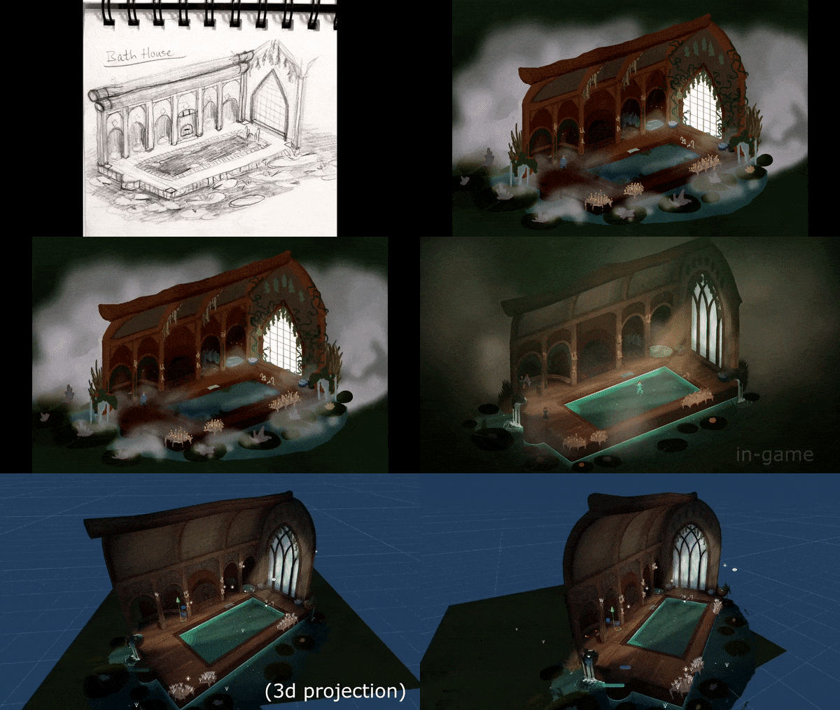
There are benefits and drawbacks to this process. The main drawback is that it is incredibly labor-intensive compared to some methods of creating interiors, especially when compared with 2D tilesets. But the benefits are that our interiors look unique and hand-drawn, and use shapes that simply could never be achieved with a tileset. Some might say we will be more limited in how many interiors we can create because of this workflow. That’s true. We mitigate that particular pitfall with the genius solution of… spending way more money and production time. But it does help our game stand apart.
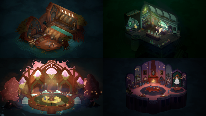
It’s been a blast taking on the development of a more novel art pipeline for Songs of Glimmerwick, compared to Eastshade, where largely the strategy and methods were pulled more from my background in triple-A working on high fidelity 3D titles. I feel like we’ve learned so much, and have managed to build something I can say looks truly novel. Jaclyn’s art style is distinct and identifiable, and the rendering and technical look of our game is too, especially in motion, and I’m really proud of that.
You May Also Like