Trending
Opinion: How will Project 2025 impact game developers?
The Heritage Foundation's manifesto for the possible next administration could do great harm to many, including large portions of the game development community.

Featured Blog | This community-written post highlights the best of what the game industry has to offer. Read more like it on the Game Developer Blogs or learn how to Submit Your Own Blog Post
In late 2012, ROBLOX launched one of the first iOS gaming apps to feature user-generated content front and center. How does user-generated content translate to the mobile space? This article explains how we made it work and what we could have done better.


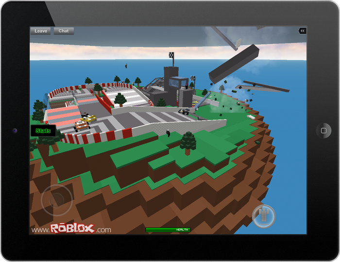
ROBLOX Mobile Running on iPad
One of ROBLOX’s goals is to empower users – to create anything they can imagine with a complex, but accessible building kit, share what they create with millions via a cloud of gaming servers, and even participate in a game-development democracy that increasingly favors indie studios and one-man shops. In December of 2012, we added a new power to the list: the ability to create something once and publish it to both desktop and mobile devices.While mobile has cemented itself as a gaming platform, “going mobile” wasn’t a decision ROBLOX made without risk. Not only was ROBLOX Mobile one of the first iOS gaming apps to feature user-generated content front and center, its development also demanded a significant fraction of our company’s resources. Developers from across ROBLOX – including members of the rendering, physics, client, content, QA, operations and web teams – rallied to complete and launch a high-quality mobile app based on an extensive desktop product under a self-imposed holiday-season deadline.
ROBLOX Mobile, however, has been a net win for both our users and ROBLOX as a company since launch. But getting to that point wasn’t without challenges and, in hindsight, things we would prioritize differently if given a second chance.
We aligned people from all across the company behind ROBLOX Mobile. We didn’t treat the app as a “port” of a product, but an entirely new piece of software that should have, at the very least, the same level of quality as our desktop product (the tight, unified user experience even raised the bar for our desktop products). This required people from all parts of the company – including members of our rendering, physics, client, content, QA, operations and web teams – to come together between August and November, and focus on assembling the pieces of a high-quality app.
We started by leveraging each team’s existing strengths. For instance, our web team developed custom mobile pages for game and virtual item discovery, and leveraged its shift toward a Model-View-Controller (MVC) framework to create mobile-friendly versions of ROBLOX pages without rewriting the base code. Our physics and rendering teams leveraged ROBLOX’s existing distributed physics engine and platform-independent OpenGL-based rendering engine, respectively, for consistent look and behavior between platforms.

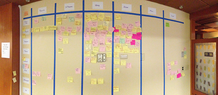
ROBLOX's Wall of iOS Tasks
Every day, the mobile development team congregated for a SCRUM meeting. We gathered around a wall plastered with sticky notes – in hindsight, a timelapse photo would have been a great way of illustrating how much was accomplished – and moved each individual task from phase to phase until it hit completion. While this was a great way of visualizing the amount of work completed and left to do, it more importantly helped everyone on the team band together.
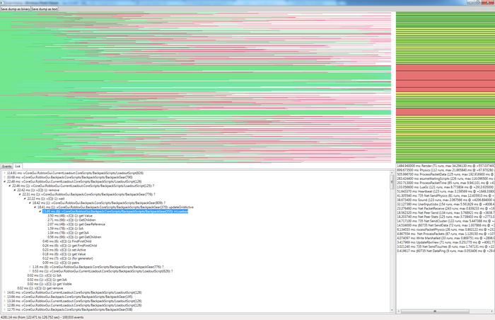
We profiled our source code to enable gameplay on mobile hardware. Our client team scoured ROBLOX’s source code to hunt for performance spikes by building a game mode that recorded player actions and sent them to a diagnostic tool. Using the tool, we were able to analyze what happened in each render frame and drill into the code that caused spikes. This is what our tool looks like:

ROBLOX Code Profiling Tool Screenshot
It is primitive, but functional. The top-right section of the window shows the render frame durations. In this sample, performance was generally good (green frames are approximately 30 FPS), but it dropped in several places. The bottom-right section shows the individual tasks that ran during the currently selected time range. In the selected time range, 100,000 events were logged across four seconds of gameplay – roughly 780 events per frame. While rendering took the most time, the delay in red frames is more likely attributed to ProcessPacketData (this task reads packets from the networking stream and decodes them into objects in the game world) and ResumeWaitingScripts (this task runs Lua scripts), based on the “max” field. Changing the time range to include just the red (slow) frames confirmed this.
The top-left section is a general picture, with each color representing a different thread of execution. We use several threads on ROBLOX Mobile – most of our rendering code runs in parallel with most of our physics/networking code and occasionally some other tasks (e.g., content processing). The length of each line represents event activity. From this graph we can tell how the load is distributed between threads.
The bottom-left section either shows the actual log stream (all events in the time range with event data, such as part name for rendering, property value for part updates, etc.) or the Lua-profiling information that is extracted from these events.
In this sample, all the script executions in the selected time frame are visible. We were drilling down to identify a bottleneck — i.e., why one execution of the LoadoutScript, which is in charge of updating the GUI for a player’s inventory, took 30 milliseconds. The main culprit was inLoadout, which took 15.95 milliseconds to execute six times. The task was so expensive because it traversed a large hierarchy of objects attributed to the player to find out whether “X” object was their inventory. This traversal was implemented in Lua code, but all property accesses (i.e., getting the children list) went through a Lua/C++ interop. With some reorganization, we replaced this with a significantly cheaper Lua table find.

Feather
We developed new technology that not only benefited mobile performance, but desktop quality as well. In addition to improving ROBLOX’s existing code, we built new features to improve gameplay quality.ROBLOX levels are constructed out of primitives known as “bricks,” similar to a physical construction toy. One of the most powerful developments was “featherweight parts” – an optimization that reduced the memory consumption of a ROBLOX brick to a fraction of its original demand. The first iteration of featherweight parts allowed us to bring user-created levels with 10,000+ bricks, which would have previously only run well on the desktop, to ROBLOX Mobile.
Rather than store every piece of data for each similar part individually, with featherweight parts we group shared data in a “dictionary.” For instance, if there are 100 of the same blue, non-moving bricks in a ROBLOX level, we store all shared information – for example, “material,” “color,” “transparency,” “reflectance,” “AlphaModifier,” “locked” and “name” – in one piece of memory. Each part draws on that piece of memory and carries its own coordinate frame and unique ID. As long as there are two or more parts with the same combination of the seven required properties, a dictionary entry is created for them.
Another part of the featherweight parts optimization was being more aggressive about batching rendering tasks. While we have historically been conservative about batch-rendering parts (because ROBLOX runs a comprehensive physics simulation, meaning any single part in a larger structure can move at any moment), we observed that static parts – the bricks that make up environments, for example – don’t change often. With featherweight parts we moved toward batching parts into larger groups. An object consisting of 1,000 parts can be rendered with one command to the GPU.
If any one of those 1,000 parts does happen to move, the object separates into smaller batches of parts – with a maximum of 80 – to streamline the transition and potential for massive simultaneous movement. This used to be a slow process with a significant performance spike, but we rewrote rendering code to it about 10x faster.
We built ROBLOX Mobile with cross-platform play as a priority. From day one of development, we were set on making Mac, PC and mobile users all populate the same, shared servers. This upsets the balance of gameplay in some cases – it’s almost always harder to play games that leverage keyboard/mouse input on mobile – but we want our users to be able to develop once and distribute anywhere, including mobile. ROBLOX’s core is digital building (whereas a fraction are power users who take build and program interactive games), and virtual worlds lend themselves much more naturally to sharing across platforms. You don’t necessarily need keyboard/mouse input and precision aiming to “play” them.
We accomplished cross-platform play by being less rigid in the lifecycle management of different versions of ROBLOX. Previously, we required that PC and Mac players have the absolute latest version of our game client in order to play online. (The update is an automatic part of launching the desktop client, making it relatively simple to manage.) However, running through the iTunes App Store throws a wrench in that operation: we’re at the mercy of Apple’s approval process, which has a variable turnaround time.
To solve this issue, we allow different – but substantially similar – versions of the ROBLOX client to play together. ROBLOX Mobile players may be slightly behind on occasion, but with every second or third update to the app we force players to update.
We tackled the hardest UI problems first. Almost all playable content available on ROBLOX is created by users, meaning there is a huge variety of designs and no one-size-fits-all solution to displaying them on mobile devices. For instance, some content creators add buttons to their games that, on mobile, are rendered beneath the virtual joystick for character movement. Any touch in that area registers as character movement, making the buttons impossible to interact with.
There was nothing reasonable we could do to avoid that sort of problem. However, we approached the ROBLOX Mobile UI with the goal of minimizing such issues by making it as unobtrusive as possible and adaptable to iOS devices of all sizes. We were partly inspired by Steam, which allows users to press Shift + F8 to bring up a complete but transparent overlay, and Windows 8, which has a consistent, quality look across multiple platforms.
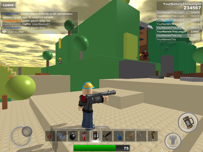
First, we added transparency to our old, “heavier” UI. If something doesn’t need to be addressed at that very moment, it doesn’t need to block part of the screen. If a player chooses to leave a ROBLOX game, we show an opaque menu because the player must choose whether to stay or leave. On the other hand, the player list always displays and transparency keeps it from fully obstructing a player’s view of a level. Second, we were selective about showing and hiding elements based on iPad, iPhone or iPod touch. We developed one extensible UI and avoided bifurcation by making sure we could show/hide elements based on the device.

ROBLOX Mobile UI Prototype
We kept character controls to a bare minimum. There’s a virtual joystick, which activates when a player touches within an area that is 33% of each screen dimension in the lower left-hand corner, then moves with their finger until the touch is ended. A jump button is situated on the opposite side of the screen.
We could not support the iPod touch 4th Generation or the original iPad. Between the fourth and fifth generations of the iPod touch and the first and second generations of the iPad, the memory budget doubled (from 256mb to 512mb). We heavily optimized ROBLOX’s memory footprint by developing featherweight parts – one of the successes of ROBLOX Mobile’s creation – and lightening the resource requirements of everything from the UI to character and material textures. While this enabled gameplay on mobile devices with 512mb of RAM, we weren’t able to pack quality ROBLOX gameplay into a device with only 256mb available.
Ultimately, this frustrated a respectable number of users – both those who downloaded the app and discovered they couldn’t participate in mobile gameplay (roughly 9% of ROBLOX Mobile users are on an iPod touch 4th Generation), and those would-be players who skipped the app altogether. Many of our negative reviews on the iTunes App Store stem directly from users who only have access to an original iPad or iPod touch 4th Generation.
The lesson here is to be very clear about what devices a game supports and warn players in-app if their device is not capable of supporting crucial features.
We don't block games that require more memory than a given mobile device has. ROBLOX users can create virtual worlds with tens – even hundreds – of thousands of parts. While our development of ROBLOX Mobile helped us extend the maximum part limit for mobile play to more than 10,000 parts, there are still many user creations that require too much memory to run on even the latest mobile devices. ROBLOX Mobile does not filter out user-created worlds and games with massive numbers of parts, meaning players can see and launch into games that quickly cause the app to crash. We tried to avoid this problem by curating a list of games that are mobile-friendly, but each user has his or her desktop favorites – and they found them on ROBLOX Mobile.
We’re working on improving our game sort so mobile-friendly games naturally rise to the top of the millions of available levels, and warning users before entering games that are known to cause crashes. However, this problem has already frustrated many players since the app launch and also contributed to negative reviews.
We added crash analytics data late to the game. Whether a crash was caused by excessive memory consumption or a bug, we didn’t know – at least not on the date of the official app launch.
To illustrate just how wrong of a “wrong” this was, we added detailed crash analytics a couple months after ROBLOX Mobile’s official launch. The crash information we receive is a combination of the stack trace from the crash and the ROBLOX logs that describe what the user was doing at the time. After analyzing crash information, we found that roughly 60% of all post-launch crashes were caused by one bug: a threading issue that occurred when players tried to chat into a text box. We were reading the chat data from the text box in an inappropriate thread; fixing the bug took about five minutes of engineering time and drastically reduced crashes.
We could have guaranteed a much improved player experience by implementing proper crash analytics on the front end.
We haven’t made enough virtual items available for direct sale through ROBLOX Mobile. Since the launch of ROBLOX Mobile, we have released a total of seven iOS-exclusive items to the ROBLOX catalog of virtual goods – character adornments and gear that can be purchased using virtual currency. Unlike standard virtual items, these iOS exclusives can be purchased directly via iTunes. This method of sales removes the requirement that players first purchase virtual currency, making the end results – buying an item – a much simpler task.

iOS Exclusives
They have been highly successful in-app purchases – players love to show that they have virtual goods others don’t. The Apple-approval process applies to these items, making it a much greater sales effort than a standard virtual item, and we should have gone into the app launch with a more comprehensive plan for releasing a regular stream of iOS virtual goods.
We waited until 2012 to release a high-quality ROBLOX Mobile app. For years, we’ve had an iOS app available in the iTunes App Store, but it didn’t facilitate gameplay and didn’t represent the quality and vision of the ROBLOX desktop experience. Aligning the company behind building ROBLOX Mobile allowed us to ship a product quickly, but mobile wasn’t “new” at the end of 2012
In spite of the things that went wrong, ROBLOX Mobile has been successful. In the month of launch (December, 2012), we had 82,000 players log more than 10 sessions and 220,000 players log more than five sessions. We also saw the app downloaded more than 100,000 times during launch month, which was enough to get us to the middle section of the top 200 apps in the Games section. We now have a total of roughly 1 million installs and have logged roughly 24 million play sessions, and a mobile development team continuing to improve the app quality.
Data Box
Developer: ROBLOX
Number of Developers: 8 (full-time), 10 (part-time)
Length of Development: 4 months
Release Date: December 12, 2012
Platform: iPad, iPhone, iPod touch
Read more about:
Featured BlogsYou May Also Like