Trending
Opinion: How will Project 2025 impact game developers?
The Heritage Foundation's manifesto for the possible next administration could do great harm to many, including large portions of the game development community.

Featured Blog | This community-written post highlights the best of what the game industry has to offer. Read more like it on the Game Developer Blogs or learn how to Submit Your Own Blog Post
In this post from his blog "Psychotic Pspeaks", Psychotic Psoftware's Mike Hanson outlines some of the entry level thought processes for creating good, simple collision detection in a 2D SHMUP.
http://psychoticpsoftware.blogspot.co.uk

When I started Power Up, one of the scariest aspects of it was collision detection. I was only too aware that as a fairly fast paced shooter, any problems with collision would particularly damage the game.
As mentioned in earlier posts, everything I had made proviously, I had made in Director and was exported as Shockwave files or little Windows .exes. With collision, Director allowed me to essentially just use a mask of the image in question as collision. Basically, when two sets of pixels intersected they would act accordingly. (I click the box... Director does the rest. Nice). It took me a few games to figure this out though so at first I was limited to basic box collision. Having experienced that first hand, I really know how non-ideal it is.
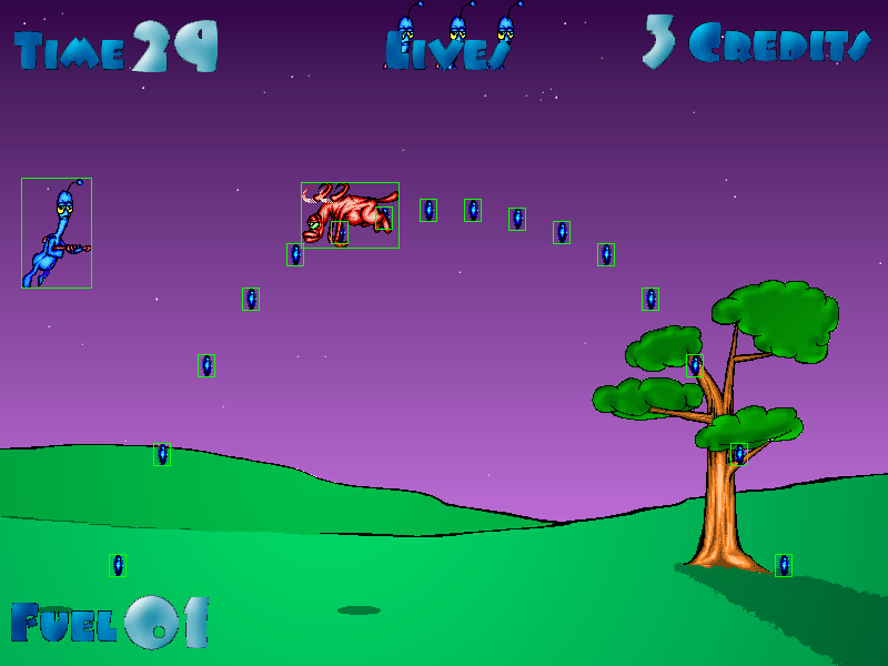
(Basic Box-Collision Nightmares!! These sprites from my first self-made game, "Diz" (circa: 1998-99) were a lesson in character design for bad box collision!)
Box collision is basically just that. A big bounding box which surrounds the image and dictates whether or not it collided with something. Sounds fairly simple and effective eh. Well it is certianly simple... and that's really the problem.
From my point of view, with simple bounding box collision you've got your pros and cons. Pro: It's simple, dealing with 4 points and the straight lines between them. This, I'm told (by real programmers), makes it easier on the processor. Cons: if the sprite is not a perfect square/rectangle, there's bound to be some empty space in the image that acts like it collided. (usually the corners).
This is a biggie! While I could accept my early games looking ropey in the collision department, I needed to find an alternative.
---
Recently, a much better suggestion was made. "Bitmap masking". This is basically the same as what Director offered all those years ago. Trouble is, XNA has no "masking on" button for your sprites and I must have missed the tutorial. Now I have half a game with far too many baddies comitted to it for me to just bulldose through them all completely changing the collision type... I've got to learn it first too. All of that would heavily effect my estimated release of "Early-2013" which I've already pushed back, cramming all that needs to be done between now and then.
Nope. The sensible thing to do first was to look at the code I was already using, to become much more familiar with it and to figure out if/where it was perhaps a little more versatile than I first assumed it would be.
Without boring you with code snippets, I found it was actually quite versatile. By applying a little of what I'd recently learned about c#/xna syntax, I was able to make a few generalised adjustments to the collision rectangles.
Originally, the collision rectangles were set to the width and height of the sprite in question, placing their hot-spot at 0,0 (their top left) or at the centre of the sprite. (depending on what messes I'd previously left while learning).
What we currently had was box-collision around the edges of all the sprites. The usual corner-collision problems would ensue unless I thought of something...
Basic Box-Collision (mock-up): See how the boxes surround the whole image, and in some cases, the whole animation? Just look at all that horrible, collideable empty space.
Basically, by consistently placing the centre of the rectangle at the centre of the sprite (width/2, height/2), I could then reduce the rectangle somewhat. Whether this was to pull say, 10 pixels off the height and 20 pixels off the width, or to apply something like (width/3*2, height/3*2) to get a rectangle that was two thirds the width and height of the ship, I was able to adjust and play around with the size of the rectangle until it played right!
So now I could manipulate the size of the collision rectangles for pretty much everything in the game. How could I use that to make cheap collision feel well, a little less cheap?
---
Basically, the last thing I wanted was a bad review because the player suffered a cheap death through a collision with a transparent corner of a baddie's rectangle. Regardless of how many baddies and bullets I throw at the player... regardless of how many hits said baddies require to kill and how fast and accurate said bullets fly... regardless of all the balance issues that will hopefully start out fairly easy with practice, becomming more difficult until things are suitably challenging for those hellish final levels... despite all that, the collision must be FAIR. If I can't get it to be fair because of its rectangular limitations then it must always go IN THE PLAYER'S FAVOUR!
Now, I know a few people are expecting something particularly ground breaking here, but it's not. Bearing in mind that this is my first go at xna and having done some basic Shockwave game coding previously, I'm basically just applying a little latteral thought to the processes, this is how I'm doing it.
*As the player, your collision remains INSIDE your ship.
*The collision for your enemies remains INSIDE their ships.
*The collision fir their bullets goes INSIDE them (though these are pretty small and probably don't need as much attention, so scratch that).
*The collision for your bullets stays OUTSIDE like a bounding box. (Making nice big collision areas. If in doubt, make it connect with that baddie!)
*And as for pickups, OUTSIDE. We want those nice beneficial things to be as pick-uppable as possible.
there, looks fair to me.
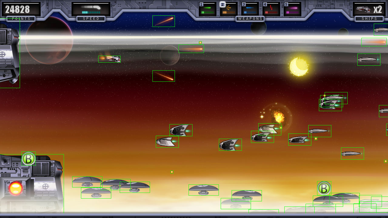
Modified Box-Collision (Mock-Up): with a simple general 2/3rds reduction, collision detection becomes much tighter and at little to no extra cost. Notice that boxes for player projectiles, pickups and small enemy bullets remain their original size.
So, here we have a situation in which the player should very rarely, if ever, actually collide with an enemy's empty corner and die. If anything, the player will always be given a couple of pixels' grace with which to fend off a few close calls. Because of the adjustments to the player collision and the small size of the enemy bullets, the same applies with those. Should the player ever die, it should only be from a definite case of head on collision or a clear contact with a projectile. In theory (and so far, in practice), collision with an enemy or bullet should never be in dispute.
However, applying wide collision to your own bullets gives you a generous advantage. If collision is ever in contention, it will only be slight and always to the player's advantage.
All that with the simplest, cheapest kind of collision type available.
Now, I might find that the Xbox 360 (or whatever we're playing on by the time this gets out) can handle the ammount of sprites I'm churning out alongside all the projectiles, explosions, audio and of course, accounting for my not particularly well optimised first go at game coding. If that is the case, I'll pour a lot more time into much more technically impressive collision types in my next games.
As far as Power Up is concerned, this is all work-in-progress. Some of it is implemented, some of it is a bit rough around the edges. Later, I'm planning to put some extra time into getting this collision type as close to spot on as I can, but that's all for nearer to submission. At the moment, the main thing is that the concept works. Unless it stops working I'll see it through throughout the project.
Again, thanks for taking the time to read my blog. See you in the next one...
Read more about:
Featured BlogsYou May Also Like