Trending
Opinion: How will Project 2025 impact game developers?
The Heritage Foundation's manifesto for the possible next administration could do great harm to many, including large portions of the game development community.
What if Minesweeper...was good?
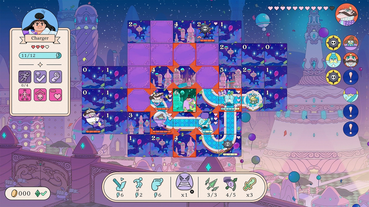
Game Developer Deep Dives are an ongoing series with the goal of shedding light on specific design, art, or technical features within a video game in order to show how seemingly simple, fundamental design decisions aren’t really that simple at all.
Earlier installments cover topics such as educating players on the potential of renewable energy with Green New Deal Simulator, how the writers of Coffee Talk Episode 2: Hibiscus & Butterfly transformed their DLC plans into a full-fleshed game, and mastering minimalism and layering complexity with the strategy game Thronefall.
In this edition, Michael Highland, creative director at commercial animation studio BUCK, and Ian Sundstrom, gameplay engineer and lead designer, walk us through the journey their team took through the tedious process of shipping their first commercial game, a take on Minesweeper called Let's! Revolution!.
Hi, we are Michael Highland, creative director at the animation studio BUCK, and Ian Sundstrom, gameplay engineer and lead designer. At the start of 2022, a small team of four dedicated game developers was given a year to finish a commercially viable game at BUCK. If we failed, the future of making games at this global creative company was uncertain at best.
You may not have heard of BUCK, the reigning heavyweight in commercial animation and design, but you have most certainly seen our work. The games team at BUCK operates much like an indie studio, collaborating with artists, animators, and designers borrowed from BUCK’s core business of providing creative services to prominent clients like Apple, Meta, AirBnB, and Riot Games, as well as contributing visual direction and animation to major IPs like Love Death + Robots and Spider-Man: Across the Spider-Verse. While BUCK has an illustrious 20-plus-year track record of animation and design, shipping an original game had eluded the company.
Spoiler alert: We did finally ship our first game on July 19, a rogue-lite puzzle mashup that combines the rules of Minesweeper with turn-based tactics called Let’s! Revolution! This postmortem will give you an insider's look into the prototyping of that game, a two-month-long process during which we transformed a small initial idea into a raw but complete representation of the finished game’s main mechanics. A game which, as one reviewer cheekily put it, finally answers the question, “What if Minesweeper was good?”
Of course, we didn’t intend to “fix” Minesweeper (many would say it’s perfect as is), but we did succeed in making the satisfaction of Minesweeper less punishing and more approachable to non-logicians. Along the way, we faced a number of interesting design challenges as we iteratively discovered a combination of mechanics with a surprisingly rich possibility space. By staying focused and making disciplined incremental improvements, we ultimately achieved our goal of finishing a game within a year.
Let’s! Revolution! began with an open question: “What if we applied the rules of Minesweeper to a path?” We wanted to probe this question before writing any code. In the past, we would have used a physical paper prototype for this, but with our team working remotely, we turned to the next best thing, a digital whiteboard app. We borrowed pathway artwork from this comprehensive guide to Wang Tiles (a resource that would prove very useful as we eventually got into procedurally generating our mazes) and used emojis for placeholder art.
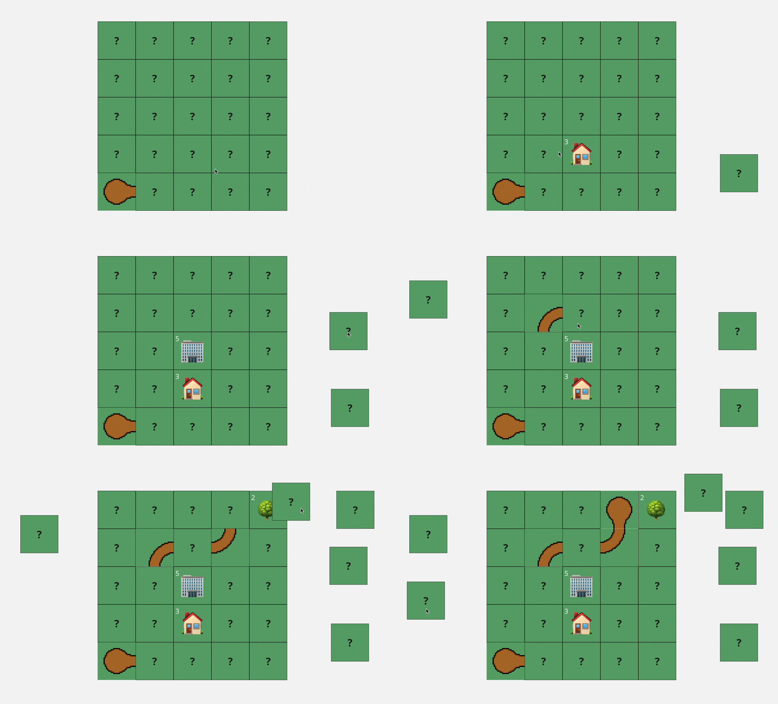
Testing Minesweeper paths in the digital whiteboard app Miro.
For the initial test, one of us hand-placed road and scenery tiles into a grid and then hid them with a second layer of blank tiles, leaving just one terminus of the road visible. A “player” could then join the whiteboard session and remove this overlay layer piece by piece to reveal the tiles below. The goal of the game (if you could call it that) was to locate the other end of the road in as few moves as possible.
Our initial test included the idea of higher numbers being associated with more densely populated locations. It made sense that tiles bordered by more roads would be more developed, whereas tiles without roads nearby would be more like wilderness. This concept persisted through development and can be seen in the final artwork for the game.


The original placeholder artwork and the game’s final tile art for the region Saffron.
It was obvious from our tests that the rules inherent to a grid-based path added an additional order of logic to the deductive reasoning of Minesweeper. Unlike Minesweeper, where you are locating discreet points, in our variation, it was possible to visualize where the path might go and how it must connect or be blocked off. While we were far from having anything close to a game, this combination of mechanics seemed promising enough to explore further. Over the next two months, we would go from this interesting seed of a game to an unrefined but mostly complete vision of the core mechanics for Let’s! Revolution!

Our very first, very simple Unity build.
End of the road
With 325 days left in the year, we finished our first Unity prototype on February 9, 2022. It was a close recreation of the Miro experience: a 5x5 grid of tiles with a procedurally generated path. One end of the path is revealed from the start, and the player must locate the other terminus while clicking to reveal as few tiles as possible. We quickly replaced the golf-style scoring with an energy mechanic, in which revealing tiles consumed energy, and introduced a fixed number of levels to clear. We also added a white rabbit emoji to the end of the path as a goal. We were now following the rabbit, like Alice, deeper and deeper into the maze. However superficial, this whiff of player fantasy helped set the stage for later world-building. It also provided us with a code name for the project: White Rabbit.
We now had a more clear win and loss condition. We modified the path generation to support branched pathways. Generating "pleasing" mazes was something we would continue to refine for months, but this basic version gave us paths with multiple dead-ends. In our February 11 build, we added collectibles (lightbulbs—another convenient emoji) that awarded five units of energy. The goal of the game evolved into finding the dead-end containing the exit, with the other dead-ends containing something beneficial. This wound up being a design we carried through to the final version.
In this build, the dead-end that contained the exit/rabbit was random, and it was possible to find the rabbit (and leave the level) before revealing all the dead ends. This created an interesting risk-reward tension as players weighed whether they believed they could reveal another collectible (worth five energy) in fewer than five turns.
We eventually reworked the placement of the level exit to always be on the final dead-end the player reveals, though we preserved the choice of when the player leaves the level after finding the exit. The white rabbit eventually became our wily, evil King, who flies to the next board each time you reveal his dead-end. Interestingly, players tend to assume the placement of the King is random and fixed rather than determined by which dead-end is revealed last. This sleight of hand ensures players don’t miss valuable gameplay on the other dead-ends.
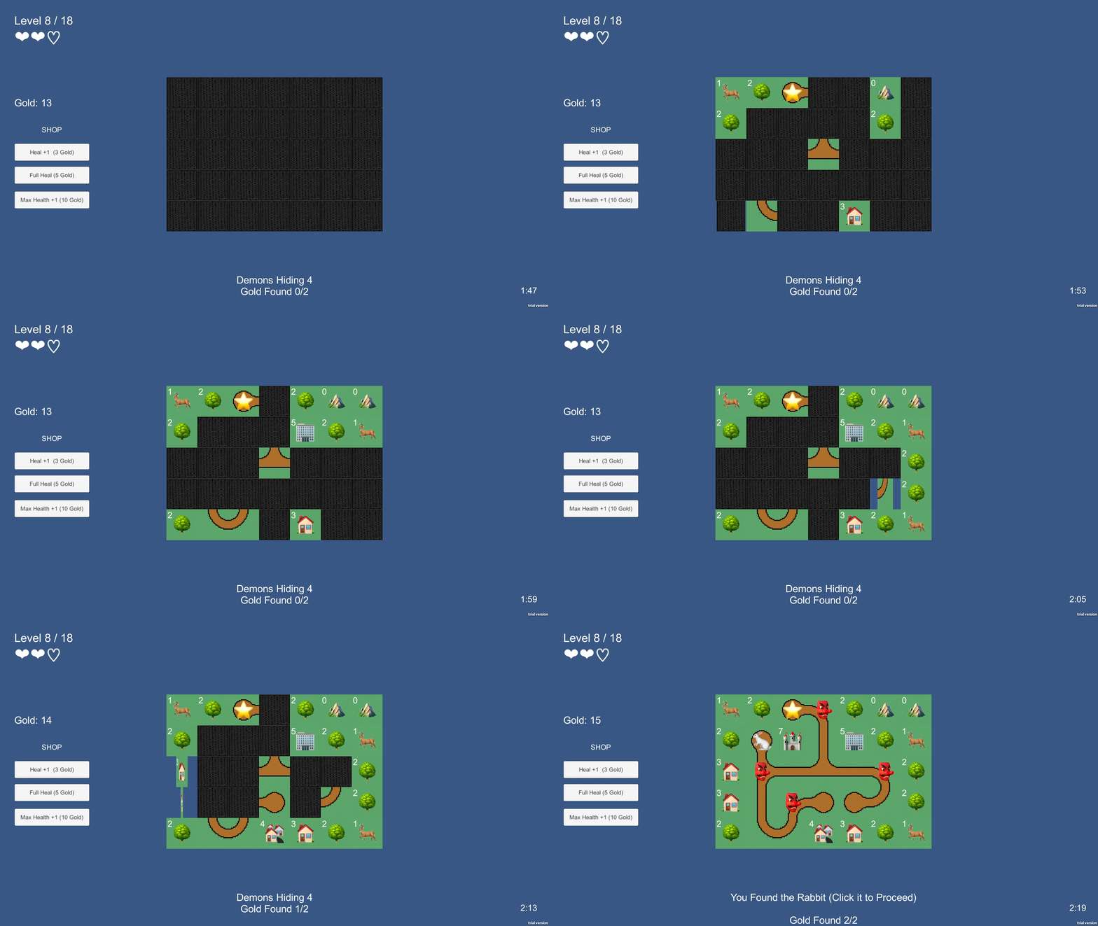
Trying not to reveal another demon in the Feb 16 build.
The maze gets deadly
The prototype was still far from fun. The slow attrition of energy as the player revealed tiles lacked drama. The optimal way to play was often to reveal a checkerboard pattern of tiles without much concern for whether or not the tile was a road. For our next iteration, we pivoted our concept of energy into health and added dangers (in the form of demons) to random road titles. Revealing a demon cost you one unit of health.
This change felt consistent with Minesweeper, with higher numbers indicating greater nearby danger. The big departure for our prototype was that not every road tile was occupied by a danger. Additionally, revealing a danger did not end your run immediately as it does in Minesweeper. This gave players the freedom to take calculated risks and follow their intuition about the underlying shape of the maze rather than always requiring they have perfect solutions. The softening of the danger mechanic also reduced the skill required to play, which we saw as an improvement.
We wanted to make a game that would appeal to a broad audience, including non-gamers, for several important reasons. First, we wanted individuals familiar with BUCK from our animation work to be able to enjoy the game, regardless of their gaming experience. Outside of our core team of seasoned game developers, BUCK staff have varying levels of game literacy, and we wanted to ensure that anyone who wound up working on the game wouldn’t be alienated by the game being too punishing.
The February 16 build included demons on the road, the new health mechanic, and the opportunity to spend gold to heal between levels. While we had addressed the languid pacing and lack of drama found in the previous version, we soon discovered there were board states where it was impossible to say which of the remaining tiles were safe to reveal, forcing the player to make a 50/50 guess. Stepping on a demon under these conditions felt decidedly unfair. It turns out blind guesses like this are an issue in Minesweeper as well (though some modern variations have ways of ensuring against it). We decided to eliminate, or at least reduce, the potential for blind guesses as they present players with a meaningless choice and an unpredictable outcome that undermines player agency and instills a sense that the game is random and can’t be mastered.
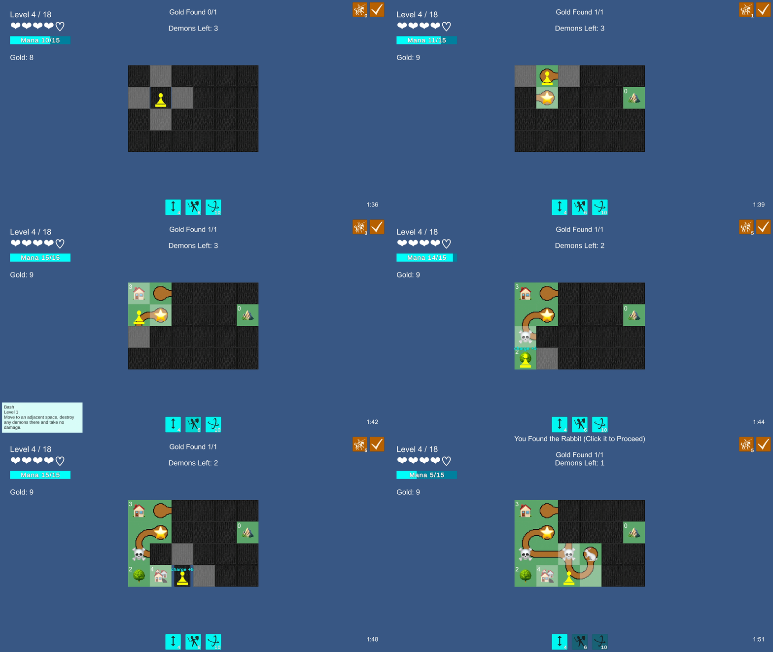
A literal pawn in the March 1 build.
Pawn takes demon
From the start, we had talked about the game in terms of being a physical space or a map-like representation of one, but we hadn’t made the leap to thinking about moving through the space as a character. Our previous game project (which we shelved at the end of 2019) had been for a 3D platformer with a dynamic real-time avatar. With the pains of that project still fresh in our minds, we aimed to make a pure puzzle game with mouse input and no visible player character to help avoid the avatar-related scope creep of our previous project.
In response to the issue of blind guessing, we began considering abilities the player could use to safely deal with dangers on the road. We also observed that the ability to click any tile (like in Minesweeper) undermined the feeling of the game as a physical space to explore. In retrospect, the solution seems obvious: we needed a hero! We hoped (and we were ultimately correct) that a turn-based 2D player character would be a relatively manageable undertaking.
For the next two weeks, we worked on adding a “pawn” to the board, and on March 1, we finished our next iteration of the prototype. The pawn could move to the four cardinally adjacent tiles. Moving to a hidden tile would reveal it. We brought back energy in the form of “Mana” and gave the player three abilities. Pathfinder could be used to reveal the direction to the closest dead end of a visible road tile; Bash allowed you to attack an adjacent tile and move onto it, and Spin Attack (which would eventually become Roundhouse) attacked and revealed all eight surrounding tiles. We also gave the player a way to gain Mana from revealing tiles via a passive ability called Charging, which provided additional motivation to explore the map. We also gave the player a gold bonus for defeating all enemies called All Clear. Remarkably, all five of these traits are still in the game.
We also moved the “shop” where players could recover health to be between levels as opposed to always available. This scarcity added more drama and became the blueprint for how shops would eventually appear in the game.
This build was our most significant breakthrough of the initial prototypes. Revealing tiles through movement worked wonderfully as a metaphor for exploration. Suddenly there was a whole new layer of interesting choices as players decided not only what tile to reveal next but how to get the pawn to the desired location while avoiding dangers. Though our programmer art had not changed, there was now a sense of being in the world and inklings of a strong player fantasy. Players could now use Bash or Spin Attack to destroy demons without taking any damage, which provided an antidote to blind guesses. We had the start of a decent game loop: reveal “safe” tiles to gain Mana, and use Mana-based abilities to destroy dangers on a tile (or tiles) you deduce to be the most dangerous.
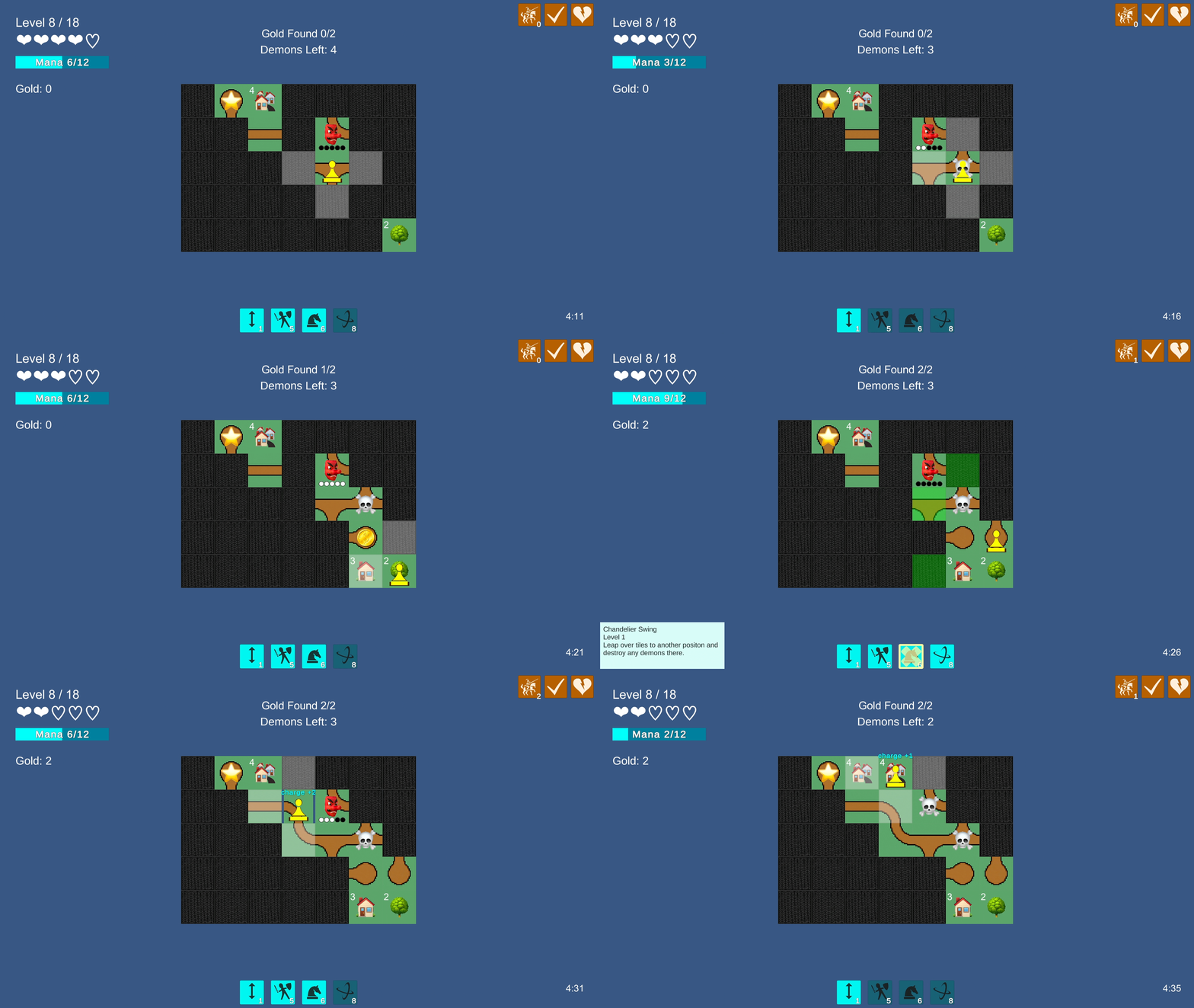
The first turn-based enemy appears.
Counter intuitions
At this stage, one of our biggest conceptual challenges emerged. When playtesting, we’d often see players just following the road, blithely stepping on demons as they went. In most games (and stories) you follow the path—and often, the road is safer than the “wilderness.” In this game, we were asking people to reason about the road while generally avoiding it. We found ourselves telling people to avoid the road, only to have them then avoid dead-ends as well.
It turns out that “find the dead-ends while avoiding the road” is not the most intuitive player goal. We considered alternatives such as dead ends always being guarded by an enemy or not counting dead ends as roads but ultimately decided to leave it unchanged. Though potentially confusing at first, once understood, this paradoxical player goal gives rise to a pleasing tension as players attempt to find the road’s dead-ends while revealing as few enemies along the road as possible.
When we finally got the game in front of real players, as opposed to BUCK staff, most of whom are not seasoned gamers, they had no issue with this concept. We were also helped by the eventual theme of the game, which revolves around overthrowing an evil, usurping King. The idea that the King’s colonial lackeys are limited to the road fits well with the theme of characters defending their home turf from outside subjugation. In this light, the road can be interpreted as a symbol of the King’s power, which ultimately leads the way for the player to confront him.
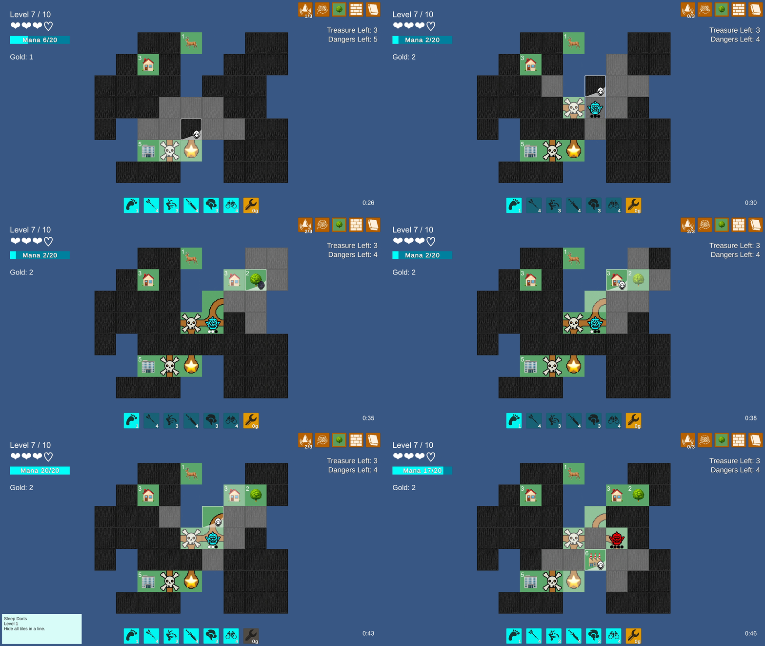
Dungeon crawling as the Rogue in the March 21 build.
Keeping it classy
Over the following weeks, we leaned heavily into building a layer of turn-based combat on top of the existing logic mechanics. Rather than have demons be destroyed when stepped on, we kept them on the map and gave them a turn-based attack clock. Players still lost 1 HP for stepping on a demon, but now there was the additional follow-up challenge of dealing with the demon before it attacked you again after X turns. Unlike in Hoplite or Into the Breach (which quickly became two of our big inspirations for the turn-based combat), enemies in Let’s! Revolution! attack regardless of the player’s position, effectively giving them infinite range. Initially, this was the easiest way to implement enemy attacks, and it stuck. We found it helped keep players focused on the turn-based timing of the enemies rather than trying to avoid attacks with positioning.
By March 21, we had added two more playable classes to the game with their own combinations of unique abilities. Once again, leaning on convention for efficiency and legibility's sake, we made the Rogue and the Wizard to compliment our original combat-centric abilities, which we bundled as the Warrior. With the Rogue, we added the ability to hide with Smoke Bombs, Blowdarts, and Cartwheels. The Wizard class was more information-based and, in some ways, felt the most like the original pre-combat prototype. We wanted each class to have a very distinct feeling playstyle and optimal strategy, almost as though you were playing a different game using the same base set of rules.
This came in part from giving each class a unique source of Mana. Where Warrior gained Mana from revealing tiles, the Rogue started with full Mana each level and could spend gold to refill Mana—with the cost increasing each time—giving each board more of a heist feel where you need to get in and out as efficiently as possible and buy your way out of sticky situations.
It was fun seeing how the basic mechanics of revealing and hiding tiles and searching for the exit could be reimagined in novel ways. For instance, we gave the Rogue abilities that didn’t advance the turn; we called these “Free Actions,” and they let the player create John-Wick-esque sequences where they impossibly avoided damage while taking down multiple enemies.
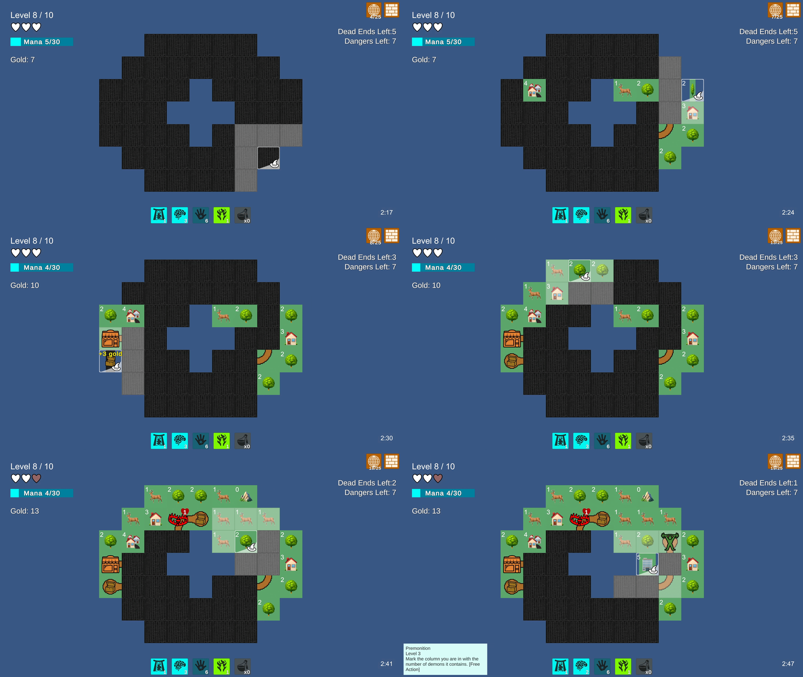
The Alpha build, which inspired the visual and narrative direction for the game. A playable version of the prototype is available our official site.
Proc and roll
To create more variability in the levels, we introduced new enemy types with variations in HP and the length of their attack clock. We added support for non-uniform maps with missing tiles to make navigation more think-y. The map generation and enemy placement algorithms are by far the most complex parts of the game. If you don’t care how this part of the sausage is made, feel free to choose your own adventure and skip to the next section.
Both algorithms use a mix of brute force computation and intelligent detection of failed conditions with early outs. The map generation begins by filling the board with a “perfect” maze; that is, a grid-based maze in which every tile is connected and there are no loops.

Perfect maze generation via http://www.cr31.co.uk.
For our game, we didn’t want every tile to be covered by road, so after generating a perfect maze, the algorithm prunes back the dead-ends until the target percentage of road tiles is met. There are additional conditions that must be met for a maze to be “pleasing,” such as dead-ends not being too close, as this would lead to a cheap feeling gameplay experience of finding one dead-end right after the other.
The enemy algorithm went through additional iterations after this initial phase to support variations in difficulty. The full game has both an easy mode with fewer and weaker enemies as well as five levels of higher difficulty. We assigned each enemy in the game a “challenge rating” based on its health, rate of attack, and other attributes, such as whether it self-destructs or begins the level revealed.
For any given level, at any given difficulty, we calculate a target average challenge rating, as well as a target saturation (i.e., what percentage of possible enemy tiles should be occupied). Using these values, we brute force thousands of possible combinations of enemies, dropping combinations that fail certain tests (such as the average challenge rating being too high) and weighting the combinations based on a number of positive factors like variations in the type of enemies.
Both the maze generation and enemy placement algorithms for an entire run of 10 levels are executed during a loading phase at the start, so while it’s a fair amount of computation to perform, it’s batched together and doesn’t feel out of place for a procedurally generated game. The only performance issues we had were on larger levels at very high difficulties where the number of possible enemy combinations balloons exponentially. Optimizations here helped remove “bad’ combinations earlier in the process and cut down on the number of cycles required to produce a pleasing result.
Leveling up
At this stage, we were starting to feel more confident we had the makings of a decent game. And it was apparent we were now making a proc-gen roguelike. While we had leaned heavily into convention for the classes and combat, mapping those conventions onto the core mechanics of tile flipping and deductive reasoning felt fresh. The main element missing was growth over the course of the run.
To remedy this, we pared down the starting traits for each class to a bare minimum and added the ability to acquire additional abilities and upgrade your existing ones. This first appeared as an interstitial element between levels where players were given a binary choice of what ability to buy or to upgrade. It quickly evolved into shops at dead-ends where players could spend gold. We were able to control the frequency of shops by mixing in other collectibles. The gold coins evolved into treasure chests, which would eventually contain gold or an occasional rare item.
By April 8, we had three shops: the Smith (where you could buy new abilities), the Gym (where you could upgrade existing abilities), and the Inn (where you could restore health and upgrade your health and Mana caps). We also introduced additional enemies with unique mechanics, a Manalith (which drained Mana instead of health) and a Cultist (who revealed other enemies instead of attacking). Both these enemies and the three shops would make it into the full game, though with different theming.
We also added some simple meta progression (technically taking us from rogue-like to lite) with the pool of abilities and the second and third classes getting progressively unlocked through a meta-currency also collected through treasure chests.
.png/?width=700&auto=webp&quality=80&disable=upscale)
The Alpha build, which inspired the visual and narrative direction for the game.
Plants vs. rabbits
During this period, our team was also prototyping a second game! And despite all the progress we’d rapidly made on White Rabbit, we were open to it not being “the one.” Our other prototype was a gardening simulation where the plants grow in real-time, codenamed Green Thumb. We intentionally made two very different games with the goal of seeing which one would resonate more with BUCK staff. We put both prototypes in front of teams of creatives from across BUCK’s four global offices in New York, Los Angeles, Sydney, and Amsterdam and asked them to brainstorm potential narrative and visual directions. One of the concepts generated for White Rabbit was by art director Emily Suvanvej. It was called Let’s! Revolution! Of all the ideas generated for both prototypes, it stood out, and the team soon aligned around it as the direction for the game’s story and visuals.
.png/?width=700&auto=webp&quality=80&disable=upscale)
The original one-slide pitch for the theme of Let’s! Revolution!
Beyond alpha
Over the following months, our focus shifted from defining the core mechanics to establishing our art style and pipeline and building our internal team from BUCK’s staff of artists, animators, and designers. Having the core mechanics finalized before starting this process helped us move quickly through pre-production. During this time, we also developed three more classes, for a total of six, each with a unique set of starting abilities. The total pool of items and abilities eventually swelled to around 100. Surprisingly, we kept nearly every ability we came up with. If we had more time, we might have made more and thrown more out, but tile logic and simple combat systems proved to be a rich and inspiring possibility space. The three original classes, Warrior, Rogue, and Wizard, were themed as the Charger, Shadow, and Oracle but retained many of their original abilities and gameplay feel.
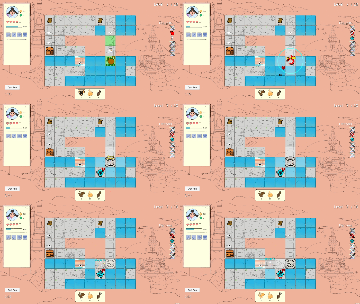
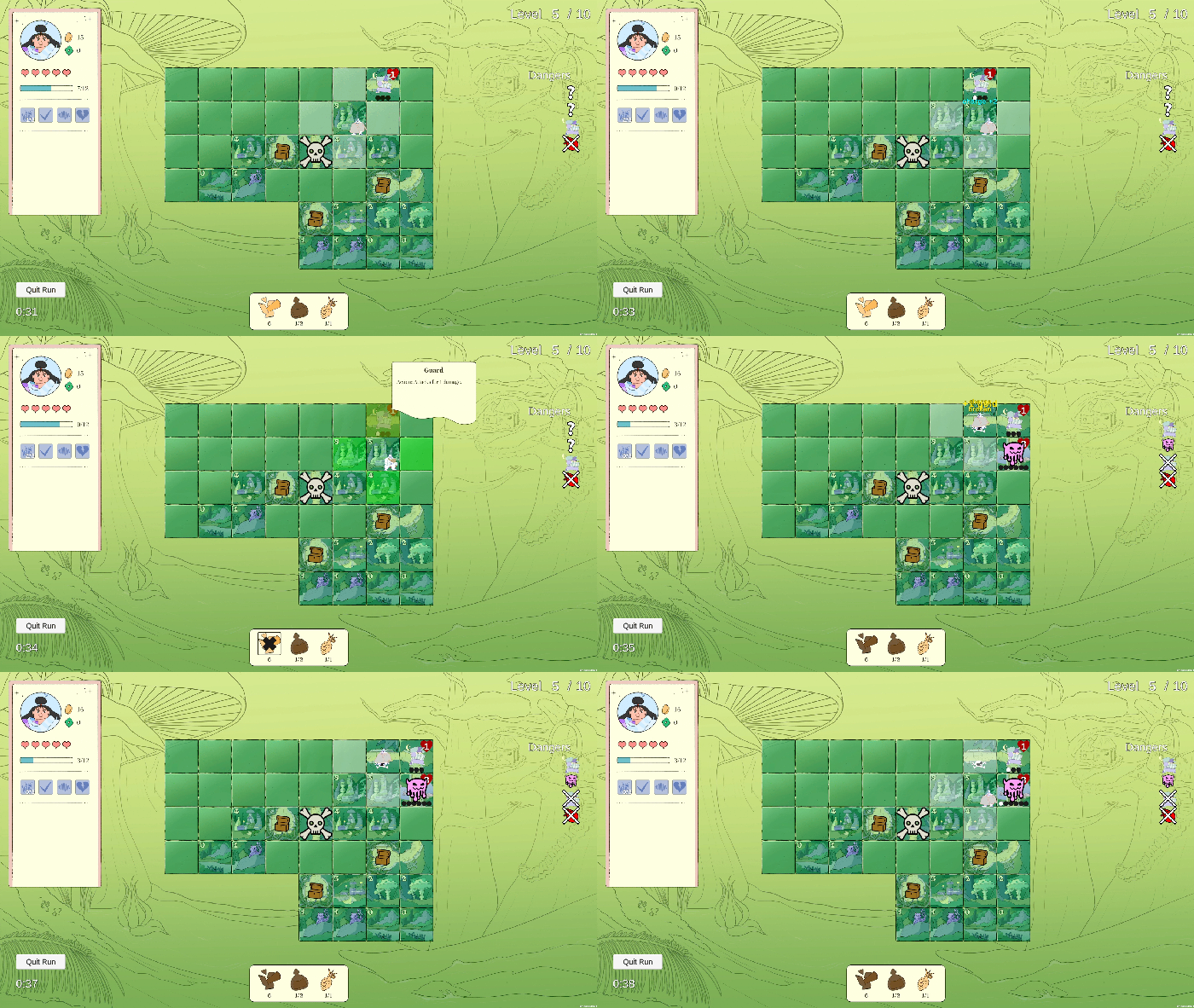
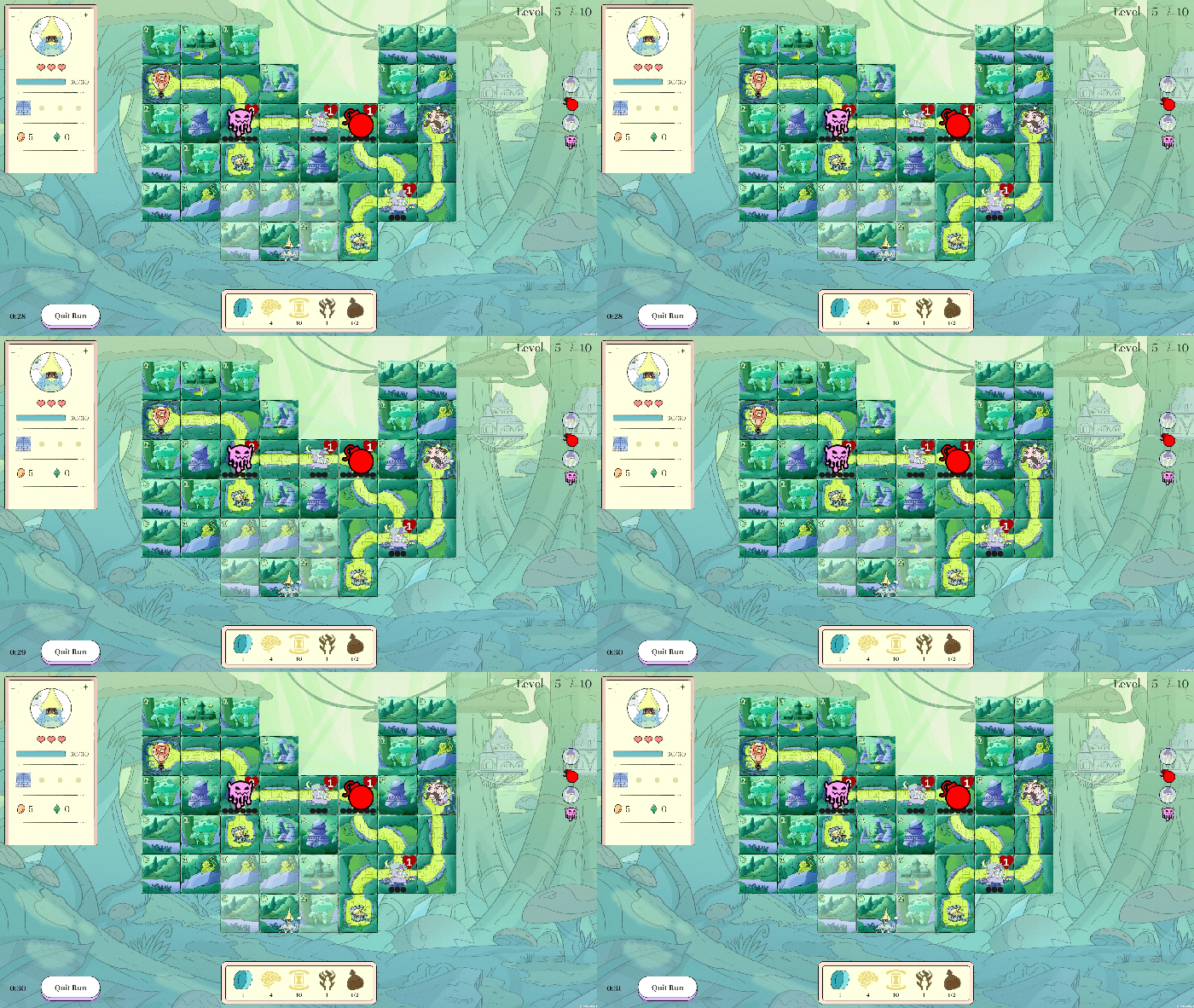
Evolution of the game’s art during pre-production.
To create and tune the classes and abilities of the game, we took an asset-focused approach to data using Unity’s ScriptableObjects. This allowed us to quickly develop new content by modifying properties in the editor without touching any code. Architecturally, the base building blocks of the game are a class of data we call traits. A trait is a single ScriptableObject asset that applies properties to player characters and enemies, such as abilities and passive effects, as well as HP, Mana, and movement characteristics. Traits can be copied, modified, and remixed. They define how enemies behave as well as drive animations, VFX, and SFX. Playable classes are defined as a collection of traits. This modular approach allowed for quick iteration. In just a few clicks in the editor, we could add and remove traits from our classes or create a whole new class or enemy as a different collection of traits.
The only major gameplay element that came together after we began working around the theme of overthrowing the King was the final boss fight. From a convention standpoint, it made total sense, but we weren’t sure we would have the time to execute it until we were into production and could take advantage of improvements to our system for authoring enemies. For the final level, the King works like a typical enemy, though with some unique mechanics to make him more challenging. He has more hit points and, when attacked, changes position on the board, flying to a new random tile and dropping a Mine as he goes. Since the last level is too late for shops to be of much use, we place a unique, rare item on all the dead ends, the Bubblezooka, which allows the player to attack any visible enemy, including the King. This made the boss fight work even with less combat-focused classes. While we kept the boss fight relatively simple, relying as much as possible on existing systems, it turned out to be an essential part of the experience—a challenging final test where players must utilize all the abilities and items they’ve acquired over the course of the run.
A year later
By early February 2023, about a year after the first White Rabbit prototype, we were preparing a demo to debut at the Media Indie Exchange showcase at GDC and had mostly made good on our goal of finishing a game within the year. We had a shippable game, though it would be another few months until the intro cinematic, final sound, and localization were complete. The initial response to the game was very positive, and when one playtester reported sinking 70 hours into completing the game, we were shocked.
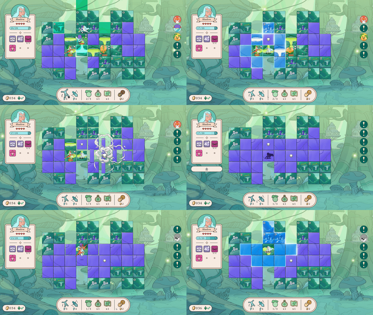
Let’s! Revolution! in its final form.
By starting from a very simple premise and making methodical incremental improvements, it all gradually added up into something that felt much larger than we expected. Everyone wants to make a great game, but when you only have a year to do so, you’ll settle for simply finishing something respectable. Keeping our ambitions relatively humble allowed us to be pleasantly surprised by and grateful for each bit of progress we made. If we had set out to make a 40-plus hour game inside of a year, we would have collapsed under the weight of that pressure, or more likely, never began, believing it to be impossible.
Looking back, there are a number of factors that helped Let's! Revolution! come together the way it did. Working within a one-year time frame forced us to keep the scope tight. Less time made prioritization of key features easier because there was no wiggle room. We intentionally combined known mechanics in new ways rather than inventing from scratch, saving time and making the game easier to market. Our modular scriptable-object-based architecture allowed us to rapidly develop a large set of abilities and enemy behaviors with minimal custom code. Lastly, having the priority be finishing the game rather than achieving some abstract level of greatness freed us from unrealistic expectations that can sow doubt and stifle creativity early in development.
You May Also Like