Trending
Opinion: How will Project 2025 impact game developers?
The Heritage Foundation's manifesto for the possible next administration could do great harm to many, including large portions of the game development community.
"The key component in establishing a satisfying sense of motion all comes down to the communication of mass."
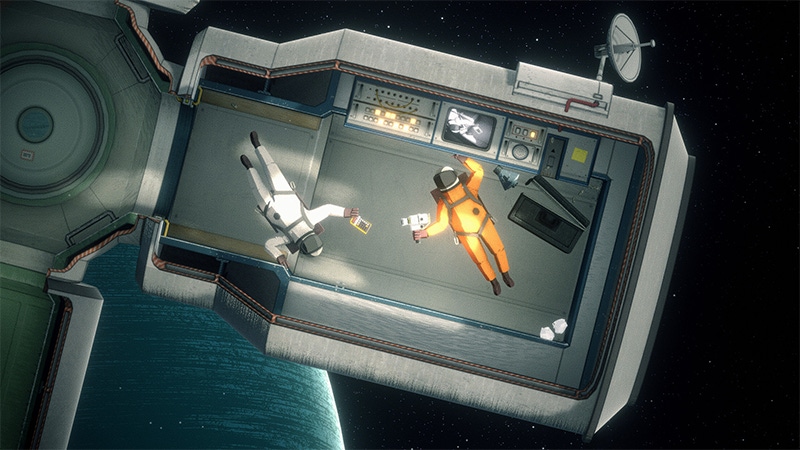
Gravity is massively underrated. It keeps us grounded on this floating blue dot we call home as it spins and careens through the universe at unimaginable speeds, and also ensured Papa Roach will forever be remembered for their irresistible earlier works and not this unseemly morsel.
It's a force we should all cherish, then -- unless you enjoy the idea of drifting though the void like a human dirigible -- and as evidenced by 2pt Interactive's newly-released puzzler, Heavenly Bodies, our lives would be a lot harder without it.
The floaty, spacey title implores players to take control of a weightless cosmonaut (or cosmonauts, if you fancy some co-op antics) and bring life to delicate science instruments that have been jettisoned into the infinite. Mending and maintaining delicate solar arrays and space telescopes would be a complex task at the best of times, but in Heavenly Bodies players will need to complete those cosmic chores in zero-gravity, wrestling their brave astronauts' loose limbs as they bump, bonk, and blunder into all manner of delicate machinery.
After catching a glimpse of the game in-motion, we caught up with studio co-founders Alexander Perrin (game developer and illustrator) and Joshua Tatangelo (game designer and visual artist) to learn how the duo implemented Heavenly Bodies' zero-gravity physics and appendage-bending control scheme.
Game Developer: Based on what we've seen so far, the cosmonauts will collide into their interstellar surroundings with satisfying bumps and bonks. How did you design and fine-tune Heavenly Bodies' physics system to create a satisfying, zero-gravity environment that enables those kinds of interactions?
Perrin: The physics system in Heavenly Bodies is one of its key points of uniqueness, so it was incredibly important to us to ensure that it behaved in a stable, predictable, and beautiful way. Tuning physics settings and using hacks to keep things held together were vital in making for a solid, juicy experience, but multiple elements are at play in giving every interaction satisfying weight.
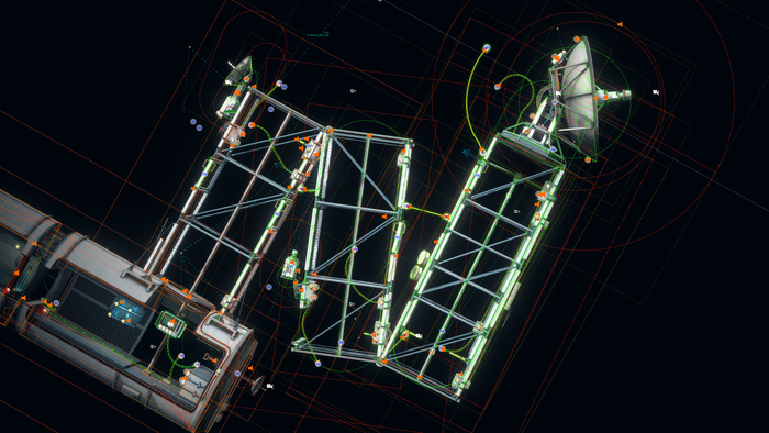
Under the hood, we just use Unity's standard 2D physics engine powered by Box2D. Keeping the simulation in 2D was essential in keeping design and technical complexity low, and allowed us to push the limits for simultaneously simulated bodies, which often reached the hundreds.
Other than changing solver iteration counts, we made very little changes to the default physics settings. As previous generation consoles tend to be fairly CPU bound, we had to be very wary of not pushing the limits too far. To assist us with balancing performance and stability across each mission, we created 'physics settings profiles' which provided sensible values given the requirements of each environment.
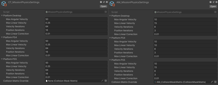
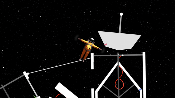
Data (left) contains a large quantity of hinges which we had to stabilize with high velocity iterations. Minerals (right) on the other hand could support lower iterations that allowed us to simulate a field of… 28,725 asteroids.
The key component in establishing a satisfying sense of motion all comes down to the communication of mass. This was supported by a physically-simulated character which aims to let you sense the force required to move your body and the weightless objects in your environment.
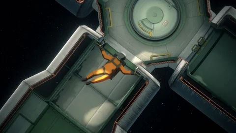
Apart from the space station itself, we aimed to make every object physically simulated. A wonderful benefit of working in zero-g is that you can crank the mass of objects well beyond usable limits than if they were pinned down by gravity. With no drag or other forces to get in the way, there's virtually no object that's immovable by the player. The ability for the player to sense wild contrasts in inertial behaviors is truly magical.
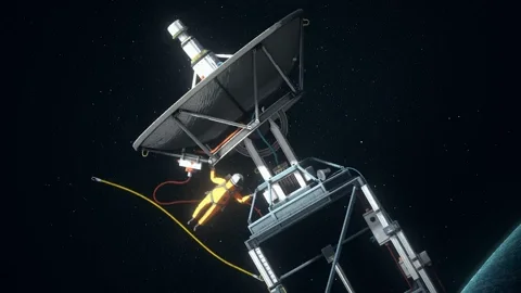
Sound also plays a huge role in communicating environmental physicality. Every collider in the game has an Impact Sound component that contains data about 'hardness', 'weight', and 'materiality'. When impacts (inevitably) occur, collision data (eg. relative velocity, normal impulse) is paired with the Impact Sound data and sent off to FMOD.
Our sound engineers (Fuligin Sound) designed an FMOD event which selected playback samples based on the materiality and 'intensity' of the incoming collision. This means that, as your body bops around the space, you can hear sounds ranging from the resonant thumps of hollow metal drums to the pleasant soft thuds of padded walls. We took some liberties with the whole 'no sound in space' thing, but it really helps to fill the void.
Was there a singular element of the physics system that was particularly tough to implement?
Perrin: There wasn't much to Heavenly Bodies which wasn't challenging to get right, but something I'm quietly proud of is the player movement system which, with Newtonian mode enabled, allows you to move about the environment with a net force addition of zero. In other words, every action has an equal and opposite reaction!
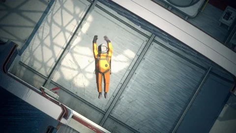
A key challenge in getting this to work was to wrap my head around the torque transfer that occurs between the player's arms and the surrounding environment. Because we used a standard torque application to move the players arms, I had to make sure that the resulting torque ended up being applied in reverse to the most relevant connecting body. Without this, forces would quickly get out of balance and make for chaotic, wacky physical behaviors.
When the player has something in their grip, the player's arm reads from the grabbed object's 'stability coefficient' which represents how much torque should be applied back into the object. A value of 1 (full stability) results in the torque being transferred into the object, and is used for walls and super heavy objects. A value of 0 (no stability) results in the torque being transferred back into the body, and is used for small objects such as spanners.
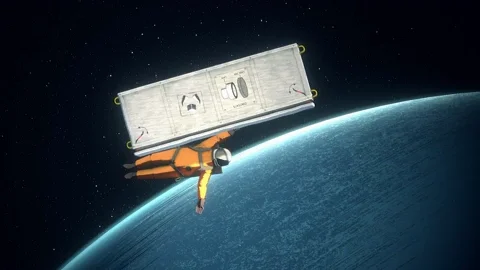
This torque transfer behavior was incredibly important in communicating the weight of objects, and allows the character to move about the space in a natural way.
I'm also curious how you designed the title's unique dual-analog control scheme, which allows players to manoeuvre by controlling individual limbs, with interactivity and zero-gravity puzzling in mind?
Perrin: Heavenly Bodies' control scheme is the origin story of the game, and has taken all 3 years of the game's development to get right. From day 1, our goals with the movement system were to:
Capture the feeling of using an articulated, muscle driven arm with a single analog input
To have the movement feel relatively controlled and predictable
To look fluid and natural
To support physical interaction with the environment (eg. arms can get stuck in doors)
From the perspective of physical setup, not much has changed since our V1 model. We have a simple ragdoll setup which utilizes a series of capsule and circle colliders.
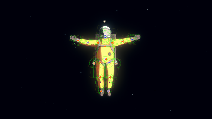
When it comes to actually moving the body, things quickly become complicated. We finely tuned a system of inverse-kinematic targeting to drive each limb segment. The player points the sticks in the direction they want each hand to move towards, then the IK simulates the 'next best angle' for each ragdoll limb to rotate to, to meet the desired IK goal.
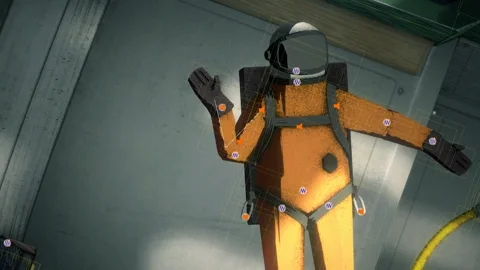
Early on, it was often the case that the shoulder or elbow joint had too much force and resulted in spasmodic behaviors, so the limbs had to be carefully damped and tuned to feel natural, but stable.
Talking more broadly, how did you design vehicular and cosmonaut movement to strike the right balance between fun and frustrating? It seems like failure in Heavenly Bodies will deliver plenty of comedy value, but there'll obviously come a point where players begin to lose patience. How did you walk that tightrope?
Tatangelo: We always try to make failure something that is fun, but ultimately avoidable if a little patience is exercised. We rarely need to set players up for failure as it's something that naturally occurs given the nature of the controls and the precariousness of the scenarios. If someone wants to jump in and make a mess of the place it usually ends in disaster, but it's something they knowingly committed to which adds to the comedy and softens the frustration.
At the other end of that approach, all tasks can be completed at your own pace, using one of three control methods which are: Newtonian (fully simulated, punishingly accurate), Classic (a mix of challenge and fun), and Assisted (provides some ease of motion) - essentially, the movement can be tailored to the level of challenge you're looking for. On top of the control modes, in-game checkpoints are also generously placed after key objectives and actions, so repeating a tough section is not necessary. It's been a tough thing to balance the difficulty of the scenarios, but constant testing and feedback along the way has helped us establish what we feel is the right blend of difficulty and fun.
It looks like a lot of the missions will take place in tight, compact settings filled with objects that can be grabbed, pressed, and carried. Could you talk about how you made those spaces readable, allowing players to assess and interact with precision and purpose?
Tatangelo: One of the biggest considerations when designing the environments has been creating a clear division between what is interactable in the foreground and what is essentially cosmetic in the background. Since everything in the game is built in 3D but the physics are all happening in 2D the distinction has been quite tricky to get right. When trying to visually communicate something like the inside walls of a pod, we rely on color, contrast, and shading to create a sense of depth and hierarchy between the edge of a wall/where a collider would be and the surfaces that fall back into perspective away from the camera (and out of the playable space). The exterior hull cutaways also aim to provide a rough silhouette of what can be expected on the inside of the structure.
Making the physical limits of the space and the character the most prominent values on screen aims to define the boundaries, and anything secondary to gameplay then falls back. To get a little technical, all of the geometry in the game has been UV unwrapped, meaning that we have precise texture control over what edges and surfaces we want to highlight or tone down and it's been a process of tuning things as we go. White, grainy lines on the facing edge of a wall always dictate that it is going to be grabbable and collidable. There also is an intentional lack of clutter or greebling, striving for a more clinical looking environment where detail is focused rather than overwhelming to the player.
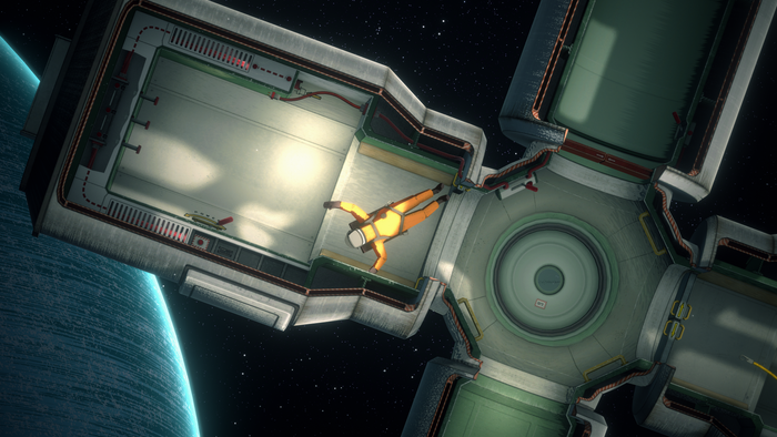
Whenever something is intended to be grabbable by the player, but not collidable, we try to keep it rendering in front of the player -- the green bars in Oxygen are an example of this behavior. The player is free to pass behind the geometry and grab on if and when they choose to. As well as being practical, this also creates a nice sense of depth.
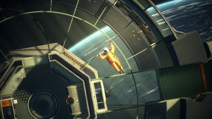
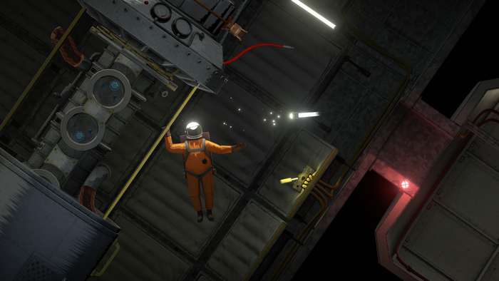
With puzzle and object design, the underlying direction has been to prefer clunky analogue technology and large forms that communicate their operation so that players can intuit their operation at a glance. The control scheme lends itself to bigger physical gestures, so we've tried to avoid anything being too small or finicky as it usually doesn't make for an enjoyable interaction. Key items also have a subtle shimmering effect that highlights the object at timed intervals. This can be a subtle hint in the right direction, or a helpful hand when trying to find an object in the dark.
Finally, what's one thing you feel you excelled at mechanically, and how did you achieve that outcome?
Perrin and Tatangelo: There are lots of small individual technical and visual details that we're proud of, but it's the marriage of all these achievements that we're most pleased with. We feel that we managed to keep things consistent across the visual aesthetic, gameplay design choices, and technical considerations as the game came together over the years. The look of the world informs the large, analogue readable details which cater to large, gestural interactions from the player.
From an implementation perspective, it helped that both of us have similar aesthetic tastes which allowed us to combine technical and artistic visions without too much friction. We were very careful, however, to thoroughly prototype every single space, surface, and interaction to ensure that our goals never exceeded realities.
Read more about:
FeaturesYou May Also Like