Trending
Opinion: How will Project 2025 impact game developers?
The Heritage Foundation's manifesto for the possible next administration could do great harm to many, including large portions of the game development community.

Featured Blog | This community-written post highlights the best of what the game industry has to offer. Read more like it on the Game Developer Blogs or learn how to Submit Your Own Blog Post
Modelling interiors behind every window in a city often takes too much performance, so some games use "interior mapping", a shader trick to render geometry that isn't actually there, but still achieves sharp, perspectively correct rooms.

The recently released game Marvel's Spider-Man has interiors behind windows in many buildings. This looks great and it seems to be done using a rendering trick: the geometry for the interiors isn't actually there and is generated using a shader. I haven't seen any official statement by Insomniac regarding how they made this, but based on how it looks it seems very likely that they implemented interior mapping: a technique I came up with in 2007 as part of my thesis research. I've never written about this on my blog before so I figure this a good moment to explain the fun little shader trick I came up with.
Let's start by having a look at some footage from Marvel's Spider-Man. The game looks absolutely amazing and Kotaku has captured some footage of the windows in particular:
As you can see around 0:40 in this video the rooms aren't actually there in the geometry: there's a door where there should clearly be a window. You also see a different interior when you look at the same room from a different corner of the building. In some cases there's even a wall that's beyond a corner of the building. All of these suggest that the rooms are faked, but nevertheless they are entirely perspectively correct and have real depth. I expect the faults of these rooms don't matter much because while playing you probably normally don't actually look at rooms as closely as in that video: they're just a backdrop, not something to scrutinise. I think creating rooms this way adds a lot of depth and liveliness to the city without eating up too much performance.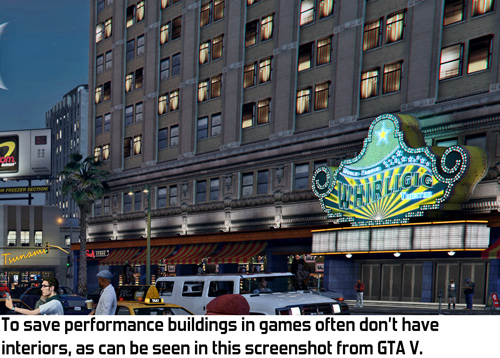
Before I continue I'd like to clarify that this post is not a complaint: I'm thrilled to see my technique used in a big game and I'm not claiming that Insomniac is stealing or anything like that. As I stated in the original publication of interior mapping, I'd be honoured if anyone were to actually use it. If Insomniac indeed based their technique on my idea then I think that's pretty awesome. If they didn't, then they seem to have come up with something oddly similar, which is fine too and I'd be curious to know what they did exactly.
So, how does interior mapping work? The idea is that the building itself contains no extra geometry whatsoever. The interiors exist only in a shader. This shader performs raycasts with walls, ceilings and floors to figure out what you should be seeing of the interior.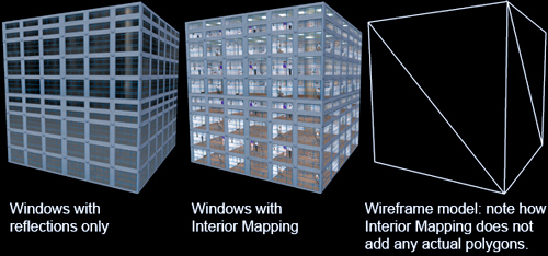
The ray we use is simply the ray from the camera towards the pixel. The pixel that we're rendering is part of the exterior of the building so we only use the part of the ray beyond the pixel, since that's the part of the ray that's actually inside the building.
Doing raycasts may sound complex and expensive, but it's actually really simply and fast in this particular case. The trick is to add a simple limitation: with interior mapping, ceilings and walls are at regular distances. Knowing this we can easily calculate which room we're in and where the ceiling and walls of that room are. Ceilings and walls themselves are infinite geometric planes. Calculating the intersection between an infinite plane and a ray is only a few steps and eats little performance.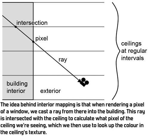
A room has 6 planes: a ceiling, a floor and 4 walls. However, we only need to consider 3 of those since we know in which direction we're looking. For example, if we're looking upward then we don't need to check the floor below because we'll be seeing the ceiling above. Similarly, of the 4 walls we only need to consider the 2 that are in the direction in which we're looking.
To figure out exactly what we're seeing, we calculate the intersection of the ray with each of those 3 planes. Which intersection is closest to the camera tells us which plane we're actually seeing at this pixel. We then use the intersection point as a texture coordinate to look up the colour of the pixel. For example, if the ray hits the ceiling at position (x,y,z), then we use (x,y) as the texture coordinate, ignoring z.
A nice optimisation I could do here at the time is that we can do part of the intersection calculations for each of the three planes at the same time. Shaders used to be just as fast when using a float4 as when using a float, so by cleverly packing variables we can perform all 3 ray-plane intersections simultaneously. This saved a little bit of performance and helped achieve a good framerate with interior mapping even back in 2007 when I came up with this technique. I've been told that modern videocards are faster with float than float4, so apparently this optimisation doesn't achieve much anymore on today's hardware.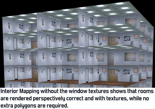
For more details on exactly how interior mapping works, have a look at the paper I wrote on interior mapping. This paper was published at the Computer Graphics International Conference in 2008. Having a real peer-reviewed publication is my one (and only) claim to fame as a scientist. This paper also includes some additional experiments for adding more detail, like varying the distance between walls for rooms of uneven size and randomly selecting textures from a texture atlas to reduce repetition in the rooms. It also goes into more detail on the two variations shown in the images below.
Since we're only doing raycasts with planes, all rooms are simple squares with textures. Any furniture in the room has be in the texture and thus flat. This is visible in Spiderman in close-ups: the desks in the rooms are in fact flat textures on the walls. As you can see in the image below it's possible to extend our raycasting technique with one or more additional texture layers in the room, although at an additional performance cost.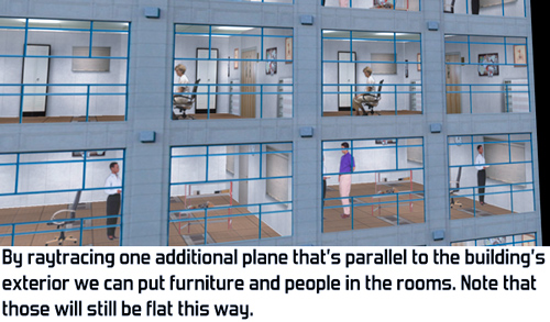
After having published this blogpost one of the programmers of Simcity (2013) told me that interior mapping was also used in that game. It looks really cool there and they have a nice video showing it off. They improved my original idea by storing all the textures in a single texture and having rooms of varying depth. The part about interior mapping starts at 1:00 in this video:
If you'd like to explore this technique further you can download my demo of interior mapping, including source code. If you happen to be an Unreal Engine 4 user you can also find interior mapping as a standard feature in the engine in the form of the InteriorCubeMap function.
After all these years it's really cool to finally see my interior mapping technique in action in a big game production! If you happen to know any other games that use something similar, let me know in the comments since I'd love to check those out.
For more blogposts on development of Awesomenauts, Swords & Soldiers, Cello Fortress, Proun, my music and any of the other stuff I work on, check my dev blog at www.joostvandongen.com.
Read more about:
Featured BlogsYou May Also Like