Trending
Opinion: How will Project 2025 impact game developers?
The Heritage Foundation's manifesto for the possible next administration could do great harm to many, including large portions of the game development community.

Featured Blog | This community-written post highlights the best of what the game industry has to offer. Read more like it on the Game Developer Blogs or learn how to Submit Your Own Blog Post
In this article, we explore the concept of the Magic Circle and how to preserve it, so that nothing distracts the players from their experience.

Video games are fun only when players’ minds are engaged in playing and pretending. Pretending creates a mental state that some call the Magic Circle, and maintaining it is essential for players to enjoy the gameplay. In this article, we explore the concept of the Magic Circle and how to preserve it, so that nothing distracts the players from their experience. We also introduce four principles that can help us achieve this goal.
The term “Magic Circle” was first introduced by Johan Huizinga in his book “Homo Ludens” (or “Man the Player”) [1]. However, he did not use the term as a generic name for the concept, but rather referred to it as a playground, similar to a tennis court, or in other words, as a space in which playing takes place. To better understand what the magic circle is, let’s first review what playing and pretending mean and what characteristics they have.
Playing is an activity that we engage in voluntarily for its own sake. It requires effort and can be serious, but we know it’s not real from the start. It has a beginning and an end, and it doesn’t necessarily benefit us in any way. And most importantly, it’s done within limits and rules.
Pretending, on the other hand, is when we create a new reality in our minds. In the concept of games, is an act of creating rational reality [2]. Pretending creates a space in our mind where we can assign new values to real facts, events, and objects, without any limits. It separates the real world from the imaginary world. When we’re in this space, the ideas and activities we come up with can be totally different from what they are in real life.
The magic circle is that secondary, artificial world. It’s the boundary between the normal rules and reality of the world and the artificial reality of the game world. Our minds create it based on the game rules, and then we play in it. Just like a playground. The game itself is like a blueprint for making that magic circle.
When players enter this secondary world, the fun from the gameplay is drawn by playing. We should do everything in our power to make sure players never leave this world and break immersion until the end of the playing session they choose. By creating a game with a unified theme and clear rules and goals, we can help players stay engaged and entertained. Then, it’s crucially important to avoid anything that could distract players and pull them out of the magic circle.
In the following section, we focus on maintaining the magic circle, rather than creating it. We’ll leave creating a good magic circle for another time. However, it’s worth noting that a game with clear rules and goals, and a well-defined theme that players understand from the very beginning, would be a solid foundation for creating a magic circle .
We’ve created a game and transported the player to a magic circle. But how do we keep them there? The ideal answer is to avoid anything in the game that questions the magic circle or connects players to the real world. However, that’s not always easy. In this section, we’ll introduce four principles to help sustain players within the magic circle and avoid distractions.
As we mentioned, games are made of rules, goals and actions. But how players get to know them? Video games could have pretty complicated ruleset and big range of actions. Once a player starts playing a game, they should learn the rules so that the magic circle becomes coherent enough for them to start playing in it. This part, which we teach players the game, is called tutorial. But where is the problem? Problem is the tutorial itself.
Players hate tutorials because they are, usually, destroying the magic circle at most. Why a swordsman after 40 years of killing monsters should practice how to swing the sword around the ragdoll? Player bought the game to kill monsters for instance and she has to face training opponents for 1 hour? That's not ideal. However, this tutorial could be very small and resistible and that’s when we have small ruleset. We still could have a big depth in gameplay but with a small ruleset. Games should be easy to learn and hard to master (often called Bushnell's Law, credited to Nolan Bushnell, Atari founder). That shows pretty much of what we just said. Easy to learn means small ruleset, and hard to master means have a big depth in the gameplay.
Consider a game which all you do is jump. That’s a pretty small ruleset. But challenges you are facing could become complicated but still are solvable by just jumping. That's elegance in designing a gameplay which is a sign of a perfect design. In that case we have no real problems about teaching the player, however sometimes no matter what you do, you have a big ruleset and big range of actions and you have to somehow eliminated this tutorial, or at least prevent it to be frustrating.
When we said we wanted to remove tutorials, we didn’t mean that we should actually remove them from the game and leave the player to figure things out on their own. Rather, we meant that we should hide the tutorial from the player. The player should not have a clue that they are learning the basic rules of the game. That’s our goal, and that’s how it’s done. As we mentioned earlier, the biggest issue with tutorials is that they can destroy the magic circle. Our strategy is to implement the tutorial as a part of the gameplay happening within the magic circle and leave the player to discover the rules on their own.
Super Mario [3] which had not much of a ruleset, all you can do as actions in this game are to move forward, backward and jump. It did not have tutorials, or did it? Shigeru Miyamoto, creator of the game, mentioned how he implement the tutorials he wanted into the game. Figure 1 is the first thing a player sees when he enters the game world.

Figure 1. The first screen with which the player encounters for the first time in Super Mario.
Miyamoto explains that he put the player in a non-obstacle environment where they can move right and left and try out the buttons to see which one does what. To proceed, the player should understand how to move, which is pretty simple, so we can rely on the player to figure it out without us mentioning it. Ideally, the player will also understand how to jump. But that’s not certain. After a couple of units of space moving forward, the player encounters an obstacle that requires jumping to overcome it (Figure 2). However, there is a hole in that obstacle. There are two possibilities here. First, the player, who now knows how to jump with their controller, jumps over the first hole. In this scenario, we are sure the player knows they should jump over the holes. Second, the player doesn’t jump and falls, but as we mentioned, there is a ground, so they don’t lose. To get out, they jump out and go to the next obstacle. This time, the player sees that the hole is real with no end, but from the first obstacle, we are mostly sure that players know how to jump over it 1.
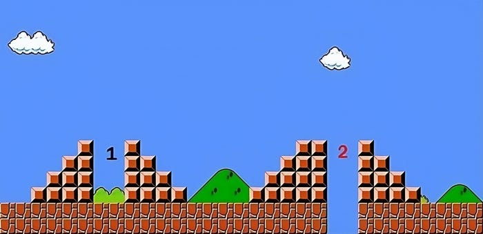
Figure 2. Two obstacles one after another. The first one is safe if player falls in it but the second one is not.
Nobody tells the player how to jump or which holes makes you lose, but he learns it himself and that doubles the enjoyment. It's like players himself find out the secret and he feels accomplished something. Designing in this matter needs more time and accuracy, because a bad implementation adds a lots of trials and errors which are frustrating.
Here is an example of a large ruleset: Clash of Clans [4]. This game has a very short tutorial compared to its ruleset size. In the tutorial, a girl guides the player from the screen (see Figure 3). She introduces the basic rules of the game in a way that does not break the immersion. The player can imagine that the girl lives in the village and she is teaching how to build a base. This is not a bad approach! However, the designers still made this part brief and left many strategies and rules for the players to discover by playing the game.
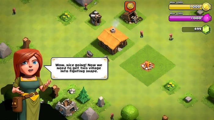
Figure 3. One villagers are informing the player about how to start playing the game.
When designing tutorials for games, it’s important to ensure that they don’t break the immersion of the player. Tutorials should be integrated into the game and not be presented as a separate entity. They should not question any value set in the magic circle and rules about the game because they have the potential to do so. If you must include a tutorial, make it brief and leave other rules and strategies for the players to discover by playing the game. This way, players can learn the game mechanics while playing the game and not feel like they are being taken out of the experience.
User interface is what connects the player to the game’s world. Although UI is not there to empower the immersion, we can’t deny or eliminate it from the game. It’s a necessary part, but it can be detrimental to the player’s immersion. For example, a text showing the character state, pushing a button to jump, selecting a text on screen to start playing, or loading the game from where we left, are obviously out of the magic circle’s territory. Anything between you and the game’s world decreases the immersion effect. Fortunately, players have become accustomed to the fact that games have some sort of UI anyway, and they are masters at pretending it and including it in the magic circle. However, this increases the magic circle’s radius and makes it harder and more energy-consuming to maintain it. We can’t eliminate it, but we can lessen the negative effect on the magic circle or the player’s impression by designing UI that is intuitive, minimalistic, and blends seamlessly with the game’s world
There are two strategies to consider when designing a game’s user interface. The first strategy is to implement information into the game’s world itself as much as possible without making the player more confused. However, for example, in an adventure game, leaving the player without a mini-map can be detrimental to the player’s experience. In most cases, we can’t put everything into the game’s world and present them with objects, so we have to use some sort of channels of information on screen or a layer of user interface on the game world to highlight important stuff. The second strategy is to build a UI for our game that serves the theme we defined for the game as much as possible. This way, it’s easier for the player to pretend and include the UI in her magic circle. Designing a game’s UI is a graphical profession that requires careful consideration of factors such as color, placement of channels of information, and more.
Dead Space [5] is a 2008 science fiction survival horror video game developed by EA. Horror games rely heavily on immersion, and the designers at EA knew this. To immerse the player into their world, they tried several things, one of which was eliminating the UI completely from the game as a layer on screen or between the world and the camera. They put everything the player needed into the game’s world. As you can see in Figure 4, the health (2) of the character and the bullets amount (1) of the gun are shown as a part of the character and the gun itself. Other complicated information like panels about upgrading your guns or other menus of the game were on digital computers in the game’s world with big light screens (Figure 5). This approach allowed the player to stay immersed in the game’s world without any distractions from the UI.
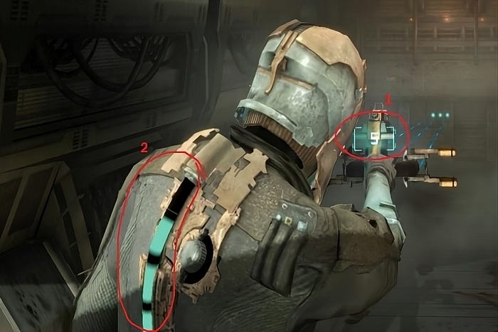
Figure 4. Health bar and Bullet count are visualized through the game world.
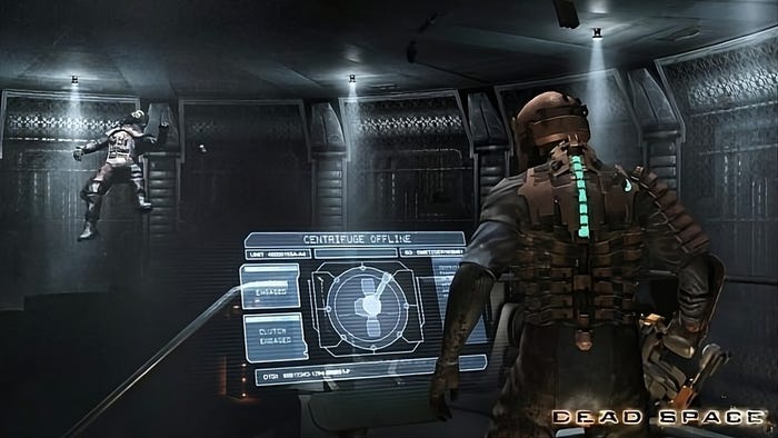
Figure 5. Manus are the game are represented as in-game panels.
When designing user interfaces for games, it’s important to consider the game’s genre and the amount of information that needs to be conveyed. For games with large amounts of information, such as simulators or strategic games, it may not be possible to eliminate the UI completely. In these cases, the second strategy should be employed to get the best result.
For example, StarCraft 2 [6], a strategy game developed by Blizzard, has lots of information and commands that players must choose from. The designers put big channels of information and other user interface components (Figure 6), but they tried to make it easier for the player to pretend it’s all not fake and something out of the game. Players in this game are actually commanders, so it’s their job to command. In cinematic movies between missions, the player sees commanders commanding the forces on the battleship through some big table screens (Figure 7). This way, the player can simply enter this UI in the magic circle as if they are commanding from one of those tables the forces they rule
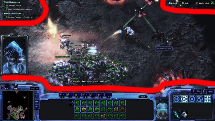
Figure 6. Lots of information channels are shown the player but they are in harmonize theme to the game world graphically.
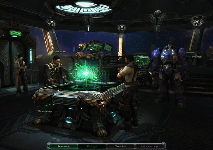
Figure 7. Player as commander is communicating through a 3D table screen.
Designing user interfaces for games is a challenge that every designer faces throughout the process of making a game. UI is always bad for the player’s experience because it’s hard to relate it to the game world. However, we can lessen the effect by implementing the information we want to share with the player through the game and objects in the game. Furthermore, the second strategy is to try to relate the UI with the game concept and graphically craft those components considering the theme of the game. By doing so, we can make the UI more intuitive and less intrusive, which can help improve the player’s immersion in the game world
Allowing the player to save the game has its pros and cons. One of the pros is that it prevents frustrating experiences for players, such as having to replay a part of the game over and over or losing progress that they put so much effort into. There are situations in which the player isn’t even to blame, such as powering off, technical issues, design bugs, and other problems that could shut the game down. If we didn’t track the player’s progress, they would have to play it all over again, which is not good at all. By allowing players to save their progress, we give them the ability to leave the game anytime they want and join back later. However, when a player can save and load a game, a couple of issues arise that affect the magic circle and storytelling the most. Those are:
Allowing players to save the game makes them feel safer because they can always reload, but it reduces the dramatic tension of the story and the experience we want to create for the player.
If the game concept doesn’t serve saving and loading, the fact that the player can jump into the game anytime and anywhere or save the progress they are in could hurt the magic circle and suspension of disbelief.
The whole experience starts to feel fake when certain events happen repeatedly, such as dying an important character (including yourself; again, if the game concept doesn’t explain it, as we’ve seen, some roguelike games explain this greatly).
Managing and predicting the difficulty of the game becomes blurry for game designers when players can redo certain actions and gain experience to do them, which makes designing the whole game harder.
Above all, saving the game is an out-of-magic-circle activity and has a negative impact on the player’s immersion anyway
As we mentioned in the last part (A), “if the game concept doesn’t explain the action of saving or loading,” that’s where our first strategy comes in. We can make saving and loading a part of the game world, so it becomes easier for the player to pretend it’s not fake (look at the next example section for more clarification).
In the Grand Theft Auto series, when you die, you respawn at the nearest hospital and are charged a medical fee. This mechanic allows players to continue playing the game without having to start over from the beginning. The fact that the player respawns at a hospital makes it seem like they never went back, which can help maintain the player’s immersion in the game world.
The second strategy, which requires professional teams and certain genres of games, is to make a game in which you can’t go back. The player’s progress is tracked automatically by quick saves, but you can’t load manually, and you should always continue your progress. This strategy is expensive because you should predict a wide variety of consequences that may happen, and you should offer deep gameplay in all of them. In other words, there should not be an event in the game that the player can trigger that terminates the story or the gameplay. If that happens, the player should reload the game.
For example, if there is one character on whom the story is based, you shouldn’t allow the player to kill that character in the early stages of the game. If you want to let them, you should also offer lots of other story and gameplay when that character is dead, which requires twice the time and money to build just these two scenarios. In this case, if you want to use the second strategy, you should limit the encounters between the player and that character so the player can’t kill them, like not allowing guns for meeting them if they are a boss or something.
Life Is Strange [7] is a game that revolves around the concept of time winding and traveling. The game shows the player that nothing is certain, and in most cases, the player doesn’t even know where or when they are playing. This concept supports seeing certain actions several times just by its nature. You can’t die because every time you are about to die, you can wind the time back a couple of seconds to save yourself. This concept can give the player several chances of playing. This is an example of using the first strategy, which works fine. On the other hand, big RPG video games with several lines of stories can support the second strategy to some extent. In these games, designers create a story engine that works alongside the engine of the gameplay (core mechanics) spontaneously. That story engine always keeps track of the player’s actions and produces stories based on their actions. For example, if you could kill one character, all those stories related to them vanish from your experience of the game, and other stories could fill that up.
Unfortunately, you can’t eliminate the saving-loading ability from your game because, in most cases, the comfort it provides for the player is worth taking, even though it can hurt the magic circle a bit. However, you can lessen the negative effect with two strategies. The first strategy is to manage the game’s logic in such a way that it makes sense to the player and is integrated into the game world. The second strategy is to keep track of the player’s progress and not let them do certain actions (in a smart way and considering the magic circle) for which we didn’t provide the consequences in the game.
Bad executions mostly arise from small and inexperienced teams, but some big companies still make this mistake because it’s tempting. Why is it tempting? Because we all want our game to be good at everything and add what we can into the game, not what we can do perfectly. One of the major reasons teams make this mistake is that they don’t consider the team’s real capabilities. Bad execution could happen in anything such as graphics, animations, sound effects, level designs, software aspects of the game, and more. One of the most common mistakes is hiring non-native speakers for alternative languages that the game supports, which can destroy the game for those language users, especially if they are native speakers.
We have two options here. If the content that has low quality is necessary for gameplay, you should leave it for the player to pretend (see example for more clarification). If it’s not necessary (for example, alternative language voices), just eliminate it from your game. Bad quality content and executions will just destroy the magic circle.
For our first option, which was letting the player pretend, you can see what happened in old text games. When players encountered text-based video games, they imagined the environment, and none of them expected cool graphics or sound effects because the game concept was simple. So players made the magic circle for those text games and enjoyed playing them. However, if you give your audience a big 3D game, they obviously expect more than just some texts describing the world around them.
For the second option, examples are countless. There are dozens of video games being made each year that don’t include voice-overs in all languages. However, in very few cases, they make sure it’s good when it’s there.
Bad executions and content in video games are the most significant immersion killers ever known. We should understand our team’s real capabilities before starting to make a game. Changes in the concept at early stages of development are far cheaper than later, so it’s best to change or switch to simple abstract 2D from 3D if we don’t have decent 3D artists and technologies to implement.
Throughout our conversation, we discussed the characteristics of the magic circle, how it's made, and gave four principles on how to maintain it. While there are always new and better principles, if we understand the true nature of the human brain, how it plays and pretends, and how a magic circle is shaped, we can always create better places to play. By following the principles we discussed, we can design games that are immersive, engaging, and enjoyable for players.
References:
1: Huizinga, Johan. "Homo Ludens". First published: 1938.
2: Adams, Ernest. "Fundamentals of game design", Second Edition, 2010. (page 4, 'Pretending').
3: A Platform video game series by Nintendo. Creator: Shigeru Miyamoto.
4: Clash of Clans is a 2012 freemium mobile MMO strategy video game developed and published by Supercell, a video game company based in Helsinki, Finland. Initial release date: August 2, 2012.
5: Dead Space is a 2008 science fiction survival horror video game developed by EA Redwood Shores. The game was released on all platforms through October 2008.
6: StarCraft II: Wings of Liberty is a military science fiction real-time strategy video game developed and released by Blizzard Entertainment. Initial release date: July 27, 2010.
7: Life Is Strange is an episodic graphic adventure video game developed by Dontnod Entertainment and published by Square Enix. Initial release date: January 29, 2015.
You May Also Like