Trending
Opinion: How will Project 2025 impact game developers?
The Heritage Foundation's manifesto for the possible next administration could do great harm to many, including large portions of the game development community.

Featured Blog | This community-written post highlights the best of what the game industry has to offer. Read more like it on the Game Developer Blogs or learn how to Submit Your Own Blog Post
A tech post about how I made the crop circle effect in Bombernauts (also know as a visibility circle, or a cutout circle).

(cross post from the Bombernauts Dev Blog)
I've gotten a few questions about the crop circle effect in Bombernauts (also knows as the cutout effect, or the see through walls effect), so I figure I'll share the technique a bit. It is, unfortunately, not a general-purpose technique, so I'm not going to share code for it (nor would the code be useful to you), but I will share the technique and thought process behind it, and plans for future improvements.
Here is what the effect looks like in it's current incarnation. I consider this effect as "not final", but it's certainly good enough for now, and it took a LOT of work to get it there.

First of all, to understand the crop circle requires a knowledge of how the level is rendered. The whole level is 1 model. Actually that's sorta a lie, it's 5 models, one for each directional face, without any bottom face since you can't see the bottom of tiles. Here's what a level looks like when I move its parts around. This lets me set different shader properties for each face separately, such as texture and various fields relating to orientation.
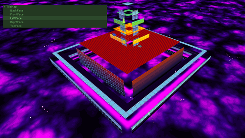
As a result, there's a few restrictions on what techniques I could use for the crop circle. Transparency is out of the question, since self-transparency is a really tough problem in computer graphics (see: this). In addition I can't make individual blocks disappear because it's all one model, and only faces exposed to air are rendered.
Here is a screenshot of the very first iteration of the cutout effect. (Actually I still have a build of this up, here):
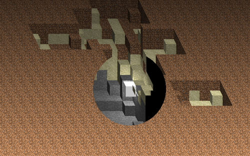
The first few prototypes of the game were in an isometric perspective (which was changed very early on, because it is extremely visually confusing). Anyway, I don't remember exactly the method I was using in this build, but I remember parts of what I tried. There was a massive logical tree in the shader for this, a check if it's in the "crop circle screen region" (a simple radius check on screen-coordinates), then if it was it does the crop effect. Each texel knows what face its on, where the player is, and its position in the world. I tried a lot of various conditions on these.
Each texel would let itself NOT be cropped if certain conditions were met. A texel on an upward-facing face would always show if it was below the player (in world coordinates). A texel on a front-facing face would always show if it was behind the player. A texel on a left-facing face would always show if it was to the right of the player. Every other pixel would be cropped. I believe there were a few other conditions here too but they aren't important. Unfortunately, while 2 of these conditions still held true when the game was switched over to a perspective projection, the left-facing face part doesnt hold true anymore. Here's my comment from the first iteration of the shader that I had comments in:
//if texel is above character (world) AND texel is IN FRONT of character
(depth) AND texel is IN FRONT of character (world), crop
It was getting a bit complicated, and every change I made to it was never... good enough. Could fix it in some situations, and not in others.
A few months ago, shortly before recording the trailer actually, I redid the whole effect again. I think it's up to version 4 now. Here is what the crop looks like, when the entire level is "cropped" (and the outline effect is disabled).
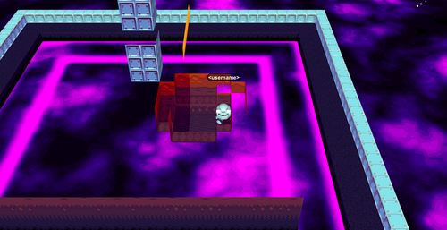
This crop mode right now still lets any pixel through that is below the player by default, but the rest of the confusing conditionals now are gone. Instead, now it's just checking which side of the face a player is on, and which side the camera is on. A handy diagram here shows what I mean (though, in 2D):
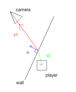
In this diagram, dotproduct(v1, n) and dotproduct(v2, n) will have the same sign if the camera and the player are on the same side of the wall. If they're on different sides of the wall, they will have different signs. A quick check for this is to multiply them together, same signs makes a positive number and different signs makes a negative number.
If they're on the same side of the wall, great! the wall CANNOT be blocking the view of the player. Otherwise, the whole wall gets cropped. You'll notice, regardless of which position on the wall you choose, the math works out the same. So the position I pick is just the texel that is currently being processed in the shader. This is an amazingly simpler method than the craziness I was doing before, though it obviously has a lot of problems still.
Here is a gif of the first pass of this new effect:

It has a lot of the same problems as before, though with a lot less glitchiness in the cropping itself. One of the main things I wanted was to be able to see what was being cropped out of your vision when moving behind something. Games traditionally do this by just making the object transparent, which I've explained above why that won't work. I looked into dithered transparency, but it would have just looked really bad.
So uh, doing the outlines was the first and most obvious attempt at this, and it surprisingly worked really well!
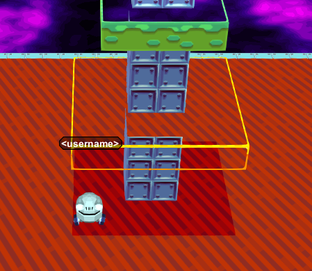
They aren't a post process effect like outlines are traditionally, they're actually part of the tilemap, and are generated on the CPU.

The shader knows what outline tiles to use for each main tile, and is only responsible for comping them together with changes in lighting to make it easy to visually process the shape of the landscape. The game actually generates a separate set of tiles for concave and convex edges, as seen here:
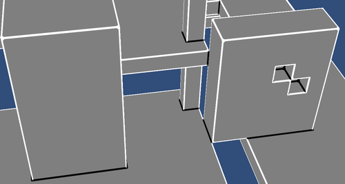
So the important thing here is the shader knows already if a texel is an outline or not. Don't cull it if it's an outline! And it looks great this way. I am only showing convex edges in this, showing the concave ones too makes it too confusing to look at. Here's what it looks like with both edges shown, just for comparison:
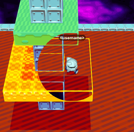
It's a bit busy and you lose the ability to clearly see the shape of what's being masked out.
The other major problem was, if you watch the earlier gif, it was running the crop effect when the player wasn't being visually obscured by anything. You can see that here:
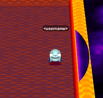
My solution for now is, I just make the size of the circle dynamically change size when you walk behind walls! It's surprisingly simple too, I run a raycast from the player to the camera, if it hits a tile, I take the difference between the point where it collides and the player, and make the crop sphere have that for a radius (with reasonable minimums and maximums, and easing). It works pretty well for now. If an object is far in front, the crop circle is bigger. If you're pressed up against a wall, it's smaller.
Here's the gif from the start again, with all the effects in place:

Its not perfect yet. There's a lot of other effects I want to add. I want to add a shadow effect for when a player is partially obscured by walls (other players would have this effect too, and possibly other in game object). I want to change the calculation of the size of the sphere to take a few more points rather than just the center of the character into consideration. And there's a ton of other small things that could be polished up with it too, but at this point in time I think it's "good enough".
It took a long time to get it there though.
Read more about:
Featured BlogsYou May Also Like