Trending
Opinion: How will Project 2025 impact game developers?
The Heritage Foundation's manifesto for the possible next administration could do great harm to many, including large portions of the game development community.
An look on Zelda: Breath of the Wilds' UI/UX. Trying to put some light on this subject, too often left into the dark.

I've played a lot of Breath of the Wilds, and I’ve discussed a lot about it, with various profile of players. It was really interesting and a whole lot of fun, but it helped me realize that very few people are talking about UI/UX design, and that’s a crucial part of any given game (or product).
I'll try to put this subject into sunlight, focusing about UI/UX and how it’s linked to design decisions.
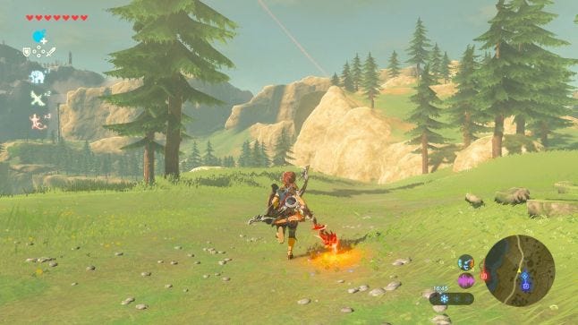
Regarding quests
Every Zelda games have managed story to guide players, letting them express themselves within the game worlds. It has never been truer than with Breath of the Wilds.
The main quest consists of broad objectives that you don’t know how to face. You can activate only one quest at a time (main, or secondary), and doing it mark it on your map. This force the player to focus and keep them from being overwhelmed. Plus the main quest is so broad (eliminate the 4 divine beasts and calamity Ganon) that you’re likely to leave it for a secondary right away, to encourage exploring the world, the pressure of the main quest no longer reminding you that you’re not doing “what really matters” in the game’s context.
Beside your quest marker, the map only contains discovered cities, stables, shrines, and towers. Opposed to your classical open world, when you climb a tower, and reveal a big part of the map, it’s empty. No little stamps to indicates collectibles, side quests or dungeons. Just the topography of the area, and everything you’ve already discovered on your way to the tower. Meaning that if you want to know what can be done in the area, you have to actually look around. A good thing you just climbed a tower, right?
It’s possible to put your own markers on the map (there’s several icons available), and there are two ways to do so:
Looking through the scope and place a beacon. Which lands at the exact location you’re aiming, so except for shrines that are pretty hard to miss, a lot of this is based on “I wonder if there’s something there?”.
Putting a stamp directly from the map view either by guessing the location, or using the first solution to come up with a vague position, and then stamp it.
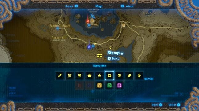
The map of Breath of the Wilds and its stamps
Cooking
Before going on your next adventure, you have to prepare!
Like a lot of other RPGs, BotW (Breath of the Wild) came with a crafting system, from which you can make different potions and dishes. No recipe is given, it’s either you wait to find recipes scattered within the world, or from trial and errors. This system is based on discovery. To try something, you have to select up to five different items from your inventory, “hold” them into the world, and finally put them into a cooking pot. This setup gives you the time to “feel” what you did, making it satisfying when you discover something.
It is not perfect though. There is not much variety in things you can do. Once you discovered the whereabout of the system, the setup starts to get in the way. The game is filled with materials, and it’s easy to get in a situation where you have A LOT of them in your pocket but won’t cook more than strictly necessary because the whole process is way too long.
Set on a new adventure!
Now I want to address the subject of the horse a bit. To get a mount in BotW, you have to find one, tame it and bring it to a stable, where you will finally give it a name. After that if you want you horse to be 100% responsive, you have to spend time rewarding him with a smart system that demands from the player to pay attention. Unlike in a lot of other games, teleporting your horse is not an option, which means that if you want to play with your horse, you’ll need to plan your moves to avoid being stuck by cliffs, rivers, mountains…. (and sometimes pebbles or trees...).
Time spent with your mount encourages players to connect with their companion, plus a not teleporting horse feels more convincing. ♥
In this context, your horse, with all its qualities, has understandable flaws that demands the player to invest in this relationship, making your steed something more than a shallow tool.
But this design idea comes with drawbacks. Players tend to look for efficiency over anything, so can be frustrated and choose to not play with the horse at all. The introduction of the highly effective climbing skills Link has been given in this episode, also goes against these ideas. You experience close to complete freedom while climbing (climb plus paraglider combo), which makes moving with your horse afterwards feels like you’re in a highly restrained space.
One a side note, your given the ability to whistle to make your horse come to you (within a certain radius), but he is doing so in a speed that is just slightly faster than Link’s sprint speed, forcing you to stand still or even come to him to accelerate the process. That’s far from increasing flow, and after experiencing Metal Gear Solid V’s horse, really feels rusty in comparison.
Equipment
Through your journey, you will find quite a big roster of clothes, each of them with one specific focus (some of them will be needed to cross certain areas). This system, mixed with the diversity filled world of BotW is made to keep you on your toes at all time, and encourage player to change clothes according to every situation.
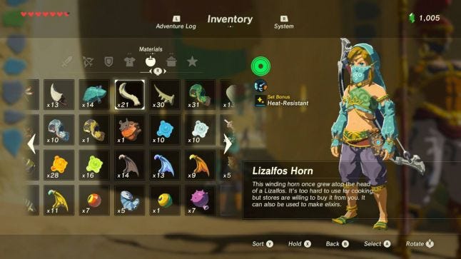
Breath of the Wilds inventory menu
But changing clothes is slow: you have to go through your inventory (it stayed where you were the last time you closed it), go into the cloth section, find and equip as many as 3 pieces of equipment. And sometimes the situation encourage you to change clothes (to optimize) three to five times in 5 minutes. A simple quick inventory menu like they did for the other pieces of equipment (main weapons, bows, arrows and shields) would have solved the problem.
This brings me to the biggest UX flow of this game. The throwing equipment system. I’m not talking about the fighting ability to throw your main weapon around (this one is perfectly fine to me), but about the lack of ability to do the same with shields and bows!
One of the core system of BotW is finding equipment, playing around with it, break it, and do it again. Every enemies drop their weapons when stunned or defeated, you can find many as reward, and the world itself is filled with weapons (or things you can use as weapons). And all of them with their specific stats. Which means you will be switching weapon A LOT. But as you only have a given number of equipment slots per type, you’ll want to throw one of them. But to throw away equipment is the same as to change clothes, you have to get to the menu each time.
Again, very simple systems already exist since a long time in the industry. Switching your equipped gear, with the one on the ground by maintaining a button for example would already be a great improvement. The game has a contextual gear wheel, but this menu is used to switch weapon during a fight, so the only thing doable is moving right or left in the menu, and validate your choice. A button could easily have been set to “throw”. And to solve every problem at once, a quick inventory menu, like the one you can find in Bloodborne, would have solved both issues entirely.
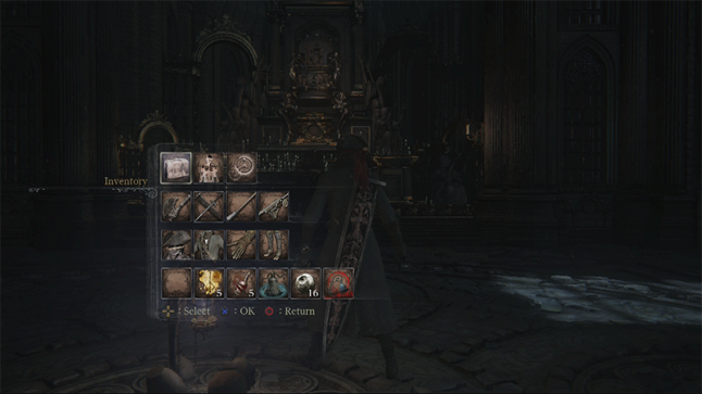
Bloodborne's quick inventory
Compendium
The compendium is the list of creatures, monsters, materials, equipments and treasures, that you had taken a picture of in the game. Later into the game, you can unlock the ability to find them within the world. This an interesting mechanic, the problem is that there is only a given amount of picture you can take (which makes sense), so if you want to do that consistently, you will often have to go to the menu and delete a big chunk of them all at once.
Meaning that if you took some pictures just for the sake of it, and you want to keep them, you have to select everything, and then manually find and unselect the ones you don’t want to see deleted. A restrictive process for a system supposed to either push the feeling of adventure through picturing every new thing (like drawing in a notebook), or give a tool for players to express themselves.
Separating the compendium pictures from the “enjoyment pictures” players might take, could have been a more rational choice. Making only the enjoyment ones limited.
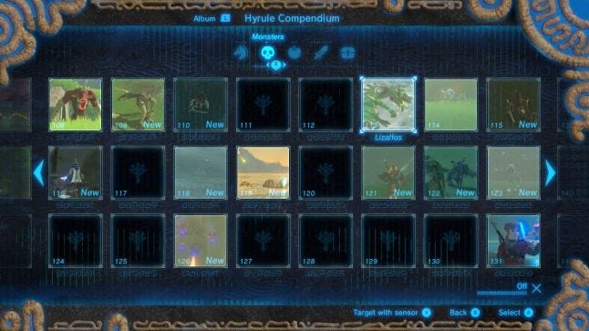
Breath of the Wilds' compendium
Shrines
To finish, I would like to talk about of one of Nintendo’s important design choice. Staging. In their latest games, Nintendo put a lot of effort into staging a lot of action they felt was important to make the player feel like she did more than the simple bare design action actually happening.
Like the cooking animation, the sweet dialogues each time you buy an object (and the fact that you can buy only one at a time), the animation for every chests, and so on so forth.
The example of the shrine looks like that; at the start of one you have:
The sheika slab animation
To walk to the elevator
The elevator animation
To wait for the loading
And finally the elevator landing animation
Then the name of the shrine softly appears as the mysterious, meditative music starts in the background.
And when you finish one you have:
The “touch” animation
A little text
The pop up “you got a spirit orb” (important reward for the game, as four of them gives you either a piece of heart or stamina)
The last animation
And the loading to take you back to the game world.
This setup helps create a massive, meditative space, breaking from your more epic adventures the games offers. But after a lot of shrines, if the player don’t want to see the 15 seconds for the first set up, and 30 for the ending it'll start to feel heavy.
It may not seem like much, but going that much against the player will can really breaks the flow of the whole experience.
So if anything, it’s important to keep in mind that UI/UX decisions are entirely linked to the design of the game, and have tremendous effects on player’s experience.
Read more about:
BlogsYou May Also Like