Trending
Opinion: How will Project 2025 impact game developers?
The Heritage Foundation's manifesto for the possible next administration could do great harm to many, including large portions of the game development community.

Featured Blog | This community-written post highlights the best of what the game industry has to offer. Read more like it on the Game Developer Blogs or learn how to Submit Your Own Blog Post
The architect from The Witness shares leanings from their collaborative process, things to consider in order to design digital environments with gravitas and what to know when hiring an architect.

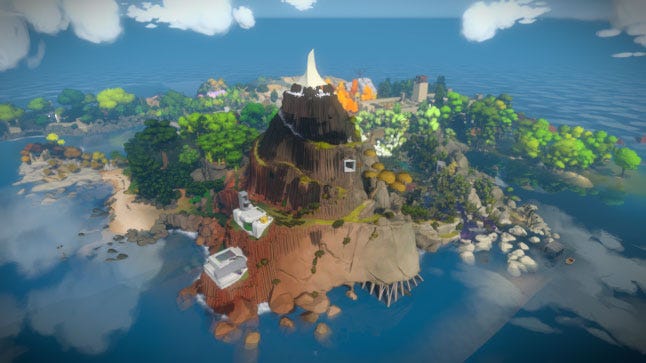
I am the founder of FOURM design studio and one of the architects for The Witness. This article is inspired by my experience working with the landscape architects and game developers on this project. It may be the first time all three have collaborated so closely to do so.
As with all attempts at cross-industry collaboration, there are growing pains -- but if successful (and I believe we were) the results can generate beauty and innovation. It is also my hope to illuminate and facilitate this process for others through our learnings and to explore how this collaboration leads to an experience of gaming with gravitas.
WHY WORK WITH AN ARCHITECT
It was September 2010 when Jonathan Blow approached me to work on his new video game in development, titled The Witness. After viewing the prototype, we also brought on landscape architects Fletcher Studio. This seemed like a good idea considering that while there were 20 or more buildings on the island, the majority of the environment was landscape. Architects and landscape architects know that a building is a mark on the land in a context. No building should be designed without considering the landscape it is a part of. Jonathan saw the logic of this, and by the summer we were off and running.
My experience working on The Witness the last five years has been one of the single most creative and exciting experiences of my career. While I am grateful that artists like Ronen Bekerman are advancing the quality of architecture in gaming, as I look at the architecture of most video games I feel let down by what I see. I wonder why do we not see more collaboration between experienced architects, landscape architects, and video game developers.
From the architect’s side, I know that we like to make stuff in the real world, and perhaps don’t think it will be rewarding. Architects often don’t play games or see how they can be of service. Many think it’s all about coding and that we need to have this skill. I also think architects may not see the value of the video game industry and its products, which is unfortunately an ignorance that I also possessed prior to working in the industry.
From the game developer’s side, they may think they do not need architects and do not understand their value. After all, they are not trained in the video game industry. My experience is that most game developers, including artists, just don’t understand architecture or landscape design. This is not a surprise, given that it is a highly specialized field where people study for up to seven years in college to absorb and develop design skills. Finally, many developers may also just think that designers like us are not affordable.
The reality is that these beliefs may be interfering with a collaboration that could both expand the design and development of physical architecture and video games as an art form.
Let me provide some reasons to consider working with us:
When you include an architect and landscape architect as part of a development team you are bringing on a profession already trained to work conceptually, iteratively and critically.
The design development processes and tools are similar even though products are different.
We are trained in considering the user experience when moving through a space so absorbing the concept of gameplay is not difficult.
We bring great depth of knowledge to the creation of 3D environments that can foster deeper immersion and enhances gameplay.
We are used to working with clients and in multi-disciplinary teams so should be essentially easy to work with.
Technological advancements in game engines, rendering capacity, virtual reality etc. present a more urgent need for our expertise as digital environments strive to become even more realistic and/or fantastical.
To conclude, any game that is three-dimensional in nature could potentially benefit from an architect or landscape architect. We can help developers think of space as more than just enclosure/envelope. When this thinking is not applied, many elements of design that are critical to enhancing gameplay immersion and experience are lost to the detriment of the game developer’s intention.
DESIGNING FOR GRAVITAS: THINGS TO CONSIDER
If you are working without an architect or landscape architect there are 10 basic things that games tend to do that could be avoided with some design knowledge and application. I am going to refer to some games other than The Witness as both successful and less successful because they are popular, diverse, and frankly most of them I really like. It would be nice to see them taken to the next level so that the environments are not distracting and incongruent with the goals they are trying to achieve.
1. Developing architectural narratives
It is always helpful to remember that landscapes and architecture are based in the temporal, physical, and institutional constraints of the real world. What is the topography of the land? What materials are available to us? What climate are we in? What are the zoning laws? Where is the sun coming from?
Therefore, one of our first questions we asked Jonathan’s team (Thekla) was “What direction is north?” They replied, “What difference does that make?” I knew then that we would need to recreate and reframe the real world constraints with which we had been working. In order to design customized environments we would need to develop a narrative and new kinds of constraints that would define it.
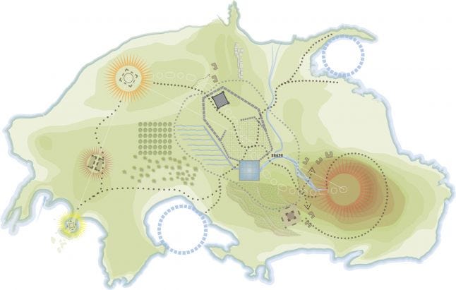
So how do we create narratives that deliver rich environments? Sometimes in an effort to create a holistic identity or world, video games commit to one style/period, or genre yet this is not how environments exist in reality. Our built environments have history, a story across time. They are layered. In The Witness we use this passage of time to create the narrative so the environments are a series of adaptively re-used buildings and landscapes beginning with prehistoric times to the present day and beyond. Each building and landscape is designed in response to the needs of at least one civilization and in some buildings all three civilizations are expressed.
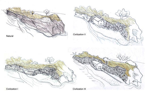
For example, at the edge of the island is a concrete factory that sits in a quarry. The environment registers how the Stone Age people (Civilization I) began to quarry stone for tombs through small cuts in the cliff side. Then one can see where the stone was mined at a larger scale for religious structures such as churches and cathedrals in Civilization II. A church is built here both carved and constructed from the stones being quarried around it. As Civilization III developed, even larger stones were mined and used to make concrete, a more contemporary building material. Small stones were also required as aggregate and the church was converted to a factory in order to scale this process and construct other buildings on the island. As a gameplay wayfinding element, the factory exhaust rises up out the old steeple. Inside factory equipment integrated with the religious frieze panels provide the game artists with additional opportunities to tell a deeper lever of narrative.
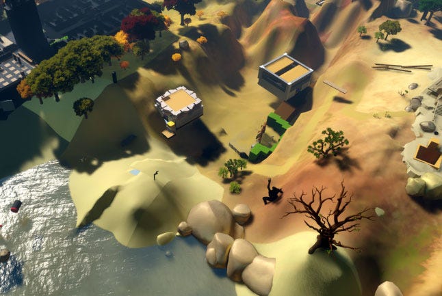
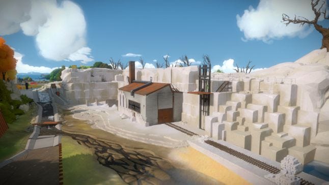
While architectural narratives like these were easy for us to develop, they may not be as easy for gameplay developers. For us the gameplay constraints were more challenging. We were fortunate to have a developer like Jonathan who provided us with what became our primary constraint-game play. The rules of The Witness with regards to gameplay were rigorous and finite in many ways. As architects, we had to learn about what this meant. It is one of the things architects need to understand when working with developers and an aspect that developers can more rigorously apply to environmental design.
2. Integrating landscape and architecture
Developing a close integration between architecture and landscape is critical towards creating a realistic and integrated experience. Games like The Witness, Bioshock Infinite, The Talos Principle, Ether One, and even Super Mario 3D World are creating environments where the integration of this aspect of the world is critical to the player's experience. In The Witness, the landscape architects helped us to understand the way the natural world develops and how to explore and adapt the variety of amazing geological formations and bio zones to meet the needs of gameplay. We also worked together so that every building was integrated into its environment and used the landscape to guide players to components they needed to locate or see.
3. Building design
Buildings in games are usually references to images of buildings the game developer or artist sees in magazines, their lives, or image references. Rarely have I seen in games buildings that are purpose-built or designed specifically for the style, concept, and narrative of the game.
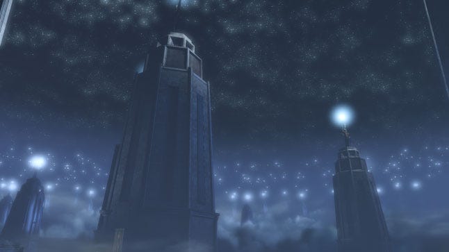
Bioshock Infinite is a game that has an interesting premise and yet does not take full advantage of the opportunity to create really amazing and unique buildings that could have supported the narrative. I love the scenes with the floating 18th century buildings jammed together and the exciting spatial quality they have achieved.
It would have been stronger if they had applied the steampunk aesthetic to the design of the buildings. If conceptualized as characters in the context of the game, a series of customized forms and details could have been replicated throughout the interior and exterior environments that would reduce the visual noise in this game. They would have been able to achieve a more sublime feel like they have achieved in the lighthouse level.
4. Deploying materials & textures
Most game designers probably know all too well the trappings of placing brush, ruin wall, stones, or stains and noise to address issues that aren’t working well in their design. Yet understanding the properties of materials, how they behave and are created can help artists make better decisions in how they deploy this aspect of the design.
Look at the world around you as much as you can, and you will start to see how concrete stains, wood cracks, or how steel rusts or melts in fire. Many games suffer from what I call the “cut and paste” look -- where buildings or materials are deployed without any rigor or understanding of their properties. This may happen due to the pace of building massive worlds within a short amount of time but if you understand some basic principles of materials then you can make fast decisions that are well informed.
For example, the steampunk style that BioShock Infinite draws on for its narratives is a genre rich with textures and details. However, in the game they create a noisy collage. Stone columns are supported by wood flooring, a much lighter material. Structures and architecture elements are made up of four or five different materials that have no relationship to one another and would not actually stand up.
In The Witness, we tried to develop a palette of materials that supported the narrative and helped the artists to understand them such as the ways concrete is formed. They are now experts themselves and are able to develop the textures in a thoughtful way that aligned with the gameplay style. We also worked on the textures to pull out the essential quality of the material to you could understand what is was without diverging from the art style of the game.
.jpg/?width=700&auto=webp&quality=80&disable=upscale)
The Witness: Belltower with Corten Steel and Civilization II Stonework
5. Scaling, proportion, and style
Understanding building assemblies (connections between elements) and how that influences our perception of these environments can help with the development of the interior and exterior environments. This is something architects understand very well. Therefore a good way to work cheaply with an architect is to have them do sketches over scenes like this one I did in a few minutes on a scene from Ether One.

The wood texture should be finer, and the desk has a low level of detail compared with other aspects like the wainscot on the wall, whose height looks too low (3 to 4’ is ideal). The lighting needs to be more integrated and the plants in the dark corners would definitely be dead from lack of light (which could be cool if they actually were). They have used stone columns throughout this area, so why not bring the element into the space for consistency? In addition, there are no pieces of wood that would span the entire back wall. Showing seams/panels here and in the desk add honesty, verticality, and a level of detail that is consistent with the rest of the space. They coudl also consider showing more layers of time in a single room that might stregnthen the dementia narrative. For example, old wood showing through gypsum wallboard that has been ripped away.
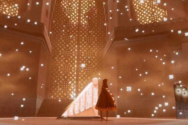
A great example of these aspects of design can be found In Journey. Here, the architecture assemblies are accurate, consistent and in proportion to one another while still creating a fantastical world. The landscape and buildings are scaled well with the character and other assets of the game. There is a verticality to the proportions that is lovely and consistently replicated throughout the game. This gives is a very refined and holistic look and feel. Even through there is a distortion in these proportions from reality it is done with an understanding of the basic principles of design so it works quite well. Once you develop an eye for the scale and proportion of architecture and landscapes they are easier to manipulate. 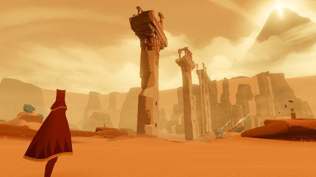
6. Details
Along with understanding scale and proportion comes the proper rendering of details in the architecture. These may be done to avoid abstraction of space if your art style is refined or making them simpler if things are of a looser style. What is most important is being consistent with the level of detail and the scale of these elements. It is something we spent a while on in the witness so that the lighting, stairs, door handles, furniture, or window openings are all developed at the same level of consistent detail and in alignment with our art style. For us, it made doing modern architecture difficult at times and we worked hard to create details that reflected these assemblies in a low poly yet realistic way for the painterly quality we wanted.
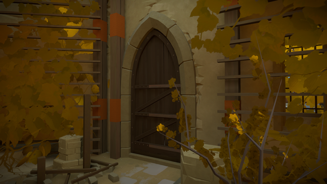 The Witness: Hub Chapel
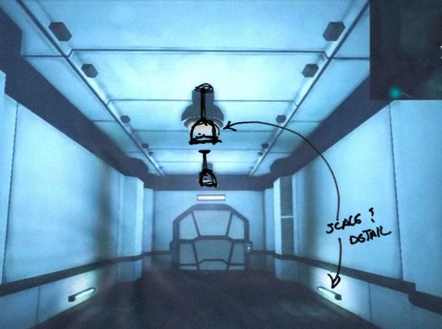 This scene from Ether One looks great, but making this small change would harmonize the entire space.
Mirror's Edge is another game that does a particularly great job of detailing most of its elements. They make strategic use of building systems such as electrical, plumbing, heating, and cooling systems with color to guide gameplay movement and perception. It is visually pleasing due to the lack of noise yet it is rich at the same time just by understanding materials, transitions, details, and assemblies of the built world. Even a game like Relativity that is diverse spatially but simple in its execution has an incredible consistency that makes it wonderful to be in.
Another beautiful but quite different game that also makes good use of detail is Relativity. It is diverse spatially, unique in its style and simple and consistent in its palette and details, which I think helps you to feel immersed in this MC Echer-esque world. 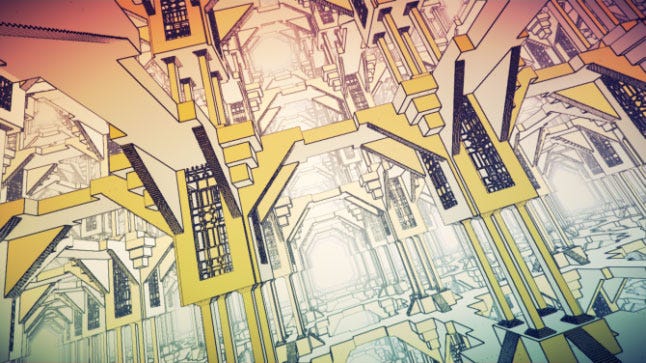
Detailing contrasting components well is also a great opportunity for good design. For example, the integration of layers of time in The Talos Principle is interesting, and it is these moments that it could have been nice to think about how they would integrate given they are very prominent in the environment. Rather than stick things on the stone, these technological pieces could have been integrated in the tectonic of the old castle wall in a more sophisticated way that would have added some gravitas to the look and feel of the game, supported the narrative and built on the textures that had.
7. Transitions
In addition to detailing connections, it is also important to articulate transitions: areas between rooms and spaces, thresholds/entries, vertical assemblies (base middle and top), where a wall meets floor etc.
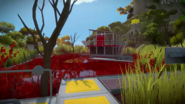
Often the architecture is covered in texture maps, from wallpaper to bricks, but then the intersection between surfaces is left out -- creating an incongruent condition between the detail of the materials and the assembly itself. I see this almost every game I have played. It is turning out to be one of the most important levels of refinement we have been doing in our final pass on The Witness.
8. Characters and environment
Christian Nutt of Gamasutra asked me if Super Mario 3D World could benefit from working with architects. I think that perhaps it could. The interesting thing is that Super Mario 3D World has a lot of modularity as does architecture in the real world.
With its great gameplay, investigating what a designer trained in architecture could bring to a game like this is exciting. I believe popular games like Super Mario 3D World are perfect vehicles for increasing visual literacy as they are simple and can help the player understand both the goals of the game and the world around them.
What I do notice in this game and many others is that the architecture environment does not have the same proportioning and detailing as the characters moving through the scene. In Super Mario 3D World it’s almost as if the curves and details of the characters have been scaled up to create the forms we see in the world.
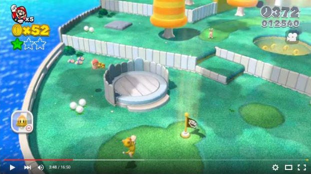

I often wonder if artists just feel more comfortable and have more experience designing characters. I know sometimes this is also being done to highlight the characters, which makes sense. However I wonder if through the exploration of the art style and articulation of the environment they could be in greater alignment with one another and improve the clarity and experience of the game. I think Mirror's Edge does this well. The backgrounds are articulated to a point that they have some gravitas but aren’t overpowering the characters.
10. The space in between
While the architecture itself is important the relationships between buildings is just as important as the building itself. They are part of an overall scene that you are creating in every moment, and understanding how buildings can create outdoor rooms and a diversity of spatial experiences definitely enhances gameplay.
The Talos Principle is an example of a game that has some great spaces that are scaled really well and others that are not so much. In many areas there is a flatness to the experience since there is no strong vertical expression or experience of the architecture that would traditional be found in castles due to their purpose and use as place for protection and surveillance.
The open spaces, courtyards or baileys where you are shooting are too large compared to the wall height, and what would have been the interior spaces of the castle. An opportunity would have been to harness the design of castles and the development of the radial form of the medieval city to help with the experience of the game and provide more interest to the experience through spatial variety that reflects the historical narrative of this time.
Most buildings prior to the Modernist movement have a hierarchy to them like the church nave or the grand entry. This flattening of the architectural experience in the agency of gameplay goes counter to our experience of this type of architecture and is a missed opportunity. Why not use the logic of these buildings to enhance gameplay?
Many games also often have large spaces that have game assets floating in them. An unrealistic building or room density does not provide containment of the events unfolding. Often objects are out of scale to one another or larger than any element might be in reality.
For example, the Gone Home entry foyer in plan is massively out of proportion with the height and the scale of any suburban home as viewed from the outside. The assets are floating in the space in ways that feel out of context with the real experience of domestic space pulling us out of the immersive reality.
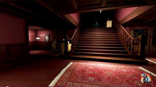
The player is drawn to the objects because they stand out in a bare room but it seems like they would have been more successful by integrating assets into well-scaled environments. They could use the space itself to guide players to these components in a sophisticated way perhaps through light, color, and detail.
Gone Home is one of my favorite games to play because it makes use of 3D and 2D representation of this space. It would have been more powerful to create a house or even a compound that had some logical complexity to it and generated a domestic environment that made sense and enhanced the game play experience by drawing on our personal memories of home.
THE PROCESS
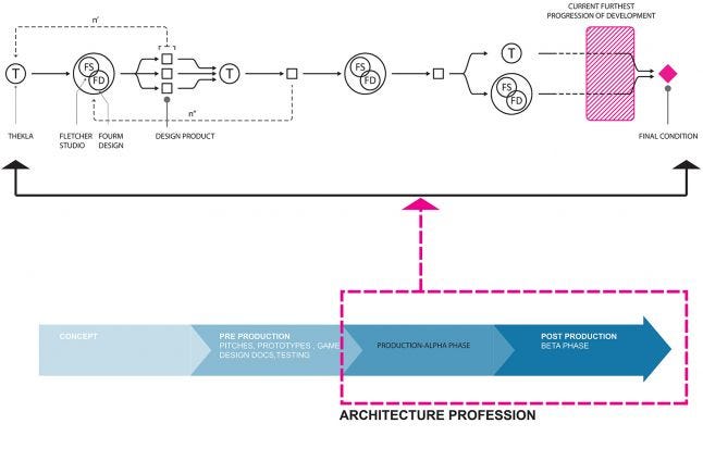
For those considering working with design professionals I wanted to share a bit about our process since we learned a lot as we went. While some things were new for us, many things were very familiar to our way of working. Architecture is an iterative process using both analogue and digital media and always requires working creatively with people coming from various engineering and artistic backgrounds. In these ways, working with game developers was no different.
The diagram below shows this process, which for us usually began with a rough prototype from Thekla. Sometimes we would have working sessions with them to develop a prototype based on idea one of us would have but usually they were developed by Jonathan. Either way FOURM design studio would work closely with Fletcher Studio to develop the building and landscape together and return to Thekla with various options for consideration.
In the beginning, we would deliver designs in the form of Sketchup or Rhino models, hand drawings and image references but we soon realized that checking our options into the game engine itself was best. Sketchup proved to be the easiest, as we were not using 3DS or Maya, and exports from nurbs modelers like Rhino proved difficult to clean up.
If some options seemed feasible, Thekla would develop one or two and evaluate its success. If the former or latter options did not work, we would return with additional options. Once Thekla had a prototype tested in game we would then refine it and everyone would work iteratively to get it to its final condition. Even recently, we did a complete polish on all the architecture in the game and it took everything to a level of sophistication beyond even my expectations.
CHOOSING AN ARCHITECT
If you are considering working with an architect then there are some things to think about in this selection. Not all architects are the same and therefore not all are going to be appropriate for your team.
You should ideally find an architect/landscape architect that has facility with 3D modeling software and understands building assemblies as most do. However, a good technical architect is not always great at thinking conceptually. You will need to find one who can develop architecture from abstract/philosophical ideas or gameplay narratives. This kind of designer can also help develop narratives for you to consider.
If they have experience in the game industry or love games that its great but they at least need to be willing to play games and educative themselves in the industry. For me this involved finding and playing games I enjoyed and some I did not. It also involved going to industry conferences on my own dime to understand the industry more deeply. On your game they will need to respect and clearly understand the rules and concept of gameplay.
TIMING AND COST
I believe we came onto The Witness at a great time. It was after the basic working prototype had been developed since Jonathan needed no assistance in conceptualizing his game.
Some of your timing may depend on budget and cost. The sad news for us and the good news for you is that architecture is the lowest paid profession (we are also not good at math). Usually architects work on a lump sum fee based on phases and are related to overall project costs. Architects' fees can range from 5% to 15% of overall construction budget depending on the type of project. If budget is an issue an architect can be brought in a key stages for evaluation and input. An architect’s hourly rate is roughly that of a senior game artist.
CONCLUSION
While all these aspects of design are important, the most critical thing that I teach to professionals and students alike is to just wake up and pay attention to the world around you. I hope that these recommendations can help you do that even if you choose not to work with an architect.
I would also like to conclude by presenting a bigger vision for this collaboration. I believe that everything we do creatively influences our larger cultural context. As more members of our society begin to play games in well-designed digital environments, we will ultimately improve the visual literacy of our population. In doing so, I believe there is a reverse effect where we will start to expect more from our physical environments rather than ignore them as we often do now. We will start to question the strip mall, the big box stores, suburban landscapes filled with McMansions and the bland colorless panelized architecture we crank out in the United States, at least. Maybe through the immense creativity found in the creation of digital environments we can envision better physical environments that foster imagination, community, sustainability, and well-being. In doing so I also hope that we have moved further down the road of accessing the power of video games to change the world around us for the better.
Many thanks to the other members of The Witness design team!
Digo Lima, David Fletcher, Nico Wright, Beth Bukolich
Read more about:
Featured BlogsYou May Also Like