Trending
Opinion: How will Project 2025 impact game developers?
The Heritage Foundation's manifesto for the possible next administration could do great harm to many, including large portions of the game development community.

Featured Blog | This community-written post highlights the best of what the game industry has to offer. Read more like it on the Game Developer Blogs or learn how to Submit Your Own Blog Post
Pixel art isn't the only option if you want to find a style that won't break the bank, and be beautiful at the same time. What was our approach for 80 Days and Frankenstein?

Joseph Humfrey is co-founder of inkle, an independent studio that specialises in story-focussed games, most recently 80 Days and the Sorcery! series for iOS and Android.
I hate pixel art. There you go, I said it. As an independent game developer, it was my terrible secret. But perhaps it's not entirely true; hate is a strong word.
There are plenty of games with a blocky pixelised style that I've loved. Sword and Sworcery is beautiful and enchanting. Gemini Rue is sophisticated and thrilling. Wadjet Eye's games in general have done a great job of moving the genre forward with excellent design and forward-driving stories that wouldn't be out of place in novels and films. And of course, Papers, Please is ingenious and politically thoughtful.
Pixel art has an enduring attraction to both gamers and developers. Most obviously, it elicits nostalgia, reminding us of an older generation of games. The visual naivity can also cause delight when a well designed game's inner design complexity bubbles to the surface - they can set up an expectation of simplicity, before surprising players with hidden depths.
However, the greatest strength of pixel art doesn't lie in its retro imagery; it's all about design abstraction. Representing a character with just a few pixels can be expressive. The mind automatically fills in the space between the pixels, forcing us to use our imagination the way the words in a novel do.
Scott McCloud demonstrates this very well in his book (actually, comic) called Understanding Comics, and has an online explanation of the concept here. He describes the continuum of imagery between a photograph of a face and the simplest possible representation using two dots for eyes and curved line for a mouth.
The continuum from realistic to cartoony images represents increasing levels of iconic abstraction; removing (abstracting) an image from its retinal source, but still retaining its basic meaning.
But it's about more than simply retaining meaning in an image. The more you remove literal extraneous details from an illustration, the more you invite the viewer to add their own. (Related: the uncanny valley occurs when too many incorrect or incongrous details are added, an especially common problem in modern video games.)
So, pixel art is a useful tool. It uses a design vocabulary that is attractive to gamers and sparks the imagination. And, of course, it's practical. Fewer pixels means less memory and faster rendering.
Why do I hate it so much then? Well, I don't dislike specific instances, when the style is used to good effect. My problem is with its sheer pervasiveness among indie developers. It's used as a crutch for developers who think they're avoiding design altogether. I certainly don't have a problem with nostalgia per se; it's the rampant repetitiveness and self-indulgence of this particular brand of nostalgia that irks me. All art builds on previous work to some extent, but it's important to move forwards and stay creative.
What's the alternative? What art style can we use that's economical, practical, beautiful and expressive? From where can we draw inspiration?
Of course, it all depends on your specific project, the skills of you and/or your team and your budget. Here's a couple of examples of specific art styles that we've used at inkle. They may not have the raw beauty of Monument Valley, Tengami or The Last Guardian, but at least they're more creative and visually eye-catching than the majority of pixel art out there. Right?
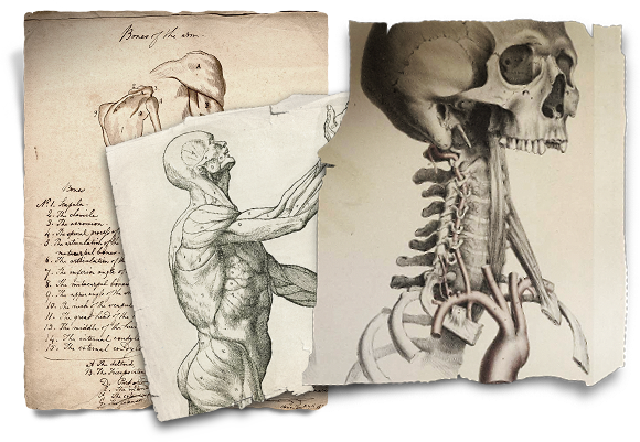
Frankenstein was the first app we made here at inkle, and was a collaboration with gamebook author Dave Morris and publisher Profile Books. It's a modern literary interpretation of old Choose Your Own Adventure books or gamebooks that were popular primarily in the 80s. We brought the technology and design; our inklewriter engine was in its infancy, but already allowed highly complex branching narratives to be written using our own proprietary but easy-to-learn authoring format. We designed and built the app, and defined the art style.
From its very conception, Frankenstein was a project born out of creative pragmatism; intellectual property is always important, and making use of out-of-copyright IP is an excellent way to get a leg up, whether you're just starting out, or already well established. Mary Shelley's original Frankenstein; or, The Modern Prometheus was first published in 1818, and was therefore well and truly out of copyright.
There was a sense of elegance in doing the same with the art and illustrations. At an early project meeting, we hit upon the idea of using anatomical drawings to illustrate the interactive novel, which was intended to broadly resemble a book, albeit one that was being written live by a 19th century mad scientist.
Thankfully, it wasn't long before I stumbled upon a treasure trove of anatomical illustrations: Historical Anatomies on the Web hosted by the U.S. National Library of Medicine. Not only were they in the public domain, but they were available in high resolution, often very high resolution.
The photographic material aesthetic strengthened as we used more and more natural textures: a wooden table surface, medical disection instruments, and dusty old books, all either scanned, or gleaned from creative commons sources. I should also point out that all this was before the day that skeuomorphism became a naughty word!
Of course, Frankenstein would never have suited pixel art anyway. But the point is that there's a lot of material out there in the public domain, and with just a little bit of creativity, a little can go a long way. We never paid a penny for any of Frankenstein's art - why not try out a collage art style in your own game?
Our most recent game, 80 Days, is a narrative adventure where you race around the world on a route of your choice, while being told a story that's unique to your particular path. The game is played out on the surface of a 3d globe, as you can see in this early concept:
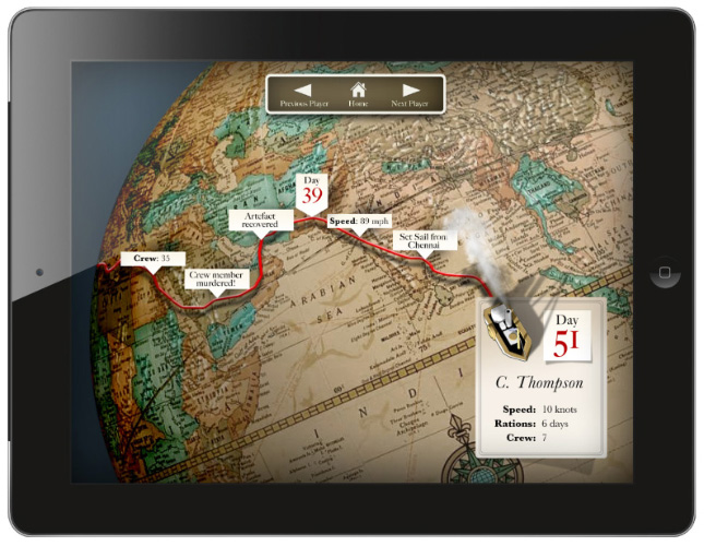
We initially envisioned our world as being classic steampunk; brass, cogs, Da Vinci machines complete with Victorian typography. It was actually a decision less concerned with the tone of the world, but rather made out of necessity: we needed airships that would zip you quickly down the East coast of Africa - otherwise, why would players ever go that way? We needed to balance the gameplay so the whole world was up for grabs.
However, I felt restless with the brass and steam. It seemed too obvious. I wanted to try something different. iOS 7 was on the horizon, designers were bemoaning skeuomorphism, and I wanted to try my hand at a more modern art style. A touch of modernism could also suggest minimalism, so I hoped that might help the art requirement load.
At some point I hit upon the idea of using Art Deco travel posters as an inspiration:
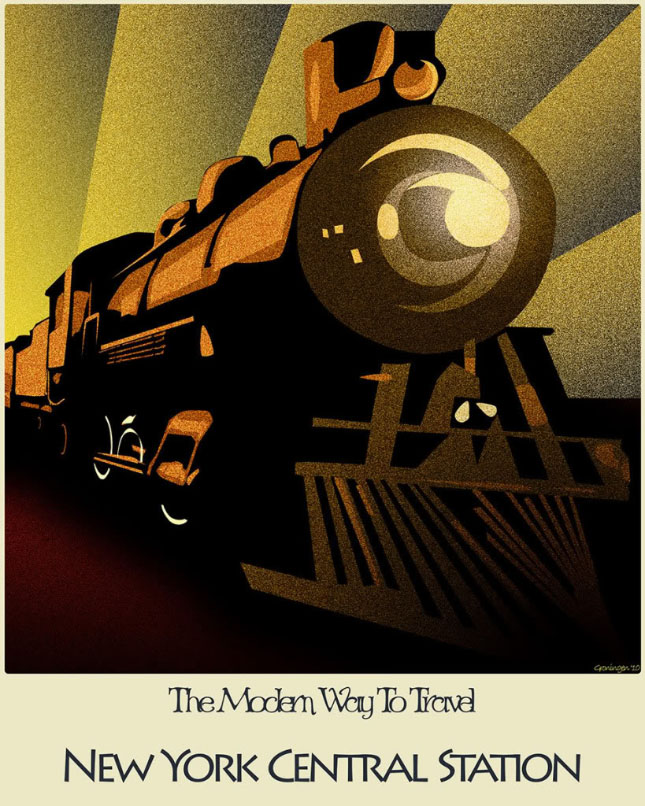
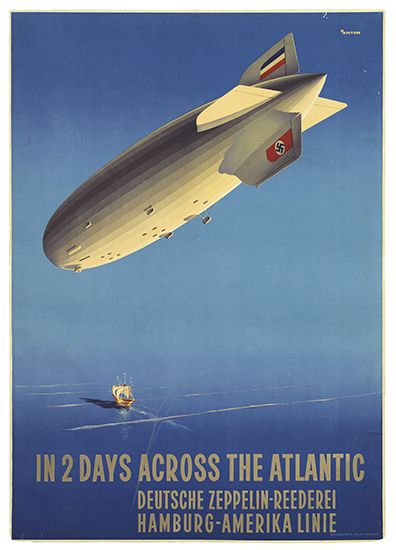
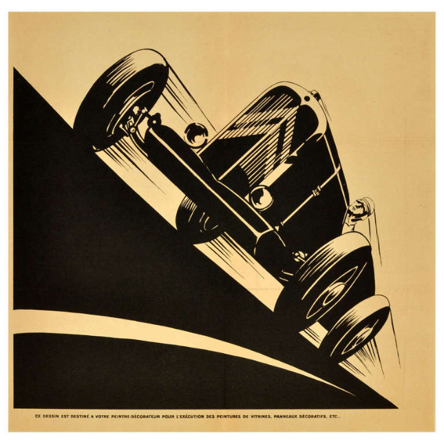
As with any idea, there's a chasm of work between having it, and implementing it. Despite the relative simplicity of 80 Days' final layout and screen composition, there were some rather large problems in getting there!
There was a constant debate, both in my own head, and sometimes when explaining the art style to others, that leaning on Art Deco might come across as anachronistic. The art movement is rooted around the 1930s, fifty years after the events of Verne's Around the World in Eighty Days. Would it seem out of place, or simply make us seem ignorant, like we were going for a retro feel, but getting our decades confused?
In addition, Art Deco had been done by other games already. Bioshock and Fallout had pretty much cornered the entire spectrum of design from the first half of the 20th century, from Art Nouveau through to fifties Americana. Would we be able to carve out a space of our own?
Thankfully, I needn't have worried. Meg Jayanth, our script writer, built a rich world that was heavily researched, but also transformed and augmented, taking the best of Verne and traditional steampunk, and layering in her own fantastic alternate vision of the 1870s. When taking creative liberties with the world itself, we opened ourselves to freedom with the whole, taking ownership of every aspect. We ended up with a unique world that belonged to us. We didn't need to worry about creating a perfect pastiche of Art Deco, we simply took it as a starting point.
Jaume Illustration understood the style, was inspired by Meg's concepts, and went on to inject a huge amount of creativity and brilliant detailing into the vehicle illustrations. When I came to define the colour schemes, I used the smooth gradients that characterise period travel posters, but gradually introduced more vibrant colours than would've been seen by the printing presses of the 1930s. I didn't strive to find a font that was overtly characteristic of the era, instead using one that happened to be created in the 30s, but was still popular in modern usage today.
Great directors and cinematographers manage to make sure that every single frame of a film looks like a work of art in its own right. You can press pause at any point, and see a stunning piece of composition. It's an ambitious, possibly even foolish goal to try to achieve with video games, but I still think it's worth thinking about. Shadow of the Colossus gently moves the camera while you're riding your horse to position it in one corner, creating a classic "rule of thirds" arrangement. It's subtle so as to avoid being off-putting, and for lack of a word, feels epic.
Consistently showing a great composition is a bit easier with a primarily 2d game than with a 3d one, where the camera and protagonist could be almost anywhere within a 3d environment, although it's still far from trivial. For a start, we knew from the start that we wanted to support iPhone in portrait orientation, as well as iPad in both landscape and portrait. Overall though, I'm pretty happy with the result:
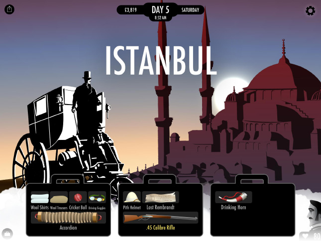
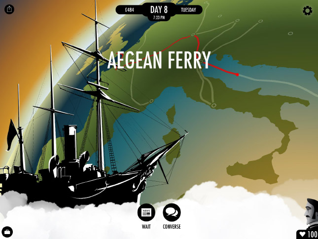
Our consistent layout keeps the current transport in the bottom left corner, while the landmark for the current city sweeps along and up the right hand side of the screen. When travelling, the globe is positioned so that the horizon arcs diagonally across the screen, and the Indiana Jones-esque red line draws in from left-to-right.
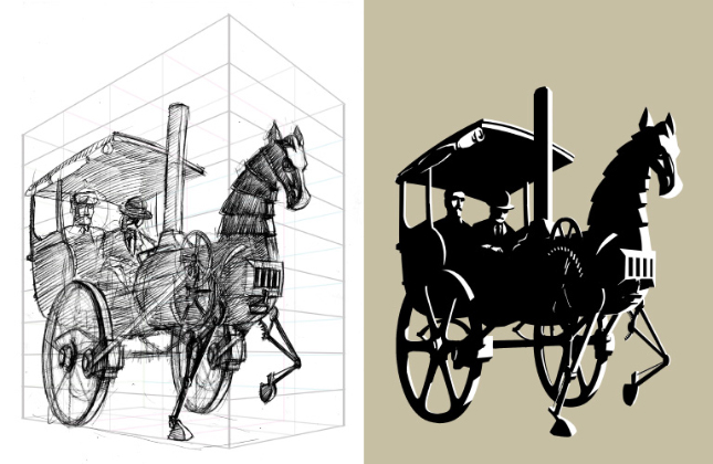
We chose to use a stark black-and-white art style for the transports partly because we wanted them to stand out and constrast against the background, and partly because naively, we thought they would be quicker and easier to create. Of course, that wasn't really the case. It also turned out that not all transports were easily recognisable in silhouette alone, which was our original plan. And, in order to define the details of an outline, the inner details of a silhouetted body necessarily have to be conceived, since they inherantly relate to one another, in the same way that the bones and muscular structure beneath the surface of skin determine the way a human figure is drawn.
Here's an example of one of Jaume's sketches, and the striking final piece. Jaume told us that the hard edges and filled shapes weren't straightforward either; although they look like they would be easiest to achieve using vector software such as Illustrator, it actually makes more sense to create them as bitmap, since it makes the details more malleable, and we didn't require the final result to be vector anyway.
In terms of economical asset creation, the background landmark illustrations were a little bit more of a success story. They could usually be directly traced or otherwise derived from photographic sources.
The character illustrations were also incredibly beautifully realised. Jaume worked with us closely to find a way of building many permutations of gender, ethnicity and social background in such a way that wouldn't cause a combinatorial explosion!
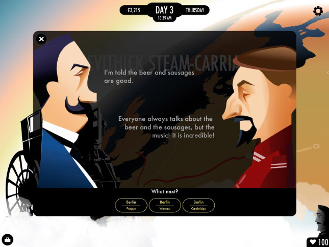
Was 80 Days economical? We certainly spent a lot more on it than we did on Frankenstein, having hired two artists for several man-months. But given the volume of original material, we think we achieved a lot on a small budget.
But those were two very specific cases, right? Frankenstein was more book than game, and quite static. 80 Days certainly doesn't look much like most games out there. Neither would've suited pixel art anyway.
The principles still apply. There are loads of inspirational sources out there that you can draw on, and even repeatable styles that can be used in different contexts.
Some styles may suit programmers with a good eye. Some may suit artists who are more comfortable with natural media than digital techniques. Some may require a larger budget. But all of them are more creative than building yet another game that pretends that it was released in the 80s.
The photographic material aesthetic of Frankenstein isn't limited to the background clutter of a book app. Imagine a fully 2D version of Little Big Planet, using photographed objects and textures. Bring the beauty of every-day objects around you into a game that looks like you could reach in and touch it.
Comic book illustration is broadly appreciated and yet under-utilised in video games. Out There uses graphic novel design vocabulary cleverly and consistently. Apointment With F.E.A.R. is another stylish example.
If you have an ambitious programmer on your team, there are plenty of code-heavy ways of producing art economically, whilst helping to define a style. Fractals and L-systems can produce surprisingly organic looking results given mathematical definitions. Taken a step further, procedural generation might the latest buzzword, but Hello Games is a testament to its effectiveness, given their relatively small team. Relying on excellent lighting technology, even the controversial ambient occlusion and stripping back texturing is a style that's becoming popular, but one that I'd love see more of.
Talking of stripping back and removing detail, why not go entirely black and white, Limbo-style? Or just be inspired by their misty layers, and use tinted monochrome, with increasingly lightening shades receding into the background:
Claymation is hardly the easy route, but it's distinctive and is sure to turn a few heads if you have the means. I've also seen examples of meticulously crafted, lit and photographed dioramas, that looked stunning. (If that sounds like your game, I'd love to hear from you, since I've lost the link! Edit: It's Lumino City)
Last, and very far from least, the entire history of art is ripe to be picked from, especially the 20th century, but not only. Apotheon looks like it's played on the surface of an ancient greek vase. Why not try using North African textiles for inspiration? Surrealism is already fairly popular as an indie game art style, but why not venture outside of the realms of Escher and Dali, and see where it takes you? Ico is a beautiful game, but I'd argue that its European and Japanese box art surpasses its in-game beauty, with a painting inspired by Chirico's The Nostalgia of the Infinite (below). Why not make an entire game based on this painting? With its long shadows and flat but deep hues, it could be stunning.

I could go on, but I should probably stop.
Pixel art is tired. Pixel art has had a good run. Many good pixel art games may continue to be made. But let's see if we can achieve something greater, shall we?
Read more about:
Featured BlogsYou May Also Like