Trending
Opinion: How will Project 2025 impact game developers?
The Heritage Foundation's manifesto for the possible next administration could do great harm to many, including large portions of the game development community.
Devs who've worked on Battle Chef Brigade, Darkest Dungeon, Guacamelee and more share their favorite tips and techniques for designing fantastic 2D monsters.

Video games have always been fertile ground for experimenting with monster design.
While technology has allowed developers to push their artistic limits and build out photo-realistic three-dimensional dioramas of their greatest fears, there's something striking about creative 2D monster design.
With that in mind, we reached out to a number of artists and designers to dive into their process for creating great 2D monsters, and what tips they have for other developers about how to do it well, and what key elements must be considered.
Embracing fantasy
Tom Eastman, programmer and president of Trinket Studios, explains how the team behind Battle Chef Brigade thrived when they started leaning into a rather fantastic premise.
The player takes part in cooking competitions in which ingredients need to be picked up by hand and sword. At first, the monsters were closer to standard farm animals, but this restricted their vision and, more importantly, room for exploration. Abandoning those initial ideas gave place to much interesting designs and behaviors.
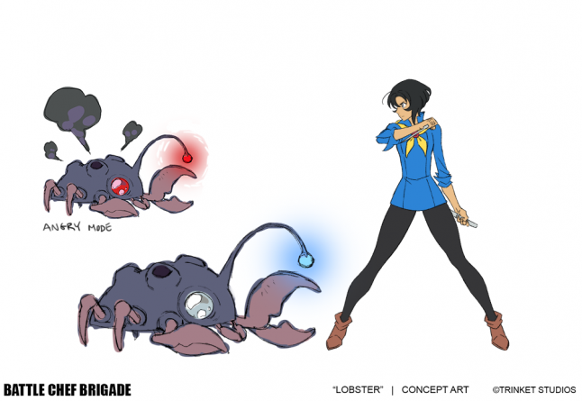
Simplicity and following a set of strict rules from the get-go were key to maintain a balance while fighting for these ingredients. “We tried to push the brawler genre into some new directions,” says Eastman. “First, we wanted the player to be picky about what monsters to fight since the arena is standing in for a cooking competition show's pantry. Second, since the player needs to hunt multiple times during a round, we wanted to build in a simple ecosystem to each environment.”
All enemies grant different ingredients when killed, and some are designed to produce different loot. Cheepchi, for example, can steal ingredients and eat them. Though this might seem like an obstacle for the player at first, the creature will later lay an egg, which can be either used in a dish, broken into a sauce or left to hatch.
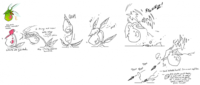
In the beginning, combat was supposed to be much more precise and complex, taking elements like heights and sizes into account. “We would carefully compare these elements ||with Mina's attack animations and try to make sure that each move would interact with monsters and behaviors differently,” he explains.
“Eventually, though, we realized a couple of key things: over-focusing on combat reduced the player's time and in the kitchen which was bad for the overall flow of a competition round and complex behaviors that happen primarily off-screen, like when the player is cooking, are utterly useless to the player. In the end, we decided to make combat easier to get into while accentuating combo opportunities, and also shortened these behavior sequences to ensure they could play out on-camera when the player is nearby.”
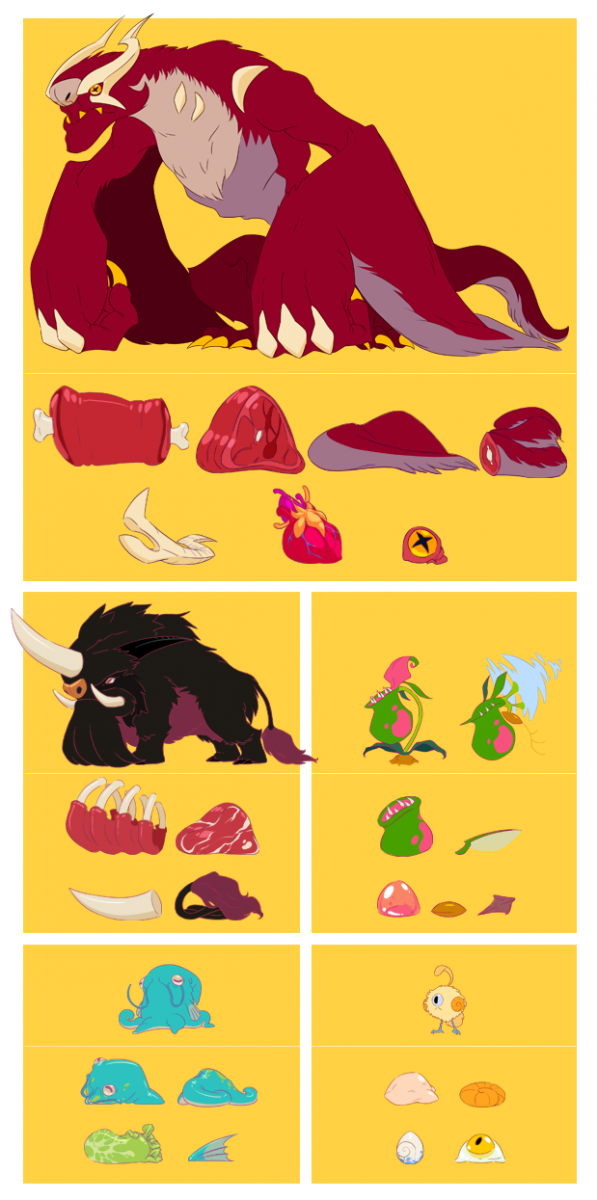
Eastman adds that the value of Battle Chef Brigade’s monsters relies entirely on how you’ll use them in a dish. This was taken into account when designing their attacks, behaviors and ingredients to form understandably and cohesive entities. An easy example of this would be The Dragon: It breathes fire, drops lots of high-level "spicy" ingredients, and is a dangerous foe.
Cultural and emotional influences
Concept and animation lead Augusto Quijano and senior designer Ian Campbell from Drinkbox Studios attribute Guacamelee’s monster design to their cultural backgrounds, whereas Severed’s horrific roster is tied to the representation of emotions.
Coming up with designs is one thing, but conveying them into interesting and easy-to-read enemies, as Quijano explains, took a lot of trial and error. “For Guacamelee, we wanted to evoke Mexico through the colorful, bold, clean shapes of the game’s enemies, while also using the day of the dead themes as well as other Mexican cultural elements.”
Many concepts were made during pre-production phase, and some missed the mark. There were ghostly enemies and baddies in skeleton suits as opposed to actual skeletons, for example. “By the time we started production we had a better sense of the aesthetic we wanted for the game, but the enemy design is always influenced by the gameplay, and enemies would change as we put them into the game and playtested them.”
In the sequel, the studio set a big focus on dodging during combat, and they portrayed it by designing a specific enemy that could only be attacked by performing such action. Now the enemy could be anything, but Quijano chose to make it look like one of the basic skeletons, giving it a central place in their enemy lineup.
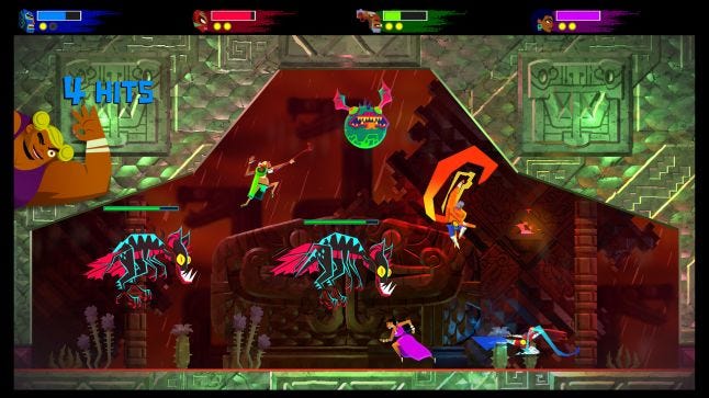
Severed involved a different process of thinking. Quijano didn’t want any traditional fantasy enemies, despite the game’s action/adventure origins. Rather, the studio looked into what the main character Sasha was feeling alone in such a strange world.
“We focused on looking inwards, on things that felt scary or off-putting. What would alienation or panic look like if they were a monster?” he explains. “Visually, we wanted the enemies to match the darkness of the story themes, but we decided to offset them with simple shapes and a bright palette. Common practice has these elements aligned, bleak story pairs with grey tones, but we used abstraction and color to counterpoint the bleakness. In a way, the bright palette and stylized designs are what allowed us to tackle tough themes like loss and mortality.”
Both games carried different perspectives, which influenced in the way the studio worked around the enemies. In terms of the crowded close-quarters battles in Guacamelee, some of the ways were giving them enough readability was to give enemies distinct silhouettes and colors, have visual designs that match their attacks so they can be remembered by players and coming up with different sized monsters.
Campbell explains that they “always introduce the enemies in isolation to give players a chance to understand how they behave, before combining them with additional enemies in more interesting ways. It’s important not to throw too many enemy types at the player at once -- the action is more understandable if you use a smaller set of enemies that complement each other.”
Strong visual and audio can also help to ensure players understand when an attack is coming, and what enemy it’s coming from. In Severed especially, as Campbell tells Gamasutra, these two elements were key for the player to not feel overwhelmed since they can only fight against one enemy at once and battles usually happen in groups.
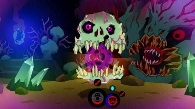
“The HUD helps indicate how close an enemy is to attacking, but the visuals do that as well, with enemies getting bigger, or more visually dense to indicate how far an attack has built up,” he adds. “The timing of attack tells are very generous, so even if you turn to face an enemy after it’s begun attacking, you still have enough time to respond properly.”
From Thunder Lotus Games, the studio behind Sundered, art director Jo-Annie Gauthier and game designer Ian Lafontaine tell Gamasutra that Left 4 Dead was a heavy inspiration for the intense behavior of their fast-paced creatures.
“One of these core choices was that monsters would be coming for the player rather than staying in a static position. We wanted the world to feel oppressive, a constant source of danger,” Lafontaine explains. “[A key difference] between Sundered and otherwise similar metroidvanias is that we did not want the player to feel in control. We wanted [them] to be responding to events and feel like the game was in control of pacing, to keep them constantly on their toes.”
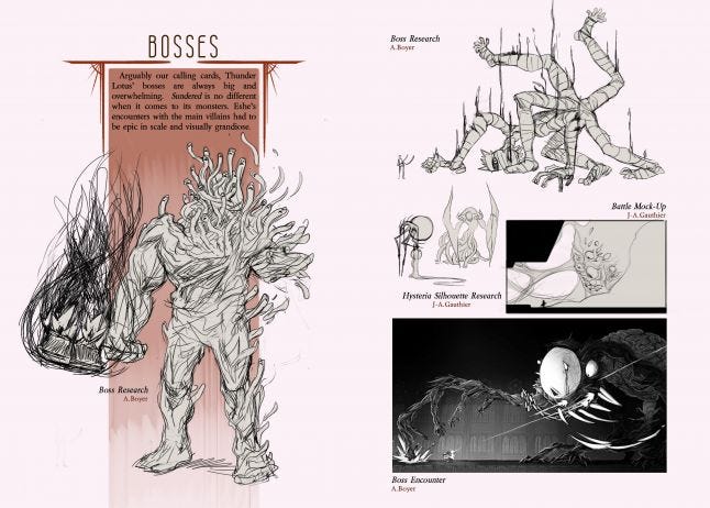
In order to achieve this, the studio decided on handling monsters independently from environments. This means that they had to be able to dynamically spawn enemies anywhere in the world, always in a way that would feel coherent. Monsters needed to navigate environments without pre-planning paths, a requirement that determined what kind of creatures they could actually make.
Two major movement design patterns arise from this: Those who could fly anywhere in front of the environment (since pathfinding with the level’s collision would have required much smarter AI which, in turn, would have greatly limited how many they could support at once), and agile creatures that could navigate every type of wall and ceiling combinations.
Another inspiration that Thunder Lotus took from Left 4 Dead was related to reinforcing an overall oppressive feel. This was tied to how they wanted players to fight against these large hordes of monsters, which would visually turn into a seething mass of chaos. But having a clear understanding of what’s happening on-screen required some clear guidelines.
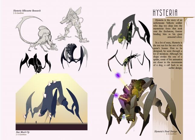
“The hordes of monsters meant that individual monster attacks needed to be heavily telegraphed and easy to avoid on their own. As soon as many of these monsters combined in a group, the sheer amount of information the player needs to process proves challenging, so giving them ample time to notice and then avoid an attack was very necessary,” he says. “Keeping some enemies small, or closer to the ground, allowed us to diversify horde types and the creation of each one while calling for the attention of the player in different ways, such as cranking up the danger meter every time the gong would sound.”
The enemies in Sundered, as Gauthier explains to Gamasutra, were primarily designed to move in inhuman ways. “That's why you'll see a lot of skittering bug-like creatures, tentacle-creeping monstrosities, teleporting enemies, tunnel-digging living machines, but minimal to no walking; the movement patterns were fundamental to the visual aspect and, ultimately, the diversity of gameplay within the hordes themselves.”
Creative director and artist Chris Bourassa saw a lot of potential in 2D spaces for Darkest Dungeon, experimenting with verticality, height, and horror beyond what meets the eye.
In terms of visuals, Bourassa tried to walk the line between creating interesting and unique silhouettes, but also maximizing the available space for enemies. The characters controlled by the player get wedged into their ranks pretty tight, which restricted elements that, in their designs, extended too far horizontally. That’s when verticality came in handy.
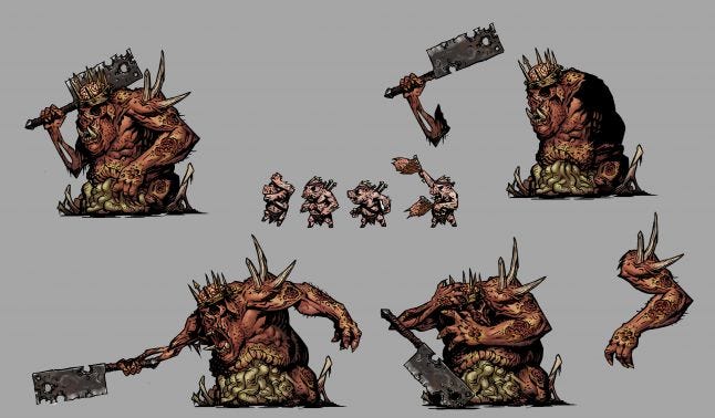 “Conventional wisdom says that the bigger a monster is on screen, the more dangerous it is, but I tried to subvert that a little by making some of the smaller, dare I say ‘cuter’ enemies be the nastiest,” expands Bourassa. “The Bone Courtier is serious stress threat, hiding in the back, and fighting with a ‘Tempting Goblet’ (inflicting stress to characters) as opposed to a giant, visually impressive weapon.”
This also comes into play during boss encounters. ‘The Swine King’ leverages players’ innate desire to focus their attacks on small foes first and foremost. The boss is joined by a tiny pig who calls out targets for the King to strike. Many players tried to immediately attack or kill the companion, but this enrages the boss and potentially causes a party wipe. “Messing with expectations, and playing with visual tropes is a fun and exciting way to generate new and engaging puzzles for the player,” he adds.
Bourassa had recently mentioned that a horrible monster isn’t scary unless it represents a horrifying idea, and it should be the tip of the iceberg. But how can this be illustrated in 2D?
He says to Gamasutra that it’s something he always tries to keep in mind, and that the escalation of dread is vital. “You need to create a sense of progression in your monsters so that each one builds upon the other, and ultimately hints at something truly terrifying.”
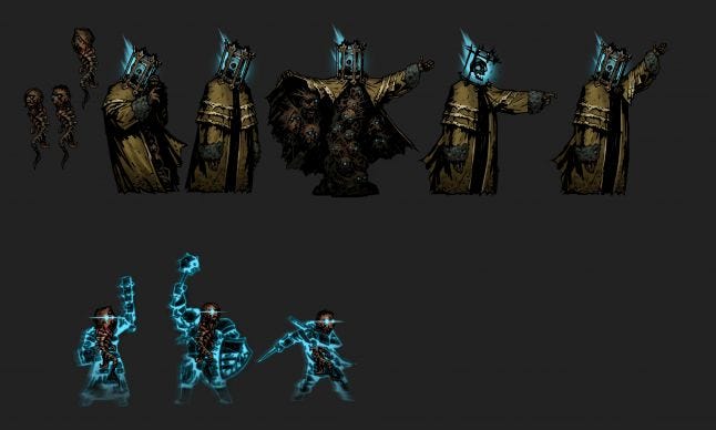
The Collector serves as an example, being a wanderer enemy that can show up anytime without warning. It looks rather regular at first as a humanoid in a regal yellow cloak, even with a flaming blue skull trapped in a cage as a head. “We escalate the stakes from here, however - the creature opens its cloak to reveal it doesn’t have a body of any kind, and is actually a stack of heads under its cloak. That’s gross, that’s scary. But what’s really insidious is that he summons the heads of some of the existing heroes.”
By doing so, it begins to create questions in the player’s mind beyond what’s on the screen. Are the hero heads an illusion, or has he collected them already, either in the past or in the future? What is the nature of time itself and the Collector’s relationship to it?
“These are big sweeping, unsettling questions with no clear answers. Cosmic dread, represented by something visually horrific.”
You May Also Like