Trending
Opinion: How will Project 2025 impact game developers?
The Heritage Foundation's manifesto for the possible next administration could do great harm to many, including large portions of the game development community.

Featured Blog | This community-written post highlights the best of what the game industry has to offer. Read more like it on the Game Developer Blogs or learn how to Submit Your Own Blog Post
Knowing how to create and present your portfolio when you apply to a game company is just as important as having awesome 2D/3D skills. If you have a badly presented portfolio you will struggle to find work. Here are some advice on making a good portfolio!

Midnight Hub is a Swedish indie studio run by former Mojang and Paradox developers. Right now we're hard at work with our story-driven mystery game Lake Ridden. Feel free to reach out on Twitter if you got any questions!
This post was originally posted on our developer blog, by our talented art director Erik Nilsson. By posting it here we hope to spread his advice on how to make a kickass art portfolio when applying for a games industry job! So, without further ado, here are Eriks' advice in his own words:
A few weeks back I found all of my usual artist work for Lake Ridden replaced by one thing: sorting through applications we had received for the available 3D artist intern position. We only had one spot but dozens of applications, so for me that meant portfolio reviews, meetings, emails and interviews all day long.
I really don’t mind it, I love looking at other people’s artwork, but as I began to dig into the pile of emails from students, one thing became clear to me: no one had taught them about presentation or what a good portfolio should look like. Almost all of the applications needed the same kind of pointers.

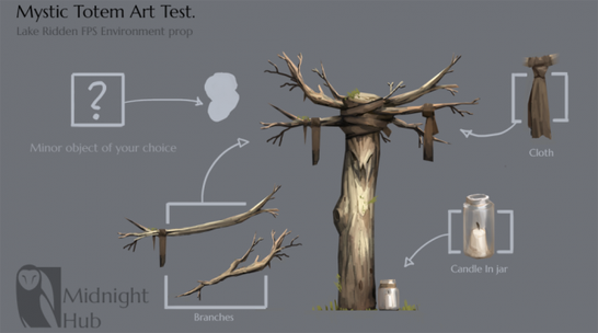
An example of concept art for a "hero prop". This was actually the art test we sent some of the artist applying for the internship at Midnight Hub. Each enlarged item tells a story and shows that there is a thought out idea behind the prop.
Knowing how to create and present your portfolio when you apply to a game company, is just as important as having awesome 2D or 3D skills. If you have a badly presented portfolio you will struggle to find work.
This all left me very frustrated, portfolio creation should be a mandatory part of any game art education by now. You can't just teach people a software and then expect them to get jobs, they are competing with every other artist in the industry, or at least the country. And some of those other people certainly know how to present a portfolio.
So! In this blog post I have assembled a few tips on what I think every artist should take to heart, student or not, hopefully it will help some artists that are just now searching for their first game art job or internships. Get ready for some tough love!
Your portfolio is king. As an artist it is the single most important information about yourself you can send to a company. Of course a short (like half a page max) personal letter is also important too: personality and teamwork is a vital part of game development after all. But as an Art Director, the first thing I will look at is your portfolio.
I don’t really care about your resume, it's always a nice bonus if you have some experience from another company, if you have shipped a title before, or are able show that you can work with other people. All that is great, but none of it matters if your portfolio is no good. As an AD I might have 50 other portfolios to review after yours, and unfortunately I don’t have the time to read a really long personal letter. If your portfolio is not interesting, an AD usually won’t bother with the other stuff.
Our producer Sara wrote a short blog post about on how to apply to a game company in general, check it out here.
So, since ADs' and recruiters' time usually is very limited, you need to make their work as quick and easy as possible. I want to open an email, press a portfolio link and immediately see your three best pieces of artwork. One click, bam! Your best art right in front of my eyes! Don’t make me search through your email for the portfolio link, don’t make me wait for a long loading time, don’t make me download a plug-in that I might not have on my pad and never send me your portfolio as a zip.

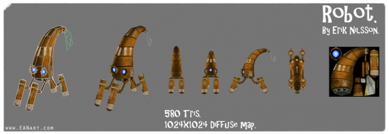
A robot concept from my own portfolio. As you can tell all the info you need is collected at one place, without any distractions. The contact info is included.
When I say a “good” portfolio I don’t necessarily mean a pretty looking one, don’t spend time decorating your website or blog with flashy fade effects or “cool” layouts. I am there to look at your impressive 3D models, not your pretty website, after all, I am not looking for a web-designer, right? A simple, neutral background color with a bunch of images and some contact info is all I need.
Always put your contact info somewhere at the top of every page in your portfolio, just make sure it’s not distracting me from your pretty pictures. Don’t send me just a demo-reel (unless you apply as animator), or a Sketchfab page. They are cool, but they take time to open and are usually a bit clunky. I want a portfolio page (with your reel on, if your an animator, Youtube embedding works fine). I really don’t want to open a Sketchfab window unless the model looks really cool. And they might not always give me the best first impressions of your artwork. Give me a portfolio with simple images so that I can quickly look at all of your art, even on a phone. Then give me the option to look closer through Sketchfab.
It will always look really cool if you have your own website, but today you usually don’t need one. A simple blog with your art on is often enough, or why not use Art Station? A lot of people do, it’s easy to use, clean and most ADs already know how it works. With that said, it does look a bit more professional with your own site.
When making art for your portfolio there are a few rules you should consider:
1. Quality before quantity - You only want to show me the best images you got. If you are uncertain on a piece: drop it! Bad images might actually cast doubt on your best ones. I would much rather see five strong images than one good and fifteen mediocre or bad ones. Remember, my time is limited, if I only see three images make sure it’s your best work.
2. Generalist or specialist - Figure out what kind of company you want to work for. Or figure out what kind of work you want to do - large companies usually want people that can specialize.
If you love making every detail on a high poly rifle look kickass, but not much else, chances are you are more suited for a job at a big company. They have tons of people hired to work there and they are competing against the most advanced tech in the industry. Because of this, they would rather pay you for doing one thing amazingly awesome, than doing a lot of different things really well.
Small companies on the other hand (like we at Midnight Hub), usually don’t have the money or space to hire a lot of people, so for them it’s usually more important that you have a broad skillset. They can’t really hire you to only sit and do rifle parts all the time.
3. Adapting to what a company is looking for - If a company is looking to hire an environment artist it’s probably a really good idea for you to have some environment art in your portfolio.
You can’t always adapt your portfolio to everyone’s needs, but if you are really interested in applying for a specific position, and you don’t have anything close to that in your portfolio already, it might be a good idea to make a new piece just for that! For example, if you want to work as a character artist on The Division, try making a next gen post-apocalyptic survivor character for your portfolio before applying.
4. Presentation - Presentation of your art is key for your portfolio. A good model can easily look horrible with the wrong composition and/or lighting. If that’s the case it will also show the AD that you don’t understand these basic artistic concepts. But having good composition and lighting will not only show that you understand this, they can also help your art stand out from the crowd.

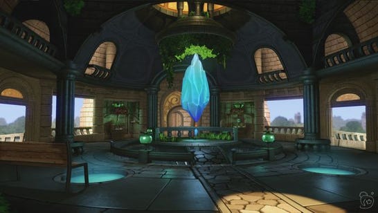
A nice 3D environment piece by my friend David Österlind. It tells a story and works great as a beauty shot. It also contains a fairly large amount of props and textures that can be shown in separate images along with their wireframes and maps.
The same can be said for texture work and design, you want to find some way for your art to stick out from among the huge pile of other artist portfolios. Another really important thing to show in your presentation is workflow. For a 2D artist this can mean including thumbnails, sketches and variations under the final rendered design. For 3D artist you usually want to show one or two beauty shots, with a wireframe, maps, triangle count and maybe a few close-ups or in-game shots.
5. Storytelling in your presentation - Telling a story with your art is another great way to stand out. If you have a concept image of a character, try doing a few more concepts from the same world, maybe a monster, maybe a location, maybe the hero and the villain etc.
With 3D you can do the same thing, or maybe do an animation. If you made a cool tree, try putting it into a game engine, build a scene, light it, maybe add a few plants etc and try to tell a story about the location. Use that as a beauty shot and include another more technical image containing all of the props, maps, wireframes etc. Present your art in a context, rather than just as a bunch of separate images. This will show that you understand storytelling, workflow and pipelines, after all, this is probably how you would work at a real company!

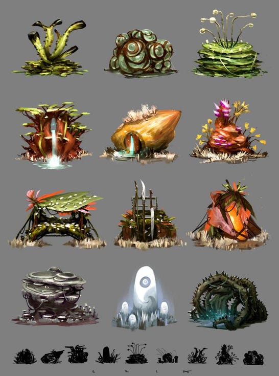
A few quick environment sketches i did a while back, they are all based on the small black thumbs and they are all set in the same world. This gives a context and a meaning when they are put together. This shows I have an understanding for the 2D workflow.
1. Portfolio is king. This is your single most important piece about yourself as an artist. Make it awesome!
2. Clean and simple. Art Station works fine. One click, bam! Your best art right in front of the art director's eyes.
3. Quality before quantity. When in doubt, don’t include the piece.
4. Adapt - what kind of games do you like making?
5. Presentation is 50% of the work. Include your items in a scene or put them together in exciting ways!
Thanks for the read and hope this helps! Feel free to ask me in the comments if you think I forgot something you consider important! Also, we managed to find a great 3D artist who will soon join the team, but more about that later. Now, go make some awesome art!
- Erik
Read more about:
Featured BlogsYou May Also Like