Trending
Opinion: How will Project 2025 impact game developers?
The Heritage Foundation's manifesto for the possible next administration could do great harm to many, including large portions of the game development community.
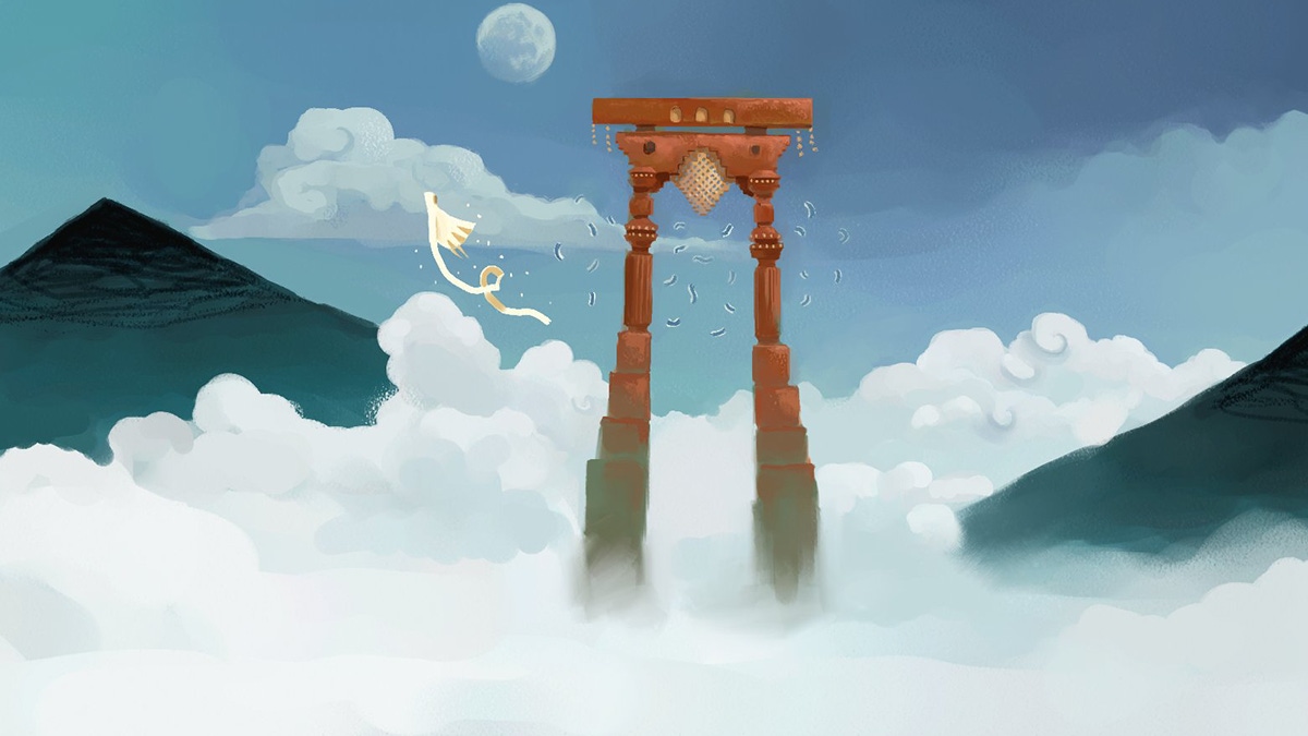
In a fascinating Twitter thread, Journey art director Matt Nava shared reams of behind-the-scenes tidbits, concept art, and 3D mockups.

As thatgamecompany's acclaimed adventure Journey celebrates its 10th anniversary, the game's art director Matt Nava has shared some behind-the-scenes tidbits on social media that reveal how the project took shape all those years ago.
Over the weekend, Nava compiled a thread comparing early development images with screens from the finished product, and it's fascinating to see how Journey's glimmering aesthetic and soaring gameplay morphed during production.
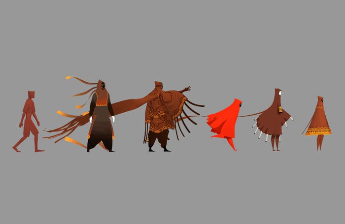
For instance, Nava explained that at one point Journey had multiple playable characters (as shown below) that helped inform the final design of the travelers we see in-game, adding he "went from humanoid to very detailed, and back to as minimal as possible" before landing on the final look.
Notably, the version of Journey that shipped only has one player character, although it's possible to interact with other player-controlled wanderers as you adventure towards the yearning summit on the horizon.

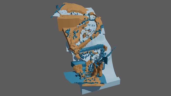
Offering more insights, Nava noted that Journey's iconic surfing level, which has players weaving through forlorn ruins and shimmering dunes, was one of the "most complex levels to build."
"I spent so much time tweaking the angle, position, and shape of every ramp and gully," continued Nava, before sharing an image of the level in its entirety (below) to show how those considerations informed the final layout.

The art director also explained that Journey had no automatic shadows, which meant he was tasked with painting them all by hand -- including those stirring columns of light and darkness that bombard players as they pass through a crumbling parthenon.
"The shadow texture was not hi-res," he said. "To get the iconic sunset columns to cast sharp shadows, I made sure that they aligned with the pixel grid of the texture."
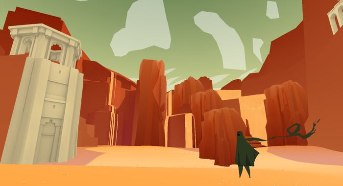
Discussing the broader mantra behind Journey's art direction, Nava said thatgamecompany always "tried to do the most with the least," pointing to the 3D visual mockup below as evidence of that philosophy in action.

You can hear more from Nava, who has also worked on The Pathless and Abzu, by checking out the full thread on Twitter.
After that, why not have a gander at our recent chat with Journey composer Austin Wintory to learn how the maestro reimagined and re-orchestrated his iconic score for the game's 10th anniversary.
You May Also Like