Trending
Opinion: How will Project 2025 impact game developers?
The Heritage Foundation's manifesto for the possible next administration could do great harm to many, including large portions of the game development community.

Featured Blog | This community-written post highlights the best of what the game industry has to offer. Read more like it on the Game Developer Blogs or learn how to Submit Your Own Blog Post
Dinofarm Games' lead artist, who just dedicated 4 years to making pixel art for his company's latest game, presents a persuasive article on how pixel art does more harm than good in an age of enormous resolutions.

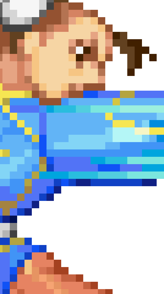
I’ve wanted to write this article for some time now, and this seems like the perfect opportunity to do so. For those of you who are aware of Dinofarm Games and our recent release, Auro for iOS and Android, you know that we spent literally years producing carefully handmade, meticulous pixel art. After weeks of work, I just finished the most recent piece. The upcoming PC port of the game needed a new title screen image, as the game will be in landscape view.
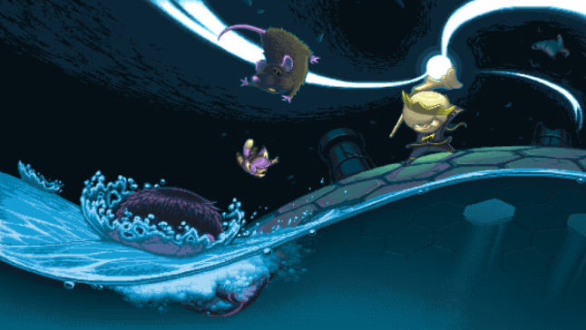
A million billion hours, only 45 colors!
I hope it’s clear from this image that I love pixel art. Auro was a love letter to the amazing stuff Nintendo, Capcom, Konami, and SNK produced in the 90s. That art was probably the primary reason I got into this field in the first place. It’s a beautiful form, and some of my favorite pixel artwork is being made today.
That said, the word “renounce” is not just click bait. Auro is likely to be the last Dinofarm Games title to feature pixel art.
Our team has been debating this for a long time, because we all unanimously love the aesthetic. The debate arose from the occasional anxiety we would get from the “HD this, HD that” fetishism that began in the early 2000s. In a way, our culture’s obsession with higher and higher resolutions made us defiant. It reinforced our stance on pixel art purism.
But in the last year, I’ve come to a very different conclusion. It’s not about what I like. It never is.
“HD fetishism” has always been around
HD is the current buzz word used to market both hardware and software. The “high” in “high definition” is relative. 25 years ago, “16 bit graphics” was the operative word, but it was ultimately the same concept; 16 bit graphics was just the the HD of its time.
Creators understand that screen size/resolution is just a canvas like any other. A good artist can make anything from a Gameboy screen to a 60 inch LED look good. Problems arise when it comes time to convey to a lay person what constitutes good art. It takes a lot effort to explain how this:
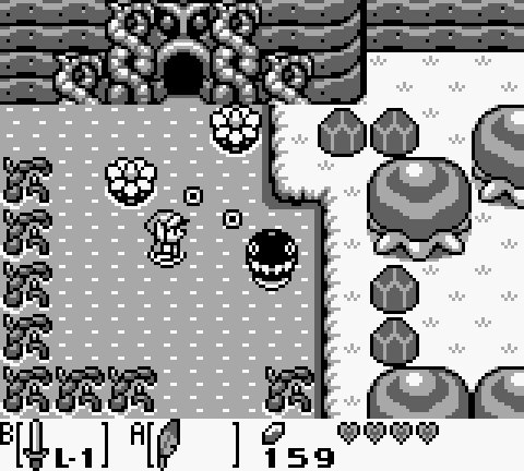
The Legend of Zelda: Link’s Awakening for the original Gameboy
has much better art than this:
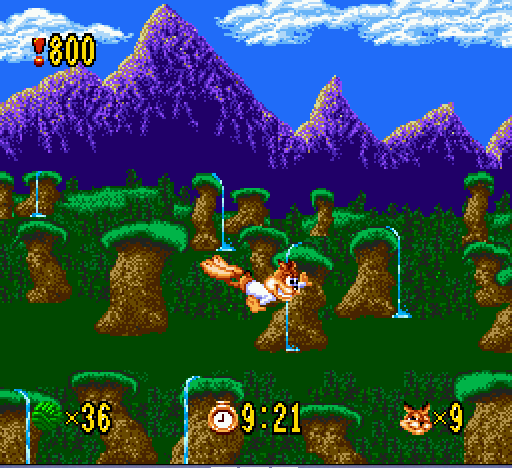
Bubsy for SNES
However, it is easy to explain that the second image has a higher level of technology. To the average person, I’m sure it’s self-evident. Some may even be so taken with the spectacle of added color and resolution that they might mistakenly think Bubsy has the better artwork.
I could write you an entire book on why that is absolutely not the case, but that’s the thing – it’s not the audience’s responsibility to read that book. It’s my responsibility deliver them quality in a language they understand.
“The H-est D”
Artists of any era tend to create with the best, most current tools available to them. Technology’s primary function is to make human life as easy and efficient as possible. This is no different in the case of art production technology. Greater production technology means fewer limitations imposed by the medium.
All mediums have their limitations, however. Just as the canvas has its edge, graphics processors have their thresholds. In the earliest days of game art, the extreme technological limitations created serious adversity.
We all get how pixels basically work. A computer divides a display into squares, and each square can be assigned one RGB value at a time. The total squares supported by the hardware is the device’s “resolution.”
This square grid is the smallest possible subdivision of detail available to an artist. It’s very much like tile/mosaic art – you can only add as much detail as your smallest available tile.
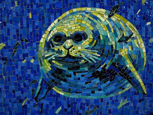
Early game artists had precious few “tiles.”
“NOTHING IS OVER!!”
This constricted medium turned good artists into problem solvers. Good artists looked at the display like a mosaic artist, and not so good artists looked at it like a rock and chisel.
![]()
“Your worst nightmare.”
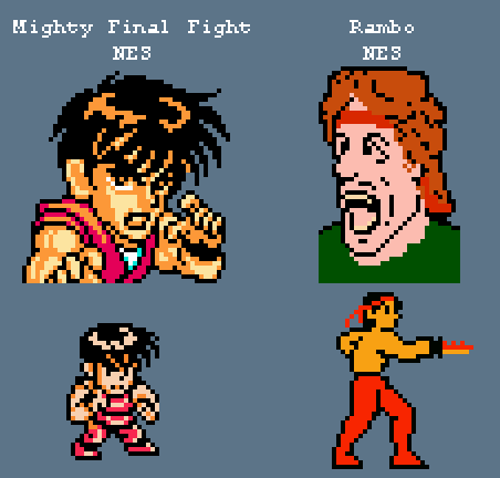
In Mighty Final Fight (pictured on the left above), Guy’s eye is constructed with illusion in mind. By strategically grouping colors and observing their relationships, more complex shapes and forms were implied. The use of flesh tone under the eyelash and on the iris even implies other colors!
The pixels in Mighty Final Fight contain actual information. To illustrate, I drew a higher- resolution extrapolation based on the information coded into these little squares. As you can see, I was able to infer a ton of detail and depth from Guy, but even though both examples use virtually the same amount of pixels, I could barely do anything with Rambo.
Techniques like those used in Mighty Final Fight, we have only retroactively come to call “pixel art techniques.” If the artists of the time had access to better production tools, I’m sure they would have been thrilled. “Pixel art” was never a thing – nobody was thinking “I think we’ll go with pixel art for this game.” Rather, they were simply working in the “H-est D” available to them.
Pixel art: a form after the fact
Only now, after the fact, is “pixel art” an elective aesthetic style. In the early 80s, IBM PCs could only display 4 colors for a full screen illustration(black, white, cyan and magenta). Blending colors was impossible, so artists would “checker board” two colors together. At a glance, this looks like a color exactly halfway between the two. This technique is called dithering.
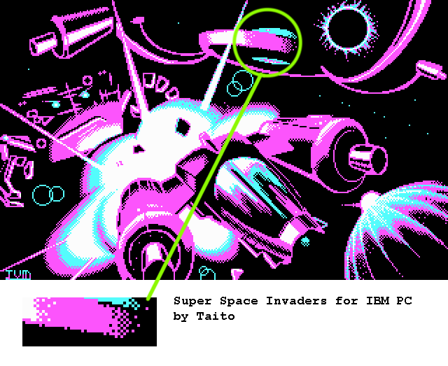
Back then, they had to dither. Nowadays, it’s used to achieve a look(art by Larwick on Pixeljoint) Modern screens can literally display colors upwards of a billion.
I think it’s safe to say that the tricks of the trade employed to make primitive games look good are no longer required. Yet there is a small, but vibrant community of enthusiasts who not only keep these techniques alive (art by Snake on Pixeljoint), but even add to the form with bold expressionist techniques(art by Calv on Pixeljoint).
This community takes pride in doing extremely complex work(art by jamon on Pixeljoint) while keeping the color count very low.
The biggest sticklers and purists consider the use of alpha(semi-transparent pixels), or software-side lighting/shadow/particle effects a form of cheating.
All these aspects of the community culminate into a sort of sport-like atmosphere, similar to the remnants of the Jazz music scene. While these communities are full of dexterous, blistering performers and highly talented craftsmen, they are also very small and very insular.
“It’s good, but kind of pixelated…”
This sort of “inside baseball” aspect of a niche movement causes problems when it comes to communicating with people.
![]()
![]()
Sometimes the word “pixelated” is used in a derogatory sense, and sometimes not. Either way, anyone who uses the word clearly doesn’t grasp the concept that pixel art is a deliberate, predetermined art style. And it’s not just with us. The Reviewer of the SNK fighter King of Fighters XIII over at IGN had this to say about the sprite work:
“While they look a bit pixelated, the character models look quite good”-IGN review of KOF XIII
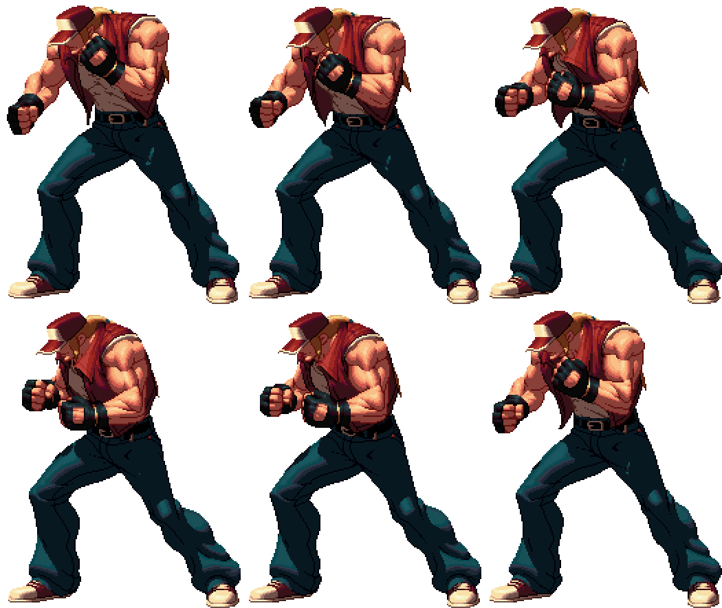
“quite good.”
This sprite is not “quite good.” It’s among the best 2D animation ever made in a video game. However good it is, it’s good in spite of it being “pixelated” according to many.
Out of curiosity, I wondered what kind of treatment a game I consider to have pretty ghastly art got.
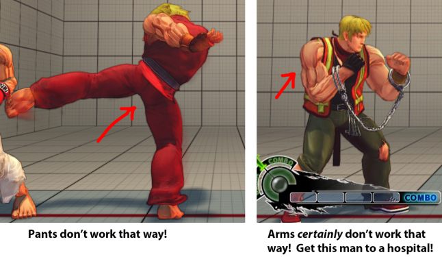 Street Fighter IV
Yes. I think Street Fighter IV is a garish, sloppy eyesore with sub-par animation. Let’s see if IGN agrees.
 *spit take*
The shoddy SFIV received a higher art score than one of the best looking games to date, and I believe it’s all due to a pixel tax. To demonstrate what I’m driving at, let’s put SFIV’s animation under the microscope.

At first glance, it looks serviceable. I think animators and artists can spot the issues right away, but to the average gamer, it’s perfectly clear and fine looking.
Anyone remember Street Fighter III: Third Strike?

God I miss those days.
SFIII’s animation is orders of magnitude better than SFIV’s. It’s not even close, but perhaps it’s still not totally evident at a glance.
 night and day
Chun-li’s body in SFIII works like a whip cracking. When every frame is a new drawing, it allows for things like flowing drapery, muscles flexing and unflexing, the natural sort of warp the body takes when it moves in extreme ways, etc. The effect is nothing short of magical.
While I’ve seen far worse than Chun-li in SFIV, the animation is just kind of dead and sloppily done. There is no urgency, and many of her limbs and facial movements seem bizarre and out of place. Because of this, SFIV Chun-li looks like she’s posing for a photo shoot, whereas SFIII Chun-li looks full of adrenaline and intensity… almost as though she were in a fight!
Is the difference clear yet? Hopefully it is to most people. But look how long it took me to explain that. Now watch this:
Street Fighter IV is in 1080p
Street Fighter IV runs at 60 FPS
Street Fighter III, on the other hand, is pixelated.
Regular D
See how quickly that takes? That’s because I’m communicating in a language that the average person living in this time can understand. When they see SFIII or KOFXIII, they don’t see the unbelievable craft that went into it, or if they do, they have to first reconcile what they see first, which is the magnified image above. They have to pay the pixel tax.
Same goes for another term highlighted above: “retro.” Auro wasn’t supposed to be “retro.” To me, the “retro game” aesthetic isn’t just pixel art, but an appeal to the specific sounds, feedback, and look and feel of a specific set of old school games. While it’s true that Auro was an homage to my favorite game art, I never intended for it to be “retro.” I just wanted to make great pixel art, yet it inexorably gets lumped in with the retro aesthetic.
But here’s the clincher. It’s not their fault.

“Retro?” Poppycock! I’ll have you know I’m quite jiggy with it!
The Artist’s Responsibility
Though I never intended for Auro to be a “retro-style” game, what I intended doesn’t matter at all, and it’s 100% my fault for failing to communicate in a language people understand.
As a game developer, time is the most valuable resource a human can give you. Nobody owes us their time or attention. As such, when someone gives us their time, an implicit agreement is made and we are now in debt to that person. We owe it to them to deliver value for their time, and to deliver it efficiently.
I am an illustrator/animator. The kind of value that illustrators/animators are responsible for is distinct among other types of visual artists. We must establish meaningful intent as close to instantaneously as possible. By meaningful intent, I simply mean that the audience has to internalize the concept, motion, emotion, perspective, etc. of a piece right away. The second the audience asks “how can he bend that way without breaking his spine,” or “Why is he shooting where he’s not looking,” we have failed them. They don’t owe us the time to look at our work in the first place. They certainly don’t owe us the time to squint their eyes and try to make sense of our work.
Meaningful intent applies to medium as well. In choosing to make our game with pixel art, we have accidentally taken on a war on two fronts. My job was to make Auro’s art polished, inviting, and clear to the audience, not to also educate the audience that pixel art is a deliberate style.
It’s not their problem that they don’t know what pixel art is, and it’s not their fault. Choosing pixel art was ultimately self-serving and wound up confusing and even frustrating people. This is all because we failed to embrace the medium.
Embracing The Medium
Earlier I mentioned that every medium has limitations. I also mentioned that artists endeavor to eliminate these limitations so that nothing comes between them and their vision. Paradoxically, good artists also embrace limitations. Limitations force ingenuity and innovation, as well as push a form forward.
Pixel artists appropriate the limitations that existed 25 years ago and self-impose them. Though this causes confusion among general audiences, it has made for some of the most advanced, ingenious pixel art yet (art by Fool on Pixeljoint).
Keeping the color count low, as mentioned before, isn’t just for the sport of it. A harmonious palette creates a cohesive piece(art by Thu on Pixeljoint). This principle, along with many others, applies to all visual art, pixel or otherwise.
No matter the period, there were artists who embraced the limitations of their time. That could mean using pixel art techniques to make the most out of a low resolution screen…
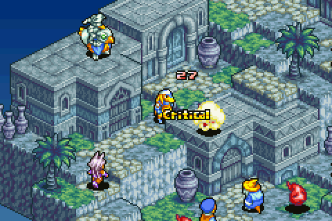
Final Fantasy Tactics Advance for GBA
…rather than digitizing high resolution 3D models and cramming them into a low resolution sprite.
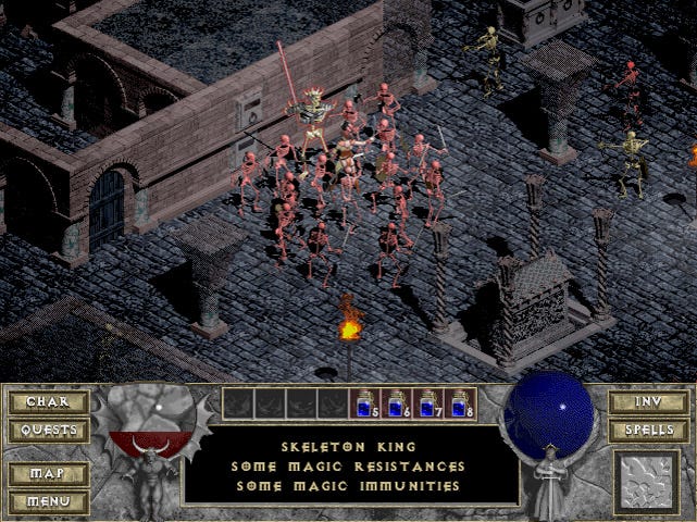 Diablo for PC. Or as I like to call it, Anti-Aliased Antfarm: Muddy Colors Edition!
Embracing the medium could mean working with a low polygon model by using simple, symbol-like textures…
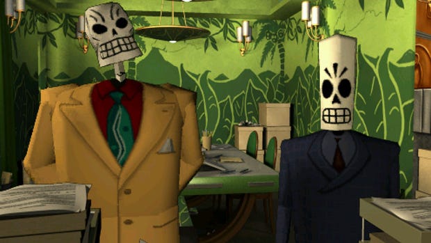 Grim Fandango for PC
rather than against it by stretching a compressed photograph across a polygon slab.
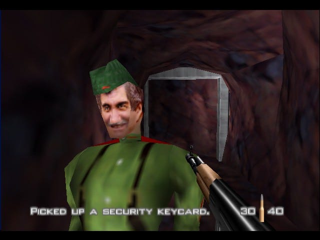 Goldeneye for N64
Modern screens are so huge in terms of resolution, pixels are virtually invisible. To demonstrate how huge we’re talking, I looked into how many NES screens(256×240) fit on the iPhone 6 plus. The total comes to somewhere in the ballpark of 50!
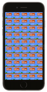
Talk about a “jump” in technology!
When every pixel was visible to the naked eye, it made sense for an artist to hand-place each and every one. Nowadays, it’s no wonder people think something is wrong when they see games like ours on an iPhone 6 screen.
 Screenshot for our poor, pixelated baby, Auro!
Pitfalls of Post-Pixel Pixel Art
Not only did my purism give my audience the chore of deciphering a language they don’t understand, but by not embracing the medium, we ran into all kinds of practical problems.
Some devices blur Auro. Some devices stretch it. Some devices letterbox it. No matter how hard I worked to make the art in Auro as good as I could, there’s no way a given person should be expected to see past all those roadblocks. Making Auro with higher-resolution art would have made it more resistant to constantly-changing sizes and aspect ratios of various devices.
Many developers who try to achieve the retro aesthetic overlook how much magnification is going on, resulting in not one, but several different resolutions at once. Not only can this be unsightly, but it’s “showing its strings,”which defeats the purpose of limiting your resolution in the first place.
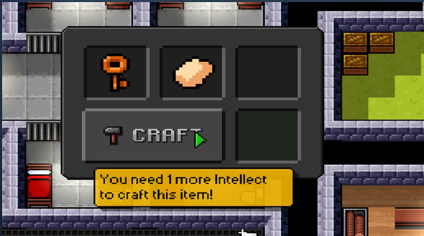 The Escapists by Mouldy Toof Studios for Steam
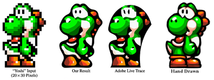
Evidently, even some retro game enthusiasts want to get rid of pixels so badly that they would rather have a computer smear the art like runny makeup than appreciate the pixel art for what it is. A few years back, the Hebrew University and Microsoft set out to “depixelize” pixel art through a new anti-aliasing(pixel-smoothing) algorithm.
![]()
I don’t care what you have to do, just GET RID OF THOSE SQUARES!
The hand-placement of the squares is precisely what makes this kind of art valuable. If anyone besides artists should appreciate that, it’s retro game enthusiasts. When even they are splintering on this issue, I think it’s time to face the chiptunes.
Dinofarm’s Art Moving Forward
It is with a heavy heart that I endeavor hang up the old pencil tool for all of our future games. To any dismayed pixel art heads out there, the good news is, we will continue to support Auro with expansion material, ports and other new content. Since we’re at the point of no return with Auro, all future art for it will still be pixel art. Like I said, I love pixel art, so on a personal note, I’m happy to be able to scratch that itch for a while.
As for the future, I’m planning to shed purism and do my best to mature. I plan to embrace the medium, whatever that may be, and make the best art I possibly can. No level of technology or spectacle can match the careful, hand-done touch of an artist. There are no shortcuts, and there are no algorithms. There is no cheap way to make it good, only relatively good ways to make it cheap.
Anyone think those smoothing algorithms above actually improved the pixel art? I wouldn’t blame you, as the smooth lines are speaking a more modern language. That said, I’ll close by illustrating my larger point with, well, an illustration. Pixel art, 3D art, mosaic art, stop motion art, etc. are just mediums. Don’t let the medium come between you and your audience. Speak in a language people can understand so that they can actually see what makes your work great without a tax.
Working in high resolution doesn’t prevent us from making great game art. The things that made pixel art great are the same things that make “HD” art great. Artists must make the decisions, not computers. Instead of hand-placing squares, hand-place curves. Good art is good art, and nothing beats the real deal. Embracing the medium simply ensures that everybody else knows it.
Embrace the medium!
Read more about:
Featured BlogsYou May Also Like