Trending
Opinion: How will Project 2025 impact game developers?
The Heritage Foundation's manifesto for the possible next administration could do great harm to many, including large portions of the game development community.
Lasting Legacy is a game in which you guide a family though 200 years of history, arranging marriages, choosing careers, gaining friends and prestige, and building a memorable legacy. This is how its art style came to be.

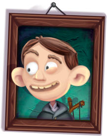 Original posted on the Mystery Coconut blog.
If you follow me or Noel Llopis on Twitter, you already know we have been working on a new game. It has been quite a while since we did Casey’s Contraptions, so I am really excited to work with him again.
What is the game about? In Lasting Legacy you will guide a family though 200 years of history, arranging marriages, choosing careers, gaining friends and prestige, and building a memorable legacy. If you are into genealogy, period dramas like Downton Abbey, or card games like Magic the Gathering, you will like it.
Following Casey’s formula, I am in charge of the art, Noel is doing the coding, and we have been working on the game design together. If you want to know more about it, he has already written a few posts that you can find in the Lasting Legacy Tumblr. Today I want to talk about the art style of the game, and how it came to be.
A few things were pretty clear from the very beginning: We wanted the main view of the game to be some kind of family tree. The tree grows as players gain new members through marriage and mostly legitimate birth. The game starts in the 1700s, ends at the beginning of the 1900s around the Great War. The number of actions a player has depends on how many people in the family are alive, and how many friends the family has. That meant we had to allow pretty wide trees; makes historical sense too, but not easy from the user interface perspective. In any case, characters were first and foremost. That meant not only that I had to draw a ton of them, but also that how they look would determine the art style for the whole game.
I spent some time trying to figure out just what that style should be. Noel and I tend to like the style of Franco-Belgian comic characters over the chibi-style Japanese characters popular nowadays; I considered things like Spirou, Tintin, or Asterix. I think it was during this search that we decided on the family tree being portraits hanging on a wall.
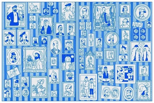
The inside cover of Tintin comics by Hergé.
I wanted something more expressive though, players were going to be looking at these characters all the time, and even when calculating dowries to marry into nobility is serious business, it is also kind of ridiculous. I wanted that mix of dignified and absurd. And that’s how my search brought me to kid’s books, and to Welsh illustrator Jonny Duddle, specifically to these two images from his work for the Aardman movie, The Pirates! In an Adventure with Scientists!.
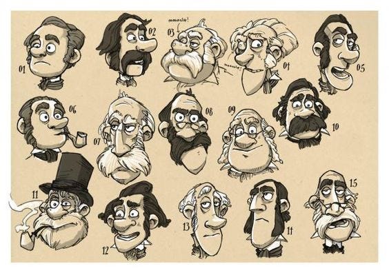
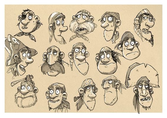
That was exactly what I was looking for, the look of Aardman characters in Wallace and Gromit, Pirates, or Shaun the Sheep. Claymation was too much for me (trust me, I tried this before), but drawings in the style of Duddle’s seemed the way to go.
Not only that, but check those scientists and pirates. Some of them are the same basic character with different facial hair and hats, or slightly different eyelids or mouths. This put us straight in the path of…
As you can imagine I was not looking forward to drawing a ton of characters, so random generation seemed the obvious solution: draw a few different noses, chins, or hair pieces and mix them together to get more characters with less work. Up to this point it was kind of a fuzzy idea in the back of my mind, I was still not sure how to pull it off. But looking at how Aardman animates their characters, with interchangeable 3d printed mouths or eyelids, was an eye opener.
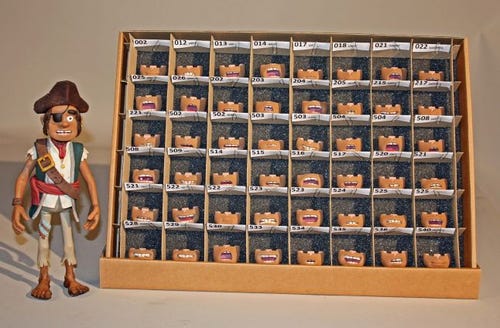
Say ARRR!!
Knowing this, and having decided on the look I wanted, I started drawing. The first tries looked good, but actually made me realize I needed to change tools.
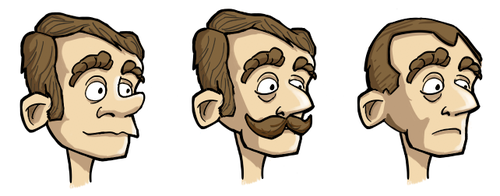
Can you hand me a mustache and a wig, my dear Watson?
You see, up to that point all my drawings had been done in Adobe Illustrator, a vector program. This had the advantage of making images mostly resolution independent (I still had to be careful with line weights getting lost at small sizes). But while doing the mockups above I kept running into problems with the dark lines delineating the characters; merging together separate pieces sometimes resulted in a bunch of unnecessary lines, making the end result too obviously… made out of pieces! Since I wanted it to look like a handcrafted complete face I had to find a more natural way of mixing pieces together. And that meant no lines, but changes in color and gradients.
Luckily I had found Clip Studio Paint while looking to replace myAdobe applications (their renting policy was pissing me off). It has really nice natural looking brushes, and making pieces with translucency and gradients worked great.
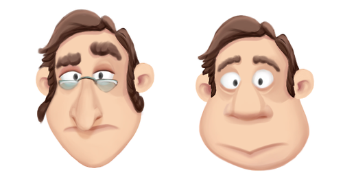
Art? Style?!
That’s how we got to what you can see today. More about the random generation of faces in a future post!
Read more about:
BlogsYou May Also Like