Trending
Opinion: How will Project 2025 impact game developers?
The Heritage Foundation's manifesto for the possible next administration could do great harm to many, including large portions of the game development community.
Remedy Entertainment's Control launches at just the right time to lean into Brutalism with an intensity I'm not sure we’ve seen before.

Brutalist architecture in games has been simmering in the background for some time now.
Every now and then an indie classic like NaissanceE will burst into view, or we’ll catch a glimpse of some exposed concrete in a big-budget immersive sim, but Remedy Entertainment’s Control launches at just the right time — alongside surging interest and reappraisals — to lean into Brutalism with an intensity I’m not sure we’ve seen before.
What follows is a close analysis of several areas of the game, alongside ten real buildings and architects that have in some way been used as reference or influenced Control’s environments.
Also, whilst Brutalism certainly makes up the foundation, it isn’t the only architectural inspiration. In fact, out of all of the buildings to follow, only two or three could be traditionally categorized as Brutalist. What they almost all have in common is their use of concrete, along with the expression of strength, rawness and authority that material often seems to bring.
Control begins with a low-angle shot looking up at the exterior of a building. This establishes the game’s principal location: the Oldest House, an ominous and imposing structure hidden amongst the noise of downtown Manhattan. The camera traces long, concrete depressions down to street-level, where New York taxis and pedestrians cruise about in the rainy night. We enter the building as if taking cover from the downpour, but the truth is there’s no place more inhospitable.
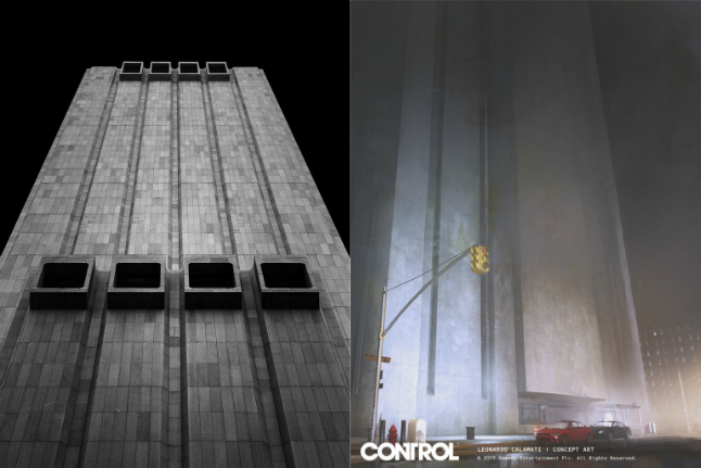
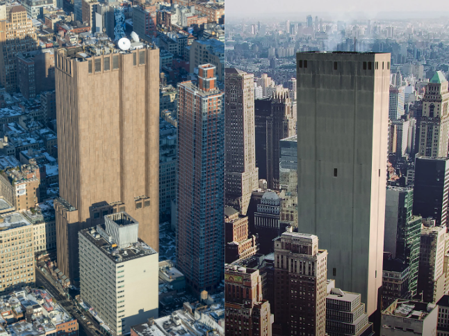
Remedy have been upfront about the architectural influences of their new game. World Design Director Stuart Macdonald named the windowless skyscraper at 33 Thomas Street, formerly the AT&T “Long Lines Building”, as one of several “origin points” for the design of the Oldest House. The Brutalist monolith gets its name not from the long indents that run down its facade, but the telecommunication lines that historically operated from the exchange.
Built by the architect John Warnecke in 1974, Long Lines was originally referred to as “Project X”, and, constructed with concrete and granite, was hardy enough to withstand a nuclear attack. Warnecke’s grand vision was to create a “20th century fortress, with spears and arrows replaced by protons and neutrons laying quiet siege to an army of machines within.”

Whilst the building still houses phone switches, it is now rumored to be a highly-secure data center. The online publication The Intercept, which aims to hold "the most powerful government and corporate factions accountable", has named the Long Lines site as the likely location of a mass surveillance hub codenamed “TITANPOINTE”, with links to both the NSA and FBI.
The Feds have a history of working within sturdy, atomic bomb-proof, Brutalist structures, such as the iconic J. Edgar Hoover Building as well as their training facilities in Quantico (a location which features heavily in Netflix’s Mindhunter, a TV series that seems to have influenced Control in more ways than one).
All of this context adds to the enigmatic nature of Control’s Bureau. Similarly opaque and clandestine, the Oldest House and the secret agency it accommodates is this sturdy icon of power and control, a place where global communication is tapped and tightly governed (the Astral Plane is even referred to as a “Switchboard” at one point). It’s also a site of impending danger — its innermost workings inscrutable and more than a tad sinister.
As well as being this impossible labyrinth where room dimensions fail to ever measure up and bathrooms, janitor closets, or just the office water dispenser, suddenly shift to somewhere else, the Oldest House is also utterly mundane. Upon entering the building, you’re met not with some intra-dimensional landscape, but your typical mid-century office.
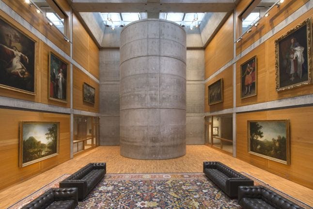
Whilst several of the executive hallways and rooms were influenced by Lois Kahn’s Yale Center for British Art — with its blend of wood and concrete materials, carpets and antique furniture — it's the austere office spaces that are most prominent.
One of the most important influences on the design of these offices is Kevin Roche, particularly his interior designs at the heavy machinery maker John Deere’s world headquarters. The secretarial pool of the building — with its rigid, repeating arrangement of desks — appears throughout the Oldest House, but is most striking when found early on in the game’s Executive Sector.
According to “The Evolution of Office Design”, the open-planned offices of the early to mid 20th century were purposefully structured to run like “well-oiled machines, dedicated to the sacrament of work.”
Based off of the principles of Fredrick Taylor and his theory of Scientific Management, offices were organized like factories. Furniture, desks, cabinets and dividers were placed systematically “to keep employees focussed and worktops tidy,” maximizing efficiency and increasing productivity. The idea was to revolutionize clerical work the same way the assembly line had factories, or the machine-gun killing.
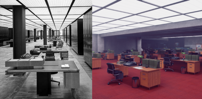
Taylorist offices created a constant workflow of simple, repetitive tasks. The open-planned nature also allowed managers and supervisors to scrutinize employees the way a prison guard might.
Control recreates this clinical organization, it’s own offices running autonomously — sealed off from the outside world, with widespread air-conditioning, formations of fluorescent lighting and a building-wide communication system in the form of pneumatic tube mail. Office work posters state things like “delays caused by house shifts do not count towards overtime,” which appears alongside anthropomorphized clocks with a great grinding faces. Upon the same walls, a multitude of actual clocks glare down at workers from above. Remember: efficiency, productivity.
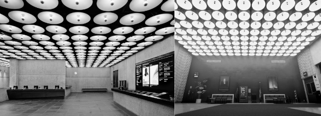
Another key influence on the Oldest House is the Hungarian architect Marcel Breuer. His New York gallery, the Met Breuer, was one of several places Remedy visited (alongside Long Lines) as part of their research, and the building’s impressive lobby area is reflected throughout Control’s Executive Sector.
When entering the lobbies of Control you’re greeted with row after row of the same large, circular lights, all of which go towards ensuring nothing remains outside of the Bureau's gaze and highlighting the sheer intensity of the office space.
To be bureaucratic is also to be ecclesiastic. Government buildings and churches aren’t as different as you might think, and clerks are in some ways the modern day clergy. The word clerical can pertain to priesthood, but also to routine office work: documentation, recordkeeping, accounting and other administrative duties.
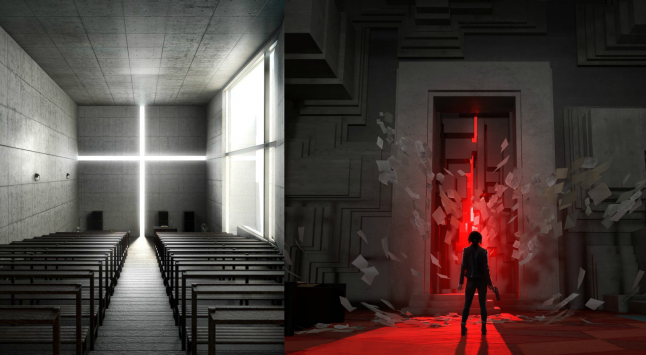
The Dead Letters Archive is one of the more dramatic areas of the game, and also appears to have some Breuer influence. The back wall of this vast room features cavernous recesses that reach all the way up to the ceiling, letting what seems to be natural light in, which bathes the ritualistic “Control Point” below. These church-like recesses are similar in shape and form to Marcel Breuer’s Saint Francis de Sales Church, a modernist masterpiece that was bizarrely built in a quiet suburb in Michigan.
Other monumental sacred spaces appear in the game. The Mail Room, with its colossal columns of pneumatic tubing that congregate in a back room resembling a cathedral organ, as well as many large-scale gateways, echo the work of Japanese architect Tadao Ando, who famously uses slits and clefts to bathe concrete interiors in light. One of his most famous works is the Church of Light, where a vertical cut in the back-wall creates an intense feeling of serenity. Ando is even directly referenced later on in the game’s “Clock threshold”, where a corridor with an irregular series of slits lets light in in the same fashion as seen in Ando’s Koshino House.
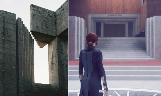
Remedy build on Ando’s quiet spirituality with a ritualistic use of architecture that mirrors the work of Italian architect Carlo Scarpa. His Brion Cemetery is an uneven, but completely mesmerizing, assortment of concrete and light. Scarpa worked on the cemetery for almost a decade before dying unexpectedly when falling down a flight of stairs. His work, particularly the cemetery, is known for its heavy use of steps which turn up into the walls, columns, doorways and ceilings. You’ll see the same stepping technique appear throughout the Oldest House — its repetition symbolizing both the occult invocation of power that happens to the objects locked within, as well as the prosaic white-collar work that is repeated day-to-day in the building. In the Oldest House the mundane is mystical, and the magical everyday.
Scarpa’s influence emerges again in Control’s Research Sector. Dotted around the immense hall are various brass sculptures reminiscent of those seen in the Olivetti Showroom designed by him.
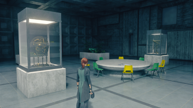
More impressive than the props is the structure itself. Another reference comes via Kenzo Tange, whose work on the interior of the Kurashiki City Hall is reproduced in Central Research. On the walls of the great hall are an array of oblong details, openings and small windows, some of which you can later levitate through in order to open up a shortcut.
Compared to the standardized rigidity of the Executive offices, the Research labs are thoroughly chaotic. The forms are still largely Brutalist, but there’s far more asymmetry — a varied jumble of shapes that express a kind of offbeat creativity. Whilst Executive would have been home to the stoic Director Trench, his managers, and their masses of oppressed clerical workers, Research is a place of playful experimentation best personified by the colorful but increasingly unhinged Dr. Darling.
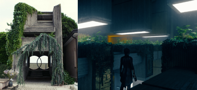
Organic matter is another element of disorder that appears more frequently in the Research Sector. Like the overgrown garden sections of Scarpa’s Brion Cemetery, there are areas of the Oldest House that are thick with greenery and plant-life.
Upon entering Research’s main hall, you’re greeted by a set of giant sequoias. Ivy grows round the cafeteria walls, whilst large rounded light features disturb the uncompromising monotony of right-angles found elsewhere in the building. As if to cap all of this chaos off, a strange mold germinates in the basement area below.
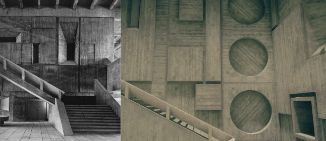
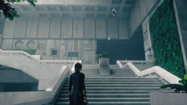
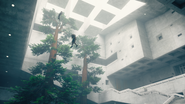
Another Brutalist trope that features heavily in Control is coffered ceilings, also known as “waffling” due to the similarity of the sunken grid pattern. The ceilings of Control borrow from two key sources here. The first is the Andrews Building — part of the University of Toronto, Scarborough. Remedy’s Stuart Macdonald has name the central hall of the building as an important resource. Its minimalist stairwells, balconies and mixture of concrete panels and boards are referenced throughout the game, as are its coffered ceilings.
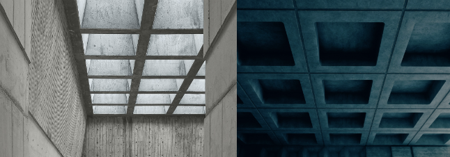
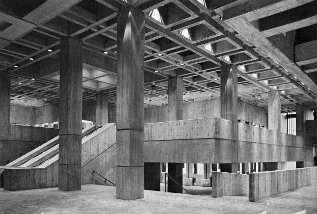
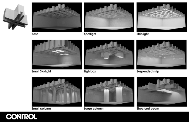
Another significant building is the Boston City Hall. Whilst the exterior is particularly striking, its the ceilings inside that appears throughout. Stuart Macdonald did an analysis of the building’s hall in order to show other artists at the studio how a modular ceiling system might work, with the coffers fusing with all kinds of different lighting, columns and beams.
Of course Control is very much about the power of the unknowable, and the failure of over-rational, instrumental thinking that attempts to control or categorize these forces. In the same way, charting every reference or influence on the game’s environments is, like the Bureau’s work, futile.
These are just a handful of real buildings that have left their mark somewhere in the Oldest House. Likely, Remedy’s spectacular world will remind you of many more Brutalist structures. From universities, libraries and town halls, to skyscrapers, government buildings and even churches — it’s a familiar world of concrete, but also, more than a little weird.
You May Also Like