Trending
Opinion: How will Project 2025 impact game developers?
The Heritage Foundation's manifesto for the possible next administration could do great harm to many, including large portions of the game development community.
Remedy's Control was one of the most interesting games of last year because of its mysterious world where the mundane collided with the strange. Mikael Kasurinen and Brooke Maggs tell us the thinking behind the world-building.

Remedy's 2019 game Control wowed players and developers alike last year, with a game built around exploring a mysterious setting called The Oldest House.
The Oldest House isn't just one location however--its influence creates a vast conspiratorial world, one that's investigated and covered up by the fictional Federal Bureau of Control.
Game director Mikael Kasurinen and narrative designer Brooke Maggs joined us on the GDC Twitch channel to explain how Control's worldbuilding was the driving force in how the rest of the game came together.
Kasurinen began his explanation of Control's development by contrasting it with the set piece-driven design of other linear adventure games. "It wasn’t about set pieces, it was about the world itself and then finding compelling elements that you could discover within this world," he explained.
According to him, the goal was to share a sense of exploration with players--to connect their literal exploration of the game world with an uncovering of Control's fictional world while "staying out of their way as much as possible."

This led to the development of a number of spaces and encounters that were meant to exist independent of the player's actions. "It's like the boss fights in Dark Souls where they just kind of exist there," he said. "You can discover them...but they aren't necessarily a bigger set piece moment connected to the story."
One of the game's narrative designers, Brooke Maggs, explained the logic that informed the game's level design as well. Maggs gave credit to Stuart Macdonald's world design team, which focused on creating departments that might actually exist within the Federal Bureau of Control, and that would allow for the game's supernatural player mechanics.
This led Macdonald and the world design team to aim for a Brutalist art style for the game's visual design. (Fun fact, Brutalism is not named for the word "brutal" but rather the French phrase "Béton brut," meaning "raw concrete.")
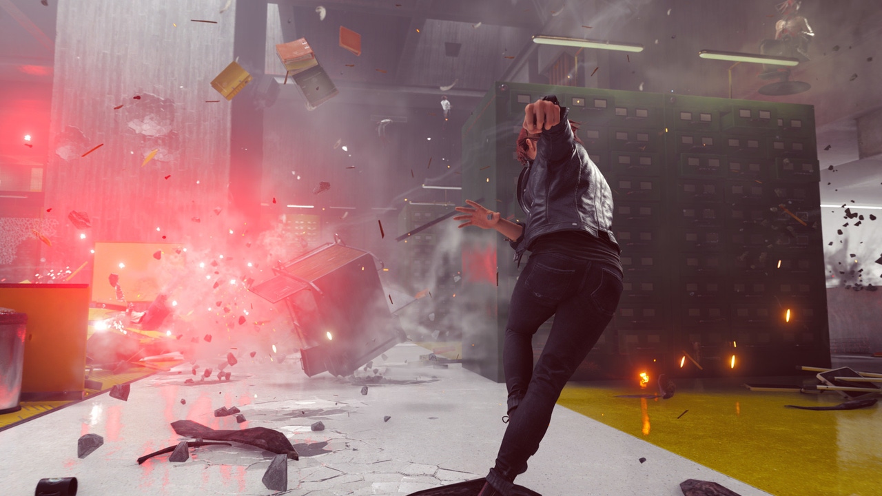
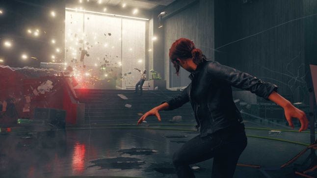
"Brutalism is very straight, clean lines that work really well when the player is running around destroying things with their abilities, Maggs explained. "The environment is more readable in that way. If it was super busy all the time it would be really hard, so it's all very conceited in how it's designed."
An important thing to know about Control's spaces is that, like many video game levels, they do not make a lick of literal architectural sense. Unlike other video games, that is a feature shown to players, not a fact to be disguised.
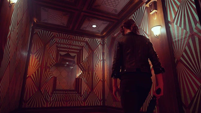
There were still guidelines for making this work stylistically however. "There's this conflict of collision of strange and mundane," said Kasurinen. "What made it interesting is [you'd see] something familiar that you can recognize and understand, like an elevator, but then as you use it you discover that something else, something more complicated is going on that you're trying to understand."
Control's first minutes contain one of these spaces, as players exit the lobby of The Oldest House and begin wandering its offices. After an encounter with the janitor Atih, who directs players down another hallway, players round a corner only return to to the lobby, far from the original hallway they entered in.
The Oldest House sends players back and forth to track down essential answers. Players revisit levels and zones with new powers and a larger pool of monsters trying to hunt them. To make these areas successfully "backtrackable," Kasurinen said these spaces were designed in reaction to the team's work on 2016's Quantum Break.
"Quantum Break was a linear story-driven game, and a lot of spaces were built with a purpose in mind," he said. "But then the player blasts through them, kills everybody and moves to the next room. It was a bit of a shame."

Kasurinen said this kind of thinking led to a reshaping of Control's spaces--he called out the trees in the middle of the department of research as one example. "They kind of ground the space and act like an anchor point and can lead to different directions, and you always return to this central area," he explained.
While all of these guidelines were certainly wonderful tools for defining the spaces of The Oldest House, Kasurinen pointed out that it wouldn't do to say these methods were entirely prescriptive. As game director, he said he spent less time dictating how things "must be" and more time helping developers hone their ideas to be internally consistent.
"What’s tricky with Control is that it embraces...philosophies and ideas that yes, you can say them out loud early on in production and say 'these are the key elements we can look and at think about,' but then when it comes down to actually building things, you realize there are a lot of things that are not clear cut."
For developers looking to learn from Control's example, Kasurinen said it was important to think of these various rules as a guidebook, and more like a sandbox. That way, for all the high-minded rules and 'facts' about the world created by your creative leads, developers can be free to iterate on ideas that may not have emerged in the original design plans.
Read more about:
Horror GamesYou May Also Like