Trending
Opinion: How will Project 2025 impact game developers?
The Heritage Foundation's manifesto for the possible next administration could do great harm to many, including large portions of the game development community.

Featured Blog | This community-written post highlights the best of what the game industry has to offer. Read more like it on the Game Developer Blogs or learn how to Submit Your Own Blog Post
The top grossing of the App Store is the ultimate dream of any developer. What can an artist do to nudge a game in this direction? First, he can look at those games that are already there and learn and analyze the main tendencies...

There’s no use in iterating what’s already been done. It’s very important to create what will be in demand tomorrow.
I’ve analyzed the art of the “champions” of the Russian, American, European and Asian iTunes Store, Google Play and Amazon, and want to share the regularities I’ve determined. The article was prepared in the frames of a conference that took place in May. Surely, the top has changed; nevertheless, all the examples are still timely and, in my opinion, portray the general tendency. 
Interface is dead? Up with interface!
If we take a look at the general picture, we can see the distinct tendencies in the interface design. Two-three years ago we could see arrows and joysticks on the touch screen. In order to start a game we needed to click a lot and to change lots of screens. Now the situation is contrary to that: the interface became the element of the game. All needless operations are removed; a player is rushed into the game at once. All that he might need to change is already presented on the screen. All important buttons are flashing and semaphoring. No way you can miss them.
One can compare the nowadays interface with the nervous system of a game. Nervous system is a part of an organism, threading through its structure, responsible for the functioning of its parts and of an organism as a whole. The same is with the modern interface. It’s no longer an add-in used to manage gameplay. It’s integrated into the game and is a part of it! The interfaces of top-grossing games are of top class. Even midcore projects feel very easy to play. Let’s look at the examples that can support this nervous system theory.
Subway Surfers & Temple Run:Oz: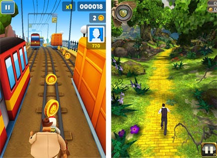
There are no additional screens here, the main menu is gone, the store and the settings come out as windows:
Clash of Сlans, Real Racing & HayDay: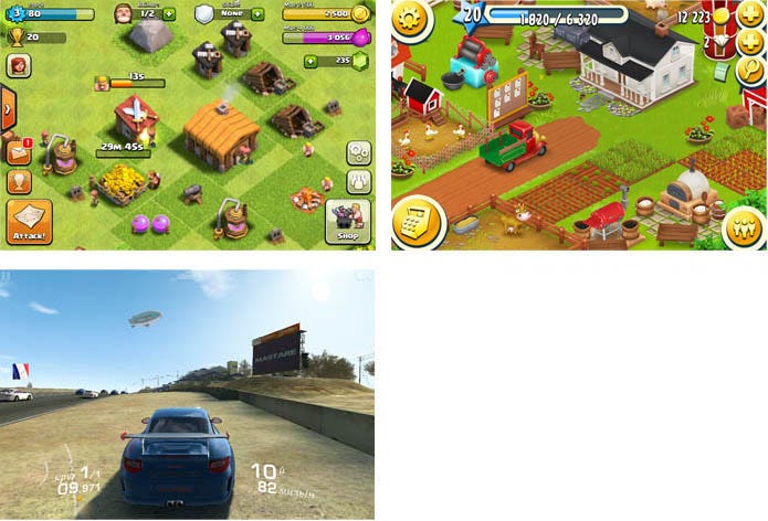
So how can we explain the process of the interface integration into games? Most certain, the answer lies in the ever-growing capability of devices which developers have learnt to use. For example, simple tapping allows you to manage game elements without any additional operations. So, all you have to do in order to raise usability and involve a user in the gameplay is to take away joysticks, put every detail on the screen and minimize the number of taps.
The advent of 3d — a myth or reality?
Long ago, the appearance of the first smartphones gave an impulse for 3d-games to appear. The games were highly admired, even awarded, but were never widely spread. And then Apple emerged the market in 2007 with its iPhones. Tablets, powerful smartphones, hybrids… And now we can see 3d in the top-grossing of the stores. Can this be a tendency?
I’ve reviewed the top-grossing in March and April while preparing for a conference. It needs to be cleared that I’m talking of a true 3d, rendering doesn’t count.
A quick look at the Apple Appstore and we see that Subway Surfers, Real Racing, Injustice are the constant members of the top-10 of the grossing in Russia, making 30% of all top-10 revenue. As for the US Injustice is the only 3d-project in the top. And there were no 3d-games in the European top-grossing. Asian chart seems to be a sort of a parallel world, though Injustice can be found there too. 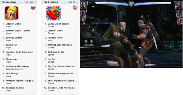
The US and European Google Play didn’t see any 3d projects in their top-10 of the grossing. The only Android exclusion is Temple Run Oz occupying the first place in the Amazon Store. But I believe, it’s more about the policy of the store.
If we widen the range under the examination and look at top-30 of the top-grossing of the US and Europe we will see that in all stores outside the first ten positions some of the above mentioned projects start to appear, plus Minecraft and Infinity Blade. Interesting, isn’t it? What can we make of it?
First, it doesn’t seem like the age of 3d has come yet. Simply because it’s easier for the most of the developers to make a high-quality 2D-project. 3D-games have potential, though: these are advantages in certain genres and its audience. The key word here is genre. And the potential will be growing within racing games and first-person arcades.
Quantity vs quality — what will bring you a million?
Surely, it would be wrong to concentrate on the opposition that, actually, doesn’t exist at all. But if we decide hard and disconcertingly - the quantity will, definitely, win. As long as there’s something to achieve, something to do in the game – the player is yours. Give him more heroes, more buildings, more bonuses.
In order to prove the point let’s look at the supermarkets of the following games:
Hay Day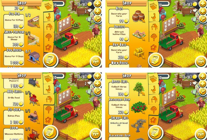
King of Empire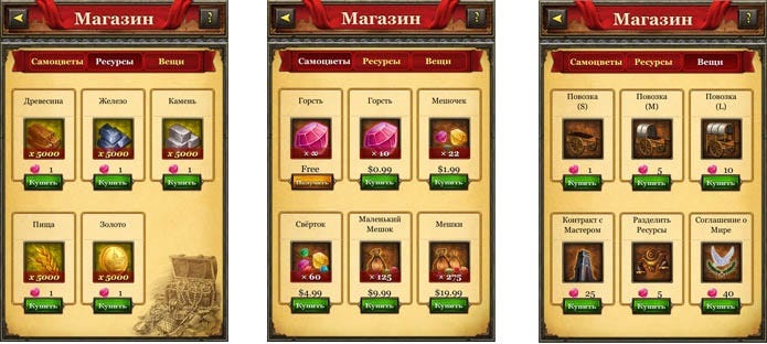
The tribez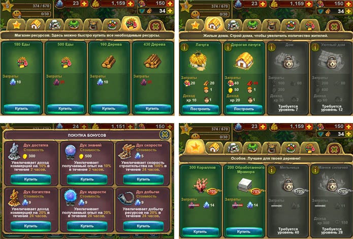
Subway Surfers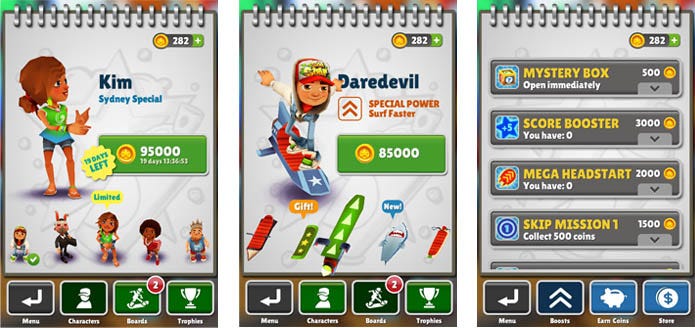
Sex sells? How an ancient principle works in the frames of Stores.
Why ask? We often face a situation when it would be great to have beautiful sexy girls on our promo art. But we also have to be sure that they won’t be censured. But still they have to be hot.
It’s no secret that the principle sex sells is widely used in ads, video games, in movie industry – with the different degree of allowability. Apple Appstore, GooglePlay and Amazon, the biggest representatives of the market, in their guidelines forbid everything that deals with explicit erotic. Well, Playboy App was released, but with girls fully dressed. So has the principle gone forever and for good? I don’t think so. For some reason we tend to forget that nowadays the terms “erotic” and “sexual” do not necessarily mean “lack of clothes”. One can even say that there’s no connection between the degree of nakedness and sexuality. And now let’s examine the top-grossing games and define the limits of the research. So:
1. Beauties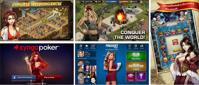
No doubt that expressive poses, decolletes, and loose hair, are still an integral attribute of beauty, but now these all are presented in a rather moderate manner and are used to decorate the screen rather than to seduce a user.
2. Good-lookers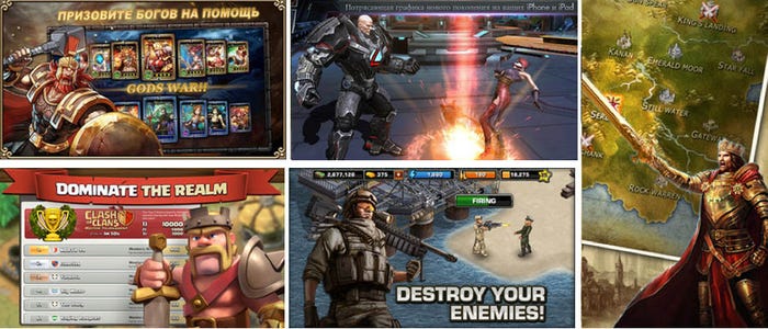
Here we will find all the attributes of masculinity: muscles, power, brutality, aggression. Give them the liberty and you’ll see violence and blood.
3. Here I should take a short break:
About a year ago our Korean partners asked for permission to redesign an icon of our game about the adventures of a piglet. The reason was that the one that we offered didn’t fit the market. We said ok, but when we saw the result I believe, our faces were like this: о_0. The Koreans chose the sprite of a piglet with a face-wide smile, put it on a brown background, added a few flowers, and all this in a golden frame. We were astonished to say the least, the Koreans – were in the state of ecstasy. Thus there IS a difference between us and them.
So let’s now go back to our topic. 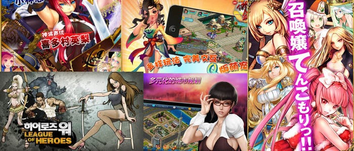
Asia is a different world with different view of the world: the cover is more important than the content. So the abundance of the information you can find on their promo art will blow your brain, used to composed and content-oriented style.
No wonder that the sexuality of the content in the East is expressed more explicitly. The reason is that they are more emotional than Europeans.
So, what do we see? Sex really sells, but may be less aggressive than it was before in java.
The art of top-grossing: let’s put away envy and look at it objectively.
First, we can see that bright and casual is in favor: HayDay, Candy Crush Saga, the Simpsons, Subway Surfers, the Tribez, Puzzle and Dragons. They all are bright, rich and amiable. 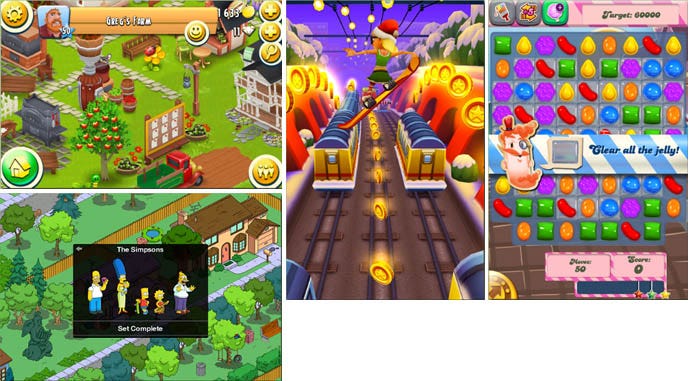
On the other hand we can observe the walkoff from casuality. There are projects that can be described as midcore with their style close to hardcore games: the colors are subdued, the interfaces are close to those of PC-games, the graphics can be realistic. These are Clash of Clans, Kingdoms of Camelot, King's Empire, Rage of Bahamut, Blood Brothers. 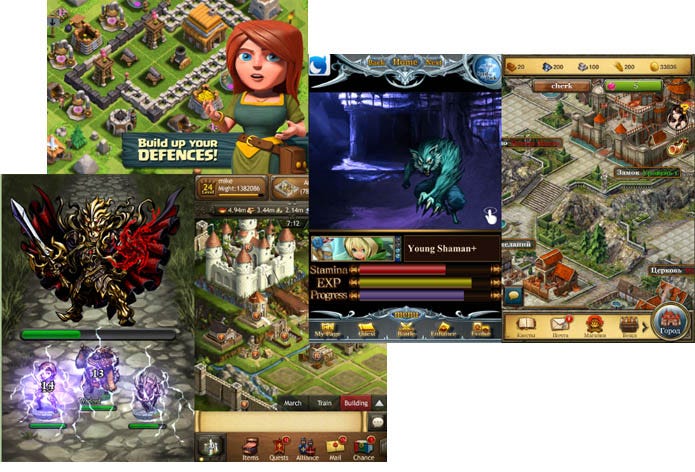
The graphics of many top-grossing games is of average quality. For example, Candy Crush Saga and Blood Brothers: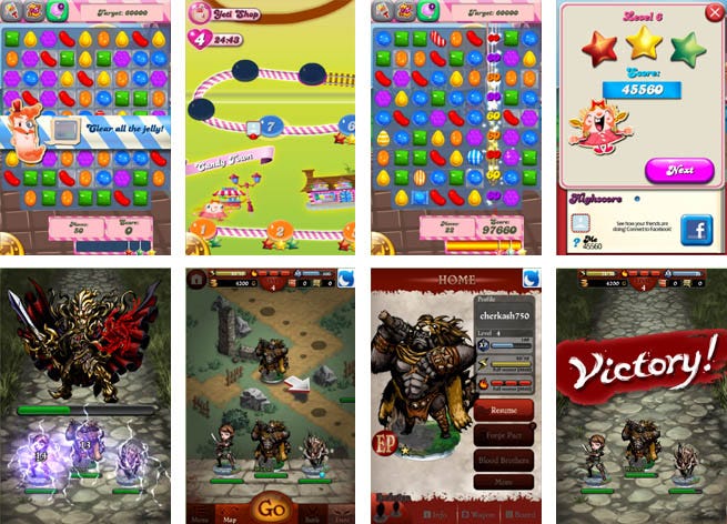
– objectively, there are no any super effects, no mega art, everything is solid, but not of star-quality. But what difference does it make? People play them and this makes them happy. But why? Simply because gameplay is what really matters and makes the game. Design is also very important, but not in the sense of graphical appearance, but in the sense of how this all works. And it works magnificently: the top-grossing games are usually marked by well-thought, handy interfaces and details.
To sum it up: the cult game art and the art everyone is trying to copycat are just a support team of a good game design. It is born the next way: a game with a well-balanced gameplay, usability, social functions is well-promoted and supported and voila! It has tons of fans and a top position in charts. Though its graphics can be average or higher. There are only a few high-quality graphics projects in the top-grossing of the Stores. Though we might have hastened when called art the support team. It’s not at all that simple. We should always keep in mind the importance of the first impression and emotional impact. And they depend very much on the graphics and artists creating it.
Read more about:
Featured BlogsYou May Also Like