Trending
Opinion: How will Project 2025 impact game developers?
The Heritage Foundation's manifesto for the possible next administration could do great harm to many, including large portions of the game development community.

Featured Blog | This community-written post highlights the best of what the game industry has to offer. Read more like it on the Game Developer Blogs or learn how to Submit Your Own Blog Post
Differentiating a demo from a full game. Our reach exceeds our grasp. Part Three of the subjective post-mortem of Cube & Star: An Arbitrary Love. Developed in Unity, by a single man. Winner of Intel LevelUp and IndieCade finalist

The Story Thus Far
Cube & Star: A Love Story began development in March 2013.
It was currently December 2013. The game was still in a weak alpha state.
It had fluctuated wildly since showing at PAX Prime and IndieCade.
The demo was available on Steam, but I didn’t feel great about it.
I had just emerged from a development lull and was energized to complete the game.
Moving Goalposts
I set a lot of release dates for Cube & Star over its development.
Some were vague: "The end of the year..."
Some were specific: "January 30th"
But up until this point my heart hadn't really been fixed to those dates.
I set a date that felt both realistic and a little intense - something that was real and would push me to ship the game.
Valentine's Day, 2014.
I Gave My Pain a Name
The game had been named: "Cube & Star: A Love Story" up until this point. It was a name that was intended to be facetious, but which missed the mark given its colorful graphics and simplistic visual style.
The title failed on many levels - it failed to convey the deeper tone of the game, it failed to imply humor or joy, and it failed to hold the attention of the casual observer.
It also sounded a lot like "Cuban Star" - which would admittedly be a more interesting title.
I couldn't drastically change the title of the game - we had a domain name, we had established (but extremely limited) branding, so I changed the post-script.
And thus "Cube & Star: An Arbitrary Love" superseded "Cube & Star: A Love Story".
It's wasn't great. But it was better. Slightly.
The Final Evolution.
A name change and a gimmicky visual style wasn't enough to make Cube & Star feel like a new game.
I needed a set of new features that were in line with the existing gameplay without breaking the tone.
I felt like the early game was completed, but the mid and end-games were lacking.
And so…
Narrative #3
I reverted to simplicity. I thought: Don't force the story.
Just.... make everything analogous to things in everyday life.
A kind of... abstract and interactive representation of my worldview.
You cannot do good. You cannot do evil. You can only do things.
Sometimes people will like you, and sometimes they won't.
Sometimes things happen, and sometimes they don't.
You are adrift in a sea of systems over which you have limited control.
The world is beautiful, but you have no purpose.
You must create your own goals. You must set your own standards of victory or failure.
You must... live.
That was a concept I was happy with. It wasn't strictly a linear narrative. It was a cumulative social commentary.
Mid-game: World Map and Mood
A world map is a really obvious addition in retrospect. The whole game takes place on a single texture, so it's the feature that kind of... creates itself.
To make color selection a little less random and a little more directed, I added a set of dominant colors and mapped them to world "moods".
So a player who painted the entire world red would earn a "passionate" world.
Arbitrary, self-directed goals. If Cube & Star had both an extreme positive and a negative point - it would be this reliance on self-direction.
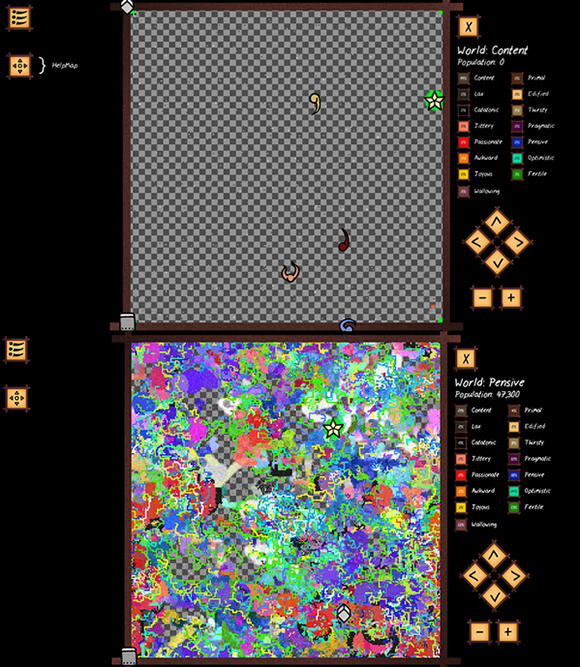
Chaos is born so readily from order. Without systemic rules... both ugliness and beauty are born.
Mid-game: Critters
At this stage Cube & Star had only three critters - a bee, a squirrel and a frog.
All of which should be read in inverted commas.
I felt that they were one of the more charming aspects of the game. They were obnoxious, they wrecked your palette, and they looked cute - in a geometric way.
So I added a huge amount of new critters - bound to time of day and ground color.
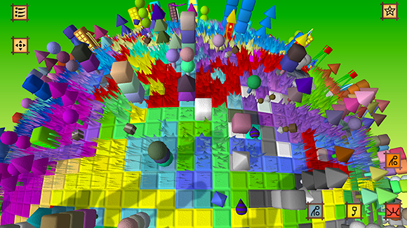
Striders and slugs, squirrels a skitterer and a butterfly way in the back.
When a critter walked over a new tile, it would check the ground color. If a new critter was bound to that color for that time of day, it would leap into the ground, and a new critter would emerge.
Seeing new, strange critters emerge was kind of a thrill - and they helped make different color palettes feel like unique ecosystems.
The new critter system would also enforce a kind of... "highway" model into the pathing system.
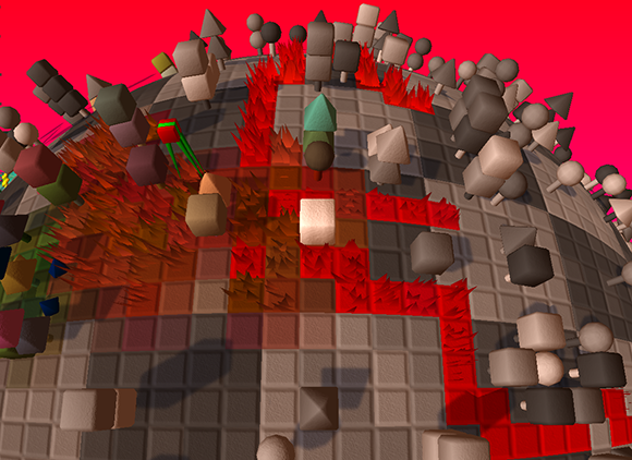
Striders cut highways across the world.
Critters would prefer colors closest to their own, which gave a nice visual history of where critters had been - and where they would go.
Late-game: Flood Fill and Fire
I like the concept of creating and destroying. You know... building a wonderful tower of blocks, and then knocking it down with the back of your hand
Fire was an obvious choice, but it didn't really... fit with the relaxed nature of the game. In retrospect, it makes sense that fire is required to clear grass - but the appeal was purely chaotic.
I decided to pursue the painting metaphor and add floor fill, with a musical twist.
I added four pillars (three for color, one for fire) to the world.
When you nudge the color pillars and collect the item they drop, it adds an ability to your UI - which will play a musical note correlated to the color.
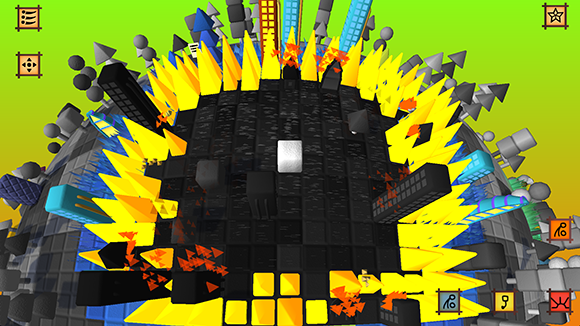
Fire. Passion. Destruction.
I'm pretty proud of the mechanic: Color impacts on hue, the speed with which you play impacts on brightness, and the accuracy of your note timing impacts on saturation.
Using this system, a player could create any color and fill broad areas of earth with color.

A side effect of this: Color storms. An unintended "feature" that would create an infinitely-propagating floodfill of competing colors when the player triggers two floodfills in a short period of time.
I tried a few times to remove them - but they seemed interesting enough to negate the effort required to remove them. A little curio. A side effect of emergence, I guess.
Late-game: Buildings and the Tiny Things
The Tiny Things were a late development addition - a weird kind of meta-entity. If the Ancient Cube was your elder, then you were elder to the Tiny Things.
Tiny Things are spawned by Buildings - which replace Trees when they are replaced using the flood fill ability.
Buildings were a controversial issue. I was really hesitant to bring the game too close to reality. Best to leave Bees as cubes with stripes.
But in the end... I like it. It gave the late-game world a little bit of a metro feel; vaguely surreal and industrial but with few direct analogues to real life.
Each building set is mapped to a world mood, to tie the whole affair together.
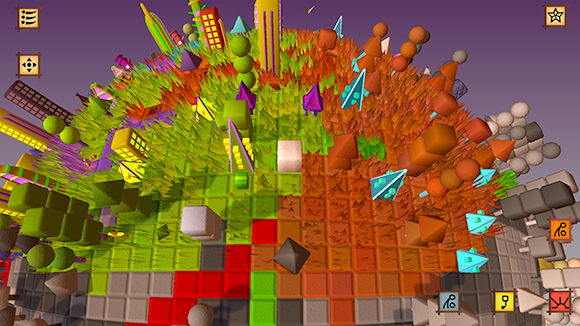
I loved Simcity 2000. Who didn't?
Tiny Things behave as a more advanced form of Critter - they path to other buildings, and they path to other Tiny Things and flatten grass as they go. Over time, I hoped that this would create a system of "roads" between buildings.
Late-game: Decryption
The language of the Tiny Things was an eleventh-hour addition, inspired by the Vorticon alphabet from Commander Keen. Originally, all Critters spoke in regular English - but after adding the language of the Tiny Things, they were replaced with symbols.
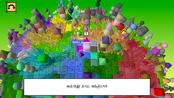
The critters speak in their critter-y manner.
Over time, as more volumes of the Tiny Things history are collected, the player can use a (very primitive) decryption function to attempt to unlock the alphabet.
I really didn't anticipate anybody in the world to use the decryption function. It was a knee-jerk development for a little bit of systems-fun.
Post-release, I was super-excited to find that somebody has uploaded a fully decrypted alphabet to the Steam community within half-a-day.
The Soundscape
It's an interesting thing... the common chorus of the game developer:
"This time I won't leave sound until last".
And inevitably... it is left until last.
Obviously I can't speak for every development team, but it seems to be the common thread.
I had create a vaguely-complete sound design for the initial Cube & Star demo: five soundtracks (day, night, morning, twilight, greyscale) and a collection of instrumental sound effects.
The soundtrack had met with some surprisingly positive feedback. I am a little sensitive about my composition skills - as it's probably the weakest aspect of my development skillset.
The demo sound design had a fundamental flaw: the soundtrack was consistently spread across the entire game. It never yielded - it was ever-present.
There was no space for the sound effects; no space for silence.
For the final release - I created an overarching volume curve. The curve ran over around six minutes, and brought the music up and down to give a little room for the soundscape created by the in-game entities moving about and nudging things.
In lieu of an ambient, environmental track (wind and such) I stripped the soundtracks down to their minimum and lowered the volume to create a super subtle world backing track.
Never pure silence, just a subtle reminder of the soundtrack.
I think it worked in the end. I think.
Up Next.
Finality! The release. The end of days. All of our best-laid and randomly-laid plans come to fruition.
And we learn, once and for all - that we never reach the top of the ladder.
We merely begin anew on the lowest rung of a new ladder.
-Joshua McGrath
Continue to Part Four here
Read more about:
Featured BlogsYou May Also Like