Trending
Opinion: How will Project 2025 impact game developers?
The Heritage Foundation's manifesto for the possible next administration could do great harm to many, including large portions of the game development community.
Indie developer Dejobaan Games discusses what went right and what went wrong creating IGF 2010 finalist Aaaaa! -- and the choices that made the game unique.
September 22, 2010

Author: by Leo Jaitley
This is the story about how AaaaaAAaaaAAAaaAAAAaAAAAA!!! -- A Reckless Disregard for Gravity (Aaaaa! for short) put Dejobaan Games on the map. We're a small studio that proudly makes its home in Boston, Massachusetts, alongside game dev companies of all sizes, from industry heavyweights Turbine and Harmonix to tiny one-person affairs. Our company is tiny, with a core team of three people and a handful of part-timers.
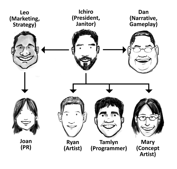
The team structure at the time we started writing this article.
Aaaaa!, our 13th title, was a finalist in the IGF 2010 and Indie Game Challenge 2010 awards, and was selected to be part of the Penny Arcade Expo Indie Showcase in that convention's first appearance on the East Coast.
The game challenges you to walk off of a perfectly good building, create your own stunts to impress the judges, and flip people off for points. It also teaches you how to debristle a pig.
The question we want to answer with this article is simple: How on earth did this happen?
1. Marketing = Game Design = Marketing
This is it -- if we did nothing else right, we hit this one on the head.
Marketing [n.]: Creating a game so wonderful that people will a) give you their hard-earned money to play it and b) talk to the world about it. Marketing is an integral part of game design, rather than a spare afterthought.
Say "marketing" to many people, and it's an evil, filthy thing that you use to force people to buy something they don't need. But to us, it starts with designing an experience that makes people so passionate about that they actually pick up the game and tell all their friends. To wit, both Dejobaan's design lead, Ichiro, and our marketing and strategy guy, Leo, have hands in both business and game design.
With Aaaaa!, we started by tossing ideas back and forth until we had something that interested us as gamers and businesspeople. It went exactly like this:
Leo (Marketing & Strategy): So, what's this game about?
Ichiro (President): Jumping from buildings and landing without dying.
Leo: That's dry. You know that bit you put into the video about mooning people?
Ichiro: That was a throwaway joke, dude.
Leo: What if that was in the game? You could moon people for points.
Ichiro: I could get fired for suggesting that.
Leo: You own the company.
Ichiro: Fine, we'll put it in.
That evolved into a mechanic where you could give passing fans the thumbs-up and flip protesters off, which is something that journalists and gamers always talk about. Designing the game and thinking about how it would engage our audience were the same thing.
Amusing concept -> Realization that people might like this -> Incorporation into game
This seems like a no-brainer. But countless times, we've heard developers propose something absolutely ridiculous and hilarious. Everyone will laugh until tears start streaming from their eyes, then someone will reign it in. "Come on, guys, let's get serious. What do we really want to put into the game?"
Why do people do this?
Flipping off protesters was a throwaway gag that became one of the game's central mechanics. At PAX East, we told gamers about it in conversation, and they laughed in delight (and then signed up for our fan club to hear more).
Things like "over 80 levels" or "15 music tracks" aren't as noteworthy as "deploy obscene gesture for points" is. We tried to apply this throughout the game -- for example, if you get too keyed up playing, you can unlock a full, 3-minute guided meditation.
We think that this process made Aaaaa! more remarkable and generally more awesome.
2. We secured core gameplay, then spewed awesomeness all around it.
An excellent video game isn't just about presenting interesting rules -- it's about delighting the player with bits of awesomeness all over the place. The best arcades did this well during the '80s.
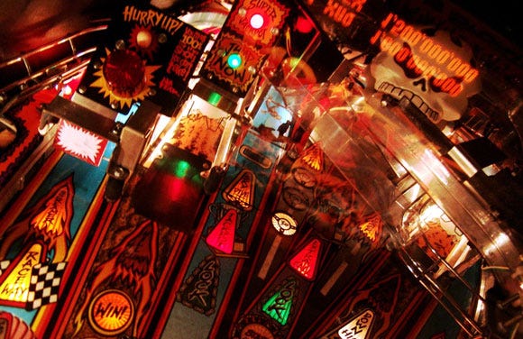
Big lights and lots of games like these.
In their heyday they were like miniature Las Vegases for kids, filled with interesting details. At the core were the games -- but they weren't just all dumped into a dusty warehouse. Step inside one now -- the decor (tacky, yet awesome) starts with a pitch black room with wavy neon lights and disco balls. The cabinets are densely-packed, with illustrations sprawling over them. Peek around to the front of each one, and you get a glimpse of a ridiculous matrix of lights playing out. Off in one corner of the room is an illuminated glass cube filled with plush toys and a gleaming claw.
While you're picturing the ambient glow, listen to the sounds of a dozen games beckoning with their distinctive sounds. The best arcades were spaces to explore. And like that, our favorite games delight us all over the place -- it's a little like stumbling across little Christmas presents wherever we go.
We tried to do this with Aaaaa!, starting with a solid core of gameplay. If we could then make people grin at something as silly as the options menu -- and then apply that to all the details -- people would want to keep playing the game just to see what'd happen.
So! BASE jumpers must lose a lot of teeth -- why not make teeth the game's currency? Elevator music in the level selection menu? Sure! And we included a guided anti-meditation, in case you lived a life of too much relaxation, and wanted to feel as though bugs were crawling around your body. Each little piece made the game stand out a little more.
Games can always do this, but they often don't, because we fall into a checklist mentality:
Q: How do you make a good game?
A: Here's a recipe:
There should be at least 14 enemies, because other games have 14.
Better yet, there should be 15 enemies.
And over 20 levels.
The story should be an epic tale of intergalactic space war.
Give it a cool name like Space Fighters: The Extinction.
Okay, that's a game. Ship it!
One of Dejobaan's development tenets is to create games that make people scream "That's so awesome -- I can't believe I just played that! I have to tell all my friends!" One thing we did with success was to add details that the players keyed in on and talked about.
Are you still listening to the above MP3 (which may or may not have taken you back to a time when parachute pants were fantastic)? In the spirit of giving you, the reader, something extra, we're going to give you a bonus photo of some alpaca:

A bonus picture of alpaca.
Read their Wikipedia entry to become unbelievably well-versed in alpacas! This is value, my friend -- all for the price of reading our article.
3. Our designers were powerful cyborgs.
Algorithmic content generation cut the time it took to create Aaaaa! levels in half. An infusion of human creativity kept them fresh.
Evolution Stage 1. Initially, Dan (as Gameplay Architect) would create a level skeleton, manually stamping buildings here and there. He'd then pass it to Tamlyn or Ryan (level designers) to push and pull individual pieces around until things worked better.
They'd give it back to Dan, who'd play through it, then add even more, piece by piece. Then over to Ichiro for yet another pass. This worked, but it took us about six hours to create a single, tiny level. Way too long!
Evolution Stage 2. So, we automated some well-understood processes -- game developers often do this to good effect. "Here's a tool to decimate a model. There's one to change the color of a skycube."
In our past games, we've often underestimated the value of building specialized tools, working instead to generate or repurpose everything by hand. With Aaaaa!, we made an effort to automate our efforts.
For example, pathing tools made playing the game part of creating it -- a designer would fall through an existing level skeleton, swooping around buildings and dodging imaginary obstacles. The tools then populated that path with scoring plates, steel beams, and so forth, turning an empty, featureless space into something with clear dimensions.
Evolution Stage 3. Now, we had tools that automated common processes; how about ones that could mimic creativity? Our favorite tools were those designed to produce interesting, unpredictable results, such as one that allowed us to semirandomly generate skycubes.
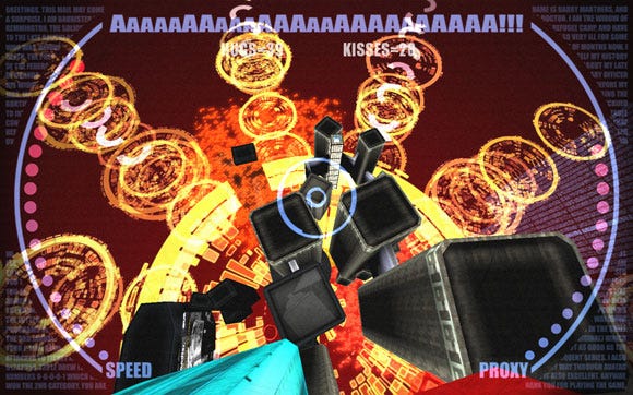
The glowy bits were generated semirandomly.
Rather than placing everything manually, we asked for a random variation and screamed, "No good! Send it back!" and played Goldilocks until we had something we liked. From there, we could tweak by hand to make things really shine. Our level designers wielded simple, yet expressive tools that allowed them to experiment with level design without having to painstakingly try everything by hand.
We loved this approach so much that it's become one of our goals to allow designers to wave their hands and watch designs grow, as if by magic.
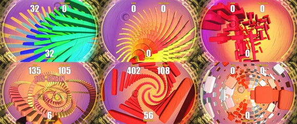
Various patterns created with roughly the same algorithm, in our upcoming project.
4. We PRed like never before.
By personally touching the press and reaching out to gamers, we helped build a phenomenal amount of visibility for the game and studio. In the past, we took an "if you build it, they will come" approach, which generally got us a lot of nothing. Consider that in IGF 2010, alone, there were hundreds of submissions up against ours! And when it came time to launch the game, we had to compete for gamers' attentions with a whole lot more:
A Short List of Things Each of Our Games Must Compete With
Every other indie PC game.
All the AAA PC titles coming out.
And all other titles on all other platforms.
Every game that's just inconveniently gone on sale this week.
And since we're an entertainment medium, we're actually up against things like movie tickets and DVDs.
And, of course, since you can decide to go get a burger instead of buying our game, we're even up against fast food.
To say nothing of television, a good book, or lying in a grassy field watching the beautiful, fluffy clouds. How are we even going to get your attention?
We had all this neat gameplay, but we knew that it would be easy for it to get lost amongst all the other games. So, we started by naming the game something fun and by crafting a humble press release, packing our finely-honed message into a page:
January 30, 2009 - Watertown, MA - Dejobaan Games, LLC has announced its next game, "AaaaaAAaaaAAAaaAAAAaAAAAA!!! -- A Reckless Disregard for Gravity," for Windows desktop PCs.
You dive off a skyscraper, relying on quick reflexes to negotiate the intricate tangle of girders that make up the City. You perform aerial stunts at terminal velocity before parachuting into the arms of your cheering fans. While other skydivers have it easy, you have to earn the adoration of the crowds by gliding within an eyelash of that glass super skyscraper at 70 miles per hour.
BASE Jumping (short for Building, Antenna, Span, Earth) has never been a sport for the masses -- it's too dangerous, and it's tough to get permission to jump off of the Burj Dubai. That all changes when Dejobaan Games brings its own wonderfully twisted take on the sport to the PC. How late can you deploy your chute before you end up a squishy bag of broken bones? How far can you trust your helmet's proximity meter before you splatter against a window like a bug on a highway? Do you believe the game's developers when they tell you that listening to your Enya CD will relax you and help you coast with more control... or should you just put on Limp Bizkit and throw caution to the wind?
As you descend, you toss the spectators a thumbs-up -- or flip them off -- to boost your score. By suspending reality just a little, this new game makes real-world BASE jumpers look like kids bouncing on a trampoline. This is AaaaaAAaaaAAAaaAAAAaAAAAA!!!, and it's coming in 2009. Check out videos and images from the alpha test at www.dejobaan.com/aaaaa.
Availability and system requirements: AaaaaAAaaaAAAaaAAAAaAAAAA!!! -- A Reckless Disregard for Gravity is planned for a Q3 2009 release, and will require Windows 2K/XP/Vista; a 1.5GHz processor; 1GB system memory; a 3D card with 128MB video memory; and Microsoft DirectX 9.0c.
Dejobaan Games, LLC is an independent developer of desktop and handheld games. Since our founding in 1999, we've published twelve titles, garnering enthusiastic reviews in print, on the Web, and on television. Visit us online at www.dejobaan.com.
# # #
Press info: Press kit with screenshots and video available at www.dejobaan.com/aaaaa.
Press contact: [email protected]
We're not press experts -- we're just a bunch of science and engineering dudes. But we tried to write the release from the journalist's perspective -- if you receive 100 such e-mails in a week, what's going to stand out? We didn't highlight the game's 81 levels or the music track list -- those are boring! We tried to tell a story about the game. We also wrote it in such a way so that journalists could lift tidbits to make their own jobs easier.
We then built up a press list by searching the web for top gaming sites, then sent the release to these contacts.
Further along, we worked to build a rapport with the journalists who wrote about us so that we could get repeated press coverage when we had new exciting things to say. We even had fun with it -- when Kieron Gillen wrote about the game, and people commented, Ichiro did a quickie video response, which Rock Paper Shotgun and its readers just loved.
RPS loved our video response to its readers' questions. Who knew?
That's it! It turns out that journalists aren't frightening or (too) mysterious -- they're people with likes, dislikes, senses of humor, and deadlines, just like us. The end result was that with a plan, we took a game that we thought was fun, and made sure that everyone heard about it.
5. We danced salsa.
All work and no play makes you a dull game developer.
All work and no play makes you a dull game developer.
All work and no play make you a drull game dvelozzz.
Having fun and getting our minds off of game development has always made our team work better. And for us, that meant dancing salsa.
It was something physically active, social, and while learning a routine can be mentally taxing, it involved a different kind of thinking than game development.
Ichiro and Leo first met at a salsa dancing class, where they were trying to break out of the science/engineering stereotypes and loosen up.
During development of Aaaaa!, weekends were largely no-work zones, while our brains caught up with things. Ichiro and Leo took time out for their girlfriends. Dan took time out to play D&D.

Salsa dancing at Water Fire kept us sane.
Focusing our tired brains on something else helped our unconscious minds chew on problems in the background. And distance from the project took the pressure off, allowing us to think strategically rather than tactically ("We must solve this system of five equations before I go to bed!" became "Say, we don't even need this algorithm, do we?")
Socializing helped in other ways, too. There's a vibrant gaming community in Boston, with monthly meetings of the local IGDA chapter called the Boston Post Mortem, and we're lucky enough to live in an area where the indie scene is also growing, thanks to the Boston Indies group. Networking has given us a chance to bounce ideas off of other bright minds and sit down and to chat about how to compete with the big guys.
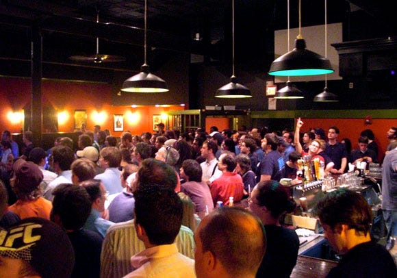
A talk given by Turbine at a local pub. Check out the dude tossing up the horns.
...and how we're fixing it.

This is one of the toughest documents we've ever had to write, and that's partly because we're now looking back and asking ourselves how we could have been so utterly stupid.
5. We screwed up the demo.
"The demo turned me off, but I got the game on sale anyway. It turned out to be awesome!" We've heard this quote from gamers a number of times since launch, and eventually came to the conclusion that the trial version just wasn't doing its job.
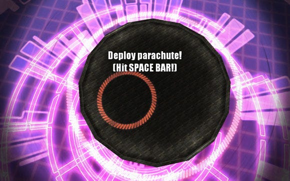
This is the first and/or last thing demo players saw. Boring.
The demo's purpose was to give players a vertical slice of the game. Here's some tiramisu. If you're sampling it, you want a tiny taste of the whole experience -- the savoiardi, the rum, the mascarpone, and the sugar. It should give you a good idea of what the whole experience will be like and nudge you towards picking up the whole slice.

A demo equals one bite of this. A tip of the hat to Fire Hose Games for the analogy.
Gamers have hundreds of flavors of cake available to them (so to speak), so in a demo, we have to get them that taste as quickly as possible. A good one introduces players to the story and mechanics, gives them just enough of a juicy experience to start savoring gameplay, and then makes it impossible not to grab the full version.
Those who played the demo found an experience that started with boring tutorials and ugly geometric primitives. While it also included some of the game's character, players who didn't actively search for it had no idea. It was possible to play through the three levels that demonstrated the basics and not notice the meditation sequence or one of the more challenging maps, where the pieces all come together. We failed to convey the full flavor of the game.
This was primarily because we left the demo for the last minute. By this time, the team was exhausted, and just wanted to get the thing out. We didn't take the time to formulate a plan, and we completely failed to consider the experience from the player's point of view.
When we later had the opportunity to let people play Aaaaa! at public functions (parties, GDC, and PAX East), they had a better time if we guided them to particular levels. We took into account their skill levels and preferences (people who’d never played a WASD game were shoved through a tutorial, but more experienced gamers were thrown right into one of the more interesting areas). After watching them play one level, we could usually recommend something else that would appeal to them. And we cheered them on. Why couldn't the demo have been more like this?
In our next title, we'll try this:
Iterate until the demo demonstrates something "wow" worthy in the first 15 seconds.
Put something interesting out there from the moment players start the game. (Or, better yet, right from the moment they start the installer.)
Create an experience that, after 5 minutes, leaves players wanting more.
Make it clear how there's more fresh content on the way, and that players "ain't seen nothin' yet."
Foist that on a fresh tester and get feedback.
Bottom line for our bottom line: we created a poor demo, and that cost us sales.
4. Fear made us conservative.
Halfway through development of the game's 81 levels, we decided to lock down the designers' toolset, forcing them to use many of the same tidbits over and over.
No new mechanics to make later levels more interesting. No new architectural set pieces -- they had to spend time combining existing pieces to make them seem fresh, rather than using new ones to make visually interesting environments.
This wasn't a conscious choice -- we were just afraid that if we didn't focus on the levels, we'd never reach the end.
After all, every new mechanic we'd added to the game (graffiti, flipping people off) required a lengthy process that we remember as follows:
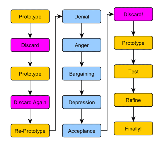
How to add a new feature to the game.
We tried to avoid that long process by stretching what we had as much as possible. We asked ourselves: did our levels reeeally use what we had to the fullest? Were we being lazy builders because we needed a new model or a new mini-mechanic to create 5 new maps? Time was running out, and that made us play it safe (which always seems to be the most dangerous way to play things).
We were afraid to use placeholder art and mechanics in lots of places. If we wanted to add a new feature, our mentality was that we had to get it right the first time. And if we didn't, it was wasted effort, and should be scrapped.
The Story of the Magnetic Grapple
The idea formed: why not allow players to play Spider-Man throughout some of the levels? We implemented a first blush "magnetic grapple," and ended up spending an entire afternoon playing with the feature. We tweaked variables to get the right feel. We formed ad-hoc contests to see who could swing up the highest. We were having too much fun to do any “real” work (which, looking back, is half the point of game development).
But when we asked ourselves how this fit into the overall game, we came up empty. So, we abandoned it. And the lesson we learned was this: don't experiment at this stage -- it's just a waste of time.
Bad us! Bad! Bad!
The last major item we added to the game was a spray can that allowed players to sprawl graffiti over things. It was a tiny addition, but it also a fantastic one! Between flipping people off and giving them the thumbs-up, players would glide between buildings to tag the right ones. After that, we turned conservative. And, as it turned out, you can only fly past the same eight story building model so many ways before it became redundant.
To address this on our next project, we're regularly stepping back to get that 30,000 foot view, making conscious (rather than reactive) decisions about how to truly generate interesting new content. We're also setting aside time throughout development to just experiment with new mechanics or tools, rather than confining that process to the prototype.
3. We flubbed feedback.
We didn't test enough. And when we did bring testers in to toss the game around, we underused the feedback we received.
As indies, we're informal about many things. Roles are often fluid: our tech lead is also responsible for the blog's graphic design as well as getting coffee for our interns, for example. That has worked well, but the danger in creating processes in an informal, ad-hoc fashion became evident in how we carried out testing:
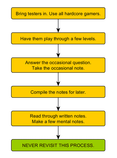
We thought we were testing properly. After all, it was easy to act on some types of feedback:
Minor elements we'd been considering: "Aha! The HUD is too high by five pixels. I knew it! I'm so glad we tested."
Explicit problems: "The player bounding box is too big for our tester to thread the needle. He dies every time."
And to reject other suggestions:
Those that were inappropriate for gameplay style: "Halfway through the game, you should climb up to the top and have to fight through the rest of the game as an ogre in an RTS."
Those that were too big for the game's scope: "Collaborative web-based level building over multiple devices. It'd be awesome to edit levels on my iPhone while other people are playing it!"
Those that were just plain wrong: "Get rid of hugs and kisses. And change the game's name to something like BASE Jump Extreme if it's going to sell."
What gave us the most trouble was recognizing the non-explicit bits of feedback. Number one was this:
You know those places where we didn't have to wrench testers away from the playing game? Those are the boring bits.
As a result, those boring bits stayed in the game.
2. We failed to empower everyone on the team.
Giving our designers strong scripting tools was great, but it didn't mean they could generate all the content they needed.
A level designer could fall through a level, dodging and weaving things like crazy. He could then hit a button and populate his fall path with scoring plates, knowing that players who followed that path would have fun.
However, to add a simple, rotating fan blade to his level, he had to go to Ichiro, who would import the model, orient it, resize it, apply a skin, add it to the catalog, and script the rotating motion. Or, he'd simply not do any of that.
The problem seems simple when we think about it now -- having everyone go through one person was a painful bottleneck.
This either prevented designers from making progress while they waited on him to implement something, or (worse), caused them to simply not think about level design outside the scope of what their tools could accomplish:
Dan (Narrative & Gameplay): Gentlemen, what can we do to make this level fun -- and different from the last fifty?
Tam (Programmer): How about a waterfall?
Ryan (Artist): Or a garbagefall! Junk could come falling out of tubes under a skyscraper, and the player could weave around them.
Tam: Pieces could blow in the wind and or fall straight down. And they could hit birds!
Dan: What would really be great would be a generic system where we could script things to fall and respond to wind. Let's ask Ichiro if he can code that.
Ichiro: No! No time to implement! Raaah!
Dan: Okay, boys. Buildings and more buildings, it is.
As a result, level designers would end up spending 20 hours trying different ways to make the same three pieces play differently. So, after the project finished, we went for some Q&A:
Q: How could we let this happen?
A: Myopia. We never took a look at our level building process as a whole. Instead, each day, we'd come in and just work on the damned levels.
Q: How did this affect the final game?
A: Levels looked similar-er than they should have. Ditto gameplay.
Q: How can we have solve this problem in the future?
A: For starters, we'll sit down with our laptops and talk about how the designers work. ("What does the process of building an entire level look like? What are the problems we've been hitting on a tactical level?") From there, we'll scope up and ask the bigger questions. ("What should the level building process really look like? What's the right balance between tool building and tool use?")
The added difficulty here is that we knew that constraints often aided creativity. In some cases, designers would come up with quick, interesting solutions to problems. However, by over-constraining, we forced designers to re-tread the same paths repeatedly. We ended up squashing creativity.
1. Poor, irregular planning nearly killed us.
This is the mighty one: We failed to step back at regular intervals to get the big picture, and became mired in the details. We didn't ask the big questions ("How does the game look to someone who hasn't been working on it for half a year?" "What are we missing?" "How do our post-launch goals affect design?"). And it almost killed the project.
Stop us if you've heard this one: after the initial planning stages, we never substantially updated our design document. Towards the middle of development, the game looked significantly different from our original plans, so we threw the plans out and flew by the seat of our pants.
We had no set interval during which we'd go back and refer to the design document.
When we did, we had no procedure in place for a review and rewrite.
Eventually, we stopped looking at it entirely.
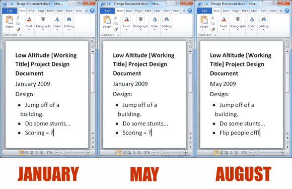
[The design document as it failed to evolve.]
We compounded this error by failing to sit down and discuss the big picture with each other -- our implicit mantra was "What do we need to develop right now?" This bit us in the butt on a number of occasions; for example:
We didn't identify the need for additional architectural pieces -- the game could have easily tossed lots of new stuff at the player in the latter levels.
We didn't identify what we needed for the demo experience, instead plowing right through its development.
We weren't able to plan for longer-term things such as post-launch content, sequels, or multi-platform support.
At worst, everything we did was reactive, and we failed to recognize problems until after we'd shipped the game. Just about everything that went wrong stemmed from our lack of stepping back and considering the project as a whole. Fortunately, Aaaaa! was modest enough, and our team was small enough such that we were able to correct for that. But we probably won't be so lucky in the future, so we're trying to make amends with our next project.
As such, our new approach has been this:
First: Begin by asking all the questions we can about a project.
We began our next game by posing as many questions as we could. Some required small, one sentence answers, while others broke out into other documents. Here are some:
How do we know if our game's high concept is remarkable?
Why's it better than every other project we could begin at this time?
What team roles are currently unfilled or underserved?
What software, hardware, or services will we require to complete this project?
How do we determine if this is a dead-end project, and how do we then terminate it?
How do we determine if this design doc is out of date, and what do we do then?
What do we need for the pre-release?
Why will this sell?
How does the customer find out that this game exists?
How can this game cross-promote with other games?
We've tried to answer these questions measurably. ("We'll know if we have a good high concept if, on hearing it, people laugh and sign up for our fan club. If they say, 'cool, that might be fun', we have to iterate on it.")
Second: Meet regularly to discuss the 30,000 foot view.
Every week, the core team has met to consider the high level questions. Every handful of weeks, we've gone through the design document to answer old questions and raise new ones -- we've tried to keep a living document.
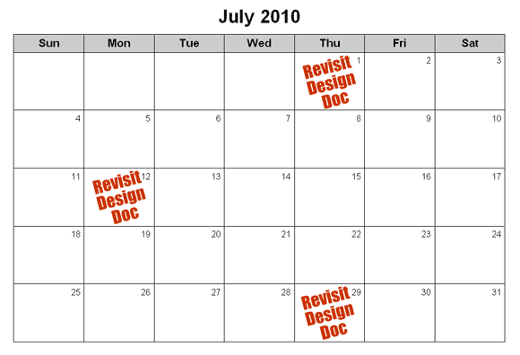
It's on our calendar now.
Third: Conduct pre-mortem post-mortems.
Much of the document you're reading could have been written before we even finished Aaaaa! -- but we never took the time to consider what we'd already been doing right and wrong. On our next project, we've been trying to look back at the past months and figure things out before the end of development.
Our single biggest takeaway from Aaaaa! is that we should regularly step back, become aware of the project, as a whole, dissect it, and move accordingly.
Well, that's it! Those are the most important lessons we've learned on our epic, nine-month journey of Aaaaa! Couples who had sex on the very day we pressed the first keystroke on the game's prototype gave birth on the day of our launch. Poetic, no?
The stars aligned. Our hard work paid off. Our mistakes didn't kill us. And our lucky 13th title has become our single most popular game with critics and gamers alike. For us, Aaaaa! has been a brilliant success. And you know what? This coming year, we're going to blow that out of the water. Stay tuned!
(And in the meantime, visit us at www.dejobaan.com and check out or pan-indie blog at www.indiesuperstar.com.)
Developer: Dejobaan Games, LLC
Publisher: Dejobaan Games, LLC
Release Date: September 2009
Platforms: PC
Number of Developers: 2 full-time, 1 part-time, 2 interns, 1 Alicia
Length of Development: 9 months
Lines of Code: 15,000ish, though you could probably compact that into just one if you used enough semicolons.
Trivia: Our team at PAX East all had nice, red Aaaaa! t-shirts. Being indies, we created them by buying blanks for $2.49 apiece and spray painting them black. They even go through the wash just fine. God, I love my job.
Read more about:
FeaturesYou May Also Like