Trending
Opinion: How will Project 2025 impact game developers?
The Heritage Foundation's manifesto for the possible next administration could do great harm to many, including large portions of the game development community.
In this rare postmortem, the creators behind acclaimed DS title The World Ends With You at Square Enix and Jupiter describe exactly what went right -- and wrong -- while making the innovative touch-screen title.
April 30, 2009

Author: by Tatsuya Kando
[In this rare postmortem, originally published in Gamasutra's sister Game Developer magazine, the creators behind acclaimed DS title The World Ends With You at Square Enix and Jupiter describe exactly what went right -- and wrong -- while making the innovative touch-screen title.]
The World Ends With You was our team's first game for the Nintendo DS -- a platform that we felt had limitless possibilities. The three of us who were primarily responsible for the game had previously worked as artists for the Final Fantasy and Kingdom Hearts series, but had never directed a game before.
The game wound up taking two years to develop, which is a considerable amount of time for a portable game, and was a continual trial-and-error process throughout. We feel that the resulting project was eclectic and ambitious, but not different just for the sake of being different.
1. Getting to go wild with original IP and gameplay concepts.
The project began with constant brainstorming and idea-sharing between the three of us. As this was our first game as directors, a healthy dose of paranoia prompted daily brainstorming meetings. These sessions established a strong sense of camaraderie and led for better overall communication, allowing us to constantly meet our deadlines without any serious delays.
From the beginning we were determined to create an original IP -- something that wasn't another Final Fantasy or Kingdom Hearts. This led us to choose the Shibuya district in Tokyo as the game's setting.
At first we thought the Shibuya locale would be a turnoff to overseas players, but the district's uniqueness adds a certain reality and depth that we couldn't have recreated in a fantasy setting, and it lets players identify more with their in-game counterparts, who are fighting for their lives in the "real world."
It turns out we were successful -- even a year after the game's Japanese release, hardcore fans are still organizing tours of the real Shibuya to compare it to the game world.
 2. A story created by committee (and free of those pesky RPG plot holes)!
Like all other aspects of development, story development was done by committee. Each director was given his own writing team, which brainstormed over the general story background, plot, and other elements.
Because the over arching story has the player trapped in Shibuya, the story needed an air of mystery about it, so the team was determined to avoid any plot holes.
One contradiction in a story like ours could bring down the house of cards, so the team worked carefully to keep the storyline locked down. The game's designers took part in the writing process as well, ensuring that as many eyes as possible went over the plot, searching for holes and offering input from every conceivable angle.
After the final story was in place, we had our Q/A department go over everything as a final failsafe. To our surprise (and horror), they tracked down several inconsistencies we had managed to miss during our multiple checks.
Their diligence reminded us of how critical it is to view the game from the player's perspective -- and these extensive preliminary story checks are becoming a standard at the company.
3. Implementing a player-controlled risk vs. reward system.
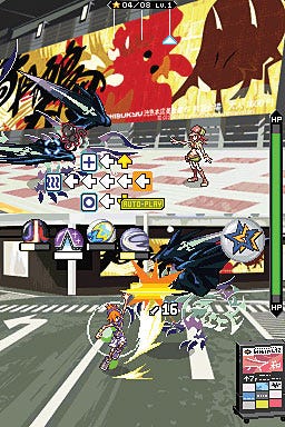
Many agree that the standard JRPG formula of walking around the field and grinding (or running away from monsters that aren't worth your time) can get monotonous and build up player stress.
Another issue on the development side is that tuning combat difficulty takes excessive amounts of time, and there's no guarantee that a designer's ideal difficulty is the same as the player's.
Our solution was the "Active Encounter" system, where players can choose how many enemies they wish to fight and when. This removes mandatory battles with "trash mobs," and allows the player to control the risks and rewards of battle.
Harder battles yield better loot and more experience points. This let players of varying skill levels enjoy the game beginning to end -- at the cost of some game balance.
4. Going full-bore 2D.
Modern settings are rare for Square Enix titles, so we had to make sure our art style would stand out from other titles -- and to keep the entire game in 2D.
Most games go for the 3D approach, but we felt we couldn't fully express ourselves on the DS if we went the polygonal route. 2D graphics can really "pop" on the DS's small screen, and we wanted to have lots of wildly shifting and morphing monsters. The game's "Noise" creatures have colorful tattoos that dynamically change shape and attack the player.
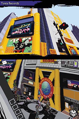
We also made an effort to make the backgrounds as faithful to the real city as possible. The entire staff went on location to Shibuya and walked its streets constantly, taking note of interesting areas where battles could go down, and what specific landmarks to highlight.
Background artists spent extensive time on location, making sure not just to trace what was there, but more actively capture the overall look and style of the city. (See accompanying photolog, below.)
5. Working closely with our middleware provider to cram a full vocal soundtrack into the game.
From the very beginning, we wanted to include a variety of musical genres that fit the mood of walking around Shibuya. Given the limitations of DS game cards, we initially hadn't even thought of using vocal tracks, but we wound up implementing CRI's Kyuseishu Sound Streamer.
This middleware had only been used for voice compression in the past, and this was the first time anyone had used it for music. We were blown away when we heard the first vocal track coming out of the DS, and realized we'd be able to include a full digital soundtrack.
We removed the pre-rendered movies and replaced them with Flash-style sequences, which freed up cartridge space to include over 30 songs. In the end, about 1/4th of the game ROM consists of compressed music data. This was an example of how trying something new really paid off.
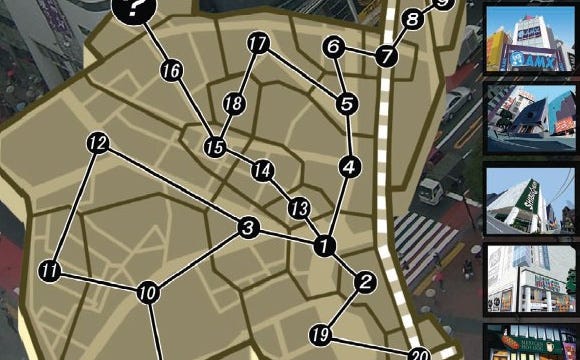
(click for full size, including specially prepared in-game location key)
1. Time management and development culture clash.
The game was developed by Square Enix in Tokyo and Jupiter in Kyoto. While we originally commissioned Jupiter as the developer, we wound up with more creative crossover than we thought.
The Square-side directors got involved in the gameplay design elements, while Jupiter went beyond the call of duty and assisted with the game planning. The cooperative endeavor resulted in a fantastic product, but it came at a price.
Square and Jupiter have very different development cultures, but it took us a while to realize it. We assumed all companies' development processes were the same -- that our way was the standard. Once we met up and reached a consensus on how to do things, work proceeded much more smoothly.
 Geographically, we were very distant as well -- it takes about two hours to get between Tokyo and Kyoto via bullet train. It was critical that we met in person, but this ended up costing us time, and it hurt the schedule at every step.
We had weekly telephone conferences, but it was hard for us to "read" each other over the line. Sadly, we were unable to do video conferencing, which I believe would have resulted in a more open, jam-session sort of feel.
2. Story creation scheduling.
Even though we were happy with how the story turned out, the process started going smoothly only halfway through the project. When we started, we were plagued by confused direction and constant rewrites by the scenario staff.
Changing plot elements mid-project is risky business, and we were making tweaks to the scenario all the way up until just before master submission!
We were able to pull it off because the game didn't contain a lot of voice -- if it had been voice-heavy, we would have had to lock down the scenario far earlier.
Although it's obvious that the scenario should be put together early on in the development process, it also takes time to create something that's truly interesting. Maintaining this balance is extremely important.
3. Overloading the player with new concepts and game systems.
We made three big mistakes with some of the gameplay concepts we implemented. The first issue was how the player could "scan" the thoughts of NPCs. We should have integrated this into the story more, because it never really related to solving puzzles.
I can't say the whole system was unnecessary, but it could have been integrated much better. If there is a sequel, this is something we'll need to work on.
Another stumbling block was the special attacks in the dual-screen battles. To activate the special attack, you play a card-based minigame on the top screen.
We wanted to drop the system in lieu of a gauge that fills up as the player uses normal attacks. We were hoping to fix it for the North American release, but we ended up not having enough time and went with the same system (with reduced difficulty).
The last issue was partially fixed for the North American version. Anyone playing the Japanese version was forced to wade through pages of tutorials. With all the new systems, the players had a lot to learn, and "the wall of text" was hard for people to absorb all at once.
I think the chaotic state of all these new systems confused the heck out of Japanese gamers. In the North American version, we trimmed down the text as much as possible, and made the tutorials skippable.
 4. Dual-screen battles, or "What's going on here?"
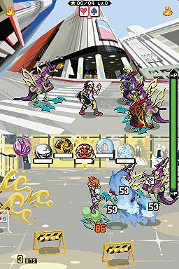
The original concept of dual-screen battles came from creative producer Tetsuya Nomura, but it was easier said than done.
Fighting battles on the lower screen using the touch panel was our original concept, and turned out as well as we expected. But our biggest headache stemmed from the battles in the upper screen.
We threw a number of ideas at the wall to see what stuck, like command-based battles or even music games. At first, we were determined that the player would have to fight on both screens at once, but after trying out a few systems we realized the error of our ways.
Why did we have to make the user do anything in the upper screen at all? Once we left our creative egos at the door and looked at things through the player's eyes, we realized what was wrong.
We had to make the user want to fight on both screens, but still provide the automatic combat if they elected to avoid it.
This sped things up and we arrived at the battle system we have today, where the player can simply let the battle progress in the upper screen by itself, or actively fight using the control pad. I regret that we hadn't come up with this solution earlier.
5. Animation quantity and quality.
The biggest problem with going fully 2D is the animation costs, and heavy amounts of animation were required for our battle sequences. To reduce our workload, we created a polygon-based template for the main character Neku and some of the larger monsters. We rendered out some simple animated models, and rotoscoped the 2D pixel art on top of it.
The tattoos on the "Noise" monsters were another headache, since the sprites moved and shifted with each frame of animation. It took a while for the whole team to agree on how each tattoo should change and lock down the data set.
Additionally, with so many people on staff, we had difficulties maintaining a quality standard for the animation. We naturally wanted everything to look cool and modern, but "cool" is subjective, so strong direction was a necessity -- so, as the animation director, Tatsuya Kando had to take a trip to Kyoto to visit Jupiter every week to check on how things were going.
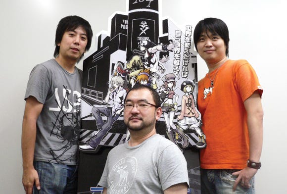
The World Ends With You directors from left to right: Tomohiro Hasegawa (co-director), Tatsuya Kando (director), and Takeshi Arakawa (planning director).
The main challenges in our project were trying out new ways of expressing ourselves, and maintaining quality while keeping an eye on costs -- an always daunting task.
Given the opportunity to do it again, we'd be able to work faster while keeping a high standard of quality. The hardest aspect is determining the staff's skill level and planning for it to allow for accurate time and cost estimates.
Publisher: Square Enix
Release Date: April 22, 2008
Developer: Jupiter, Square Enix
Platform: Nintendo DS
Read more about:
FeaturesYou May Also Like