Trending
Opinion: How will Project 2025 impact game developers?
The Heritage Foundation's manifesto for the possible next administration could do great harm to many, including large portions of the game development community.

Featured Blog | This community-written post highlights the best of what the game industry has to offer. Read more like it on the Game Developer Blogs or learn how to Submit Your Own Blog Post
Andreas Wangler, Lead Designer on Shelter, writes a post mortem on the development of Might & Delight's second game, which was released on August 28 2013.

Andreas Wangler, Lead Designer on Shelter, writes a post mortem on the development of Might & Delight's second game, which was released on August 28 2013.
I believe Shelter, as a product, is a reaction to our first game Pid, and to our time spent on developing it. Shelter as it turns out would probably not have seen the light of day if we hadn’t developed Pid both in terms of what we wanted the player to feel when playing Shelter and how we came to work on it as developers.
It's funny in a way how Shelter came to be, thinking back on what we discussed after Pid. The main idea then was to develop something that commercially would work better, that spoke to a wider audience, almost casual. Pid had shown itself to be a game aimed at a narrow hardcore audience. Well, now nine months later we have the final product, Shelter.
Is it a commercial game? Hardly. But does it speak to everyone? Yes, I think it does.
What Went Right
1. Certainty of our vision
When we decided the game was going to be about an animal mother taking care of her cubs in a dangerous world, I recall feeling both relief and fear at the same time. Could we keep the focus on Shelter being an experience? Could we rely on the experience being enough or would our love for the gameplay get in our way and ruin the vision of Shelter as an emotional journey?
I knew from the start that keeping that vision would be the challenging part of the design. It later became apparent that this part saved the project in terms of keeping the development time short. It also made us focus on not complicating the gameplay.
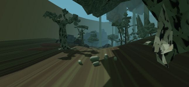
During development there were many discussions regarding whether it's enough having the player visually experience threat without there actually being any real danger. As an example, in the fire level, the fire can't actually kill your cubs. We wanted this to begin with but found that it just wasn't needed. The moving fire used together with the threat of the bird of prey was enough to stress the hell out of the player.
The bird of prey was also meant to be used more often, but this was also something we cut in the end. We noticed that by just having the sheltering grass patches put out in the world we could make the player feel insecure, not knowing if the bird would show up or not. And the impact of making the player feel insecure turned out to be so much more important than repetitively putting them in actual real danger.
We also maintained our vision of streamlining the level design experience. This obviously helped us keep the development time under control, but I believe Shelter wouldn't have worked in the same way had we gone towards a more open world design. This is after all an experience more resembling an emotional roller coaster ride on rails and we never meant it to be anything else.
Finally, the question of having a game over or not. Would the game end when the last cub died? We decided no, and seeing how the game has been experienced I believe this was the right decision. There is no game over out there in the wild, neither for us humans or the animals. Even if we lose our loved ones, we keep on going; we should keep on going and not give up. That is an important essence of Shelter.
2. Short development time without any crunch or overtime
We decided early that we had nine months to develop the game and everything depended on us sticking to that deadline. We also knew that we didn't want to work overtime. In hindsight seeing how we succeeded with releasing it in time without working overtime or having any kind of crunch is to me simply amazing and I'm really proud of that. Considering how damaged our team was at certain times this is even more surprising. Our limited development time also worked well together with us focusing on what was important with Shelter; that it should be less of a game and closer to an emotional journey.
3. A suitable art design
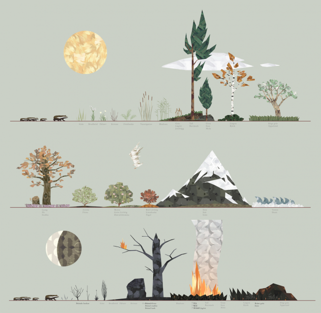
Jakob Tuchten, our art designer, needed to work within certain restrictions -- we had nine months and one artist. It should be said that the team did grow later on thanks to the addition of two interns. Due to the fact that Pid's art design was based on not using textures it was pretty clear to Jakob that the focus of Shelter would be the opposite, by only using textures. It was through these restrictions that a design started to take form that would be perfect for the game we envisioned.
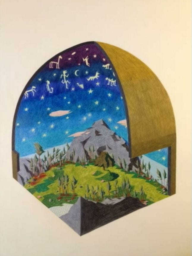
Jakob was inspired by the Japanese kamon which is a kind of emblem that is used to identify a family. These were mostly circular and were based of basic geometrical shapes within other shapes that many times showed abstractions of plants. Playing around with abstract shapes; triangles, squares and circles within the texture became the main idea, but Jakob also had a second focus.
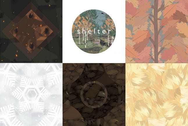
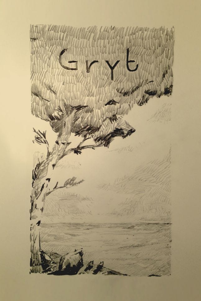
If you look closely at Shelter's logo you’ll notice the little badger family walking through the forest. The lack of contrast became the second focus for the art design. In a real forest it is sometimes hard to see stuff. Trees, bushes, ground, everything becomes one and the idea of using that and repetition as a tool became something special in Shelter's graphical design. This was further developed by not using light as a tool at all and this also helped us speed up the work on the game.
Because of these special textures we could keep the polycount pretty low and still get a good impression, though abstracted, of nature and the big wild. Basically, the art design couldn't have been more thought out for a game that had a short development time.
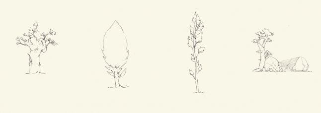
4. The badger
For every Shelter piece of content released on the web, whether it was an article or video, in the comments you could always expect a link to the famous flash animation ”Badger, badger, badger” by Jonti Picking.
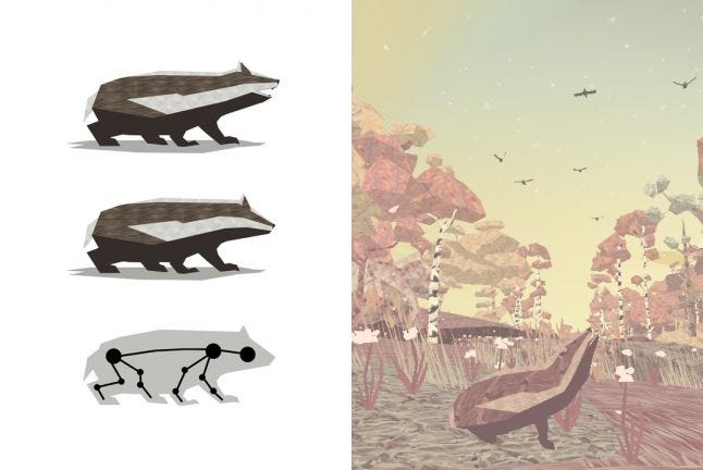
At the time of the announce trailer we hadn't decided if the main protagonist would be a badger or not. I remember that in a meeting we discussed that it could be easier for us to not connect to real animal life, because we could then have free reins to experiment with the hunting mechanics and how you would behave in the game world. In the end, it showed, it did not really matter that ”our” badger unrealistically was throwing herself against trees to make apples fall down or that she tracked down and killed foxes. The importance was her being a badger because it led to connections to funny clips on YouTube (Randall's honey badger), a certain state in the US, the cull in the UK, and literary references like ”The Animals of Farthing Wood” and ”Watership Down”. In the end we fell in love with our badger and so did everyone else.
And there is no denying how having little badger cubs in the game being killed off one by one had a huge emotional impact on people. This was a pleasant surprise since we hadn't counted on it being such a big thing as it turned out to be.
But I think it's fair to say that we don't ever want to hear anyone mention that “Badger, badger, badger” clip again. I remember someone in the office once saying: “Let's put a snake in the game!” I shouted out loud “No thank you, enough is enough!”
5. Steam only
Being able to focus on Steam and in our case Greenlight only kept down the development time a lot even though we had to live with the uncertainty that comes with waiting to be greenlit. When we finally got greenlit it all went very smoothly. The easy update system and some good feedback given from Steam themselves, on when to release the game for best possible impact, is something we appreciated a lot as a small development team.
What Went Wrong
1. Uncertainty of our vision
As highlighted earlier, we were a damaged team. There were times when we didn’t have a focused vision of what Shelter was going to end up being. This didn’t stop us from coming out stronger in the end and even more certain of our product, but still. Halfway through the development time there were a lot of discussions around whether we had enough going on in Shelter. Should we make a more challenging game, a more gamey game and risk losing the emotional touch and the wider audience? A clearer vision from the start would have helped speed up the process.
I believe some of us also fell into the well-known trap of developer blindness. As developers we walked through the woods of Shelter every day and by doing so it's easy to forget that when the actual player sits down with the game, the finished product, everything he sees, he sees for the first time. Everything is new and he/she doesn't know what lurks around the next corner. Shelter turned out to be a pretty tense game, but we couldn't always clearly see that it had those qualities during the development.
2. A damaged team
During production, only a few of us were actually able to work in the office. The company had undergone significant changes over the past twelve months. Might & Delight today is already a lot different from the set up during the development of Shelter. Even more so compared to the set up during the development of Pid. The last year of the development of Pid had a major impact on us. Everything from physical to psychological problems haunted parts of the office. The actual nine months of development time was without a doubt only six months if not less when you consider the down time we had during several sections of development. Without the addition of well-timed intern positions and leads, whilst trying to hold it all together, we wouldn't have made it in time. Everyone did a fantastic job in the end, without a doubt, and we are stronger as a company now than ever, but there is just no point in hiding the fact that we were severely bruised and battered as a team during Shelter's development.
3. Communicating gameplay
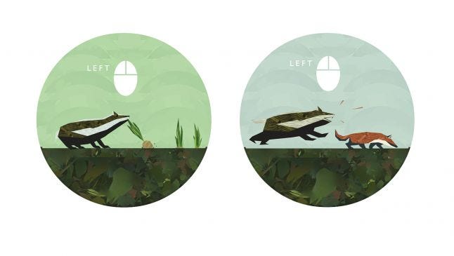
Our goal was not to intrude on the experience by having a HUD or having tutorials throughout the game that interrupted the player on his/her journey. We kind of succeeded with that.
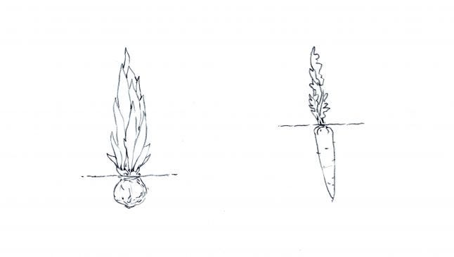
As an example, we had a few mails about the early moments of the game (talk about not wanting our players to like us!) where they simply didn’t know how to continue. The fact that you had to pick up a root vegetable and give it to your starving little cub on the ground wasn’t clearly communicated since the actual tutorial for picking up (using the left mouse button) was not shown until later outside the badger cave.
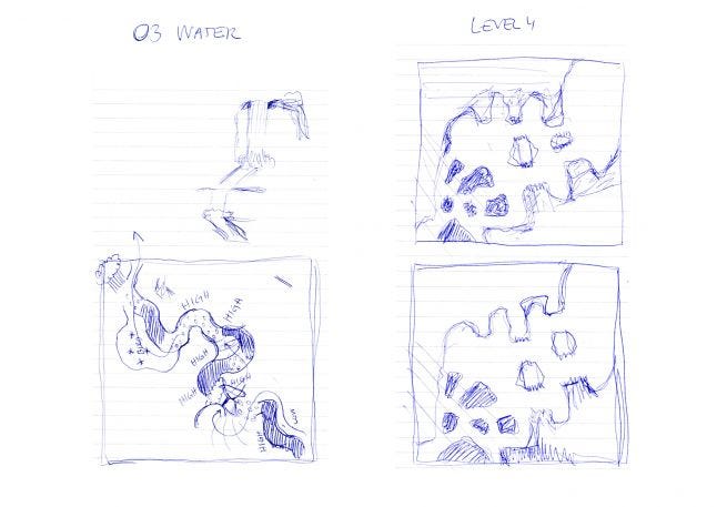
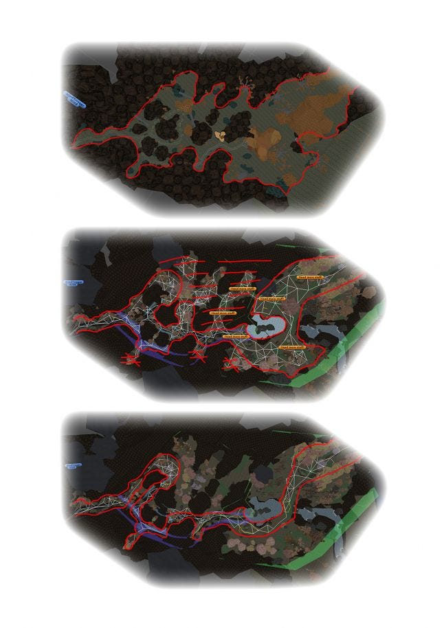
The next example came after watching countless gameplay videos. Almost everyone lost a cub in the night level! The night level was the level that ate up most of our time and had the most iterations of all levels. The first idea was to make it a labyrinth that the player actually had to find a way out of. As you can see (in the picture below) it was cut down to be completely linear in the end. But people still lost their cubs in this level. We kind of blame this on the fact that the night level was pushed from being the fourth level to being the second during the last month of development. By doing this we also misjudged how unprepared for real danger the player was at this early point in the game. A tutorial picture would have solved the most immediate issue.
I also don’t think most of the players ever actually understood that you could hide behind the rocks in the wild river level. We worked a lot on this and settled on a shadowed texture in front of the rock, but it turned out to be too abstract.
And then we have the problem of the fox. We played around with countless tutorial pictures for the first encounter of the fox. During focus tests people were scared stiff by the fox. And why shouldn’t they be? Surely the fox would eat the cubs if he got the opportunity? Not our fox. It simply existed as sustenance in our game, included to make the player feel stealthy and powerful.
But why did we choose the fox? To be honest, it’s because it was simple. We could rework the animation of the mother to fit the fox as it was nearly the same size, though we did downsize the fox a lot to make it feel like a baby fox in the end, which helped communicate the hierarchy a little. In the end I think we got most people to understand that the fox was simply food and nothing else, but it took way too long until we got there.
4. Optimization (occlusion)
Christoffer Hedborg, lead programmer, explains: We ran into some issues with Unity’s occlusion culling while optimizing the game. It seemed the game would crash if we used too small cells due to the levels becoming too big for Unity to load them. So we had to use bigger cells (which means culling isn't as efficient) than we wanted. It worked out in the end with a lot of tweaking. But there are a few places in the game where the frame rate suffers a little for it on low end machines.
5. Too little Testing on Mac
We started too late with testing on Mac and didn't have enough machines to test on. This has lead to, at the point of writing this, a severe bug where the game simply does not start on certain setups.
Conclusion
Shelter ended up being the game I and Johannes Wadin, the creative director on the game, envisioned it to be and we, and the whole team, are extremely proud of the game. Nine months went by extremely fast and it’s actually still hard to understand that it is out there. Accompanying the release, the game also spawned a digital book titled “The Circle” illustrated by Jakob Tuchten.
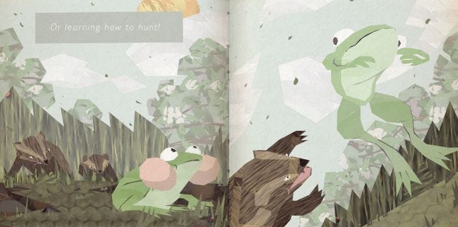
Shelter turned out to be a pretty short experience, clocking in at around two hours, but I honestly don’t think the game would have benefitted from being longer. If it would have been, the repetitiveness in Shelter’s pretty simple gameplay would have become an even bigger factor and could possibly have overshadowed the emotional impact. Also we wanted the user to play through the entire experience which is a very important part of Shelter. Our goal was to have the player finish the game in one sitting.
After Pid’s release some of us were in a bad state because of burnout. It was important that our work on Shelter wouldn’t continue down that path. With new creative energy we threw ourselves out on thin ice to make a completely different game, with hopes that it would speak to a wider audience. Seeing the many reactions from people on YouTube playing the game, and reading about people crying at the end of the game, makes us think we actually touched a few thousand hearts out there. That to me is a job well done.
So what’s up next? We are experimenting with expanding on the Shelter experience through a project called Nurture at the moment. You might call it a prequel with influences from the Tamagotchi. What's happening later on? An RTS from Might & Delight maybe? You never know…
Developer - Might & Delight
Publisher - Might & Delight
Music - Retro Family
Release Date - 28th of August 2013
Platforms - Windows and Mac
Number of Developers - 12 (some only partly)
Length of Development - 9 months
Budget - 250 000 $
Lines of Code - Around 8000
Development Tools - Unity
Read more about:
Featured BlogsYou May Also Like