Trending
Opinion: How will Project 2025 impact game developers?
The Heritage Foundation's manifesto for the possible next administration could do great harm to many, including large portions of the game development community.
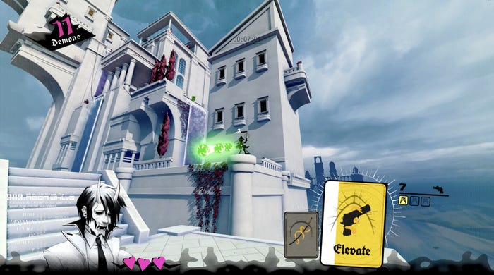
Neon White is a parkour-based shootout through heaven, one where you sacrifice guns for powerful movement abilities.

This interview is part of our Road to the IGF series. The IGF (Independent Games Festival) aims to encourage innovation in game development and to recognize independent game developers advancing the medium. Every year, Game Developer sits down with the finalists for the IGF ahead of GDC to explore the themes, design decisions, and tools behind each entry.
Nominated for Excellence in Design and the Seumas McNally Grand Prize, Neon White is a parkour-based shootout through heaven—one where you sacrifice guns for powerful movement abilities.
Game Developer spoke with Ben Esposito, the game's director, to discuss how they designed the stages to encourage players to get creative with approach, the accidental origins of the game's card-based weapon system, and the ideas that went into making it easier for players to make decisions while running and leaping at high speeds.
Who are you, and what was your role in developing Neon White?
I'm Ben Esposito, an independent game designer based in Los Angeles. I acted as director on Neon White.
What's your background in making games?
I've been a game designer for 12 years now. I started at Giant Sparrow as a designer on The Unfinished Swan and What Remains of Edith Finch. After that, I created a handful of indie games like Donut County and the mascot horror game Tattletail. I like being involved in every aspect of games, but my true form is a designer.

How did you come up with the concept for Neon White?
I made artsy and wholesome games for a long time, and after Donut County shipped I felt I had said what I wanted to say. One day my (brilliant) wife Geneva Hodgson turned to me and said "Neon White. That would be a great name for a game." I agreed and we came up with the scenario that day. It was time to make something campy and horny.
What development tools were used to build your game?
Neon White was built with Unity3d, which is the engine I was most familiar with at the time. Coincidentally, Unity3d was a good fit for the level-by-level architecture of the game.
We used Maya and the usual Adobe products to make assets. We didn't use or create any special tools to build the levels. We created layouts in the editor using primitive cubes and then art-ed them with a modular kit.
Neon White is designed for speed and creativity. What thoughts went into designing the stage layouts to encourage these things?
Player creativity requires proficiency and familiarity with a level. You can't be creative in the middle of a tense level you've never seen before, so it was important for us to design each level to be enjoyed multiple times as you learn and discover what they have to offer. The levels are designed to be fairly easy to complete, but they're intentionally misleading. If you follow the obvious path, you won't get a great score.
Once you're familiar with a level, you can engage with the core fun of the game: optimizing. We hand-designed shortcuts for each level for players to discover, but we also left plenty of room for players to improvise and trusted that the game's design would allow for a satisfying amount of freedom.
Players can get tunnel vision while optimizing, so we introduced collectible gifts which appear only after you've completed a level. Gifts provide a break from the clock and an opportunity to see the level from a fresh perspective, typically requiring an understanding of all the card resources available in the level. The idea was to encourage players to take it easy and get to know the level more deeply before diving head-first into speedrunning it.
Can you walk us through the creation of one of the stages? How you shaped it around those core elements?
One of Carter Piccillo's levels, Dasher, is a great example. It started with some clear goals: introduce blue demons which drop Godspeed cards and introduce the concept of a chain of Godspeed dashes.
Typically, each encounter in the level is blocked out in isolation, then assembled to form the overall layout of the level. The assembly process often creates opportunities for shortcuts, which are then incorporated into the design. In Dasher's case, the shortcut asks players to chain Godspeed dashes in a new context: save the first card in the level, and do some slight ammo management to hold onto their resources.
This sometimes works in reverse, though. Some levels were designed with a shortcut in mind from the beginning, and the encounters followed.
We ended up agreeing on a few simple rules for making levels:
The player always knows where to go next
The player always has the right tool for the next encounter
There is at least one non-trivial shortcut
The shortcut path cannot be hidden
The shortcut path must only use cards from the main path
Of course, we broke these rules a few times. I also don't want to make it sound like we had the design rules completely figured out from the beginning, because in reality we were changing things up until the end!

Players can sacrifice weapons (soul cards) for parkour abilities. What spawned this idea?
During Donut County's development I made a prototype FPS that used cards for weapons. It was meant to be a roguelike style game with deckbuilding, which was trendy at the time. It's probably no surprise, but drawing random weapons from a deck wasn't fun at all. In a final effort to save the prototype, I removed the deckbuilding and randomized levels and added some risk/reward by way of discarding cards in return for movement abilities.
I sent a build to my friend Tom Astle. Shortly after, he sent back his best time for the first level. We traded high scores for about an hour, after which I realized I stumbled into making a time attack FPS platformer with asynchronous multiplayer. Not trendy, but undeniably fun.
What thoughts went into creating the parkour abilities and the soul cards they would be connected to? How did you tie these items together?
We created a few dozen different abilities, some of which I thought were pretty clever. However, we only ended up using the seven or so simplest ideas. The game definitely feels better when the mechanics are simple and versatile. We found that the more clever the idea, the more puzzle-like the game became. For example, I thought it would be cool if you could discard a card to create a summoning circle where you'd be instantly resurrected if you died. It was functionally a checkpoint, but in practice you could essentially teleport by deliberately killing yourself.
It seemed like a cool idea, but the levels we designed with it were a pain. They were confusing because they branched in multiple directions to justify the concept of teleporting back to your summoning circle. Also, in Neon White, it's surprisingly hard to die when you're in a hurry. A remnant of this design is actually still in the game. The "tripwire" enemies introduced halfway through kill you when you touch their beam, but they'll also kill themselves at the same time. This was because we introduced tripwires as a convenient way of killing yourself while killing an enemy [laughs].
Anyway, there wasn't really a rule for designing the cards; it's more that each card was designed around a theme. For example, the Purify card's theme is sacrifice—this weapon has so much ammo that it's costly to discard it too soon. Purify is the first weapon you get because it reflects the design theme of the game as a whole. Other themes include gravity, proximity, verticality, visibility, and some more that I'm forgetting now.
What thoughts went into the striking look of the game? What made it suit the high-speed firearm parkour game you were creating?
We wanted the gameplay to run the show, so we developed the style of our environments to support that. The main "intended" path of each level needed to be read instantly and clearly, and we found that a clean, low detail look with lots of negative space worked really well.

Why take players to heaven when they're assassins from hell? What did this idea add to the look and feel of the game?
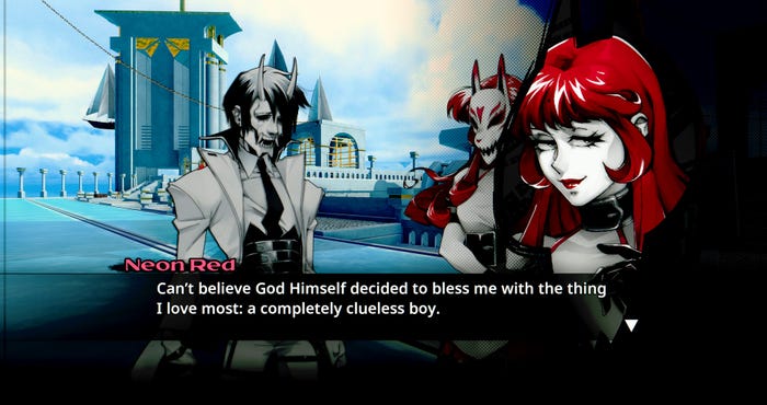
We picked Heaven because it supported the religious theme as well as the utopian-inspired Y2K aesthetic at the heart of the game. Culture is full of garish depictions of Heaven, which inspired the environment and served as the central idea for the story.
Also, Heaven was a deliberate choice in the context of the retro FPS revival at the time, which relied heavily on referencing Doom and Quake's visual identities. Neon White took inspiration from those games but flipped a lot of their assumptions, visually and design-wise.
What design ideas went into how you presented the abilities players would have access to? How did you make player abilities and options clear at high speeds?
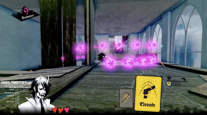
We started with the idea that weapons and abilities came in the form of cards, which is clearly a weird choice for an FPS, but it made the metaphor of "discarding" intuitive. Since we were free from the convention of showing a gun on the screen, we were able to justify some arbitrary design decisions which wouldn't have made sense otherwise. For example, you can only hold two different types of cards at once, but you can hold up to three of a kind at the same time. That's card logic!
Our 2D artist Rebecca Ryan created a really cool design language for the cards where each one has an illustration of a gun as well as an abstract graphic which suggests the utility of the discard ability. That, plus a tutorial illustration, was all we really felt was necessary. People don't seem to have a difficult time figuring out the abilities, so I'm happy.
Speed can be an overwhelming thing that's hard for players to keep up with. How did you create that sense of moving at high speeds without making it too hard for the player to comprehend what they were seeing? What challenges did you face in finding that balance?
We had a simple visual language for communicating with players on where to go. Doors are always red and always on the main path, green ivy means you're going in the right direction, etc. The game doesn't have a grounded look, so the color coded elements hopefully don't feel too out of place.
The real secret to making speed more manageable was achieved at the level layout stage. We found that players had a hard time juggling platforming, shooting, and card management at the same time, so we designed the levels to never require players to do all three at the same time. In fact, on the main path you almost never need to swap cards. Russell Honor bent this rule in his levels near the end of the game, but I went with it because he's got good taste and life is short.
Read more about:
[EDITORIAL] Road to IGF 2023You May Also Like