Trending
Opinion: How will Project 2025 impact game developers?
The Heritage Foundation's manifesto for the possible next administration could do great harm to many, including large portions of the game development community.

Featured Blog | This community-written post highlights the best of what the game industry has to offer. Read more like it on the Game Developer Blogs or learn how to Submit Your Own Blog Post
Marketing is an increasingly important part of game development, and your store page is crucial for getting new people interested in your game. For this post, I'm breaking down the areas you need to focus on when building an attractive store page.


A new feature I do on Game-Wisdom is a weekly show where we review Indie game store pages and offering marketing advice and how to best present your game. Selling your game is just as important as designing it, and I want to go over, from top to bottom, some of the basic things you can do to help your game stand out.
How we review steam store pages is by doing a top to bottom approach. Starting from the thumbnail and working our way down, consumers are going to click off your store page for any number of reasons. The goal is to make an attractive page that keeps someone looking at it for as long as possible. Because of this, the content at the top of the page is more important than stuff further down — it doesn’t matter if your “about this game” section is on point if no one even makes it that far before clicking off. For this post, I’m going to start the same way as Shark and I do on our show while listing these areas in order of importance.
It goes without saying, but your thumbnail is going to be the very first thing someone will see and needs to be a strong first showing. There are quite a lot of games that I don’t even bother looking beyond the thumbnail, because if that isn’t done right or isn’t attractive, most often the game is going to be of similar quality.

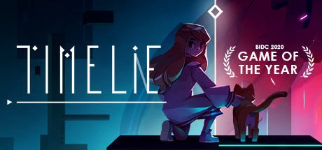
A good thumbnail is attractive, clean to read, and guides your view around it
What you’re looking for in a thumbnail is something that sticks out, is legible, and should be clean, IE: I shouldn’t have to get out a decoder ring in order to figure out the name of your title. Speaking of names, the challenge of naming a game is that you are fighting two battles: Your name needs to be unique so that people will remember it, but it also needs to be search-friendly for the store page algorithm. While it may seem cute to put numbers and symbols in your title, there’s a difference between something called “Search” and “S3$rch?!” when trying to find it on steam.
You want the design of your thumbnail to attract someone’s eye both to it, and to the title of your game. Many thumbnails we review will often feature background art or some graphic that guides your eye to either the corners or center of the thumbnail which is where the title is.
I could certainly spend an entire post talking about designing a trailer for a game, and this is often where you are going to win or lose the consumer. There are three parts that must be considered when designing an effective trailer.
The first is the actual content you must show. While you may not want to hear this, there is a reason why aesthetically pleasing, or high-quality art-focused games are often the bigger sellers on stores. These games with only a few seconds of footage can show off something amazing and eye-catching, regardless of the depth of the actual gameplay. For games where art and aesthetics are not the focus, unfortunately, it is harder to come up with a trailer to bring in consumers through the footage of your game alone. We have seen developers in the past get creative and come up with trailers that are more about presenting the product or themselves as opposed to the content itself. This is often done by making the trailer live-action and trying to simulate a commercial.
If you’re going to show game footage, you want to make sure that something has been done to it. You don’t want to just take a direct capture and put it into the trailer. Try zooming in on specific parts, time the music to what’s happening in the trailer. Your goal is to make it look like you care about showing your game in the best possible light.
While this isn’t recommended, you can try to make a trailer that has nothing to do with the gameplay itself as I just mentioned, but if consumers feel like you are trying to cheat them, they are going to refund the game faster than you can say “action.”
The second is the genre that you are working in. As I just said, the content that you must show ultimately determines what you can put in your trailer. But the genre also dictates your market and who you are trying to reach with your game and store page. If you’re making a game in the horror genre, I would expect to see something scary. The more action-focused the genre is, the easier it is to create a trailer, as you are trying to show someone why they should play your game. For turn-based or puzzle games, it’s a lot harder to show someone the actual gameplay loop when so much of it is not about player interaction. Even if your genre is slower-paced, you still want your trailer to be fast.
Speaking of which, you have the structure of your trailer. There are two kinds of trailers you can have for a game: your primary trailer and supplemental trailers. The primary trailer is the first thing someone is going to see about your game and should be the best showing of it. Supplemental trailers can focus on a specific part of your game, or literally just be a walkthrough or demonstration, and they can help but aren’t as vital as the primary.
For your primary trailer, it should be no more than 90 seconds long and should be made up of the following areas:
The opening: A cold opening that quickly gets introduces the game to the viewer or hits them with something surprising. Do not put your studio or publisher name here unless you are already established. Within the first 5 seconds, the consumer should be able to see something interesting and exciting.
The Intro: The intro should be on the brief side and quickly follow up the opening with some of the basic information about your game. This should be the first place where you show someone what your game is going to be about.
The middle: The middle of your trailer is where you want to sell what makes your game attractive to your market. Ideally, this is through footage showing your game off, but you can use text sparingly. The goal of this part is that someone should be able to walk away from your trailer knowing full well what your game is going to be about and how it plays. If you have a unique selling point, you want to have a specific section for it. You should have this footage edited: zooming in on specific moments, maybe hiding the UI in some spots. As mentioned, you want to avoid just having raw footage in your main trailer, as it can hurt the quality of it. You want your middle to start building up towards something that will be shown in the next part.
The end: Your trailer should end on something spectacular and as interesting as your opening. This is the last chance to make an impact on someone, and you want it to count. You want to have a “call to action” at the very end — telling people to buy/wishlist your game, and make sure to list where the game is available.
If you want to hear more about trailer design from an expert, here is an interview I did with Derek Lieu
Screenshots are the other way that someone can look at your game and see if it’s for them. For games that feature a “cinematic” or UI-less mode that is used for trailer footage, it’s important to show how the game is actually played through your screenshots. You want to avoid screenshots that are all similar, or images shown in your trailers. The reason is that you want to give the consumer the impression that there is more to your game than just your trailer footage. You also want to avoid anything that “dates” your screenshots — having early access version numbers, temp art, or an earlier title of your game. Do not include screenshots that have capture info on it, like the steam overlay, bandicam, etc.
While screenshots are important, and Steam wants you to have at minimum 5 on your page, the trailer is ultimately the better showing your game.
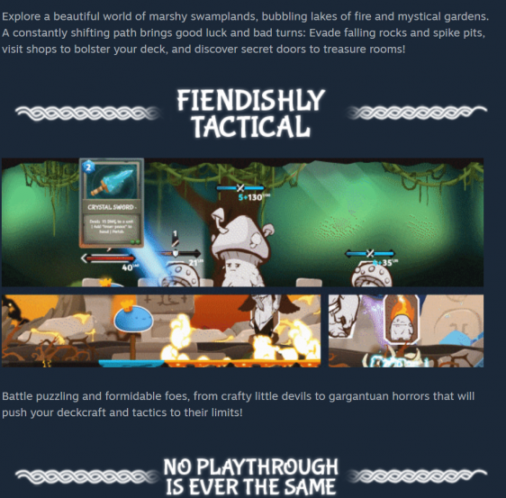
The about the game section is the final part where you can win or lose consumers after hopefully getting them interested with your trailer. There’s a set structure to how to make a good about this game page. You want to use gifs if possible, or at least images and banners to break up any text you have. Make sure to keep your paragraphs between them as short as possible; no more than two to three lines. The information here needs to give the consumer more detail about the game and convince them that this is something that they should buy.
The more professional and impressive this part is, the more you are giving the consumer assurance as to the quality of the game. What you don’t want to do is have an about this game section that is nothing but a giant wall of text with no images. Anything that is unique, or a key moment of your game should have a gif here to show it off. Make sure to use bullet points and blue text to help everything stand out.
For the final part of the store page, we have the info or developer card. This is the least important for consumers, but the most important for Steam’s algorithm. While information like the developer’s name and studio are a given, you are going to need to fill out the genre tags and any social media contacts. Your genre tags should best represent the gameplay itself. There are tons of tags on steam, and you want to have as many that can fit. Beware of using “indie” and “early access” tags, as they aren’t descriptive enough of your gameplay loop for the algorithm to use but should be on there as secondary tags accordingly. You want at minimum three tags, but the more that fit, the better.

Rise of the Slime’s page here features custom gifs and banners that do a good job of highlighting the game
For the social media side, you want to have some way for people to directly get in touch be it a website, twitter, Facebook, youtube channel etc. Whatever you link to should be of professional quality — it’s better to have no game site compared to a horrible-looking one. You still need to have some way for people to get in touch with you privately; especially for content creators wanting to reach out.
If you don’t use this section properly, it becomes that much harder for people to find your game, even if the rest of your store page is amazing.
What makes everything we’ve spoken about so important is that when your game officially launches (or is put on early access), that’s it — that’s your one and only one chance to make a big impression. Steam will promote games that do well and bury those that don’t. A bad store page will handicap your game just as much as poor marketing or a bad game. When a game does well, Steam will continue to promote it using the tags that you provide for it. There is a reason why I see the same games that pop up under “recommendations” every time I look at a roguelike or deck builder as an example.
One of the reasons why a lot of the games I’ve played don’t end up doing well can often be found in either the store page, the marketing, or both. If you can’t sell someone on your game through the store page, then it doesn’t matter how great the game is otherwise if people aren’t going to bother to check it out. The sad part is that one of the things that will often repel consumers is the art and aesthetics, which can be notoriously hard to stand out with or develop if you don’t have an art background.
If you would like us to review your store page on our weekly show, please reach out on my discord, or send me a message on Twitter
If you enjoyed my post, consider joining the Game-Wisdom discord channel open to everyone.
Read more about:
Featured BlogsYou May Also Like