Trending
Opinion: How will Project 2025 impact game developers?
The Heritage Foundation's manifesto for the possible next administration could do great harm to many, including large portions of the game development community.
With mobile games generating billions in revenue, it’s no surprise that publishers from the world of PC and console games want in on the action, each trying to bring their existing IPs to touchscreens. Let's look at some great and awful ways of doing it.

So it’s no surprise that publishers and developers from the world of keyboard and joypad games want in on the action, each trying to bring their established intellectual properties to both a new audience and repeat purchases from existing fans. Now, there are a number of ways to do this, but I want to focus on two: porting existing games from console/PC to touchscreen and building new games using existing IPs.
Bringing games to mobile presents one major issue for developers to overcome, and it isn’t graphical power: it’s how the game is controlled. Bringing a game from a 2-stick, 14 button joypad to a touchscreen the size of your hand with no other input is a challenge at best, and is what makes or breaks a good port. So let’s look at some examples.
The Bad
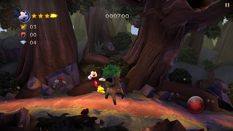
Instant reactions are very hard to perform on a touchscreen. Even more difficult if the controls aren’t responsive anyway.
Mickey Mouse’s Castle of Illusion is a port of a remake (mouthful) of a game from the Sega Master System. As such, the existing control system is relatively simple, just a directional pad and two buttons for jumping and hitting. The game is a 2D side scrolling platformer with the expected mechanics. But here, on a touchscreen, one of the simplest actions is already difficult to pull off: jumping on top of enemies with a stomp. It’s how you kill them and gain some height to reach new areas, but to do it you need to move, jump, swipe down to stomp, then move again as it jumps you back up. And it’s nigh on impossible. It’s a bloody nightmare, and it’s one of the most basic actions in the game. Doing this is difficult, doing it with the enemy walking towards you and who is going to damage you if it makes contact is just frustrating 15 seconds into level one.
So what about a game that’s slower paced? Maybe a turn based strategy game rather then a platformer?
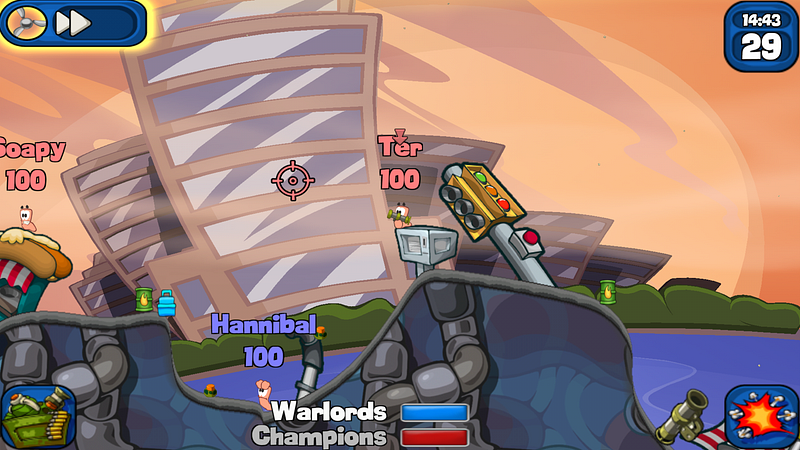
I want Ter to aim down and shoot Hannibal…
Worms 2: Armageddon. It should be fine, right? But tapping on the screen jumps the character forwards. But holding the tap fires the weapon. Swiping aims the weapon. So these three completely different, necessary and often contradictory game mechanics use such a similar control system, just trying to fire results in this:
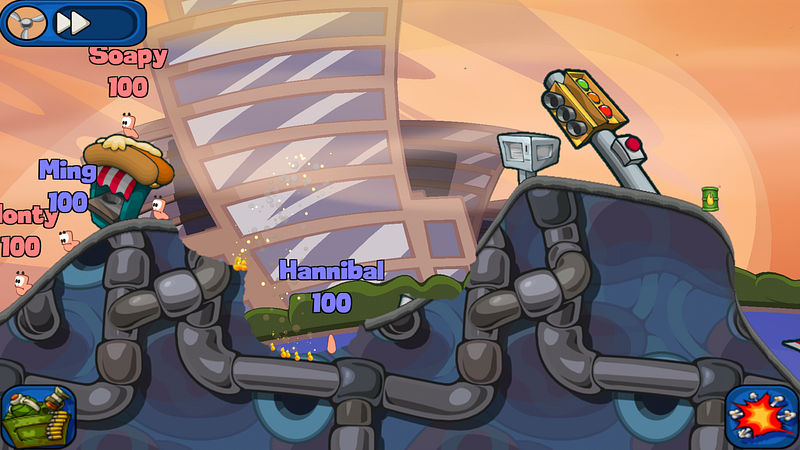
… but I jump into a mine instead.
I jumped onto a mine. My turn is over and I physically couldn’t do what I wanted it to do.
So what ports do work?
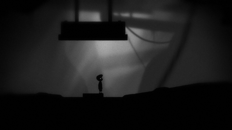
Limbo has no onscreen visible interface. Controls are pretty intuitive.
Limbo. Indie darling of 2010 and ported to pretty much everything with a screen. It’s controls are no more complicated than Castle of Illusion but it feels so much better. The difference is that the gameplay is much more suited to the platform. While it has obstacles that run at you and need to be avoided, or triggered and then dodged, these are much less frequent than Castle’s and they are already well suited to the amount of screen space your fingers have access to. You’re not jumping on top of things they night kill you all the time, you’re only holding down with one hand and pulling with the other to drag and pull across the world. The controls are responsive and the gameplay works for the actions you can perform easily. They are also intuitive to an experienced gamer, and make sense. You hold the screen to hold onto objects and pull, you swipe up to jump and drag left or right to move.
So far, these examples use what are essentially onscreen, invisible control sticks for movement and invisible buttons or swipe actions for performing in-game actions. FTL is a rogue-like spaceship game that originated on PC and later release on iPad. As a completely different game type to the other examples, FTL is controlled using onscreen buttons even on PC.
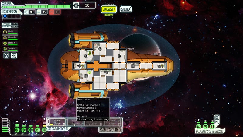
FTL on PC
Above, you can see the game on PC. The interface is perfected designed for mouse and keyboard, with hotkeys for immediately accessing items and hover state interfaces for showing additional information. Using a cursor makes it easy to hit those green and yellow power rectangles to power on or off different systems.
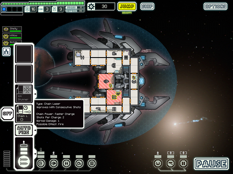
FTL on iPad
Here, everything is finger-sized and at the ready. Menus make use of vertical space rather than horizontal, which feels better when holding the device at the sides. Buttons and menus are made to be tapped. The power system interface of the PC version, where you click to enable or disable a power block, is here replaced by swiping up or down a power block, avoiding the issue of hitting small items with a thumb or finger which would block the interface. Your fingers dance over the screen, raising and lowering shields and reassigning your crew all over the ship. Quite Star Trek, actually, and it fits so well on a touch device.
The Reviews
The difference can be easily seen in the player reviews. Google Play gives a breakdown of ratings for different aspects of the games. So for controls, Limbo has a great average score of 4.4 out of 5. On the other hand, Castle of Illusion and Worms 2 have 3.4 and 3.5 out of 5 respectively, a vast and obvious difference in quality.
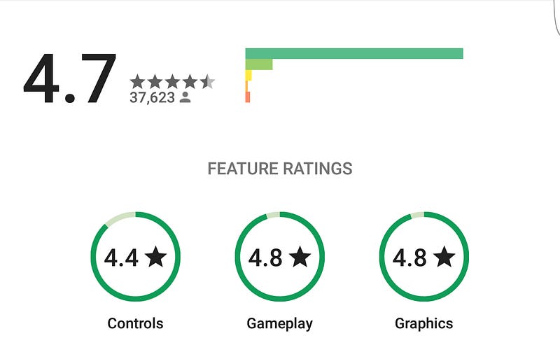
Limbo Google Play ratings (February 21st 2017)
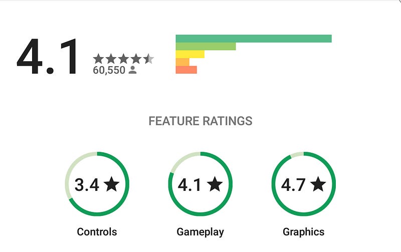
Worms 2: Armageddon Google Play ratings (February 21st 2017)
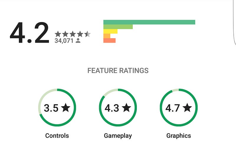
Castle of Illusion Google Play ratings (February 21st 2017)
There are many more games that can be used as examples here, from classic titles of the early 90’s to XCOM: Enemy Within. If a game is to be ported to mobile, the controls need to be easy to access, and the actions the player needs to perform also have to be simple. Complex, combo-like actions are impossible to do with two thumbs on an interface that already impairs the player’s view of the game screen.
Of course, these ported titles are premium purchases in a market dominated by in-app-purchase or ad-supported free to play titles. Since porting Limbo to a free to play model would be fundamentally changing the game, let’s look at the other way of bringing established names to the mobile space.
By this point, mobile games have developed a number of genres that remain fresh. There’s the Match 3 puzzle game, epitomised by the Candy Crush Saga series; farm games like Hay Day or Farmville; and runner games like Temple Run and Subway Surfers. Such games have found audiences in much wider demographics than the console stereotypes.
Our first example is Sonic Dash, which brought the titular blue hedgehog to mobile in an infinite runner, very mechanically similar to Subway Surfers.
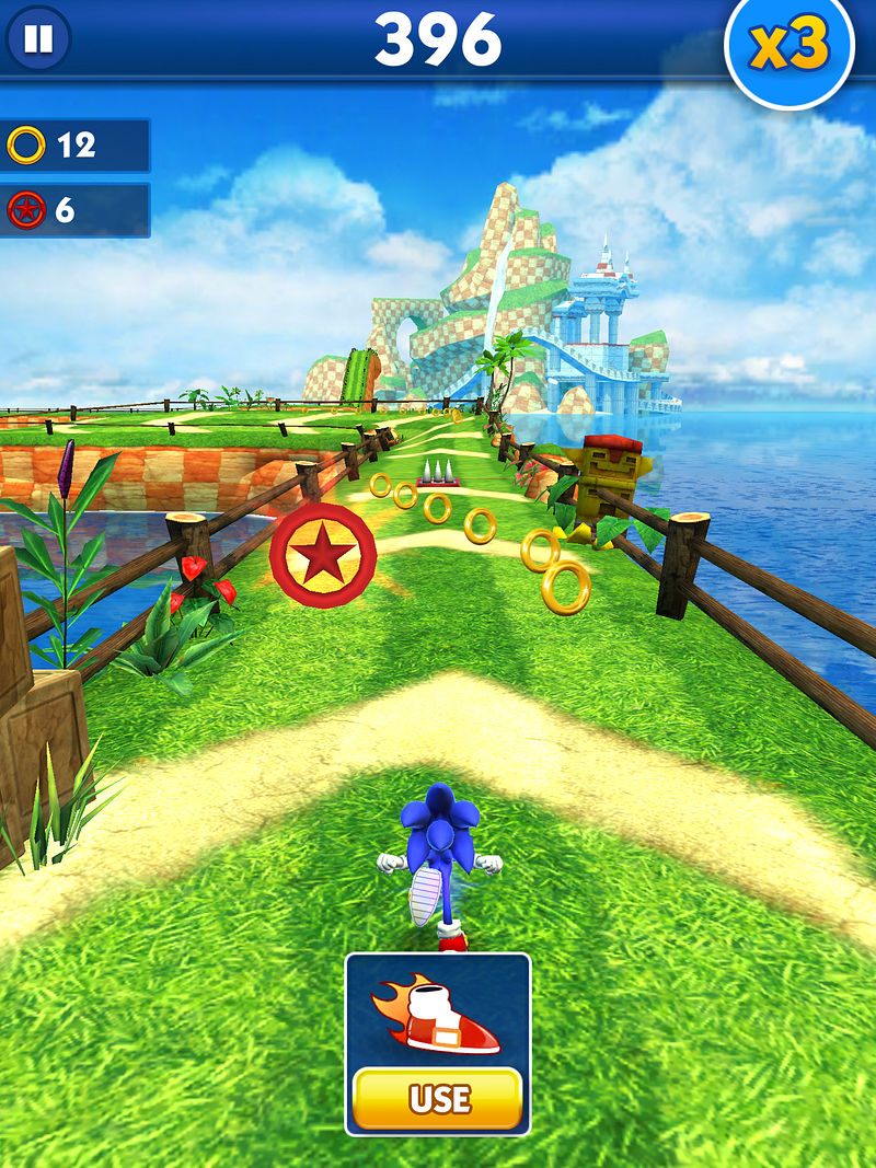
Swipe in four directions to move Sonic and dodge obstacles, collect rings and power ups to shield Sonic and protect him from enemies. Dash takes almost all that the Sonic console games offer and puts them into a world where Sonic is always running. It’s free-to-play, supported by players purchasing Revives,Power Ups and Rings which help them progress further in the game. It’s a solid example of an endless runner, but other than the Sonic theme it does little to put it above other games of the genre.
One of my favourite mobile games pull off this transition in a much more interesting way: Rayman Fiesta Run.
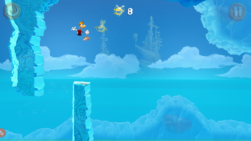
Inspired by the endless runner genre, Fiesta Run brings Rayman to mobile with carefully crafted levels where the hero automatically runs, much like Sonic Dash above, but the game is almost more like a rhythmic action game. Here, the player is also responsible for getting Rayman over and below obstacles collecting pickups, but it borrows more heavily from later Rayman console titles such as Rayman Origins both in it’s art and it’s extra moves. While this sounds much like Sonic Dash, the idea to go for designed levels rather than a procedural generated infinite track means that each level has a unique pace to it that carries the player along. Players can repeat levels and improve by collecting everything on offer, and there’s a fantastic sense of progression that other runners lack.
On paper, it’s another endless runner much like Sonic Dash. In reality, it’s crafted to be something much more fun, engaging and interesting.
We’ve looked at how developers can take existing genres and merge them with classic franchises. But some games go a step further than this and try to create something substantially new. While these examples obviously take inspiration from other games, they strive to be different and present something new to the player.
Square Enix made a very smart decision with their Go series of games. Starting with Hitman Go, then Tomb Raider’s Lara Croft Go and now with Deus Ex Go, they have taken the characters, aesthetics and notable gameplay elements from their mainstream titles and used them to craft bespoke mobile experiences.
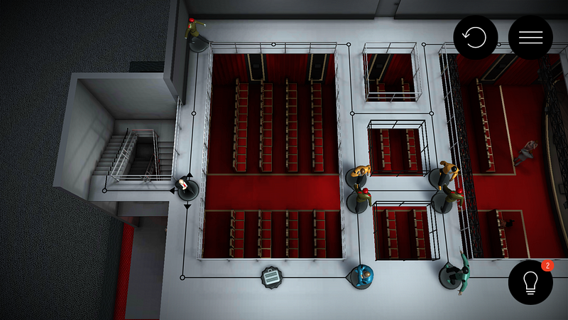
Hitman Go doesn’t take the console game and try to get it working on mobile. Instead, it opts for something else.
Let’s use this level from Hitman Go. Firstly, it’s themed from a level from Hitman: Blood Money, which is just a nice aesthetic nod to fans even though the art style is very different. Secondly, elements from the series are featured here: enemies that have distinct movement patterns for the player to avoid or kill and optional objectives like escaping with the briefcase. Other levels have disguises, distractions and a small variety of weapons to use. The Go games are clearly based on their franchises, but they stand alone. They are perfected suited to their new player interface. They are turn based, so no swift reactions required; they are puzzle game, and they have small purchase costs with IAP support.
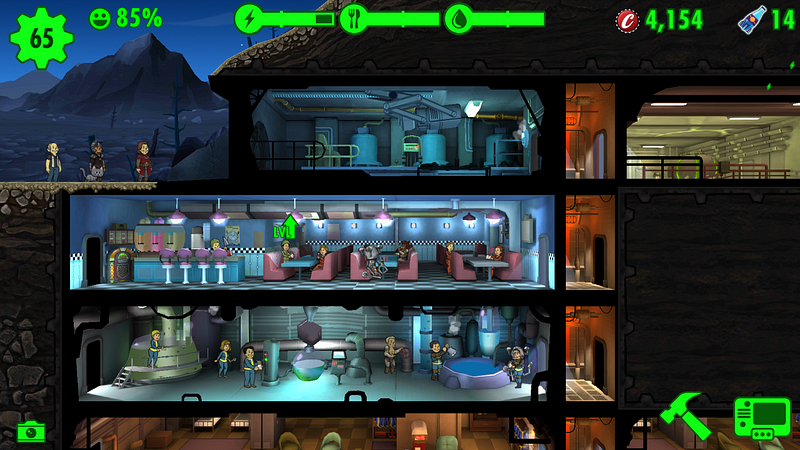
Fallout Shelter brings the charm and humour of the RPGs to a mobile city builder.
Fallout Shelter takes the premise of the role playing games: that humans have lived in underground bunkers to survive nuclear apocalypse; and runs with it from a completely different perspective. Rather than be an inhabitant sent from the Vault shelter out into the world, you build and manage a vault, sending out those characters you might otherwise play on console. Post launch updates mean the player can now guide dwellers through quests as they explore the wasteland. It’s a neat premise that matches up the world lore with a new twist on the F2P city builder genre. Supported by IAPs for packs of resources and characters, Bethesda was able to bring the IP to mobile without trying to fit a 3D open world RPG into a phone screen.
I can’t really write about this without mentioning 2016’s mobile phenomenon, Pokémon Go (so many games with Go in the title). Developer Niantic took the very basic idea of Pokémon: walk around the world and catch random Pokémon, and brought it into the augmented world.
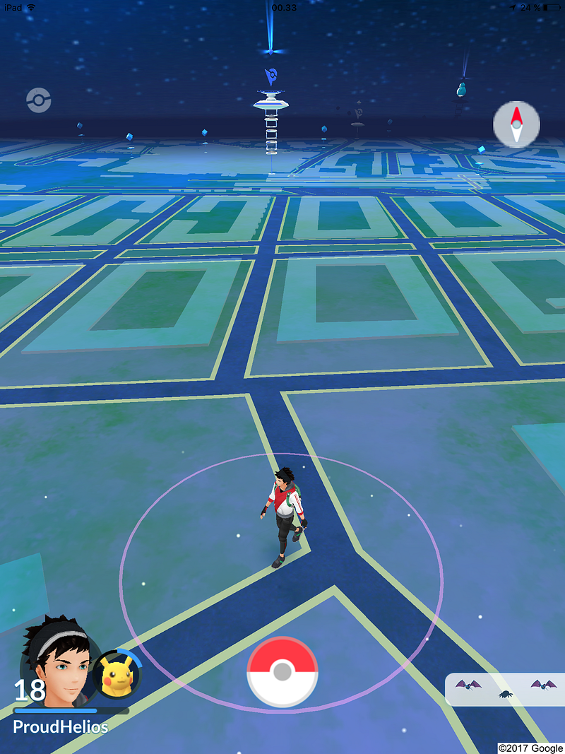
It was a huge success at launch, at least in terms of player numbers. The strength of the brand brought players of the Gameboy role playing games back to the franchise, it enthused a new generation of young players and the collectable gameplay brought even “non-gamer”, non-Pokémon fans outside each carrying phone in hand as they searched for the creatures. It’s a personal observation, but I see more couples aged 50+ still playing Pokémon Go outside than any other demographic; it really is quite impressive. Pokémon Go set out to do something utterly new, and for the vast majority of players, it was.
Examples such as these are usually released near major console title releases too, to make the most of the buzz. Deus Ex Go released near Deus Ex: Mankind Divided; Fallout Shelter preceded Fallout 4 by only a couple of months and Pokémon Go was followed a few months later by new 3DS titles of the RPG. Mobile has become a new audience to reach out from, and it makes a lot of sense. It’s much easier and more convenient to pluck an F2P or low-priced premium title from the App Store than it is to dish out $60 for a console title. Mobile players can play more, share more and see more of what others are playing, and build a franchise’s player base than they would otherwise have on console or PC alone. As to the effect this actually has, we still don’t know. Did Pokémon Go help drive sales of Pokémon Sun and Moon? Some people think so.
If nothing else though, these titles mean that developers and publishers can find new frontiers for their established brands. What I have selected here are merely a handle of examples out there. Final Fantasy, Star Wars and even Super Mario have found their way onto small touchscreen devices, with mixed success amongst them. While some games are undoubtedly financial successes, maybe they aren’t really that interesting? Super Mario Run itself is definitely flawed, it feels clumsy to control and the world building system feels tacked on at best, but the seemingly eternal appeal of Mario and the $9.99 price tag to unlock most of the game has certainly generated a nice revenue for Nintendo.
Learning from what I have played so far, I can suggest the following for anyone looking to enter the mobile space:
Design for touch. It sounds simple, but Worms 2 fails to do it well. Look to FTL: redo your interface, add or change buttons and elements to make the experience as smooth as possible.
If you are porting games, make sure the player can do what is asked. Be aware that reaction times may be slower and that dragging your joypad controls to a visual interface may not be enough. If a game isn’t built for touch, maybe change it works. Slow down the gameplay, give new interaction options or change how the characters are controlled.
If you want to create something new, play to the strengths of the medium. Hitman Go feels great! You almost feel like you’re flicking that Subbuteo-esque Agent 47 across the board and it feels wonderful. Fallout Shelter has you pinching, panning and dragging all over the screen, and it feels like it really belongs on your phone and in your hands.
This post originally appeared on my blog darylh.com. You can find more articles about Free-To-Play games and games in general there.
Read more about:
BlogsYou May Also Like