Trending
Opinion: How will Project 2025 impact game developers?
The Heritage Foundation's manifesto for the possible next administration could do great harm to many, including large portions of the game development community.
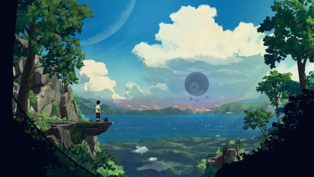
"I painted this image in Photoshop. And when it was done I knew that I had to try to bring this game to life. That image has been our guiding star style-wise since then."

Glance in the direction of Planet of Lana and you'll be smitten. The cinematic puzzle adventure is being framed as a vibrant off-Earth odyssey by developer Wishfully, and it's easy to see why.
The dreamy project, currently slated for release in 2022, features a hand-painted aesthetic that combines the whimsy and verve of Studio Ghibli pictures with the slick stylings of modern classics like Limbo and Inside. It's a blend that feels both familiar and fresh, and if the early trailers and footage are anything to go by, should look damn beautiful in motion.
Despite being a work-in-progress, Wishfully creative director and lead game designer Adam Stjarnljus agreed to chat with us about how Planet of Lana's visuals were conceived and eventually implemented, charting an aesthetic adventure that began four years ago with a single image.
Gamasutra: Why did you opt for such a lucid visual style in Planet of Lana? Can you talk us through some of your inspirations?
Adam Stjarnljus: To answer the question I need to go back in time a bit. This whole project really started with this image that I drew back in 2017. Some things have changed since then, Lana's clothes for example, but otherwise it’s the same image we still use as our main key art.
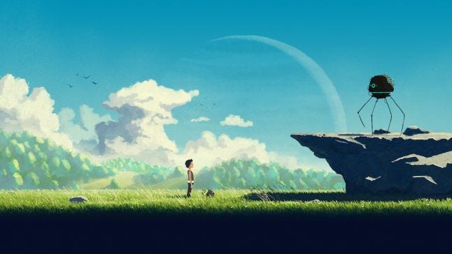
It came to fruition when I experimented to find a game idea that I could believe in because I knew I wanted to switch my career into game development and to try to create a game that I wanted to play.
I loved Inside and Limbo as well as older platform adventure games like Another World (Out of this World) and Oddworld Abe’s Odyssey. I wanted to take good bits from those games and add the mechanic of a dog-like companion. And for the world, I wanted to create something the complete opposite to the dark and gloomy backdrops that are so prevalent in many game experiences. I envisioned a colorful sci-fi world that still had a serious, grown-up tonality. A planet that reminds you of your own experiences in nature on earth, but still is a vastly different place in terms of its creatures and other surprises I’ll keep to myself for now.
So with that idea formalized, I painted this image in Photoshop. And when it was done I knew that I had to try to bring this game to life. That image has been our guiding star style-wise since then.
Studio Ghibli is a big inspiration, which came naturally since I’m a huge fan. Especially Spirited Away and My Neighbor Totoro but also bits and pieces from other great artistry as well as Zelda games such as Breath of the Wild and Wind Waker. From there we are still trying to carve out a unique style, with stylized flat-shaded characters, and this black foreground which adds the feeling of looking into a set-piece or theater stage which I really like.
Could you explain how you iterated on some of the earliest character design and environmental concepts? What informed your decision making as you refined those initial ideas?
So my issue is that I can’t really sketch, I almost always end up continuing until it’s a finished artwork every time I put pen to tablet. Which definitely is not always a good thing. So basically, there weren’t any iterations. I just pushed on drawing more of these "style frames" of how I envisioned future screenshots from the game. It really just continued from pure joy of creating these images.
In August of 2018, me and my wife Maria Brunsson started a game studio and our Lead Animator Olle Engström joined the project. Since it was just us at this time and we did the job in our spare time, it really freed me of any potential pressure from others. These are the second and third images I painted for the game during this time.
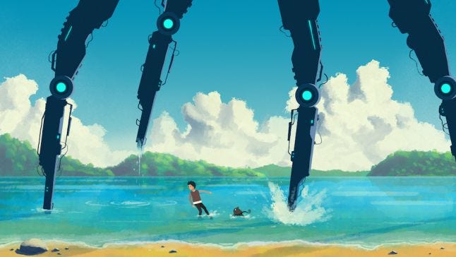
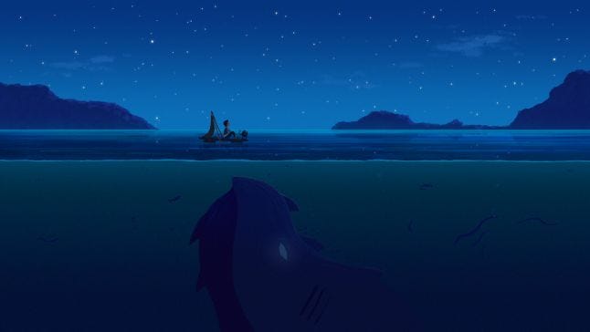
Regarding characters, we actually started the project with the vision of having them in 2D with frame-by-frame animations, as well as having a 2D world with parallax environments with a grid-based movement system, as in the old classics I talked about above (Another World (Out of this World), Oddworld Abe’s Odyssey).
Here you can see the first frame-by-frame animations of Lana as well as how our grid system worked.

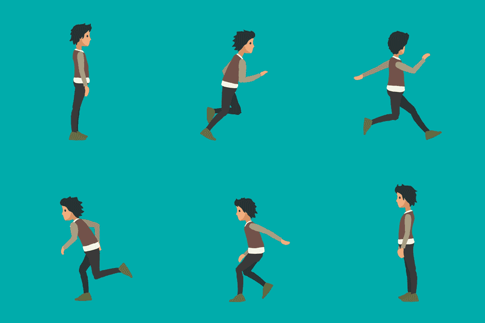
But after working for half a year as a studio, we scrapped having the world and characters in 2D only as well as the grid system after early feedback from publishers that were harsh but ultimately made a lot of sense to us. The immersion and cinematic feel we wanted to create needed a more dynamic animation system with characters in 3D, and the world also benefited from a more 2.5D look with more 3D elements.
Quickly after this we formed the current game company Wishfully together with several other very talented people. This is also when Klas Martin Eriksson joined as co-director and script writer which really also elevated the original idea to new heights.
At a later stage, we changed the clothes of Lana as well to make her pop more against the backgrounds.
You've mentioned on Twitter that you're working hard to keep the hand-painted style of your concept art when creating scenes in-game. Could you talk a bit about how you've achieved that -- what technology (hardware/software) do you use when recreating those painted scenes?
So even if we came to the realization that the world benefited from having more of a 3D feel, we still wanted to keep the hand-painted look of the original concept art. The following year, most of us still worked in the studio part-time as we experimented with trying to find the right balance technically to pull off this style as we developed a proof of concept demo for the game. But it was really when our second artist Jimmy Chan, as well as our talented level designer Rikard Carlsson, joined the studio that the style really got a boost. Together we found the right balance of 3D assets and 2D sprites to create the current style, which is also quite close to the original concept art as you can see below.
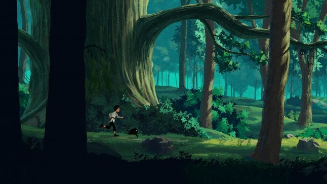
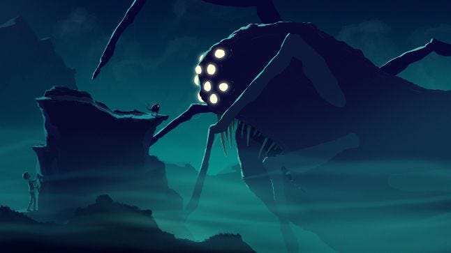
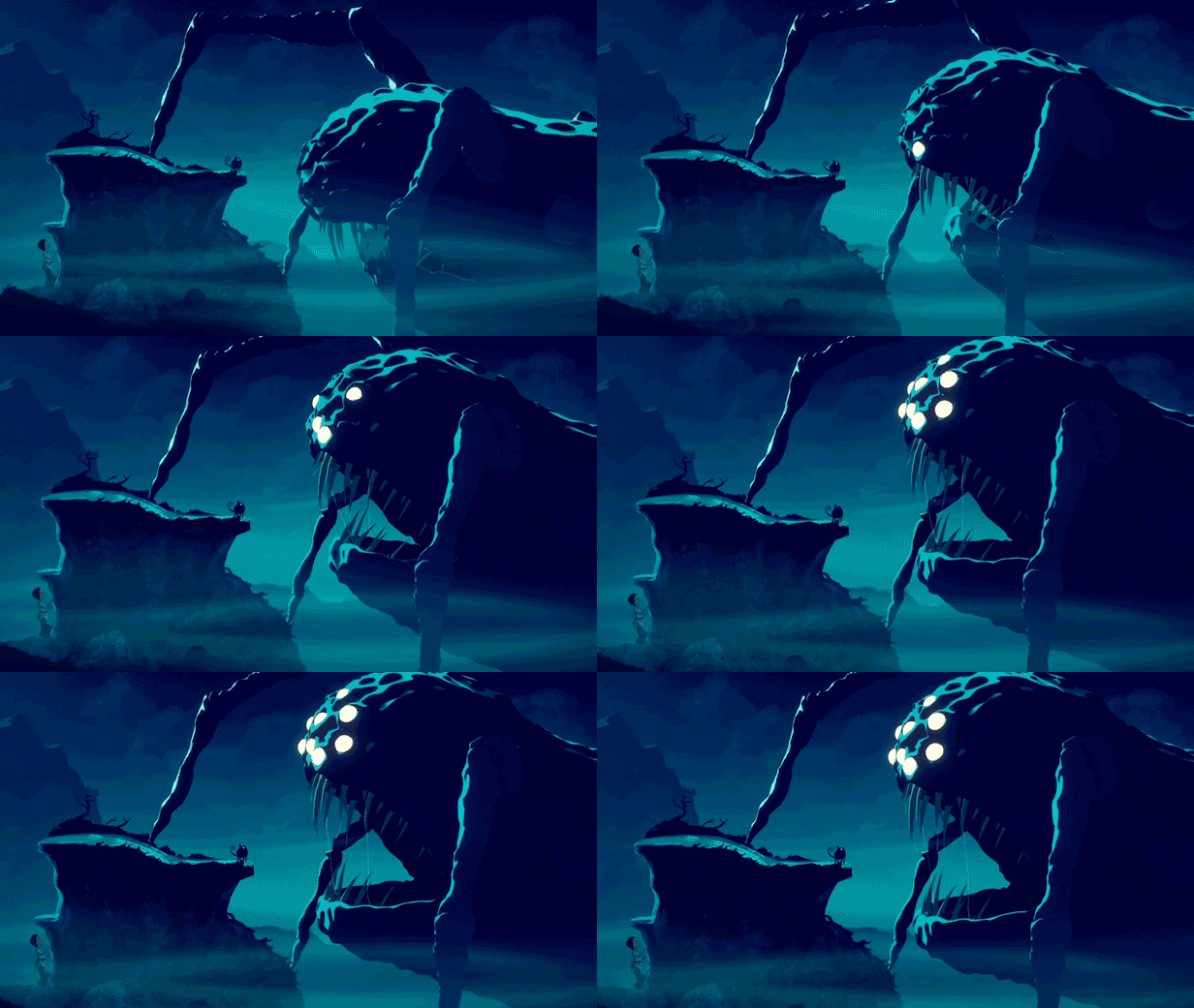
We achieve the look by hand-painting (in Photoshop and substance painter) the textures for 3D rocks, cliffs, ground planes, and other assets. And in those textures we paint the “lighting” straight onto the rock, for example. Same with the sprites for grass, trees, leaves; we paint the lighting right into each asset. We don’t have any magic 3D render pipeline. The magic comes from attention to detail and how we then with these assets, model up each scene so that the lighting feels natural and interesting. You could call it a hand-painted baked lighting solution, I guess.
On top of that we use 3D lights for dynamic shadows from the characters on the ground as well as shadows on the 3D characters themselves. We use hidden “shadow planes” to create the 3D shadows from trees and assets that aren’t actually 3D.
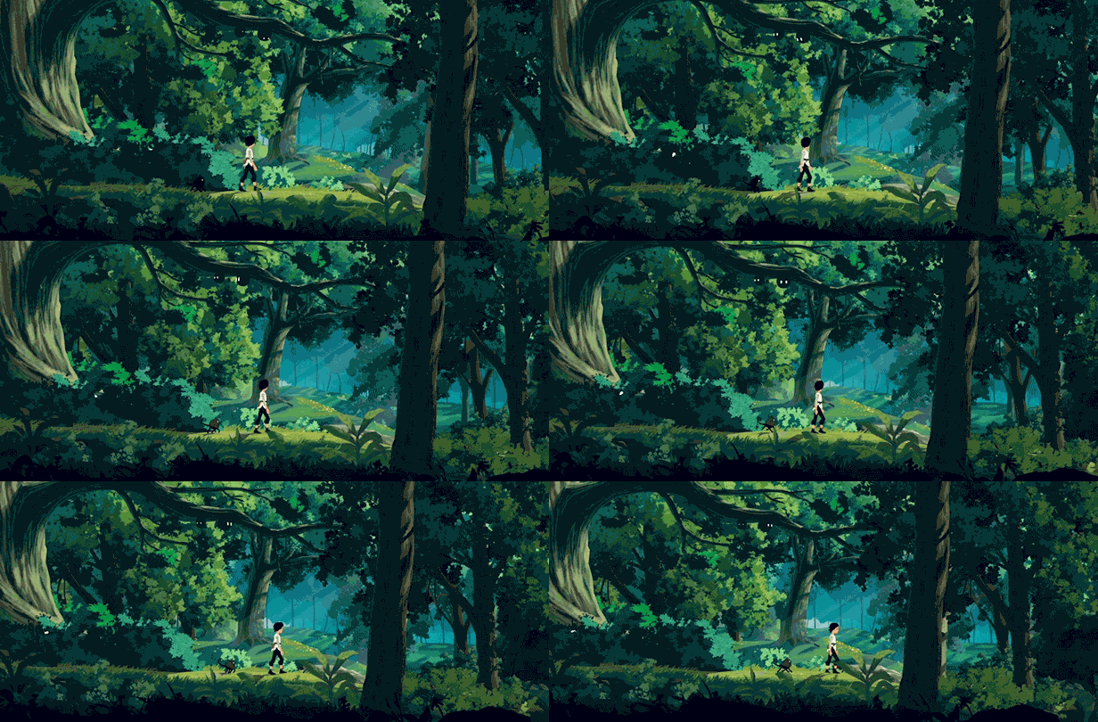
On some assets we use a technique where we project a 2D hand-painted image of a tree for example onto a 3D plane and we then model the tree to have a slight 3D effect on it. So it’s not actually full 3D, but still gives a nice depth-effect as pictured the giant tree in the gif below.
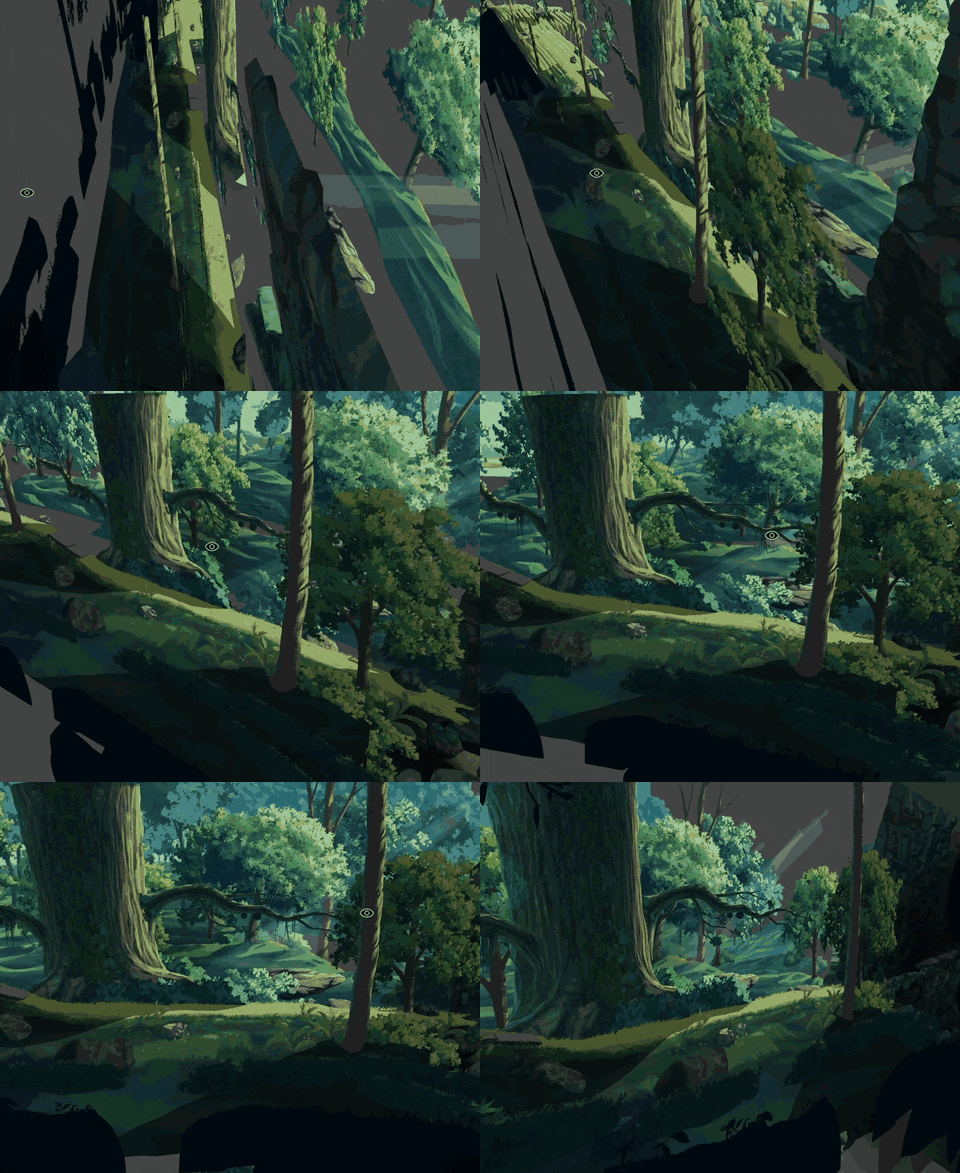
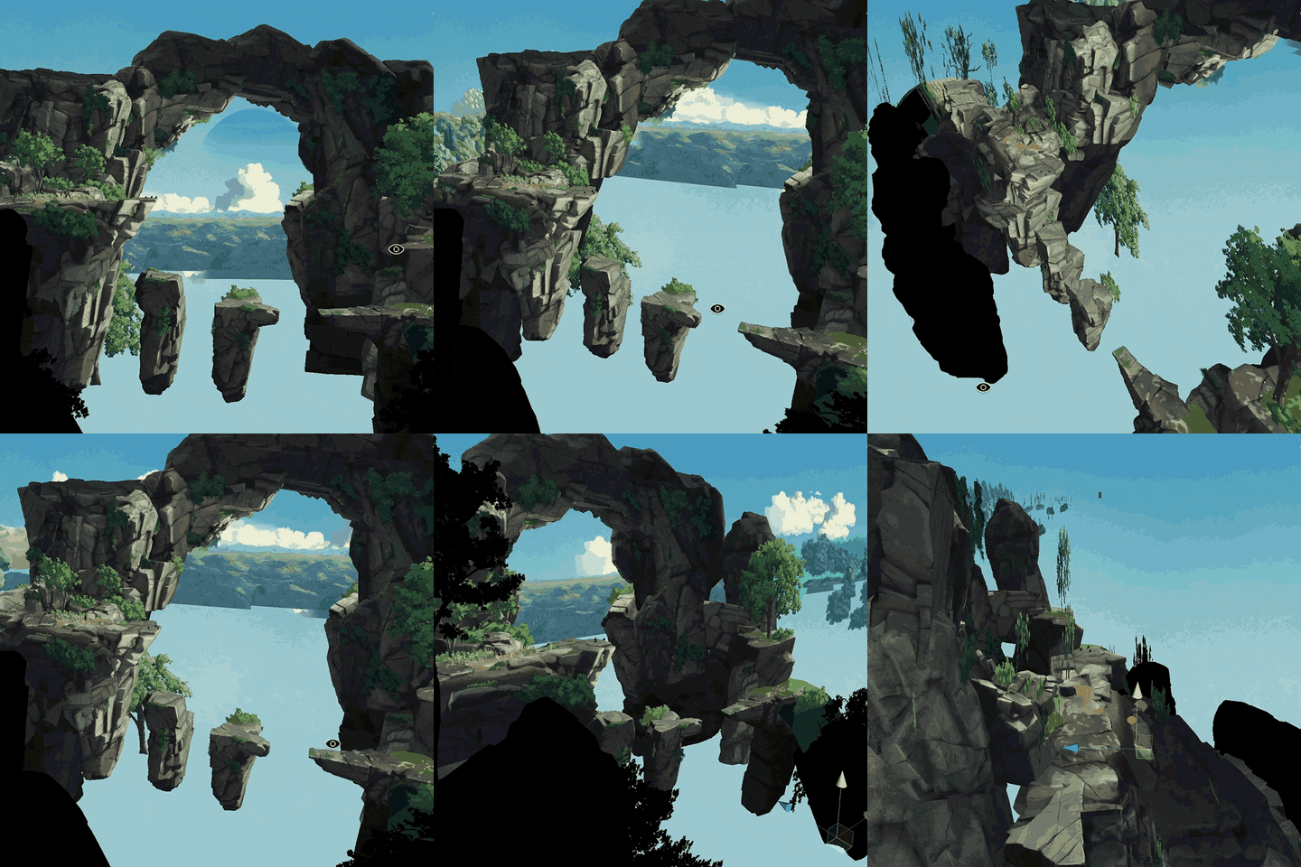
Otherwise, we create the game in Unity and we use Maya LT for characters and environment pieces as well as regular Maya to bake rendered lighting for some more advanced areas indoors as well as buildings.
It’s really a mix of techniques to achieve the final look.
Why did you choose to hand-paint your concept art? What were the pros and cons?
We wanted an original look for the game and fell in love with this style, that’s the sole reason. But to not confuse anyone, the concept art is "hand-painted" in Photoshop with a Wacom tablet. Not made by hand without a computer as some indie games do, scanning in images etc. All kudos to developers that take that route. We want our game to look like a painting in motion, but how we get there is not important for us.
The pro of having this hand-painted colorful look is that (if we’ve done our job right) it stands out from the crowd. Early on we noticed that people already wanted to play the game even when we just had that first image to show.
The con is that it took an extremely long time to figure out how to technically achieve the final look that we were happy with.
What's been the most challenging aspect of designing and implementing Planet of Lana's visuals so far?
Because of the techniques above we are kind of working against what the rendering engine wants to do, which is using real-time lighting, shaders, shadows, etc. to create the look of the image. Since this is the case we have put ourselves in quite a few tricky situations where we want some parts of this classic render system to work but others to be turned off or tweaked in ways the engine doesn’t think is logical.
Bringing the world to life has also been a challenge in itself, but the dynamic wind system we created really helps tie the style together and make it feel like a living, breathing world.
The example below shows a time-lapse from the process of painting a tree, to having the wind system bring it to life in-game.
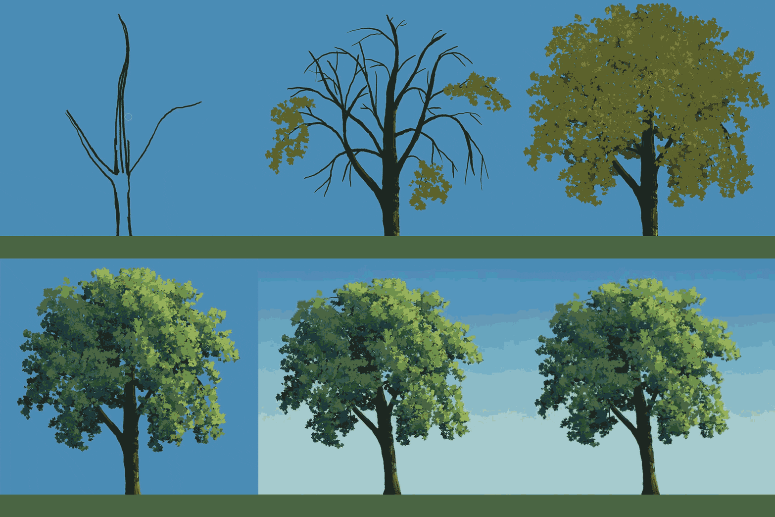
You're pitching Planet of Lana as a 'cinematic' experience, but that's a phrase that gets tossed around a lot. What does that mean for you in real terms and how are you looking to make good on that promise in a visual sense?
For us it means creating an immersive, epic experience for the player. To deliver on this vision, we need to deliver a quality package of art direction, animation, music, and sound design on top of the foundation of fun and varied gameplay that also ties into the multilayered story.
We really feel it’s the whole package that creates the cinematic experience. Since several of us in the studio come from a background of film and animation it’s also a bonus to create a side-scrolling game where it’s much easier to control the camera framing and stage of each scene.
How do you hope players will respond to the visuals when they eventually play the game?
I hope that it helps in transporting people to this far away world, creating a unique backdrop for the story and fate of Lana and Mui. And if it can inspire future game developers to create the game of their dreams just as the games I grew up with did, that would be the best outcome for me personally.
What's the biggest art design lesson you've learned working on Planet of Lana? A slice of game dev wisdom you wished you'd known when you started the project?
Be prepared to change things if needed. Even though it hurts to scrap months of work it’s better than continuing on the wrong path. Pay attention to how your audience reacts to the style you have chosen and if it works. And give yourself time to iterate on the style to make it work and to make sense for the game you’re making.
You May Also Like