Trending
Opinion: How will Project 2025 impact game developers?
The Heritage Foundation's manifesto for the possible next administration could do great harm to many, including large portions of the game development community.
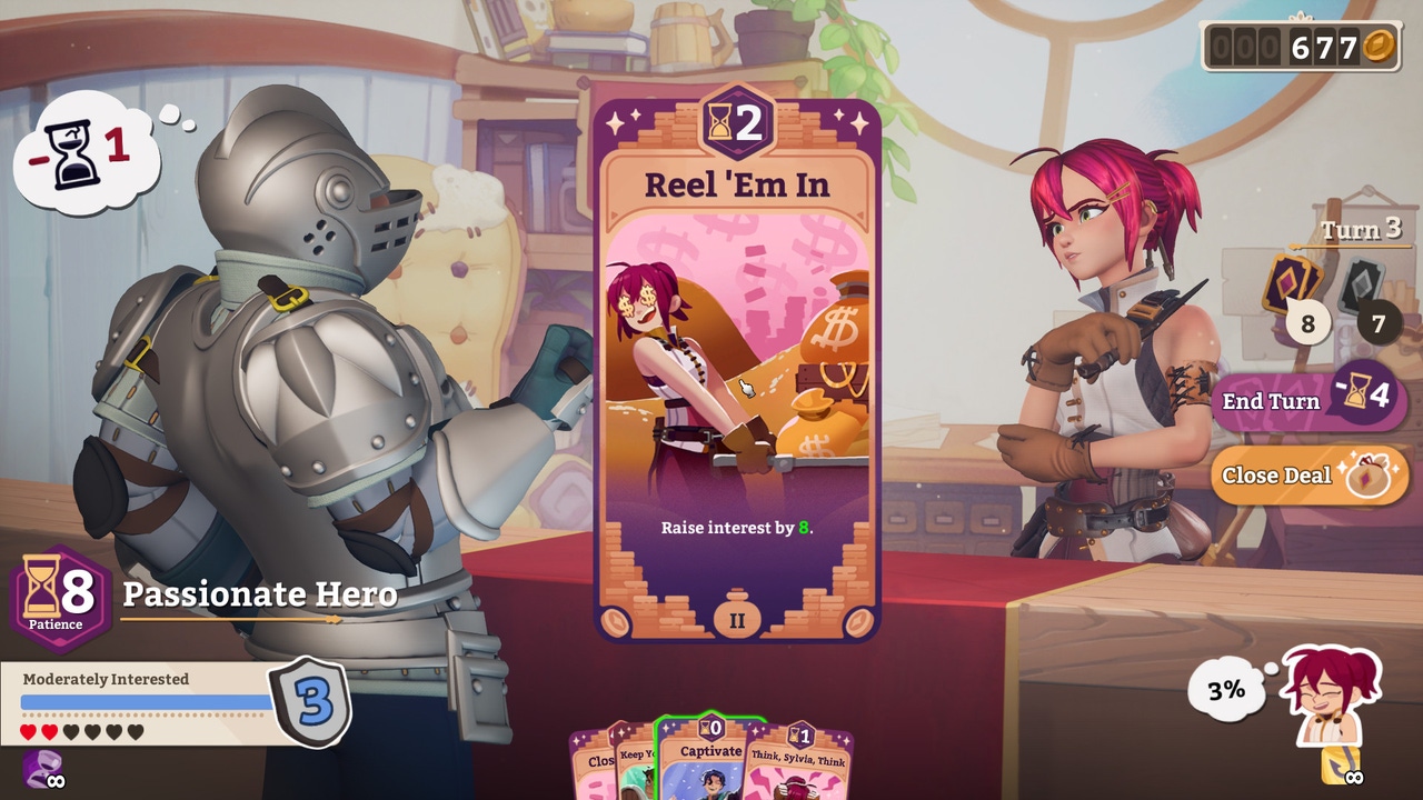
Potionomics gets players to run a fantasy potion shop, setting up their sales with a haggling-based card game that'll have them talking up their concoctions.

This interview is part of our Road to the IGF series. The IGF (Independent Games Festival) aims to encourage innovation in game development and to recognize independent game developers advancing the medium. Every year, Game Developer sits down with the finalists for the IGF ahead of GDC to explore the themes, design decisions, and tools behind each entry.
Potionomics gets players to run a fantasy potion shop, setting up their sales with a haggling-based card game that has them talking up their concoctions.
Game Developer spoke with Aryo Jati Darmawan, co-founder of the studio behind the Excellence in Visual Art nominee, to discuss how chemistry and smoothie-making inspired the potion-brewing mechanic, how they made use of their characters to make the UI clearer (and more charming) in certain segments, and the thoughts that went into turning a sales conversation into a card game.
Who are you, and what was your role in developing Potionomics?
I am Aryo Jati Darmawan, co-founder of Voracious Games and I contributed to the art and design in Potionomics.
What's your background in making games?
It has always been my dream to work on my own video games since I first played Super Mario RPG as a kid. I majored in game art in college and did an internship at Harebrained Schemes painting walls and shrubs for Shadowrun Returns. From there, I got really interested in visual effects and became a VFX artist in the game industry for a couple of years. Eventually, I found myself in between jobs and I decided that was the perfect time to pursue my dream of starting my own indie game studio.

How did you come up with the concept for Potionomics?
A long time ago, I stumbled upon a Japanese indie game called Recettear [Recettear: An Item Shop's Tale] in one of the earlier Humble Bundles. I became enamored with the story of Recette’s plight and the compelling haggle mechanic.
I thought the haggling mechanic was cool because it didn’t involve stabbing people. There are a lot of games that involve stabbing people, so I found Recettear’s non-violent mechanics really refreshing and was inspired to make something like it.
Another big influence was an anime called Little Witch Academia made by the wonderful Studio Trigger. I felt like it made a really interesting fantasy space where Western media crossed over with JRPG elements and I wanted to make a game with a similar aesthetic.
What development tools were used to build your game?
I used Unreal Engine 4 because that is the engine I am most familiar with.. From there, the main art tools we used to build the world were Photoshop for image creation, Maya for animation, and ZBrush for sculpting the 3D characters and environment assets. There were a couple supporting tools in Quixel, Substance, and IPackThat that rounded out the toolkit.
What thoughts went into turning potion-making into a game? Into bringing the character deeper into the potion-brewing process?
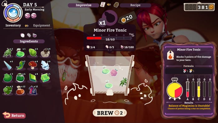
Potionomics is very grounded in reality despite being a fantasy game. To me, a fantasy world is more compelling when it’s believable. The way you make something believable is to tie it to something in real life and use it as a bridge. In the case with potion brewing, we tried to approach it like a mixture of chemistry and making a smoothie.
Magmins, for example, are based on vitamins—magical vitamins if you will. These combinations of vitamins in specific formula ratios will have different effects on the body.
How did you design the look of the potion-making system? How did you make it feel exciting, yet clear and straightforward, with the visuals?
The UI on the potion brewing screen was basically us throwing stuff at the wall until it stuck. We went through a lot of iterations! That said, one thing that always stayed the same throughout the entirety of development was being able to see Sylvia and Owl through the cauldron. We spent so much time creating our characters that it became one of the core tenets of Potionomics to use them as what I call "characterful UI." Basically, the characters are used as an extended piece of UI to add clarity and charm to the screen.
It was very important to us that their faces were always very visible and that we had a variety of animations to reinforce different brewing states. We believe this added a lot clarity to the UI on what is otherwise a very complicated screen.

Players will need to talk and haggle with their customers. How did you design this card-based haggling system?
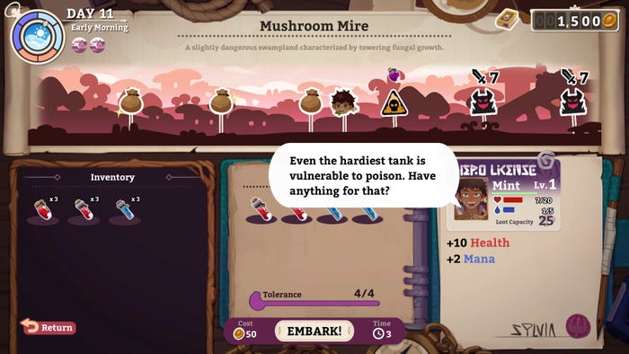
The way that almost every system in Potionomics is designed is first discovering what the thematic concept of the mechanic is. For example, If you are a potion seller looking to outfit a hero to go off an adventure, the mechanics could focus on the potions that would be needed on the adventure, how much one could drink at any given time, and what could happen if different potions interacted in the stomach?
We approached things the same way with potion selling. What would someone say to try to get them to buy a potion? How does someone learn how to talk to customers better? I wanted to imitate conversation as much as I could. I feel that the best designs are always the ones where the decision-making matrix mirrors what real life example you are trying to depict.
From there, I brute-forced iterations on the mechanics and the balance by mostly using a score system. I would do this by tracking changes on a spreadsheet and assigning scores to how accurate the changes were to feeling "right." I would then look back on the aggregate scores of certain decisions and rinse and repeat. It’s not the fanciest way of designing a card game but I think it worked for us!
What thoughts went into creating cards based around a business discussion? Talking up a product for sale?
There aren’t a lot of games about talking and I felt like it was really important to find a familiar mechanic due to how alienating the concept can be. Card games are something I started looking into because, personally, I am very fond of card games, having spent the vast majority of my free time playing games like Hearthstone, Slay the Spire, and the one that inspired the haggle system, Magic: the Gathering.
In Magic, the cards represent the spells a Planeswalker has in their mind, and playing the card represents them casting the spell. I felt that, in a lot of ways, that same thought process can be applied to a discussion between two people. We often think about what we want to say (or at least I hope so) and then try to pick the best choice amongst the options. Stringing together your thoughts into a coherent statement resembles playing cards in a specific order to maximize their effects.
From there, we picked ideas based on how conversations are structured. For example, the concept of "Openers" are like opening lines in a sales pitch to hook someone in. In gameplay, they function as cards that you have to play first from your hand in order to get a buff on future cards. There are also "Closers" which play on the idea of having a provocative closing statement and their functionality is to be a powerful way to close a deal.
This sort of thematic resonance was really important to us and we tried our best to use the card design to reflect how a real negotiation might play out.
Potionomics takes place in a vibrant fantasy world. What ideas went into building up this striking world full of bright places and compelling characters to meet, visually and narratively?
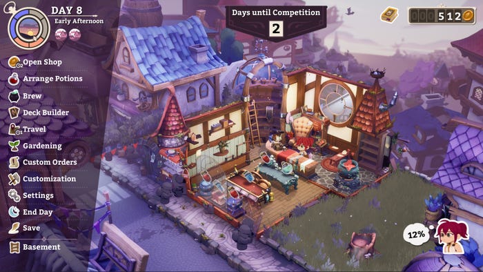
Visually, I think the question always asked was "How could we make this or that ooze more personality?" I think it all comes down to the story of the space. We specifically tried to look to design through the lens of a character, exploring how they [live] their life. How does their job affect what type of dwelling they live in? Do they leave their tools about? Perhaps Quinn would leave their inventory of ingredients in chaos but Luna would keep things to a scary level of tidiness. The real magic comes from the specific details! I think this makes the world of Potionomics feel more compelling.
This same line of thinking applies to how we approached narrative design as well. While there is a central story plot [centralized] around Sylvia’s struggle to rid herself of the clutches of debt, there are also smaller stories between Sylvia and other characters. These smaller stories give us more room to explore the characters at a more personal level. As a huge fan of "slice of life" anime. I personally wanted to see stories of our characters taking a stroll on the beach, getting into hijinks, and eating their favorite ice creams! Games rarely put a spotlight on these types of activities and I think it really helps the world feel more lived-in.

The characters really come to life through their costume design. Can you tell us about the work that went into designing the character outfits?
Generally speaking, we try to make all the character costumes be fantastical yet practical. Many of the characters in Potionomics are everyday working people in a fantasy world, so it was really important to us that their clothing made sense for their occupation and where they are from.
Saffron, for example, is a carpenter who lives by herself in the woods. We felt that it was important that she always have her tools [on] her person and for her clothes to have a handmade feel to them since she’s all about self-sufficiency. In contrast, Baptiste is a bureaucrat and noble for the mainland so he needed to look fancier and more official. Every character has a story and we wanted to ensure the design reflected that.
Players can form bonds with some of the people they interact with (or make some enemies). How did you design this system and tie it into the potion-sales mechanic?
A question that came up when we were designing the card game was "How exactly do players earn the cards in this game?" We knew that deckbuilding was a progression system that we wanted to include, especially since Sylvia herself doesn’t have any leveling mechanics. At first, we thought that perhaps cards would be given to you at the end of a haggle session like in Slay the Spire, perhaps with some sort of experience system based on how much gold you made in a session.
Around that time, we had a few of the vendor characters already and it then occurred to us that perhaps the vendors, from all their walks of life and perspectives, could provide guidance to Sylvia as a new shopkeeper. We then looked to Persona’s social link system where they tied gameplay benefits to the relationship level of each character. Following their lead, we tied receiving cards to each relationship level, giving another reason for players to invest in the characters' relationships.
This ended up creating a clear gameplay loop of haggling with the cards to receive more money, which allows you time and access to gifts to get access to more cards! We got to this point after a year or so of development and it became the defining feature of the game.
There is a customization system in place for the shop. What drew you to add this? What ideas went into this system?
I think it might be the Animal Crossing fan in me, but I think customization is a must in any shop game. Interior customization is such a fun and easy way to allow players to have something that is personal to their experience. It serves as an equipment progression system similar to those found in traditional RPGs, since Sylvia or the heroes don’t equip anything themselves.
The majority of the focus was on the shop items Sylvia can equip to increase her potion-making abilities and entice customers to come to her store. Cauldrons, shelves, and display shelves all help Sylvia in her potion-making job and help invoke the feeling of running that cozy potion store.
We made the floors and wallpapers completely cosmetic to allow the player full aesthetic freedom without worrying about their stats. I felt like we have all been there where the pink shoulder pads clashed heavily with the navy blue vest, but the stats are just too darn good to pass up.
Read more about:
[EDITORIAL] Road to IGF 2023You May Also Like