Trending
Opinion: How will Project 2025 impact game developers?
The Heritage Foundation's manifesto for the possible next administration could do great harm to many, including large portions of the game development community.

Featured Blog | This community-written post highlights the best of what the game industry has to offer. Read more like it on the Game Developer Blogs or learn how to Submit Your Own Blog Post
In markets saturated with bad clones of good concepts, we endeavored to make a good game without resorting to evil tactics.


You've seen them: The "Guess The" and "4 Pics 1 Whatever" titles that litter the app stores. They're popular in that Flappy Bird kind of way - they do something right and can be a lot of fun, but you kind of wonder how much of it was a happy accident. Then you get a sour taste in your mouth as you play it, realizing good user experience design has been thrown out the window to try to make a quick buck from microtransaction sales.
This hurts gaming in the long run.
It hurts gaming because it is destructive to clone an idea without improving on it. They are cash-ins on popular ideas without understanding what makes them fun. We now have a large batch of new gamers - these tablet children and soccer moms - who are destined to become seasoned gamers that no longer fall for those money-grabbing tactics. At some point the bubble bursts and you look at the pile of shovelware before you with disdain.
Still, these games have potential. Certainly, the original "4 Pics 1 Word" was a ton of fun. We at Firecracker Software loved the idea of these games so much we started asking ourselves, how do we fix them? And in two attempts, our most recent being "What's the Flick," I think we've made something worth looking into. We're not a big studio; we don't get many downloads or reviews, but I think we're doing something novel, and here's why:
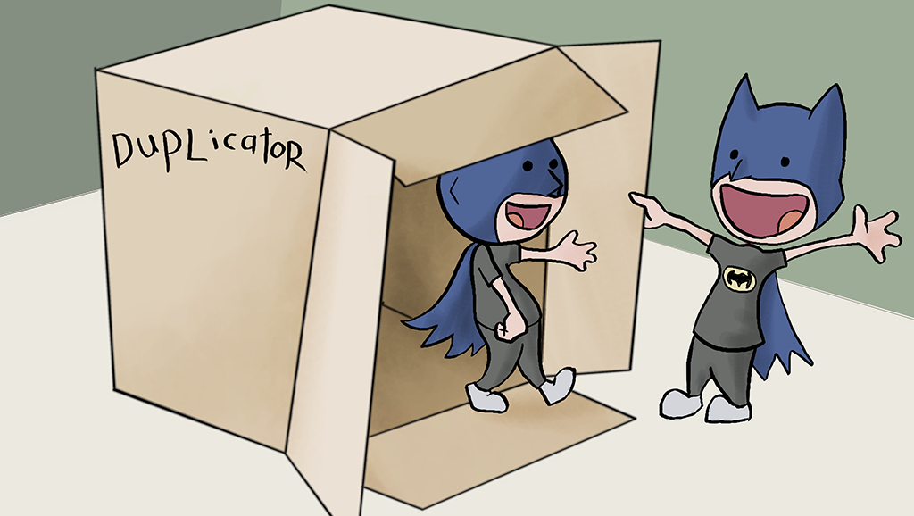
Pick up any 4-Pics style game. The best of them will have bothered to make each level a puzzle. It's why the formula worked so well in the first place. Down arrow resting atop the corner of a table? OH I GET IT, "Down on the Corner!" It makes you smile. You move on to the next one immediately. It's that "30 seconds of fun" kind of rush Joe Staten (Halo series) likes to talk about.
But as the market fills with clones, especially clones that unseat the original titles from the coveted top 10, this type of puzzle design is decreasingly prevalent. Probably, we're lucky if the stock images in these games were ever legally licensed. And it's that stock photography approach, slapped on top of a formulaic interface, that cheapens everything.
Many of these games aren't even puzzles anymore. As of the time of this writing, "Guess the 90's" is the #3 app on Google Play. It's fun for me as I grew up in that decade (and I encourage you to go try it), but there is no real game design there. You either know the picture or you don't. It's not a puzzle. It's barely considered a quiz. Not even the microtransactions mean anything at this point. The hints are just shortcuts to get you moving on to the next required level.
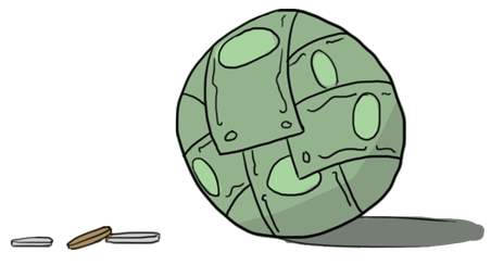 Speaking of, therein lies the issue of the paywall. Each level you play is absolutely required. If you get stuck on one of them, you better pay up or wait 24 hours. Waiting 24 hours isn't fun. Now I've been known to buy into a free game, because I believe free-to-play works and I support titles that give me a good hour of fun, but a free game with a linear path and an unchallengeable paywall is not a free game.
And more generally, a game that requires you to bother your facebook friends in order to proceed is not an honest game. Nor should it ask for your rating on the app store only after it's determined you're not going to one-star it.
Knowing our grievances going forward, it gave us a list of goals for our own game:
BE CREATIVE
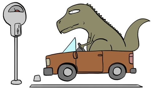 Something that hadn't been done at the time was the use of custom art for puzzles. I understand why: making art is an expensive and time consuming process. The benefits of it, however, are totally worth it. Suddenly, the puns gain a sense of humor. You have characters and situations that could not be expressed with stock photos and clip art. You can be entirely clear as to the hints and subjects of your puzzles. We kept the cost down by having our artists exchange quick sketches of ideas to know they would work before inking, and (with rare exception) we kept the polish phase to a single pass with flat colors. The result has been well received by players.
BE NATURAL
A great amount of work went into the user experience and user interface aspects of our game. Whereas other games were very simple affairs, we built a robust input system. I've heard directly from players that they can't stand other guessing games after using ours. It's amazing how much you miss the simple things, so ingrained in our interface lexicon as they are, once you've tasted them and then have them denied. Things like being able place your cursor, or the existence of a backspace button. Once again, I understand why other games haven't done this. It's actually rather difficult on the development side to implement these things correctly, despite how natural they feel to the player.
BE OPEN
Something else we found while improving the user experience is how these design choices change the gameplay at a fundamental level. Believe it or not it introduces an amount of skill to playing these games. Being restricted to the foremost input slot used to mean you had to solve each puzzle from the entirety of your remaining tiles. With our setup, you could input what you were certain was correct and look at the reduced pool of combinations to help you solve a puzzle by elimination.
Openness is a positive in almost every instance you can manage to put it into your games.
So we did the same thing to level progression. Instead of forcing a player to complete the game linearly, possibly losing said player over the fact they hadn't found our game to be worth a $1.00 microtransaction, we keep them in the game by opening up 30 puzzles right from the start. It's not hard to find value in that. Our software is modestly ad-supported, and the majority of free-to-play users will never spend money on you. It makes no sense at all to push that majority out of your player base. Keeping them ensures ad revenue, and it minimally affects your bid for the users who do buy in.
I say minimally because it does make your game easier. We're just willing to argue (data forthcoming) that a happier player base is a better player base, and that paying players are still for the most part paying players no matter how many avenues for skill-based progression you provide. This is essentially what Plants Vs Zombies 2 is banking on, and it seems to be working for them.
BE HONEST
...Which brings us to monetization. Now that we've excised all the underhanded tricks other games were using to squeeze money from their players, how do we make an honest buck? Once again, openness holds the answer.
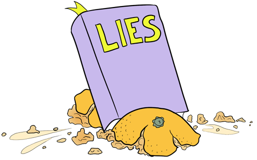 I've heard developers say that if you can make $50 horse armor for the handful of people that want to support you with it, you really should. While we're not quite willing to take the hyperbole at face value, we certainly retained the hint system found in other games and built an economy around it. We also made buy-in options for things such as removing advertisements. That kind of microtransaction helps a free-to-play developer more than you know - certainly more than advertising alone - and doesn't have to rely on being shady to be effective.
But that wasn't enough. If our players buy into the game, we wanted to make sure their investment - real money or earned credits - wasn't wasted. We made the purchase of hints persist between levels and sessions until completed, for one. But also, we wrote individual mini-paragraph hints for every single puzzle. If bought during gameplay, they are the biggest hints in the game (think how Nintendo all but gives you the answer in its recent games). If the player doesn't need them, they become little comical rewards on the win screens.
And finally, we addressed the whole social thing. Our Facebook integration is collaborative instead of coercive. If you choose to play our game socially, it becomes an item in your news feed to be displayed to people of like interest, NOT an annoying message in a dozen inboxes of people who just want you to stop it with the Farmville invites already. Even our market rating method is as hands off as possible, because honest critique and feedback is far more useful to us as craftsmen than a forced five-star rating. If you can answer to your users on the market, you should have nothing to fear.
Another note on the market rating: As of this writing, we are an incredible 5 FULL STARS on the Apple App Store, which is just unheard of, and not a single one of those ratings is faked, bought, or coerced. A good game will speak for itself, developers.
 That depends on your outlook. On the one hand, we can sit back and say we've made a good product. The simple truth is our game will never see the massive success of our competitors. It could be argued their annoying, shady tactics arose from app markets being inherently flawed systems. If your recommendation system is built on massive amounts of ratings and downloads, people will always find a way to abuse that system.
It's the same reason Facebook fills your news feed with baby pictures instead of interesting discussions. Google Play and the App Store do not praise the survival of the fittest - they echo the perceived popularity of apps, no matter how they got there. And yes, poor ratings destroy apps on these markets because these markets cannot sustain an ecosystem of honest critique, causing other developers to slither around it to everyone's detriment.
But that's an article for another time. For now, consider trying our game. Enjoy it knowing we did it because we love making games that give people genuine joy. Know that some game developers out there are still fighting for the honest approach and that, with your help, they might even succeed.
Read more about:
Featured BlogsYou May Also Like