Trending
Opinion: How will Project 2025 impact game developers?
The Heritage Foundation's manifesto for the possible next administration could do great harm to many, including large portions of the game development community.
Creating a successful iOS game isn't as simple as it looks, and in this postmortem, developers Noel Llopis and Miguel Ángel Friginal explore what it takes to create an easy-to-play, well-designed casual game and take it to number two on the sales charts.

[Creating a successful iOS game isn't as simple as it looks, and in this postmortem, developers Noel Llopis and Miguel Ángel Friginal explore what it takes to create an easy-to-play, well-designed casual game and take it to number two on the charts.]
Casey's Contraptions is an iOS game created by the two of us, Noel Llopis and Miguel Ángel Friginal. Noel, an industry veteran for over a decade, turned indie over four years ago and found success with microtransaction-based Flower Garden on iOS. Miguel worked as a graphic designer in the advertising industry for years before becoming a web developer. Casey's Contraptions is his first published video game, although his first paper role playing game came out almost 20 years ago.
We met through Twitter several years ago, and then finally in person at a 360iDev conference. Even thought we didn't plan it that way, we ended up working together during a game jam, and that set us in the path to collaborate in a future project.
We knew we wanted to target iOS for our next project because we love the platform from a user and a developer point of view, and because it's a platform where it's possible for indies to succeed financially. Beyond that, starting a new game is never easy.
Even though we have page after page of possible ideas, settling on a specific game idea is always very hard.
We wanted something that met three requirements: The game had to be creative in nature as opposed to using destruction as the main gameplay element, it had to be something we were excited about, and it had to be something with the potential to sell reasonably well on the iOS App Store. Easier said than done!
We prototyped game idea after game idea, and even though a lot of them were not bad, none were a complete standout. Eventually, after seven or eight different prototypes, we settled on the concept of creating physics-based, Rube Goldberg-like contraptions to solve different puzzles.
At its core, the game has similar mechanics to some classic games like The Incredible Machine, but with an emphasis on exploration of creative solutions rather than finding the one right answer to each puzzle, designed around sharing, and built from the ground up for a touch interface on iOS.
We structured this project as a pure 50-50 partnership, and without any external funding or publishers. Miguel quit his full time job (as a web programmer no less!) to do the art for Casey's Contraptions, and Noel took care of the programming. Design was a fully collaborative activity, where we both contributed equal amounts to everything from the rules, the feel of the game, or level creation. Everything else we split up based on our strengths and expertise: web site, server back end, PR, etc.
This is not a true postmortem, but more of a post-launch analysis. Games today, and especially iOS and Facebook games, are becoming more of a service rather than a product. Development and launch are only the beginning of the story. If all goes well, we'll have a lot more to say about Casey's Contraptions in a few months.
1. Strong Theme and Style
Casey's Contraptions started life without Casey! The initial prototype focused only on the creation of contraptions and the physics simulation behind it. It showed a lot of potential, but it was missing something to make it stand out. It needed more personality.
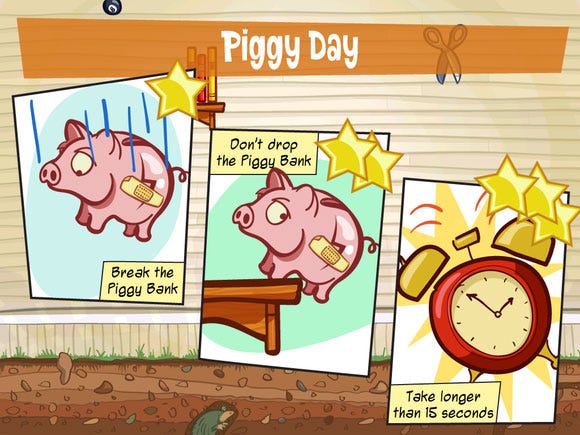
Pre-Casey level goals
After some brainstorming, we quickly zeroed-in the idea of a smart eight year old building the contraptions. Not only did that add the much-needed personality to the game, but it also focused the rest of the development. Instead of doing a physics game with generic pulleys and levers and other industrial-looking items, we naturally went with toys and household items Casey could have access to: His sister's doll, paper planes, or his RC truck.
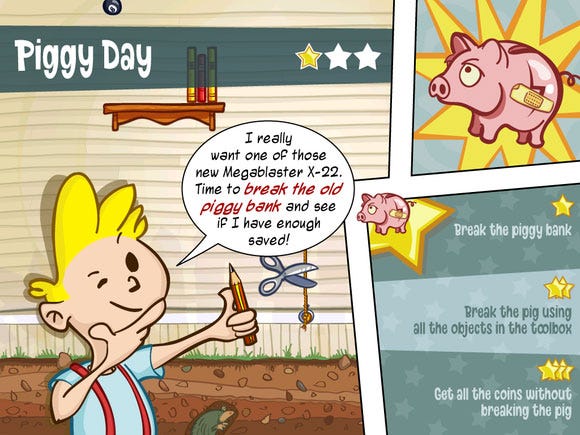
And the same level goals after Casey
The choice of toys as game items not only influenced the level design, but also the goal of the levels. At the beginning we were thinking of doing levels to accomplish tasks Casey would have to deal with in real life, such as putting toys away or popping a balloon. After a while, the idea of "playtime" levels came up, where the setting and the goal were completely imaginary (rescue explorers from a jungle in their hot air balloon) just as Casey would have imagined during his playtime sessions.
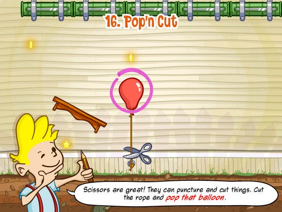
Prototype goal - pop the balloon
The character of Casey also helped anchor the art direction. We were aiming for something that would appeal to a very wide range of people, from the very young to adult casual gamers.
Although Miguel looked into everything from a most modern Cartoon Network style to manga, to crazier Warner Bros., we ended up settling with a mix of Calvin & Hobbes and something out of a '50s Hanna-Barbera show, with strong outlines and solid colors, to make people of all ages feel comfortable with the visuals. We were able to carry this distinct style to all the items, locations, and user interface in the game, which gave it a very consistent and unique look.
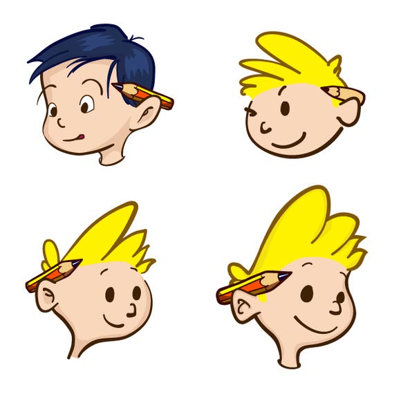
Casey's evolution
2. Social Features
Creating something is fun, but creating something and being able to share it with people is twice as much fun. We wanted to make Casey's Contraptions a very social experience from the start. Not something that you played through and put away, but something you could share with friends along the way.
Since Casey's Contraptions uses a full physics simulation at its core, it's possible to come up with very unique, chaotic, and often unexpected solutions to most puzzles. Weeks after launch, we're still amazed at how some people are solving some levels, coming up with item combinations we never thought about during development. Since these solutions are very unique and fun to watch, they were a perfect candidate to share with friends.
With that in mind, we designed the game with sharing from the start. After you complete each level, you can share your solution with all your friends just with the tap of a button (and, in the latest update, the default is to autosubmit a solution if you improved your score).
Your friends' solutions are equally accessible, as cropped thumbnails in the level completion screen, and tapping on any of them will bring up a full-screen view, so you can even replay and watch the full solution.
In addition to sharing solutions, we also included a level editor to allow players to create their own contraptions from scratch. This was the same level editor we used to create all the levels in the game. Nothing like eating your own dog food to make something solid and usable.
Initially, players were able to share these levels through email, and, in the first update, we also added the ability to share them publicly through a web site (http://shared.caseyscontraptions.com), effectively giving players access to hundreds of new levels.
As it's the case with most games that include level editors, we were aware that only a small minority of players would take the time to create their own contraptions. But it's also those players that are really devoted to the game, and take it upon themselves to spread the word about your game and champion it to all their friends.
3. Iterative Development
For Casey's Contraptions we used a very stripped down and relaxed form of iterative development. We had short iterations and in each iteration we aimed to fully implement what we considered the most important features at the time.
We didn't do any real estimating of tasks (other than, "yeah, we think we can do that in about two weeks"), and we didn't set a hard-limit on the iteration (they varied naturally between one and a half and three weeks). The most important concept is that at the beginning of each iteration we would make decisions about what to work on next, and those decisions were made with all the knowledge leading up to that point.
For example, we didn't start the project by coming up with the full list of items we were going to have in the game. Instead, we had a list on the wiki of possible items (to which we would add more whenever we thought of a new one during development), and we only decided which new items to add to the game at the beginning of each iteration.
That allowed us to make good decisions based on what we had learned so far: "Most objects we have so far fall down. We need more items that add forces upwards", or "The magnet is fun, but we need more metal items to make it more useful".
This mentality applied to everything: From level creation, to menus, features, etc. Looking back, we can say there's no way we would have made the same decisions early in the project than we did as we went along.
4. Strong Launch
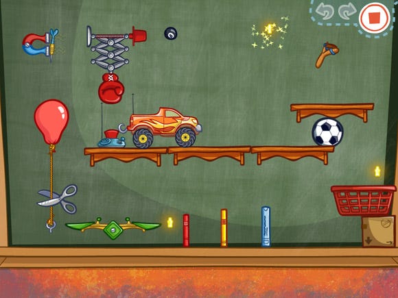
In less than 24 hours after launch, Casey's Contraptions worked its way up to the top 10 paid apps in the U.S. and in over 20 different countries. A day later, it reached the number 2 overall spot in the U.S. and had great initial weekend sales.
This strong launch wasn't just pure luck. It was something we planned months in advance and worked hard to achieve (although we did need a dash of good luck). We wanted to build awareness and buzz around the game, but given the short development cycle for iOS games, we would have to do it in a shortened scale.
We started out by announcing the game more than six months before release (25 percent of the way into development). During the following months, we continued talking about the game on Twitter and our blogs, often showing work in progress or outtakes. The next big milestone was showing the game around at GDC. Not only did we get a lot of other developers to play it and give us invaluable feedback on it, but we also met with some of the game press, and that resulted in some very nice previews afterwards.
The final push came as soon as we submitted the game to Apple for review. We decided to set a fixed release date three weeks after the submission, which would give us enough time to do all the PR work: creating a video, putting together a media packet, contacting media outlets, etc. In the weeks leading up to the launch, we also stepped up our blogging of different interesting aspects of the game.
As a result of everything we had done up to that point, we were very lucky that Casey's Contraptions attracted Apple's attention, and they featured it prominently on launch day as iPad Game of the Week worldwide. We had given the press enough time with the game, so a lot of very positive game reviews came in right around launch day, helping get the word out for the game.
Even though we had been originally thinking of pricing the game at $4.99, we decided to shoot for volume instead and priced it at $2.99. That turned out to be the right decision and immediately put us on the top 10. Sales on iOS charts follow a sharp, exponential drop off, so being in the top 5 represents a huge increase in sales over just a few positions down the chart.
Looking at the App Store today, it's apparent that it's becoming harder for small, quick games to be really successful and top the charts. With over half a million different apps on the App Store, and hundreds of games released every day, you really need to stand out from the rest to be noticed. Most of the games that manage to do that are ones that required significant time and effort investment and have good production values. The App Store gold rush is over.
5. Enough Development Time
From start until launch, Casey's Contraptions was in development for eight months. That seems like a long time by iOS standards, although more and more successful iOS games are starting to take that long.
Our initial plan was to ship the game by Christmas. It wasn't based on any rigorous estimating, just an off-the-cuff estimate. It just "felt" like we could be done by then. Obviously we were wrong.
Taking the amount of time that we did was a very positive thing. We didn't really waste much time, it's just that the game needed that amount of time to mature and get to where it is today. If we had chosen to ship it earlier, the final product would have suffered significantly.
One of the hardest things in a game like Casey's Contraptions is making interesting levels. Having this amount of development time, with a working game editor since the very beginning, allowed us to make a lot of levels along the way.
Looking back at a lot of the early levels we made, they were laughably hard and not that interesting. After several months, were able to develop a sense about what made good levels and what the appropriate difficulty was.
Having enough time allowed us to make fairly fundamental changes to the game design when something wasn't working. For instance, initially each level had three different goals you could achieve. Depending on the number of goals you accomplished, you earned a bronze, silver, or gold medal. It quickly became apparent that players were extremely confused by the three goals and weren't able to keep them straight.
We changed levels to have a single goal, but since we still wanted to have some replayability beyond "solving" a level, we added optional stars you could collect by touching them with any item in the game. The first star would be very easy to get, the second one a bit harder, and the third one would require some serious thinking.
That was a huge improvement, but then we discovered that most players expected to get all three stars in their first playthrough, and would stubbornly keep playing the same level until they got them all or quit in frustration. That prompted us to change the stars yet again. This time the difficulty of getting them was tied to the overall level difficulty, so players could easily get all three stars in the early levels. We're very happy with the final design, and we would not have gotten there if the project had been rushed.
We also gave ourselves sufficient time at the end for polish and style. Polish isn't going to make the game design any better, but it's going to contribute a huge amount to first impressions. Every animation, sound, and particle effect becomes really important in those crucial first few seconds with the game. On a mobile platform, polish becomes even more crucial. If your game doesn't immediately engage the player, there are lots of other things they can shift their attention to.
1. No Simultaneous iPhone Launch
The initial prototype of Casey's Contraptions was running on an iPhone. While it showed a lot of promise and it was fun to assemble contraptions even that early on, it was clearly begging for more screen space.
The iPad was the obvious platform of choice. Its large screen can display very nicely detailed graphics, and allows for very natural, direct manipulation of items. It was a perfect fit for Casey's Contraptions.
Even so, while there are a lot of iPads out there (14 million), the iPhone and iPod Touch are the undisputed kings of the App Store (about 185 million devices). Especially for a game that relies on the social component, getting a critical mass of users playing at the same time, sharing solutions, and sending levels is very important. We definitely stormed up the iPad charts, but that still left the majority of iOS users not being able to purchase our game.
Why didn't we wait until we had the iPhone version to launch? No particularly good reason other than we were itching to get the game out. We also had no idea what kind of impact a strong launch would have on our servers, so the idea of an iPad-first launch seemed like the way to go. In hindsight, we would have been better off waiting to launch both versions at the same time (or almost the same time, maybe a week or two apart at most).
To make up for this, we're planning on making the iPhone release a second launch of sorts: we'll make the iPhone version coincide with a new game update that includes a lot of new content (for free for people who already bought it), and we'll try to repeat the same strong launch we had on the iPad. The idea is to get everybody who's already bought the game playing again, along with all the new iPhone players, and create that critical mass.
2. Butting Heads Too Much
We make the perfect two person team: we have complementary specialties, but we also have a lot of overlapping skills. We also seem to always approach things from opposite ends: aesthetics vs. usability, performance vs. gameplay, simplicity vs. interest, uniqueness vs. familiarity, or tea vs. coffee. That is actually a really good thing and the success of Casey's Contraptions was in no small part due to our combination of personalities and skills.
There is, however, such a thing as too much of a good thing. We are both very stubborn and it will take a lot to convince us to see things in a different way. There were some times during development that we spent more time debating one point than actually implementing it.
The fact that we're working remotely didn't really affect most of our day-to-day development, but it definitely made hashing out these situations significantly harder, dragging them out for far longer than they should have. This was also the first time we were working together on a significant project, so it made resolving those situations more difficult. Now that we've gone through this first project, we'll hopefully be better equipped to handle similar situations in the future.
3. Unnecessary Rework
Rework is a necessary part of a creative process. You're unlikely to get everything right in the first draft of a text or a music composition. That's even more so the case for game development, because there are so many parts interacting with each other. Not only is it hard to predict the exact final outcome, but even if you could, you often don't know exactly what you want until you've seen one version of it.
Just about every screen and every item in the game went through several revisions of art, behavior, sounds, or layout. There's no doubt that every revision made them better. However, we had a few parts of the game that we had to revise a few too many times. This was mostly in some of the UI screens, like the now infamous "level completed" screen, or the look and positioning of the in-game menu, which we must have gone through at least six or seven complete redesigns.
We believe that design doesn't just flow one way. If you want the best final product, you can't just decide on the functionality of some user interface (or any part of the game for that matter), implement it, and then give it a pretty face with some graphics. Both the implementation and the graphic design will actually feed back into the functionality of the UI. Once you go around this cycle a few times, you can zero in on a very strong design, both from a functional and a design point of view.
The problem comes when you go around that loop too many times, or when the loop doesn't converge into a particular design, but keeps shifting around. That was often caused because we were fuzzy on some of the details, or when we were forgetting about some particular feature that had to be reworked into the design.
Some other times feedback from our testers made us realize that a screen wasn't clear enough as we had designed it and caused us to rework it. As tempting as it was to push through and call it good enough since it was already completely done, it was always the right decision to go back and re-work things as needed.
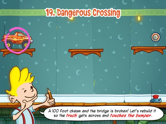
For example, at the beginning of each level Casey explains what goal you need to achieve. This screen seemed straightforward enough, except that the version we had early on was blocking the view of the level while it was up. Our testers complained it was hard to remember what you had to do without seeing the items it was referring to at the same time, so the final design shows Casey's dialog along the bottom of the screen, and the goal items are even circled with a marker.
We can alleviate this problem by iterating on particular pieces of UI or the game in smaller cycles, without taking each one to completion. Instead of starting by completely implementing a screen, or completely creating a perfect mock up with all the graphic elements, we need to start by laying out a screen with simple boxes and buttons and implement the basic functionality.
Then we can make a first pass at a real layout and some graphical element, implement some of the new functionality and animations suggested by that, and continue iterating until it's done. We got much better about this in the last third of development, and it's something we want to carry forward to future projects.
4. Not Enough Unit-Testing
Noel is a big fan of unit testing and test-driven development (TDD). Those are some techniques we used in past projects to very good effect and something we definitely wanted to carry into Casey's Contraptions as well.
The goal was never to have 100 percent unit-test coverage or write every single line of code through TDD, but to write only the tests that would benefit the project. That usually meant some code that a lot of other code relied on (the game item management), or something complicated (toolbox interaction), or something prone to breaking (rope manipulation).
In the end, we slipped to the side of not having as many unit tests as we would have liked. Some things like object attachments kept repeatedly giving me headaches during development because of the complicated, untested code. By the time we noticed those problems and wanted to start adding tests, it was too late because some of that code relied on non-unit test friendly APIs like UIKit or Box2d.
We should have taken the time when those problems started appearing to start writing some tests and slowly refactor the code as we fixed the bugs and added new features. Instead, since we seemed to be constantly "just a few months away from shipping", we decided to skip that and definitely paid the price later on. We even shipped with a few off edge cases that we knew were buggy but we didn't dare fix weeks before submission.
We're already working on updates and and an iPhone version of Casey's Contraptions, so we'll continue dealing with that code for quite a while to come. We'll slowly introduce unit tests in areas of the code that we need to revisit during this time.
5. Fixed Price Model
The pricing model is something we went back and forth about several times during development. In spite the long-term success of Flower Garden and other free games with microtransactions on the App Store, we chose to go with a fixed-price model for Casey's Contraptions.
We thought our audience would appreciate a traditional fixed-price model better than a microtransaction-based one. We also figured it was a model that was working well for other similar iPad games such as Angry Birds or Cut the Rope, so it made sense to follow their lead on that.
Unfortunately it seems that might have been the wrong decision from a financial point of view. After a really strong initial launch, Casey's Contraptions dropped down the charts very rapidly after just a few weeks. Since revenue follows a very sharp exponential drop off, even being in the top 100 iPad games means very little revenue per day, and points to a very thin "tail" to the sales curve.
In spite of the bad reputation microtransaction games have in traditional game development circles, they're a lot harder to develop than single-purchase, fixed-price games. Not only do you need to implement very robust server features, but you need to finely balance the in-game economy, the pace of rewards, and the cost of new purchases. Our optimistic estimate was that it would add at least a full month to the development time (and given how our estimates were, it probably meant two months for real).
A possible alternative would be to have a traditionally-priced game, but offer new levels or locations as extra purchases. This would have been a lot simpler to implement, but it probably wouldn't have made much difference in revenue. Usually, only about between 2 and 5 percent of the players buy any extra content, so for microtransactions to really pay off, they need to be unlimited (in-game currency, fertilizer, etc), or have a very large user base. With a small, fixed amount of possible things to buy, we would need to rely on having lots of players to make much of a difference.
We're hoping releasing the iPhone version will generate lots of renewed interest in Casey's Contraptions, spur lots of sales on both platforms, and hopefully increase the long-term chart staying power. If that's not the case, we can always consider the possibility of experimenting by changing the pricing model in the future.
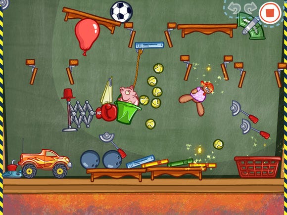
We're extremely happy with the development of Casey's Contraptions and with the initial launch. We managed to create a unique game around creativity that was very well received critically and from a sales point of view.
The first free update should be available by the time you read this. It adds the ability to share contraptions with everybody through the web site, as well as browing public contraptions, which should increase the popularity of that feature quite a bit. It also adds some of the most-requested features, such as multiple player profiles for all the parents playing Casey's Contraptions with their children out there.
Unlike a traditional retail game though, the story is far from over. What we do in the next few months will have a very significant impact on the long-term success of the game.
- Release date: May 19, 2011 (iPad). Summer 2011 (iPhone)
- Development time: 8 months
- Team size: 2 (full time)
- Development cost: Cost of living for 8 months + a tad over $1000
- Open source code: Box2d, UnitTest++
- Primary tools: Xcode, svn, Versions, Trac, TexturePacker, Adobe Illustrator, Audacity
- Lines of code: 46,518
- Raw asset size: 510 MB
- Total app size: 12.2 MB
- Subversion commits: 2442
- Trac tickets closed: 683
- Gallons of tea brewed: 77
- Shots of espresso consumed: around 1500
Read more about:
FeaturesYou May Also Like