Trending
Opinion: How will Project 2025 impact game developers?
The Heritage Foundation's manifesto for the possible next administration could do great harm to many, including large portions of the game development community.
In this Gamasutra-exclusive postmortem, the creators of IGF Grand Prize finalist and XNA Community Games standout CarneyVale: Showtime discuss what went right and wrong during its creation.

[In this Gamasutra-exclusive postmortem, the creators of IGF Grand Prize finalist and XNA Community Games standout CarneyVale: Showtime discuss what went right and wrong during its creation.]
CarneyVale: Showtime is an XNA game developed for Xbox LIVE Community Games by the Singapore-MIT GAMBIT Game Lab. In the game, which is currently available on Xbox LIVE, players take on the role of Slinky, an acrobat determined to rise through the ranks of the magical circus of CarneyVale and reach stardom.
Slinky bravely flies through rings of fire, rides flying rockets and dodges electrical and fiery hazards, all to give a great performance to his audience.
Players make Slinky perform acrobatic stunts and death defying leaps in order to reach higher areas and progress through the game.
We describe the game as a "vertical platformer" with a fundamental difference: players control the environment to propel Slinky to the top instead of exerting direct control over his actions.
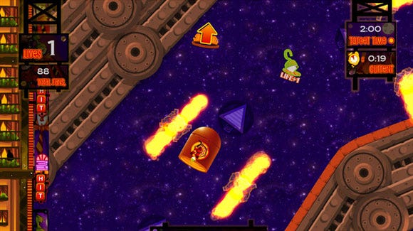
Fig 1: Slinky can use a variety of props to reach the top of each level, including rockets.
After launching Slinky out of a cannon, players catch him in mid-air with trapeze-like "grabbers" and spin him around to build up momentum. By timing the release, players fling Slinky in the direction of other grabbers and balloons.
The analog thumbstick allows the player to have some mid-air control while falling. Cannon-fired rockets give Slinky a chance to hitch a ride, steering the projectile like a vehicle. Mid-air dashes, unlocked in the progress of the game, allow Slinky to perform high-speed course corrections while flying between grabbers, rockets, and other props.
 In Boston, the Singapore-MIT GAMBIT Game Lab runs a summer program where students from Singapore explore questions in game research with MIT students and faculty.
Each student team develops a small prototype game over eight weeks to test a specific idea. At the end of the summer, the games are featured on the GAMBIT website.
Some of us returning students formed a team to develop Showtime as a spiritual sequel to Wiip, a prototype game developed in GAMBIT's first summer program in 2007. (Right -- Fig 2: Slinky is a magical ragdoll who dreams of becoming the most famous acrobat in the world.)
The team for Showtime consisted of game designer and artist Desmond Wong, producer Joshua Wong, audio specialist Guo Yuan and programmers Lee Fang Liang, Adrian Lim, Hansel Koh, and Bruce Chia.
Although the mechanics of the two games are radically different and there are no returning playable characters, both games share a quirky and colorful art style that establishes the mysterious and magical circus world of CarneyVale as a recurring "character" of its own.
Our team was working under a tight schedule: we had four months to design, build and polish our game for the Microsoft Dream-Build-Play submission deadline in September 2008.
We used Scrum to plan our workload and schedules, meeting every morning from five to twenty minutes to discuss the state of our project. We spent most of our time coming up with different concepts and prototypes for our game, inviting testers and other students to help us refine the game design to make it as much fun as possible.
1. Nailing Down the Art Style Early
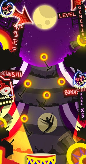 The art direction from Wiip was the most obvious component that carried over into Showtime. Because that aesthetic had already been established, we were able to quickly flesh out ideas for Showtime by churning out concept art and visualizations.
Desmond sketched out a rough comic illustration of how the game would play out while the game was early in development. Whenever we were lost or started to deviate from the main idea, all we had to do was look at the sketch to get back on the right path.
The whole team shared a good mental picture of what the final game would look like. Left -- Fig 3: Early concept art helped us figure out the atmosphere of Showtime.
This is very important in the early stages of a project, since everyone has their own independent picture of how the game should look. This gets worse when all that people can see for the first few months are squares and circles.
Since we all had a good sense of the art from the beginning, much of the game could be quickly built around that initial coherent idea.
2. Keeping Things 2D
During our development, we were torn between making the game in 3D or 2D. Thinking back, sticking to 2D was definitely the way to go.
Since our game was so heavily reliant on physics, doing Showtime in 3D would have been a technical nightmare for us. Given our limited time and resources, making the assets for a 3D game would also have been a truly immense task. A 2D game meant that art assets were significantly easier to produce; we could create and integrate new assets in the game in just a matter of hours.
Furthermore, when things had to be changed, it was infinitely easier to change one graphic than to change a 3D model and re-texture it. We were able to spend the time we saved to make a more polished game.
3. The Map Editor
The map editor in Showtime, which enables players to create their own performance venue and show it off to their friends, is probably one of the game's defining features.
It was powerful enough for us to use in creating the actual levels for the game, making it very easy for us to change a level if we felt it was unbalanced. Rather than having Desmond redraw an entire level, level designers could use the map editor on their own to move things around.
This saved us countless hours of time and streamlined our development process. By making it easy and fun to use, our tool also became a great added gameplay feature, thus killing two birds with one stone.
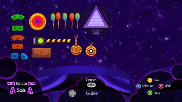
Fig 5: This early version of the map editor shows collision data for each prop.
However, if we could magically choose one more feature to add to the game, it would be map sharing. Many players of our game would also agree, judging from feedback.
We would have loved to include the ability to share user-created maps online but we had the choice of either shipping a stable product on time or putting in a completely new feature that would have required much more testing on multiple networked systems.
In addition, the networking capabilities of XNA are currently designed for multiplayer gameplay and not for sharing files between peers. This made the feature rather difficult to implement within a short period of time and we understood we had to make sacrifices to meet the Dream-Build-Play deadline.
We had an additional time constraint in that many of our teammates were scheduled to begin their mandatory military service soon after the development period!
4. Testing and Being Willing to Change
Testing was key to ensuring that our game provided the player with a good gameplay experience. We carried out two different types of testing: systematic QA testing, to ensure that the game was as stable and as bug-free as possible, and gameplay testing, to ensure that the game was fun to play.
The systematic QA testing helped us identify bugs after we made any changes to the game, as many bugs are easy to miss without a test plan to flush them out.
Gameplay testing was critically important; at the end of the day, it's not about making a game that the developers wanted to play, it's about making a game that the players wanted to play.
Understanding that important point, we constantly brought in people who had not seen the game at all. They would play through the game and we would collect their feedback. Using their observations, we could identify what players liked or disliked, address those issues and make the necessary revisions.
Once we made those changes, we would go through the testing process again to ensure that those changes did indeed have a positive impact on the overall experience.
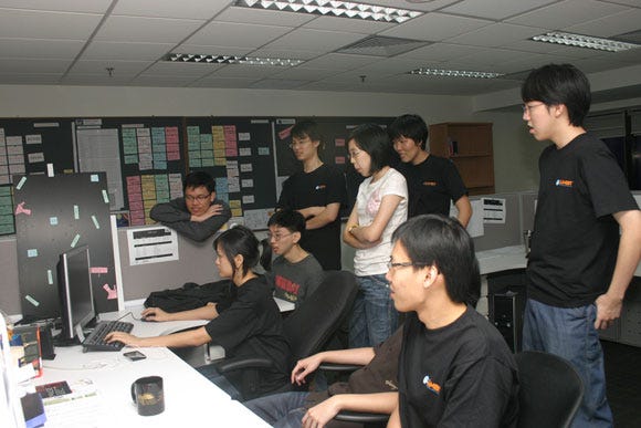
Fig 6: Another GAMBIT team checks out our latest build as we get ready for a testing session.
Like many teams at the start of a project, we had what we thought was a fantastic idea, and we began churning out code and assets to get our game going. Halfway through production, tester feedback showed us that the game just wasn't fun.
We scrambled to save the concept by tuning certain mechanics and making drastic changes to the core gameplay, but unfortunately after still more testing we realized that our basic idea just wasn't cutting it.
Since a lot of work had already been put into the game, we were reluctant to change it. However, we gritted our teeth and decided to revamp the entire game. Fortunately, that decision made Showtime into what it is now. If we had stubbornly opted to iterate on the old idea in small steps, Showtime would have failed. It was a painful decision, but we were not afraid to listen to our testers' feedback and overhaul the game to make it fun.
5. Keeping the Code Modular
While making Showtime, we did a lot of playtesting to see what worked and what didn't. This meant that there were a lot of changes. Code that was written one day could be gone the next, and entire features could be taken out and replaced by something better at any time.
Understanding that modifications were inevitable in the process of making a game, we made sure that the code was modular and easy to change. This allowed us to make the necessary revisions quickly and see the results as soon as possible.
The faster changes can be implemented, the faster they can be tested to see if they indeed make the game more fun. As a result, even though there were a huge number of revisions made to the game during its development cycle, they still remained manageable, and the final game benefited immensely as a result.
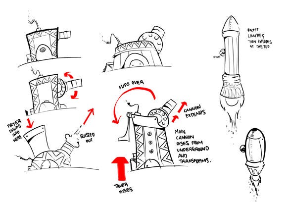
Fig 7: Different ideas for the cannon prop, from the simple to the elaborate.
1. Not Enough Prototyping
 Our team had lots of experienced game players, but did not have anyone trained in game design. This resulted in premature design decisions that eventually required us to do a lot of reworking.
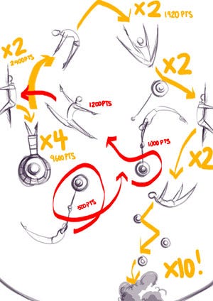
Although we were unafraid of change, constantly having to overhaul the concept of the game throughout the four months was tiring and wasteful. (Left -- Fig 8: This sketch demonstrates how we intended to combine acrobatic performances with spectacular crashes.)
We started off well by creating one digital prototype and one paper prototype to test two ideas. The digital version was a circle that could jump around and swing on lines, and the paper prototype was a paper rag doll falling down pins we stuck on the wall.
That was all the prototyping we did before we decided that the paper rag doll falling down the wall was fun.
We proceeded straight into production, basing our entire game on this concept of "failing" and rewarding players if they failed a swing or mistimed a jump.
As it turned out, testers didn't understand the logic behind these design decisions, and we spent a lot of time making a game that was not well thought-out and was boring to play. When we eventually abandoned that design, we lost countless art assets and a lot of code.
We didn't spend enough time making prototypes and testing our early ideas. More importantly, we didn't allow anyone outside of the team to play with our prototypes before we cemented the idea.
Although this ended well for us, the magnitude of changes meant that we spent a significant amount of time and effort on reworking designs and changing mechanics instead of polishing and tuning the rest of the game. A smart designer can save your team a lot of time by zeroing in on the really good ideas with early prototyping and testing.
2. Over-Scoping and Feature Creep
Showtime was originally intended to include full-length cutscenes, sixty levels, multiplayer modes and much more. Essentially, we planned for functionality that we had no way of finishing in time.
Nearly a month was spent working and reworking the story for the scenes, and another was spent creating them. In the end, we realized that we had over-scoped, and we removed the cutscenes altogether. If we had not planned for the cutscenes in the first place, that time could have been spent on other, more productive portions of the game.
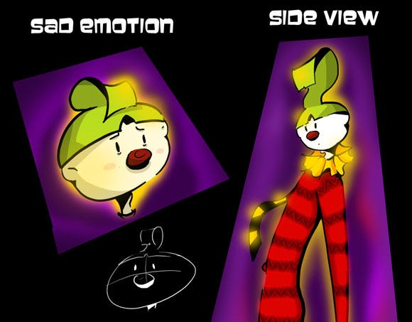
Fig 9: We originally planned to include cutscenes in which Slinky would have to convey a variety of moods.
Even though Showtime was intended to be a small-scale project, we started having lots of great ideas during production and we wanted to get them into the game. Not realizing that we were growing the scope of the game, we went about implementing all those features.
Before we knew it, we were building something much bigger than we'd intended. The crux of the issue came when we realized that, despite having more features to finish, we still had the same deadline bearing down on us. This resulted in more time spent in the office and more late nights. Even the effort of cutting out those features and assets drained our precious time.
3. HD and Localization
When we were building the game, we made sure that it looked great and ran properly on our development machines, not realizing how much influence that would have on our production. Not planning for wide distribution of our game made it much less accessible to other languages, regions and screen setups.
Our team had an HDTV in our lab that we used for most of our initial prototypes, and all of our computers were capable of rendering at high resolutions. This led us to work under the incorrect assumption that we were developing the game only for HD displays, and we lacked the foresight to support lower-resolution televisions.
In our zeal, we created so many assets that when we finally realized we should cater to lower resolutions, downsizing those assets was an insurmountable task.
For example, we had many lines of text that we'd rendered as image files with fancy effects. Although the Xbox Live Community Games reviewers did not reject our submission for this reason, many of them did complain that words were cut off and that some text was too small to read.
This was especially evident on CRT television screens that were less than 20" in size. However, due to time constraints and the need to ship, we had to push the title to Xbox Live Community Games without catering to lower-resolution television sets.
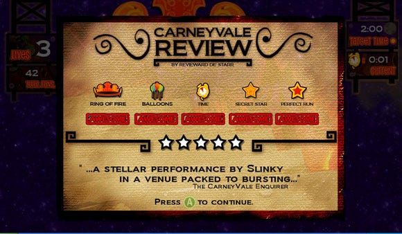
Fig 10: The text under the icons can't be read in 480i. The red color doesn't help.
In addition, three key errors we made in production now prevent us from localizing the game to multiple languages. First, as mentioned above, much of our text was rendered as bitmap images, blended with artwork designed around specific words. We didn't consider how changing the text would also require changing artwork.
Second, most of our in-game text was scattered all over our code. If they were kept in a single, separate text file, it would have been possible to swap different files for different language translations.
Third, although players could name their custom maps in our editor, our fonts only featured the basic English character set. Thus, players using different languages couldn't name their maps using letters from the full international character set.
4. Lack of Control Scheme Page
Our game is fairly different from many other titles, so players really needed to be taught the role of the interactive "props" in the game environment to enjoy the game.
Some props were useful while others posed a potentially lethal hazard. We managed to convey this message successfully via a tutorial system integrated across the game levels, which explained new props when they first appeared.
This both allowed the player to understand the multitude of game props in a simple manner and allowed us to explain the multiple ways to use each prop in clear, easy-to-follow steps so that the player didn't need to learn all the controls at one go.
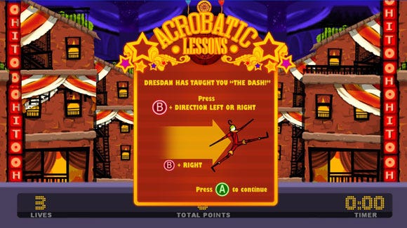
Fig 11: The in-game tutorial, which introduces new techniques to players, was so important to the game that we eventually expanded it into multiple frames.
Since we provided the tutorial system, we became overconfident and felt that we did not need a control scheme page. After all, the game only used two buttons and the analog stick. When we submitted the game to the Xbox Live Community Games playtesters, however, we were told that we needed a control scheme page that players could reference if they forgot the controls.
It was only then that we realized that, although we considered our game a platforming game, our control scheme didn't follow the conventions of the genre (such as including a "jump" button).
When we set about drafting such a control scheme page, we realized that the game's many props (which all operated differently) would have made such a page illegible. To meet the deadline, we had no choice but to omit this feature.
5. Testing with a Niche Audience
While testing was one of the things we did right, there were some blunders. At the beginning, we turned to local schools and institutions for testers, which seemed to provide us with a large pool of people to test our game.
However, it took us a while to realize that most of the testers who showed up weren't familiar with console games, which made it difficult for us to make sense of and interpret our test results. In fact, we spent close to a month or two testing with this audience before we realized our error.
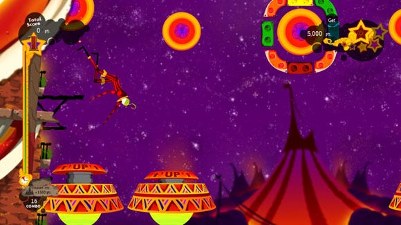
Fig 12: Pinball was a big source of inspiration for Showtime.
Due to inaccurate test data, many of the early changes we made to the game were unnecessary. We needed to completely restart testing, putting in much more effort to find broader and more varied groups of testers.
We eventually succeeded, but that didn't change the fact that we had lost so much time and effort reacting to test results generated by a niche group of testers.
 During one of our testing sessions we had three testers in our lab. All three were good friends and loved gaming. Their testing session started early in the morning and we had them play through the game from start to finish.
At noon we asked them if they wanted to stop for lunch, but one of them said that he wanted to beat the game first. He was on the final level, and was having some difficulty beating it.
The other two testers were experiencing similar difficulties as well. Before we knew it, the testers banded together and took turns at the level together.
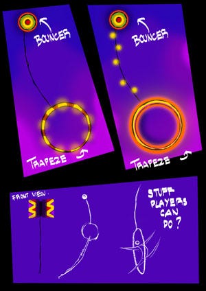
They cheered when one of them made a particularly tough leap, and were collectively disappointed when Slinky narrowly missed a target. (Right -- Fig 13: Through much iteration, the acrobatic trapeze evolved into a claw-like grabber.)
Watching them, we knew that we had created something good. We had created something that three friends gave up their lunch to play. It's times like that when we remember why we make games.
Now that the game is finished, we are overjoyed to have been a part of the project. Although we suffered many setbacks, it was a very good experience. We learned many things about ourselves and how to manage a project. Now all we hope is that you will have as much fun playing CarneyVale: Showtime as we did making it!
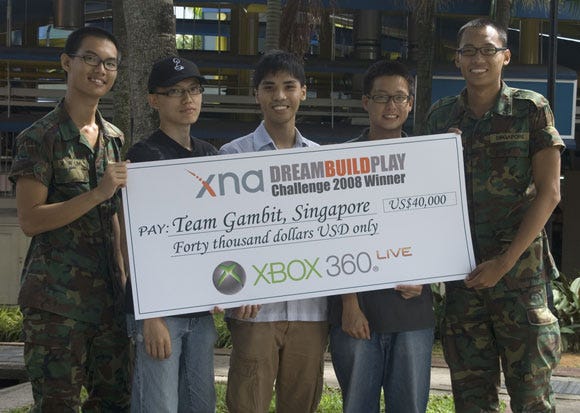
Fig 14: Most of us aim to pursue further studies in college.
Full-time student developers: 7
Part-time student interns: 2
Length of development: 4 months
Xbox Live Community Games release date: Dec 22, 2008
Platform: Xbox 360
Development Hardware: HP Desktop PC (Intel Core2 Duo 2, 2.33 GHz, 2 GB RAM), 19" LCD screen, Wacom Intuos 3 tablet, Olympus LS-10 audio recorder
Development Software: Microsoft Visual Studio C# Express 2008, Microsoft XNA Game Studio 3.0, Microsoft XACT, Adobe Photoshop CS3, Steinberg Cubase 4
Resources: Farseer Physics Engine, XNA Creators Club, EastWest Symphonic Orchestra Silver Edition, Fonts: Ligurino, Biondi, Ozone, Bell Gothic
Read more about:
FeaturesYou May Also Like