Trending
Opinion: How will Project 2025 impact game developers?
The Heritage Foundation's manifesto for the possible next administration could do great harm to many, including large portions of the game development community.
What can Usability bring to your game? Let's see how Rootworld handles it's players with some simple concepts that can point out strengths and weaknesses in any game.

This blog post was originally published on LudoTIC's website (In french too).

We sometimes see some articles about the meaning of User Experience in games, and it's usefulness. I'm a U.X. Designer at LudoTIC and I want to share with you what this field can bring to a game project and maybe some insight on game development in an accessible way.
Each month, we present a game’s review using our tools and expertise: our Game Usability Review (Game U.R. for short). The goal of these reviews is to find out what is good or bad, to uncover problems and discuss some solutions.
Game development is an art, here are some pieces of advice to turn your work into a masterpiece.
We use an internally developed method which sees a game from 3 points of view:
Usability: as a Human Machine Interface
Playability: as an object with playing potential
Gameplay: as a video game
For more details, see our related article!
You can see here our last review of The legend of Zelda: Breath of the Wild.
Rootworld is a puzzle platformer for mobile devices developed by Kiuas Games. You are a little fluffy ball (a fluffy) and you have to free your friends by breaking their cages. To move, you tap on a wall to launch a rope (a root) and swing your way to the end of each level.
This is a puzzle platformer, you have figure out the best path to reach the end. It uses progressions mechanics similar to Rayman.
In games like this, it is important to make sure the player understand what he is meant to do and why.

Rootworld is in the “early access” part of the Google Play Store since March, it means that it will change and maybe some of the topics we will talk about will be fixed afterward or won’t exist anymore. For the review, we used the 4.6 version on the 4th April 2017.
One day was enough to review this game and to end with these findings:
Guidance is voluntarily scarce in the game, to let us understand what to do by ourselves. At first, it consists of images to show us where to touch to finish the first levels, then it leaves some simple text advice to nudge us in the right direction.
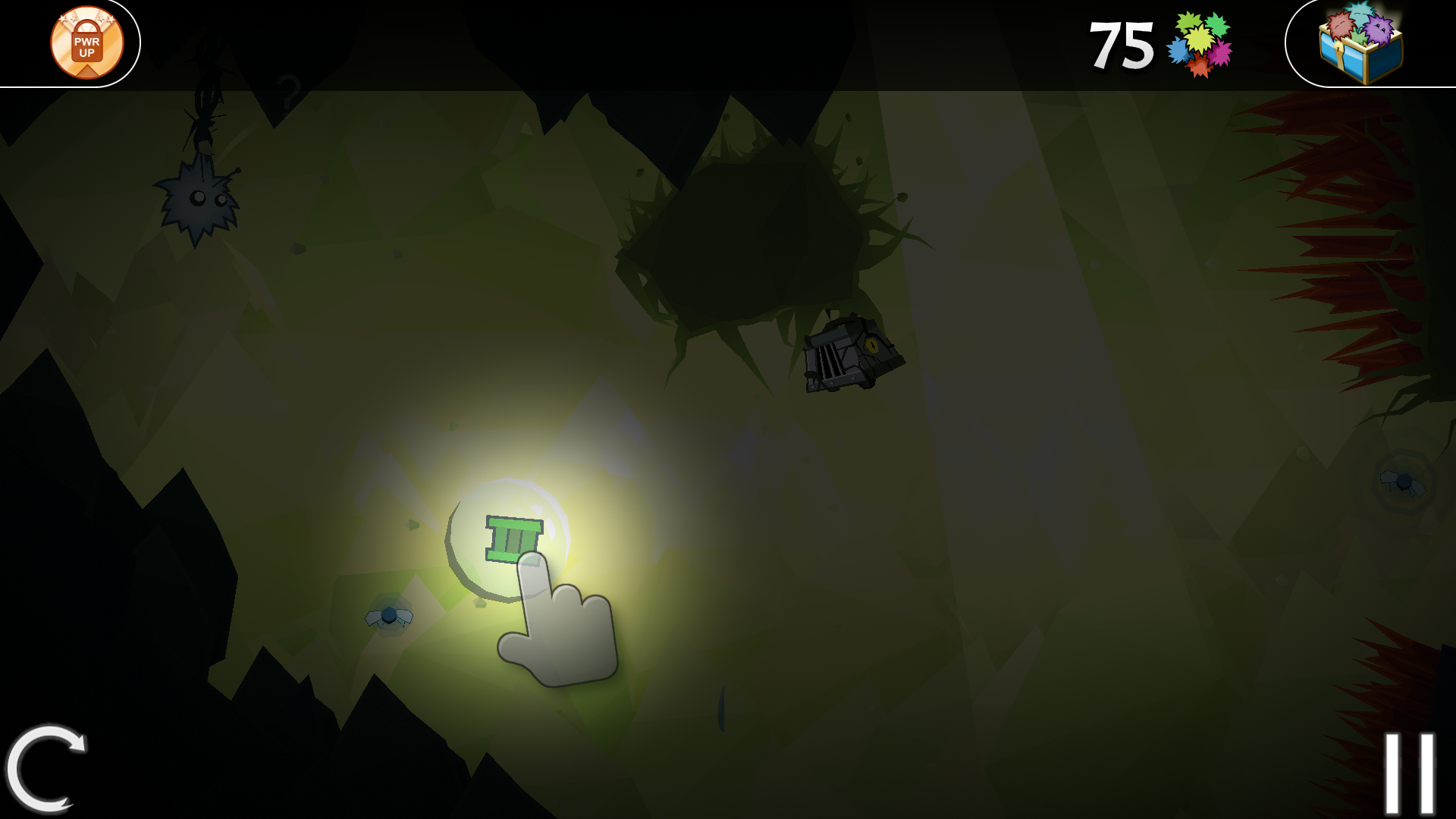 Hey Listen!
What can be bothering is that some mechanics are fully explained (“touch here, oh look you can use this bonus”) or hinted (“why is everything upside down?”) while others are simply not even acknowledged. One example could be the “non rootables” walls introduced on the 2nd world with no explanations at all. |
This help is crucial for the player to understand what he has to do. Even the simplest sentence can push the player to adopt a completely different strategy. Even if the mechanics seem simple at first, a little clue can be very helpful for some players. If it is crucial for the game experience that the player experiences the new mechanic himself then you can display a hint after a few failures. |
When we die 3 times in a row on a level, a “ghost” appears to guide us through the level.
This is a good way to help the player understand what he has to do. |
For some players, understanding the level and how to reach the end is part of the fun. In Rootworld, it is very easy to die and start again, this is part of the game. It can be frustrating to see the ghost as it can be understood as the game taking the player by the hand, saying: "You can’t do it properly, let me show you”. |
This could be less aggressive to just add a “help button” after the player died 3 times. When pushed, it would show the ghost. This way the player could continue experimenting on his own and choose when he need help. |
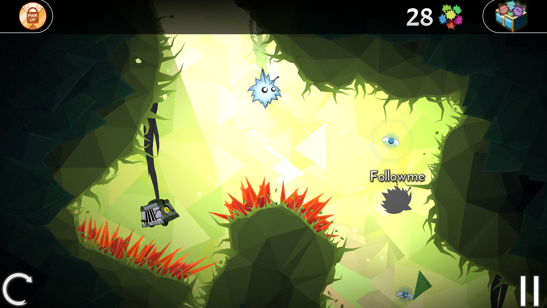 Wait! I didn’t try everything yet!
There are two different menus for navigation between levels. This is a major issue because it become very easy to get lost and the game isn’t about finding the right level. Even more, the 3 menus of the game are functionally very different. The interactions vary a lot between each of them and it can become very confusing. |
 The menus for navigating between levels
Choose one menu for navigating between levels and stick with it!It could also be interesting to show a name or a specific image for each level. To help the player recognize each of them. |

Proposition: With an insight of the level I know where I’m going
There are numbers in some places in the game. Each of them for different things, but very few are explained. The number of fluffies is understandable, as they are the main currency, but the number of fireflies at the end of each level is very confusing. This number serves no purpose (that we know of) and can be mistaken for the number of fluffies. |
Be careful to show the player only relevant information. If the number of fireflies is important, show it under the number of fluffies, if not, don’t show it at all. |
 Proposition: Doesn’t take much place
The game offers bonuses that give a special ability during one or more games and can be bought with fluffies in the shop.
While some of them are explained in certain levels, some others are left to the interpretation of the player and can be really hard to understand. We still don’t know what the “trampoline” one does, and 200 fluffies was an expensive price for something useless. |
The bonuses could show what they do with an animation before the player buys them. |
Some of the levels feature “quick reaction” moments. For example, you have to launch a root at the very last moment to avoid dying and complete the level.
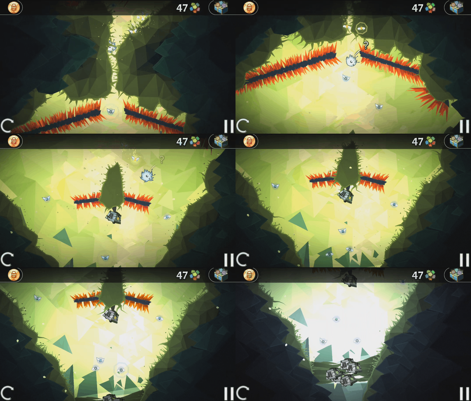 Annnd I’m dead
Although difficulty can be fun too, be careful when asking players to react quickly. Even more when they are using touch interactions and can hide part of the screen with their hand just by playing. |
This criterion is about the feeling of influence the player has about the game. Whether it is by being at the origin of his actions or leaving a mark in the game. |
In Rootworld, progress between the worlds is shown as a map coloring itself the more the player has unlocked levels. |
Players can vote after each level if they enjoyed it or not. Even if it is only for the test phase, this feature is interesting for players, they can leave a feedback and feel like participating in the game’s development. |
 Nice touch
The rules aren’t consistent! Sometimes levels begin with the fluffy hanging on a root, sometimes it is inside a bubble and sometimes it just stands on the ground. This is just an example and there are more cases where rules simply change for no apparent reason. |
Be careful with the rules, even if the levels aren’t made by the same persons, they MUST apply the same rules. Or else it would be a new game each level. |
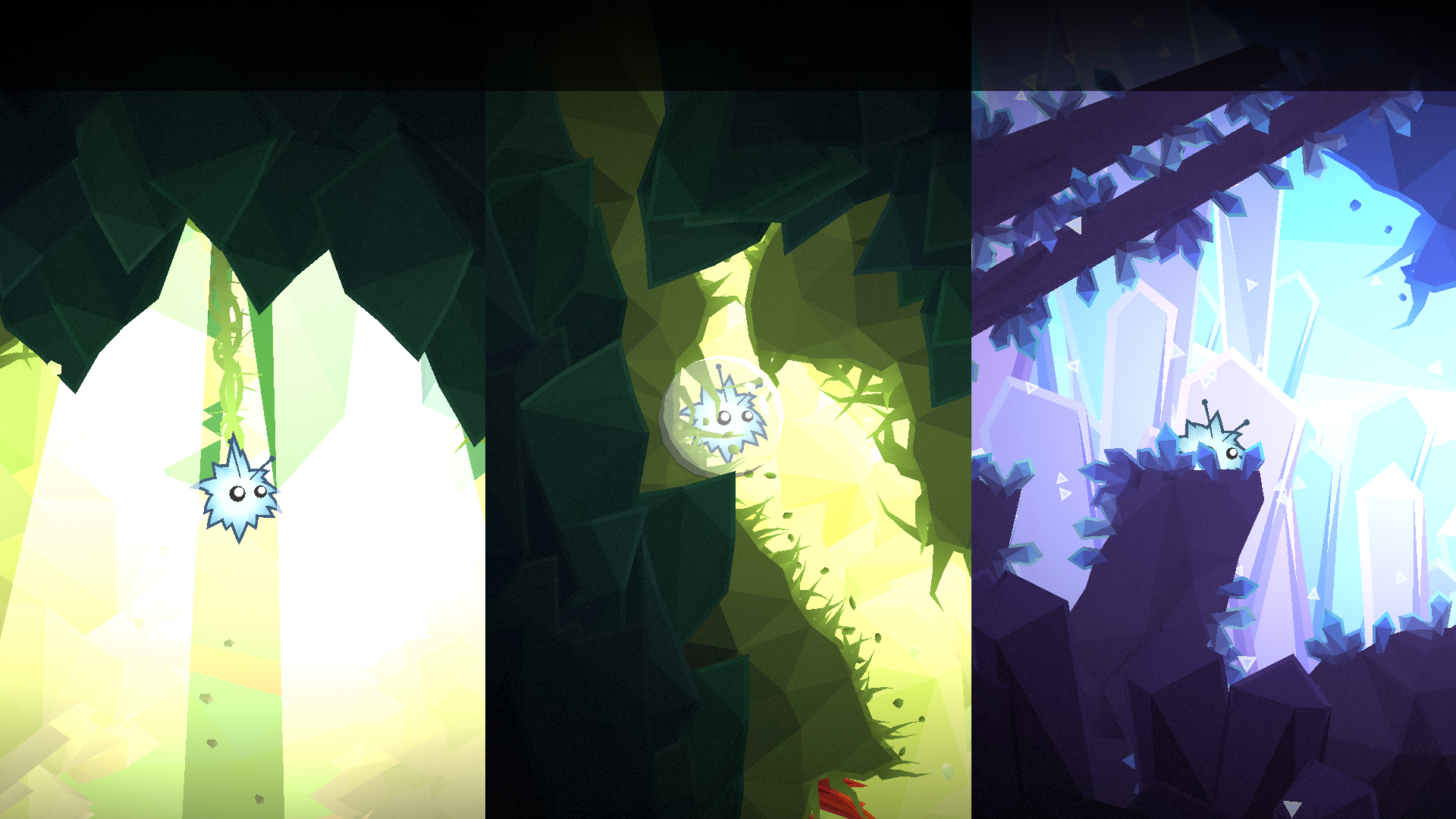 Wait, how do I begin the level again?
Dring the course of the game, new abilities are unlocked at some points. When this happens, the game explains how to use them but not that they are brand new. It can be easy to believe that they were available since the begining when they weren't. For example, when we learn that roots can be launched downward and serve as a pole, the only information is the little text hint below. |
When the player acquires a new ability, be sure that he knows what it is, even more if some other ability can be bought for a short time. This is one of the mechanics similar to Rayman, when the character learns a new ability, be sure that the player knows it is new and permanent. |
 The screen of a new power for Rootworld and Rayman, maybe we can find a middle ground.
Rootworld is a fun and cute little puzzle platformer, it is still in development but already offers some pleasant times. With short games and easy to retry gameplay, it can become a nice game to play on your phone.
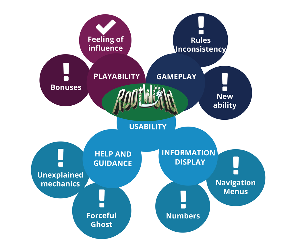 A picture is worth a thousand words
If you have questions or opinions, please tell us in the comments section. See you next time :) .
That was GameU.R. the review ergo of jeux vidéos.
Read more about:
BlogsYou May Also Like