Trending
Opinion: How will Project 2025 impact game developers?
The Heritage Foundation's manifesto for the possible next administration could do great harm to many, including large portions of the game development community.

Featured Blog | This community-written post highlights the best of what the game industry has to offer. Read more like it on the Game Developer Blogs or learn how to Submit Your Own Blog Post
The sci-fi MMO Prosperous Universe is played entirely through a futuristic user interface. Read about our initial inspirations, the biggest challenges and the solutions we have come up with over the past three years.

Hi! My name is Julian. I’m one third of the core team behind the upcoming space economy simulation Prosperous Universe, a browser-based MMO that recently launched its first public version.
I know what you’re thinking.
There are scores of mobile and browser-based sci-fi strategy games out there. Why the hell make another one? Well, we’ve been going our own way with Prosperous Universe, off the beaten track littered with premium currencies, combat, and flashy visuals that, let’s face it, oftentimes serve to embellish otherwise shallow gameplay. Prosperous Universe looks like this:
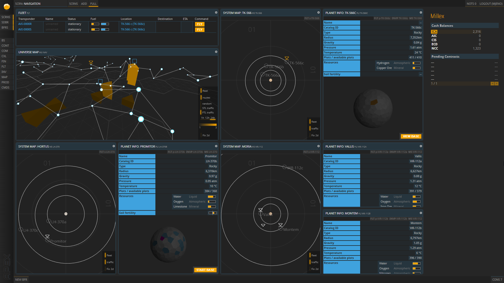
An example setup of APEX.
What you are seeing here is called APEX, and it’s the tool through which players access the entire game world of Prosperous Universe. At the same time, the whole interface is itself part of the fiction.
Throughout the following paragraphs, I’d like to introduce you to our design philosophy behind APEX, its inspirations, its biggest advantages and challenges, and what kind of gameplay it ultimately allows for. If you want a sneak peek of the status quo, check out our short introductory video. Take it away, me in full cosplay:
The way I see it, the major conflict in APEX’s design process has been this: Interfaces that look really cool aren’t practical to work with, and vice versa.
What’s the last big-budget movie with a futuristic touch you’ve watched?
Chances are it featured a fair share of sci-fi user interfaces. Some artists are specialized in making only these UIs, taking endless hours to perfect them visually for a few seconds of screen time glory. As a result, they look incredibly cool – but if you take a closer look, they are often extremely impractical and borderline impossible to use by a real person.
On the other end of the spectrum, we have real user interfaces which were designed as pragmatically as possible. Since we tried to create a realistic, grounded experience through a believable and practical UI that our players would actually need to understand and use, we drew our initial inspiration from real pieces of software.
Unfortunately, they look really dull.
That is why, after APEX’s core functions were established and a high degree of usability was ensured, we started working our way back towards cool looks in an effort to strike the perfect compromise between practical design and sci-fi flavor.
Let’s talk about where our journey started: with functionality. At its core, APEX is an enterprise management software. There are plenty of those to draw inspiration from in the real world, SAP being one example that’s famous here in Germany:
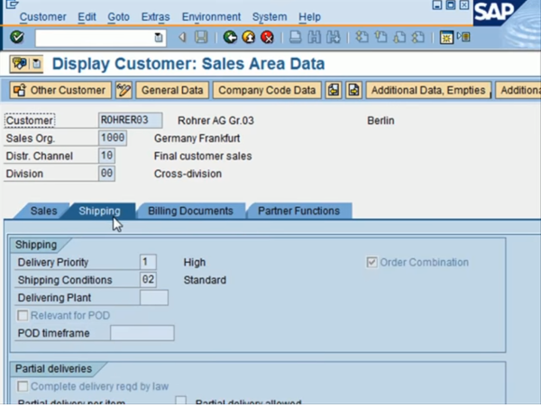
However, as you can tell, this still looks very different from APEX.
Especially when it came to our maps of the Universe and its various systems, we again turned to a kind of software that is used by real people every day: Air Traffic Control.
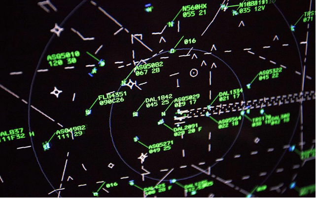
ATC’s look and features greatly informed the way we designed our in-game maps. There aren’t many spaceships in this screenshot, but the general lack of fluff in the UI’s design allows for a decent overview no matter how crowded outer space becomes:
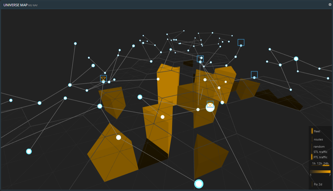
Ships move between systems (circles) along FTL routes (lines). Small triangles show the location of owned ships, big triangular bars indicate traffic activity.
Besides standard business management operations and space travel, APEX allows for a third kind of interaction: staying in the loop about economic developments. This includes tracking prices for commodities, the value of different currencies, and more. This is where stock market data software like Bloomberg Terminal has left a mark on APEX’s design.
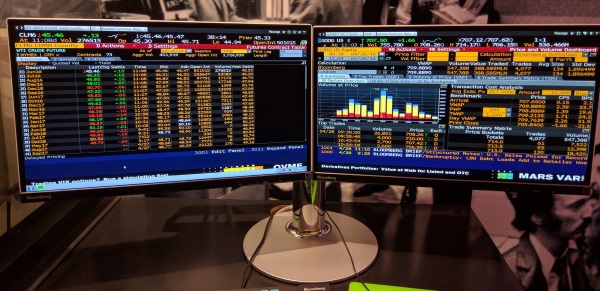
Not only did we borrow the different ways data is visualized in these types of software, but also a lot of stock market terminology. Here’s what a data tracking screen in Prosperous Universe can look like:
![]()
As you may be able to see on the right side, my company isn’t doing so well at the moment.
At this point, APEX has a big number of features akin to any other business management software, only with a twist towards sci-fi content. Users can buy and sell goods, check their companies’ balance statements, keep tabs on their workforce, track the values of different currencies, and much, much more.
So, what’s next?
Prosperous Universe is a hybrid of different genres: sci-fi MMO, business simulation, strategy game, sandbox. The latter is a term we don’t mention very often, even though it’s fairly central to our vision: Players should be able to set their own goals and find their own ways to reach them. To achieve this kind of flexibility during gameplay, it needed to be reflected in APEX’s design.
That’s where APEX is different from just about every video game interface out there: its many possibilities for customization. If you watched the video at the top of this article, you already got an idea of what I mean by that.
At the core of APEX’s flexibility lies the idea of tiles. A tile displays a specific set of information like, say, the contents of a planetary storage. Or everything about the “Farm” building type. Or the exchange rate history of two currencies. Or a map of your home system. Because tiles can be specific to instances of things – like planets, bases, flight routes etc. –, there is a near-endless number of different contents a tile can display.
To grant every player maximum flexibility in what they do and what information they track, players can set up their tiles completely by themselves. That entails several things. First, APEX has no fixed contents. The player can fill up all tiles with their desired information:
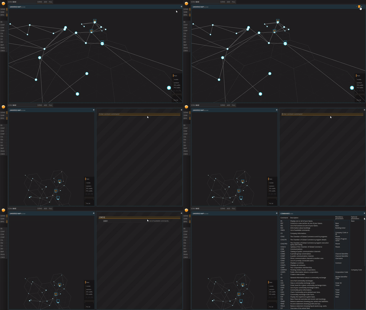
A tile is split in two. The new one is filled with new content via a command.
Second, APEX has no fixed layout. The player can drag and drop, resize, and delete tiles at will:
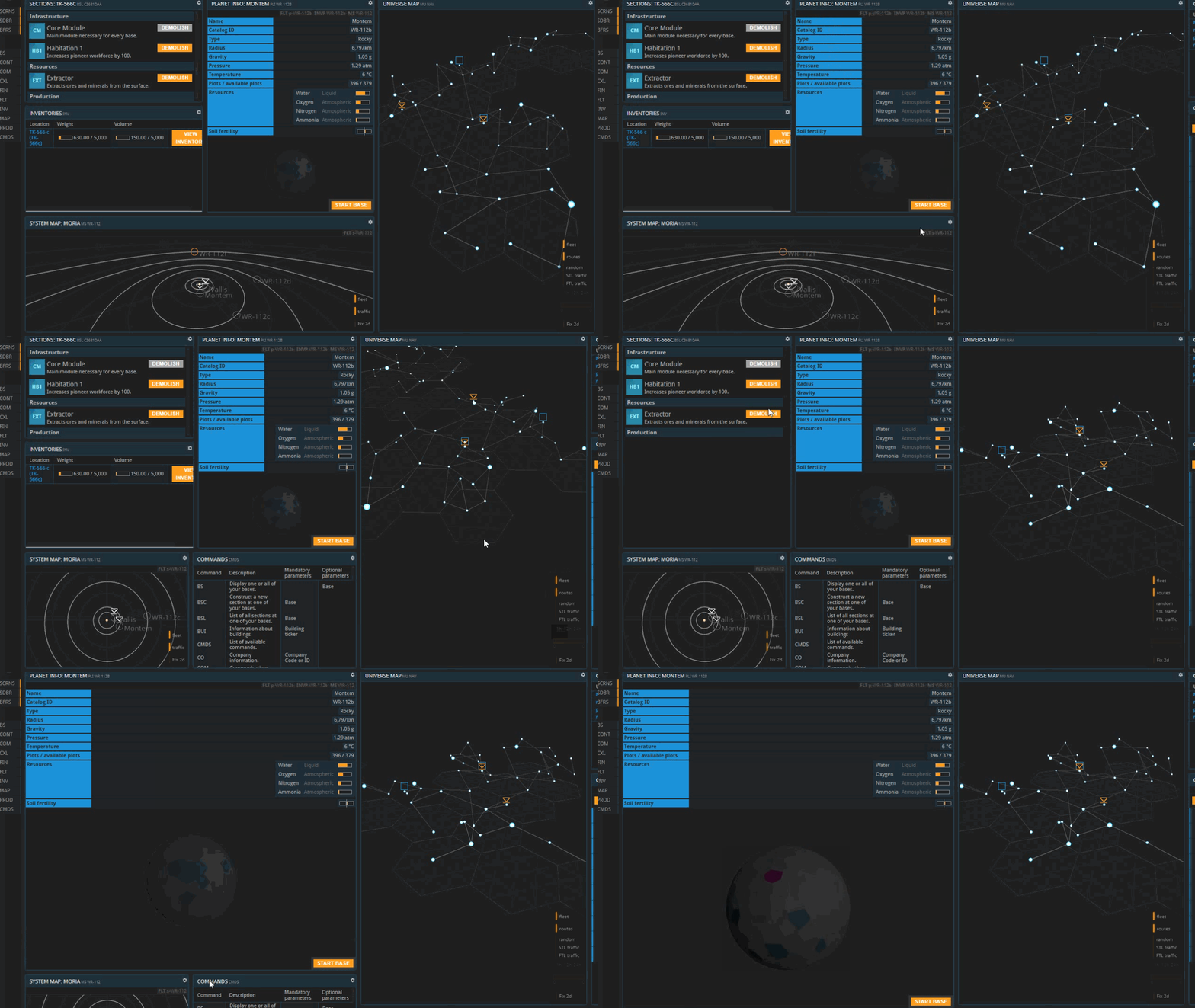
Tiles can be split, changed in size, emptied and filled with content etc.
And that’s not all.
The player can set up numerous screens, all with different contents and layouts. Of course, they are all saved in-between sessions:
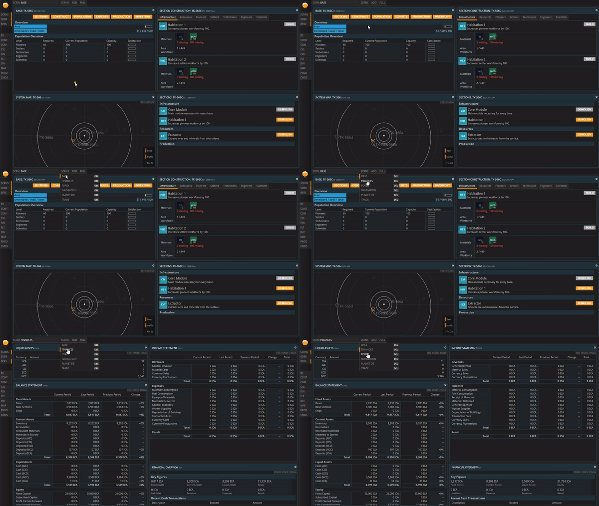
A drop-down at the top lets the player cycle through the Screens they have set up.
Okay, it’s a business tool. Where does the sci-fi come in?
Firstly – and most obviously –, your company operates in a sci-fi setting. Your trade partners might reside on other planets, in other systems maybe. Space travel is itself a big pillar of the game’s industry.
Secondly, we thought about how to introduce more sci-fi flavor into APEX’s visuals. As I mentioned above, some sci-fi UI clichés are pretty terrible to implement into an interface people are actually supposed to use. For example, circles and hexagons are impractical due to all the empty space they leave along their edges and the awkwardly shaped negative space around them. That is why we decided to stick to our initial, practical solution of rectangular tiles.
Luckily, as it turns out, sci-fi flavor and practical, rudimentary design actually do go hand in hand in some instances. I guess the common denominator is sobriety; look at our sans-serif font, for example. Similarly, the combination of blue and yellow provides both readability (even for most colorblind) and an overall “spaceship cockpit” feel. Other games and movies have been utilizing this color scheme to great effect:
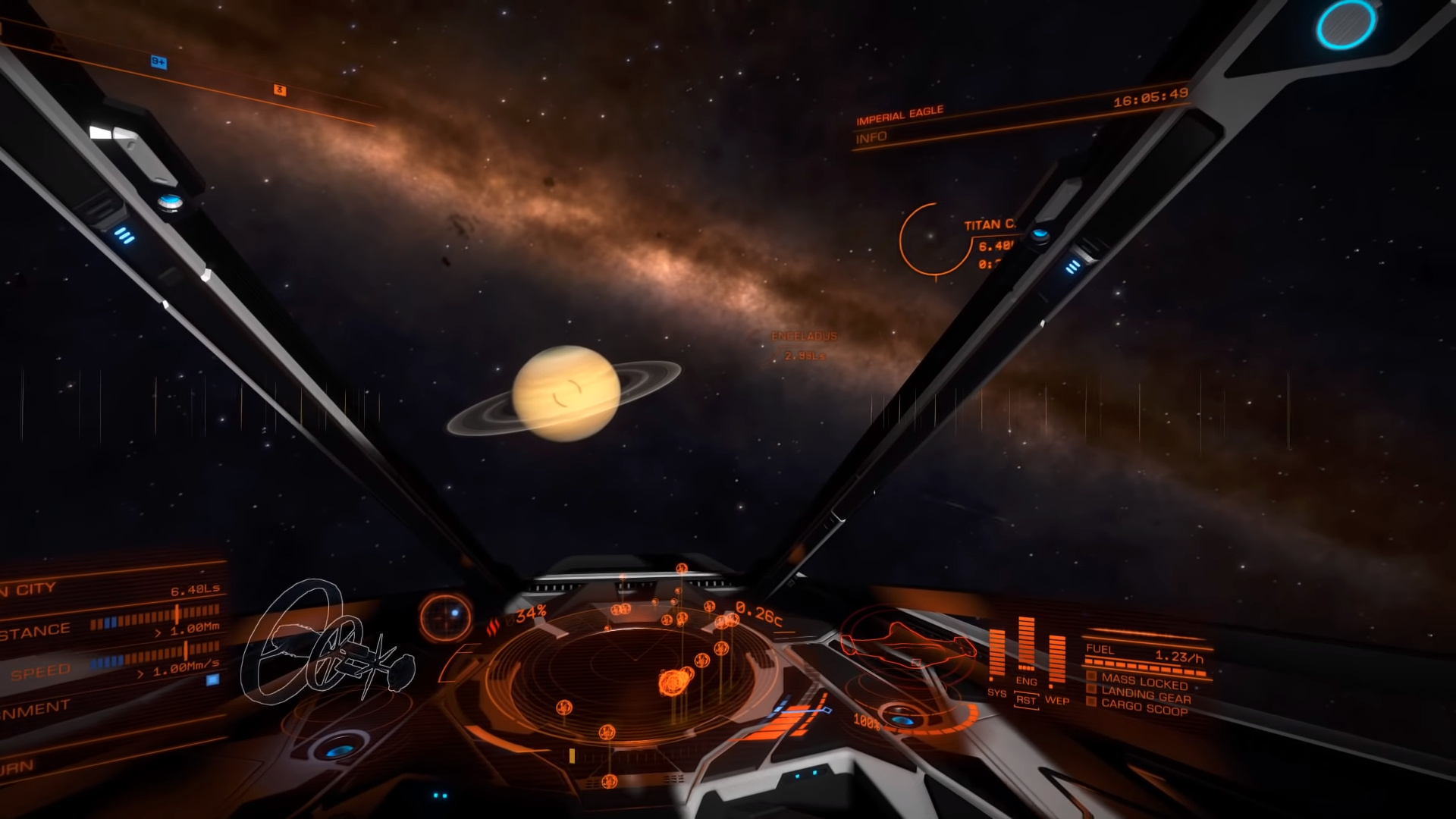
A ship cockpit in Elite: Dangerous.
Our planets and wireframe stars are another example where rudimentary looks provide an inherent sci-fi touch:
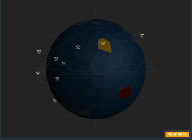
Triangles indicate spaceships orbiting the planet.
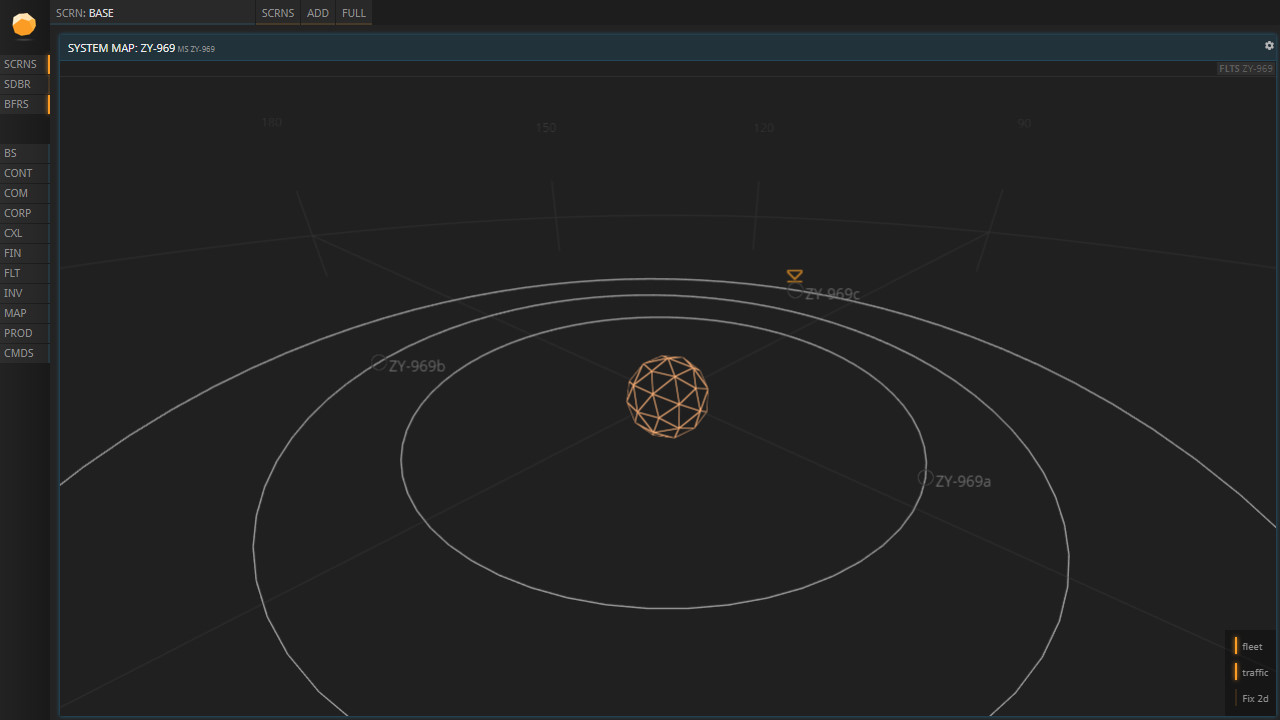
A star and its planetary system.
But we’re not done yet.
Much of our visual design is still “coder art”, as they say. We recently hired a dedicated UI designer who worked on several IPs both for the big screen and Netflix. He was tasked with bringing more eye-candy into our game without sacrificing any usability. Especially the 3D maps have proven their potential for visual improvements:
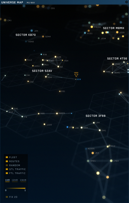
Added some depth blur and differently colored stars.
And of course, there was still room for improvement when it came to fonts, separators, corners, all the little elements that come together to form a whole:
 However, these designs are just mock-ups and still subject to change before they are implemented into the actual game.
Okay, it’s a business tool for a space company. But what makes it a game?
We’ve heard this question once or twice at every event we’ve been to so far. Putting aside the debate of whether or not games need to be fun, what people are – in my opinion – really asking is: How is this fun, and not work?
Generally speaking, fun is highly subjective. Some people might merely look at these screenshots and ask: Where isn’t the fun? More specifically, however, there are a few concrete ways to have fun in Prosperous Universe, despite its comparative lack of flavor and flashy graphics.
In a game like this, fun doesn’t emerge directly from the actions taken during gameplay. Clicking a button labeled “Place Order” can’t compete with the feeling of firing a high-caliber sniper rifle in a shooter, or steering a high-end car in a racing game. Instead, Prosperous Universe is all about the goals.
Like any user interface, APEX is a mere means to an end towards which a player works. The fun lies in making your way there. Due to the game’s sandbox design, players’ goals can be vastly different. You might decide you want to be the first settler on a particularly hostile planet. Or the designer of the fastest ships in the universe. Or simply the richest person in the system.
For some players, large parts of the fun lie in the fantasy of their in-game persona.
Optimizing your interface and, with it, your processes to reach your personal goal, that is where APEX shines. Add to that social interaction – it’s an MMO after all, featuring a vast chat system and different ways for players to band together – and the aforementioned sci-fi fantasy, and you get, as we hope, a compelling, unique type of gameplay through UI alone.
With a little bit of luck, managing the interface and, through it, your company will make you feel like… well, like a boss.
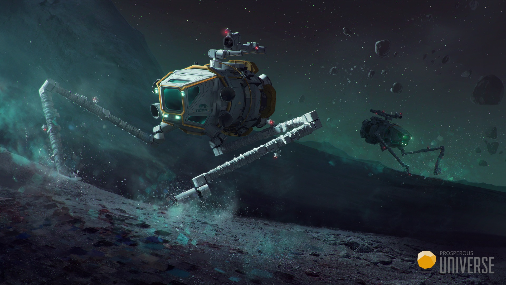
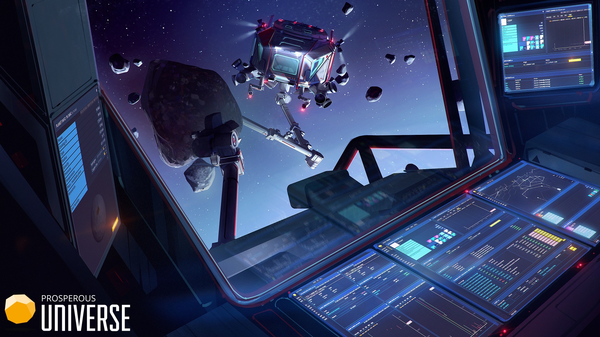
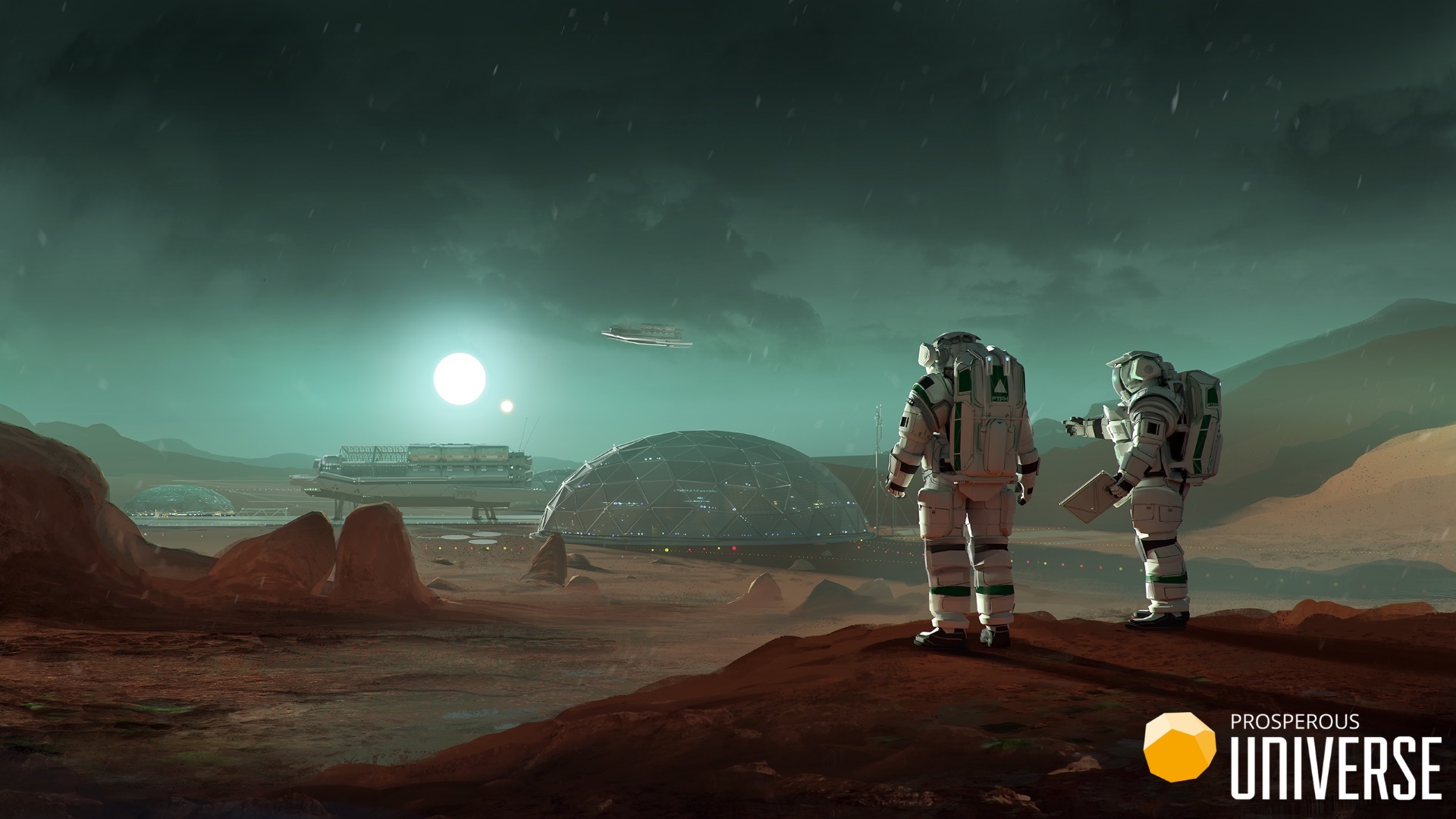
To further help with the “space CEO fantasy” in our marketing, we decided to commission artworks that show glimpses into the world of Prosperous Universe, the world you influence by enforcing your decisions via APEX. To that end, we hired the incredible Maciej Rebisz, Senior Concept Artist at CD Projekt Red. He came up with several designs that honor realism down to its smallest details:
I hope these insights into our processes have been valuable for some of you, or at the very least interesting or entertaining. If you’d like to play the game in First Access, you can sign up today on the Prosperous Universe website.
Thanks for reading!
Disclaimer: An earlier version of this article was first posted on 80.lv.
Read more about:
Featured BlogsYou May Also Like