Trending
Opinion: How will Project 2025 impact game developers?
The Heritage Foundation's manifesto for the possible next administration could do great harm to many, including large portions of the game development community.

Featured Blog | This community-written post highlights the best of what the game industry has to offer. Read more like it on the Game Developer Blogs or learn how to Submit Your Own Blog Post
Tatiana Vilela dos Santos is an indie game designer & interactive artist making games with special interfaces. She gave in March 2018 a 60 minutes talk at the GDC titled Game Design Beyond Screens & Joysticks. This article discusses details of this talk.

Tatiana Vilela dos Santos is an indie game designer and interactive artist. She makes games with alternative controllers and render interfaces, all part of her interactive multimedia project MechBird. In March 2018, she gave a 60 minutes long talk at the GDC titled Game Design Beyond Screens & Joysticks about tools she uses to analyze and design this specific kind of games. This article discusses details of this talk.
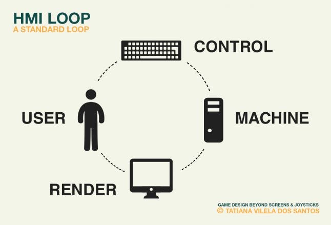
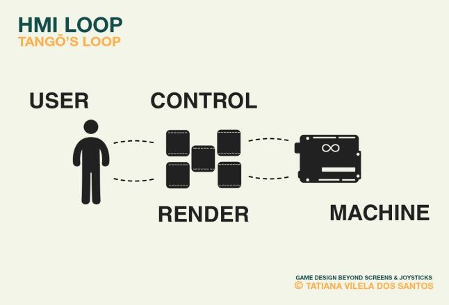
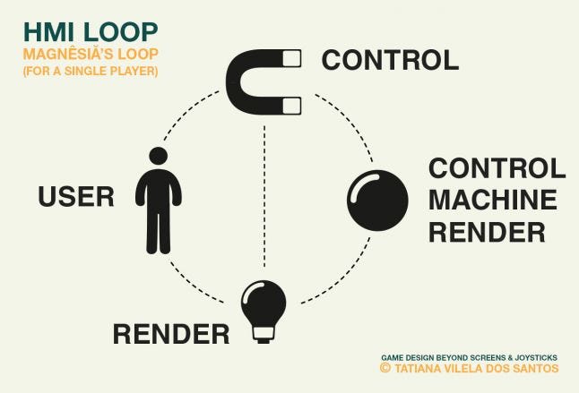
When I give my UX Design classes, whether it is to middle-schoolers or Master students, I always start by addressing the issue of alternative interfaces through the Human-Machine Interaction (HMI) loop. This loop illustrates the communication between a user and a computer. The user interacts with the machine through control interfaces while machine answers by giving back information through render interfaces. Based on these new data, the user can update his behavior, and so the cycle goes on...
If game design usually only involves the computer pole of this loop, designing a game with an alternative interface requires taking in count all of these poles. It also means that one can design games by altering this loop. Let's take a closer look at alterations of each of these poles and analyze the consequence this has on the game experience. For each pole I’ll start by giving an example of game with an altered loop and then dissect it.
Alternative control interface
Isochrone is a single player game based on a standard monitor and a simple alternative controller: a box featuring four buttons. Four nested 2D geometries are displayed on the screen. A dot is automatically moving along each line. Dots and buttons are visually related. There’s a black one, a white one, a black one with a white outline and a white one with a black outline. Pressing a button will else speed up or slow down the related dot, depending on its position. Dots on the smallest shapes can be decelerated while dots on the widest shapes can be accelerated. Players’ goal is to align the dots for a full turn.
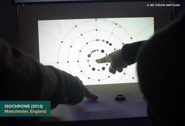
Buttons are placed on the controller so that, on launch, their position matches the one of the dots. But as the dots are moving in circle sometimes their position is similar and sometimes it’s inverted. Players thus need to indulge in mental gymnastics to avoid being misled by this constant change. This confusion is greater at each level for the shapes are more and more complex. To add further confusion to this already fooling gameplay, players have to coordinate their fingers as each button is related to a different action. Even so no guidance is provided regarding how to use the controller, they usually dedicate one hand to each action: left to speed up and right to slow down.
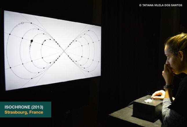
Isochrone is a typical example of an alternative controller game. On its HMI loop, only the controller has changed and this unique gamepad has a direct impact on the game experience. It’s still featuring a human communicating with a computer answering through a screen. But the way the player speaks to the machine is constrained by a special device whose ergonomics and appearance are stakeholders in the experience.
![[Isochrone�s Human-Machine Interaction loop] [Isochrone�s Human-Machine Interaction loop]](https://eu-images.contentstack.com/v3/assets/blt740a130ae3c5d529/blte12004de241a83bf/650ea49bab04837a89e5803c/InteractionLoop2.jpg/?width=700&auto=webp&quality=80&disable=upscale)
Alternative render interface
Tango is a single player game based on both an alternative controller and an alternative render interface: five small pillows including a flat vibrating motor and a pressure sensor. Each pillow vibrates at a different intensity randomly changing over time. When the correct pressure is applied on a pillow it’ll progressively cease vibrating. The more a pillow is vibrating the stronger the pressure needed to make it stop shaking will be. Players’ goal is to calm down all the pillows by mastering the pressure they apply with the different part of their hands.
.jpg/?width=700&auto=webp&quality=80&disable=upscale)
This game interface is designed to exploit exclusively players' sense of touch. As players can’t rely on visual and sound signals as usual, they have to make an extra-effort to concentrate on the vibrations tickling their fingertips. Most of them close their eyes as they play to better focus on their tactile sensation and coordinate the movements of their hands. This game provides a really internal and sensual experience when you really enter the dance of the machine.
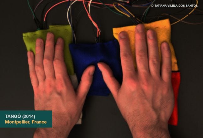
Tango is an example of what we could call an object-game. Like in a phone or a tablet, the control and render interfaces have merged into one. But unlike such devices, the object is only dedicated to the game. The computer is also replaced by an Arduino board: a small printed circuit board embedding the software part of the game. The user is still communicating with a computing machine, but it’s integrated to the whole object, The fusion of the interfaces and the embedding of the software inside the whole device gives the user the feeling of communicating with one unique entity and not to a computer through intermediate interfaces. This merger is meant to make players feel like they're trying to satisfy a little living machine that purrs under their fingers.
Alternative user setup
Snailed It is a competitive game for three players based on standard computer interfaces: a keyboard, a screen and speakers. Before the game, players choose a color: red, green or blue. On launch, a graph is randomly picked up among a pre-drawn graphs pool. The graph has ends of different colors: red, green and blue. All players share a same avatar: a snail placed in the middle of the graph. All the nearest nodes to the snail display a randomly chosen letter. Pressing a letter-key corresponding to a displayed letter will set the snail in motion. It moves along the lines from vertex to vertex. Players’ goal is to lead the snail to an end of their color.
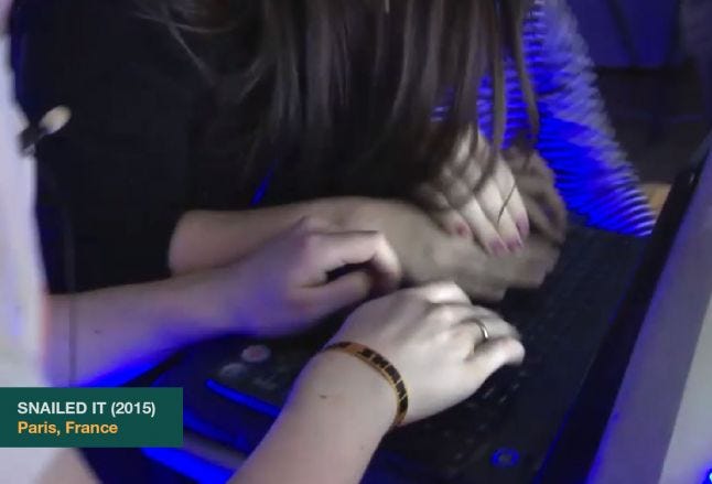
As players share one same avatar and controller they’ve to elbow their way to the letter-key they want to press. They can't simply focus on the digital part of the experience and overlook the physical one anymore because the true challenge here is to physically master their opponents. The real battle happens over the keyboard. Sharing a common device in a competitive environment is at the heart of Snailed It’s gameplay.
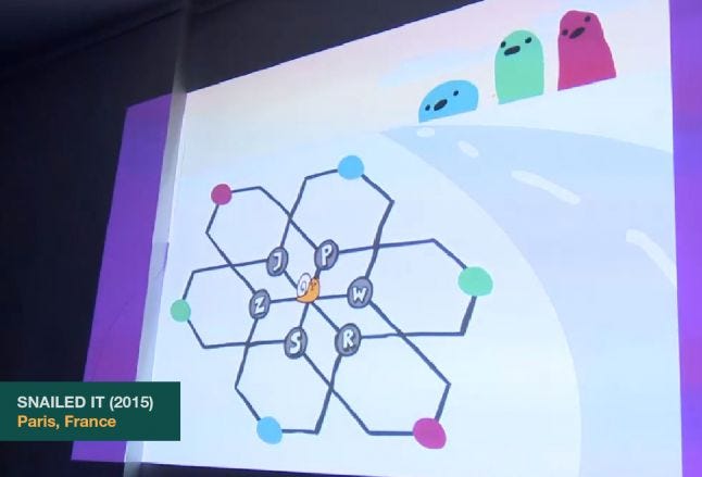
Snailed It is an example of what we could call a hacked or misused interface game. On its HMI loop, the control and render interfaces are standard. But they’re not used the way they’re supposed to. Users are still communicating with a machine but unlike most multiplayer game, they don’t have separated controllers. Snailed It’s HMI loop allows us to immediately notice that the originality and tension of this game come from the too high number of users compared to the rest of the loop.
.jpg/?width=700&auto=webp&quality=80&disable=upscale)
Alternative machine setup
Magnesia is a competitive game for two to eight players, split in two teams: red and blue, fully based on electrical and magnetic properties. The game is played on a cubic table made from a black wooden frame and several layers of acrylic glass. In-between, there are five metal balls, LEDs, magnetic switches and six circular metal targets, three for each team. Each player holds a plastic cylinder filled with neodymium, a really strong magnet. These controllers allow players to move the balls beneath the glass surface else by attracting it with a side of their tube or else by repulsing it with the other side. Players’ goal is to put a ball on each of their three targets.
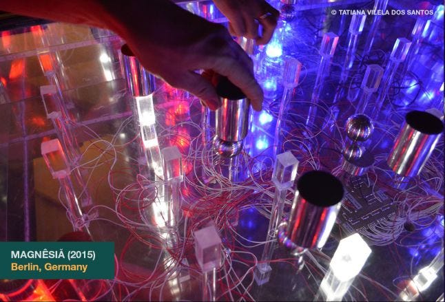
The whole device is purposely designed as a multiplayer popular game meant to be played in public places like bars and casinos. The table and balls are obviously inspired by billiard. Like in a billiard game, players move around a table to play and use physics a lot to make good moves, calculating balls’ trajectories and bounces. But as it’s played inside a maze of glass tubes, not on a smooth surface, and in real time, not turn by turn, the balls’ movements are way more messy than on a billiard table and reminds more the shamble of a pachinko. This installation-game features no sound but the one of the balls bumping into each other. To compensate, the lights’ color and blinking effects are quite showy evoking the feedbacks of a slot machine.
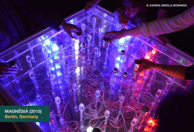
Magnesia is an example of what we could call an installation-game. Like an object-game, all interfaces and computing parts have merged into a unique device. Players’ magnets are controllers allowing them to directly turn on the magnetic switches but also to move the balls. The balls are both controllers, something the player can directly move, and render interfaces as their positions are significant as part of the state of the system. But as Magnesia is fully analog, they’re also part of what’s the closest to a computing device. For example, targets are made from two metal semicircles. When a metal ball is put on a target, it allows electricity to run from a semicircle to another and this is how the related winning effect lights up. But unlike an object-game it requires players to move around and take in count the environment surrounding them and the device.
In the next article
In the next article I’ll get into the nuts and bolts of physical interface game design and will address how the object design in itself can have consequences on the game experience. We’ll see how, as designers, we can use interfaces in a gameplay by providing challenges through their ergonomics, affordance and usability or, more precisely, through their lack of them.
→ Go to part 3/5 : Interface Game Design
Read more about:
Featured BlogsYou May Also Like