Trending
Opinion: How will Project 2025 impact game developers?
The Heritage Foundation's manifesto for the possible next administration could do great harm to many, including large portions of the game development community.

Featured Blog | This community-written post highlights the best of what the game industry has to offer. Read more like it on the Game Developer Blogs or learn how to Submit Your Own Blog Post
Tatiana Vilela dos Santos is an indie game designer & interactive artist making games with special interfaces. She gave in March 2018 a 60 minutes talk at the GDC titled Game Design Beyond Screens & Joysticks. This article discusses details of this talk.

Tatiana Vilela dos Santos is an indie game designer and interactive artist. She makes games with alternative controllers and render interfaces, all part of her interactive multimedia project MechBird. In March 2018, she gave a 60 minutes long talk at the GDC titled Game Design Beyond Screens & Joysticks about tools she uses to analyze and design this specific kind of games. This article discusses details of this talk.
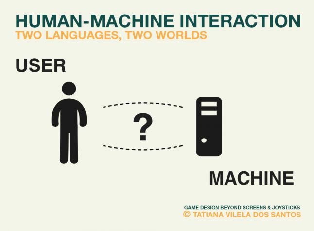
After looking at the big picture of HMI loop, let's now get down to the nitty-gritty of designing game interface as part of a gameplay. Addressing digital games through the Human-Machine Interaction loop is seeing the game experience from the perspective of communication: a video game is a talk between a computer and a human. The HMI loop highlights the human-computer interaction as a discussion between two agents that are not speaking the same language, not wired the same way, not even belonging to the same world. This was famously illustrated in the Hitchhiker’s guide to the galaxy when humanity asked what’s the meaning of life to a computer, a profoundly human question, for eventually getting the disappointing and puzzling answer “42”.
Interfaces make this impossible talk workable by translating these two languages. This is why interface design is crucial when developing an interactive experience. The fundamental difference between these mechanical and biological entities can be a curse for whom tries to make their communication as smooth as possible and aims for optimal ergonomics. But it can be a blessing for a game designer using these misunderstandings as part of a game challenge. Let’s see how creating friction by messing up the human-computer translation can be used in game design. As previously I’ll use games from my catalog as examples to show how controllers and render interfaces can directly participate in the game experience.
Involving the readability of an interface in a gameplay
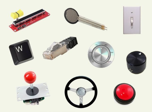
One of the most noticeable difference between a human and a computer is that a machine is a logical deductive agent while people can perform lots of different inferences while being more or less aware of the processes involved in their reasoning. This is why we often hear that machines never make mistakes in the sense that 2+2 will never result in anything else than 4, as long as it’s programmed to follow Peano's, or more evolved, mathematical axioms. They won’t make up answers from the top of their head, by intuition. If a machine can perform this level of accuracy, it’s mainly because it deals with very limited types of data. These types of variable are what the machine understands from human actions thanks to the controller. Each input of a controller is related to a type variable understood by the machine. A momentary push button, like an arcade button, is related to a momentary boolean: it’s always false and only true when hold down. A constant push button, like a light switch, is related to a constant boolean: it’s always false or true depending on its current position. A rotary switch, like temperature button on an oven, is related to a value on a scale with boundaries, etc. The machine’s vocabulary is therefore very limited.
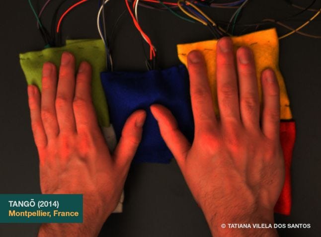
If humans’ inferences are not as perfect as the machines’ deductions, their thinking is less sanitized and their vocabulary way less limited. When render interfaces translate the computer language into a humanly understandable one, users get it through their senses. With a traditional human-computer setup, a screen will translate the computer talk into a visual form and speakers or headphones into a sound one. But one can use all the human’s senses available. In the previous article, we saw an example of how only touch was involved in TangÅ. In this game, people play with pressure strength and vibration while the computing chip deals with values on bounded scales. You’ll find lots of experiences involving smell and proprioception in the research project Perfect Plum. For games involving nociception have a look at the works of the duo //////////fur////. But the potential richness and variety of our dialogue doesn't only come from the senses we stimulate but also from the links we create between the terms of these two lexicons. We could say that making an interactive work is building a translation dictionary. We start with a pool of limited potential terms and weave bonds between them. Aiming for efficient ergonomics is about weaving an easy to understand web. The easier your code is to decipher, the better.
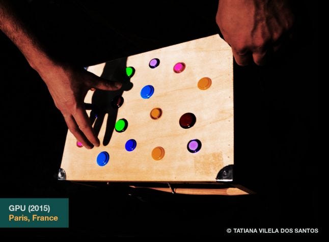
Complexifying the Human-Machine communication web in order to provide challenges in a game is what I attempted to do in GPU. GPU is a single player puzzle game based on an alternative controller: a wooden box featuring a shamble of sixteen arcade buttons. At the beginning of the game, players can import an image of their choice into the system. Once uploaded, the image is distorted by different shaders simultaneously in real time. Each visual alteration is then randomly assigned to a button modifying the effect. Players must fix these glitches and make the picture clear again by finding what effects modify the image: pixellation, line translate, pixel sort… and then have to infer what buttons are associated with these effects through a trial and error process. GPU is an example of game where my point, as a game designer, was to weave a complex web between the controller and the render interface. The challenge of the game comes from the complexity of the bonds linking the physical and the digital part of the game. The point of the player is to decipher this code. The goal, feedbacks and this purposeful lack of ergonomics and affordance are what distinguishes GPU from a standard glitch tool..
Involving the usability of an interface in a gameplay
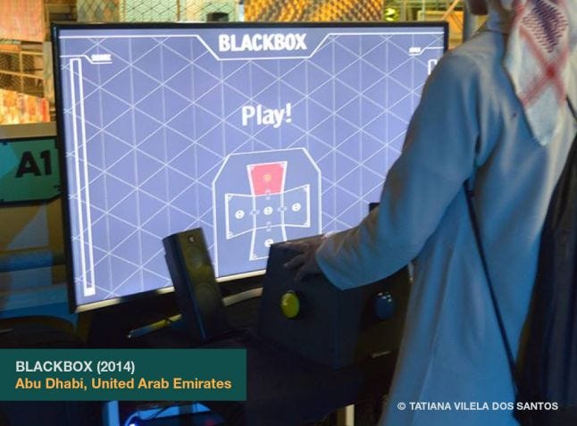
Using the friction provided by an interface design is not limited to the human-machine dialogue. The way a controller constraints body movements and position in space directly influences how the player is physically involved in the game. Music instruments provide great diversity regarding body involvement in an experience: Is the player static or can he walk around? What body parts hold the instrument? What body parts are involved in the interaction? Which one is in charge of the rhythm? Which one is in charge of the melody? Just think about the variety of these parameters and how they influence the experience of playing drums, a violin, a flute, a cello or a handpan. Aiming beyond ergonomics regarding the usability of a controller was my point when I designed BLACKBOX. BLACKBOX is a single player rhythm game based on an alternative controller: a black truncated pyramid featuring a big arcade button on each of its visible side. The net of this polyhedron is displayed on a screen. Some polygons of the shape glow on the rhythm of a music showing a pattern sequence: top, down, left, right, middle… Players’ goal is to reproduce these sequences to perform the highest possible score as the BPM accelerates increasing the pressure. The originality of BLACKBOX comes from its unique yet simple controller. Its shape doesn't’t aim for comfort and efficiency. BLACKBOX’s gamepad is designed to provide a percussive experience.
The friction provided by an interface design can also be used to put tension between players. The game Snailed It, mentioned in the previous article, was a good example of it. Here is another example with a controller specifically made for that: the latest version of Dead Pixels. Dead Pixels is a competitive territory conquest game for two to nine players - split in three teams: cyan, magenta and yellow - based on an alternative controller: a white wooden box featuring nine joysticks on its top. On launch, nine squared avatars are displayed on a white canvas: three of each color. Each one can be moved vertically or horizontally with one of the joystick. When they move, they leave behind them a trail of their color. When this trail forms a closed shape, it automatically fills itself like the bucket in Photoshop would. When colors are mixed, they generate a black pixel, an irreversible state. Games end after 99 seconds or when the canvas is full. Players’ goal is to get the most covered areas by the end of the game. As the joysticks are really close from each other, players don’t just dispute the territories on the screen but also those in the physical space materialized by the controller. Dead Pixels gameplay is about claiming physical and digital territories. The challenge comes from the limited space players can occupy in a competitive environment.
![]()
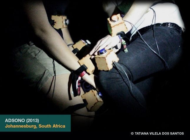
Using controllers to provide game challenges by ruling how bodies can move in space isn’t tied to competition only. Here is an example of a cooperative game constraining players’ movements by strapping the control and render interfaces directly on their body: Adsono. Adsono is a cooperative game of balance and flexibility for two players based on a wearable interface: five wooden boxes strapped to the body of each player, one on each limb and one on the belly. Each box features an arcade button and a LED. The game is played in six rounds. At each round, some buttons light up. Two on each body for the two first rounds, then three and finally four. Players’ goal is to press all the lit buttons on their partner’s body simultaneously by using any part of their own body: hands, knees, nose… By strapping the whole game interface on the players, Adsono turns their bodies into the gamefield. The game is not played in a digital environment anymore but straight in the physical space thus shifting where the game actually happens. Players aren’t immersed in another reality but are playing right here in the physical space we all share. We’ll dig deeper into this game space shift and its consequences in the following articles.
In the next article
In the next article I’ll address how the context of play, from the surrounding environment to the fiction skinning the actions, can have knock-on effects on the game experience. I’ll also provide a typology of games based on these parameters and will give examples of how I use these environmental influences, both incentives and deterrents, in my game design to induce specific players’ behaviors.
→ Go to part 4/5 : Game Space Shift
Read more about:
Featured BlogsYou May Also Like